


Beaned-Charts is a minimalist JavaScript charting library that generates responsive SVG charts with built-in interactive features like tooltips and hover effects.
Features:
- Zero Dependencies: Built with pure JavaScript.
- Minimal File Size: Compressed to under 5KB gzipped for fast page loads and reduced bandwidth.
- SVG Rendering: Charts scale perfectly across all screen sizes and resolutions.
- Interactive: Native support for hover effects, tooltips, and smooth CSS transitions.
- Three Chart Types: Supports bar charts, line charts, and pie charts with donut variations.
- Highly Customizable: Allows you to customize colors, dimensions, spacing, and behaviors.
How To Use It:
1. Install and import Beaned-Charts into your project.
const { BarChart, LineChart, PieChart } = require('beaned-charts');2. Create a basic chart instance with configuration options.

// Define your data as an array of objects
const salesData = [
  { label: 'Q1', value: 12500 },
  { label: 'Q2', value: 18900 },
  { label: 'Q3', value: 23400 }
];
// Create a new bar chart instance with configuration options
const chart = new BarChart(salesData, {
  width: 500,           // Chart canvas width in pixels
  height: 300,          // Chart canvas height in pixels
  padding: 40,          // Margin around the chart area
  barSpacing: 0.2,      // Gap between bars as a decimal (0.2 = 20%)
  showTooltips: true,   // Enable interactive tooltips on hover
  hoverEffects: true    // Activate lift and shadow animations
});
// Render the chart as SVG string and inject into DOM
document.getElementById('chart-container').innerHTML = chart.render();
2. Create a line Chart with area fill. Line charts support smooth curves and gradient fills for trend visualization:

const performanceData = [
{ value: 45 },
{ value: 67 },
{ value: 52 },
{ value: 89 },
{ value: 95 }
];
// Create a line chart with smooth interpolation
const lineChart = new LineChart(performanceData, {
width: 600,
height: 350,
smooth: true, // Apply Bezier curve smoothing to line segments
fill: true, // Fill the area beneath the line
color: '#10b981', // Set line and fill color
showPoints: true, // Render interactive data points
showAreaHighlight: true // Display highlighted regions on hover
});
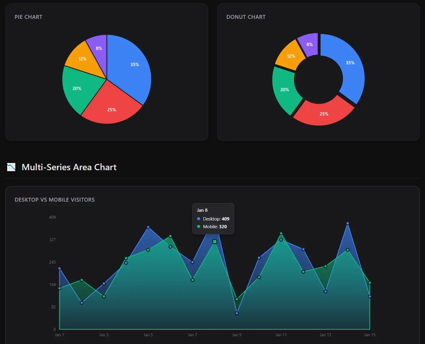
document.body.innerHTML += lineChart.render();3. Create a pie chart. You can transform the pie chart into a donut chart by adjusting the hole size parameter:

const marketShareData = [
  { label: 'Product A', value: 45 },
  { label: 'Product B', value: 30 },
  { label: 'Product C', value: 25 }
];
// Create a donut chart with center hole
const donutChart = new PieChart(marketShareData, {
  width: 400,
  height: 400,
  holeSize: 0.4, // Create donut hole (0 = solid pie, 0.4 = 40% hole)
  explodeSlices: true, // Enable slice pop-out effect on hover
  showLabels: true, // Display percentage labels on each slice
  showTooltips: true // Show detailed tooltips with values
});
document.getElementById('donut').innerHTML = donutChart.render();
Configuration Options:
BarChart Options:
width(number): Canvas width in pixels. Default is 400.height(number): Canvas height in pixels. Default is 300.minBarWidth(number): Min bar width in pixels. Default is 20.maxBarWidth(number): Max bar width in pixels.minBarHeight(number): Min bar height in pixels. Default is 10.maxBarHeight(number): Max bar height in pixels.padding(number): Margin space around chart edges in pixels. Default is 40.showLabels(boolean): Display axis and value labels. Default is true.barSpacing(number): Proportional spacing between bars from 0 to 1. Default is 0.2.colors(string[]): Array of hex color codes for custom bar colors.showTooltips(boolean): Enable hover tooltip displays. Default is true.hoverEffects(boolean): Activate bar lift and shadow animations. Default is true.
LineChart Options:
width(number): Canvas width in pixels. Default is 400.height(number): Canvas height in pixels. Default is 300.padding(number): Margin space around chart edges in pixels. Default is 40.smooth(boolean): Apply Bezier curve smoothing to line paths. Default is false.fill(boolean): Fill area beneath the line with gradient. Default is false.color(string): Hex color code for line and fill.showPoints(boolean): Render interactive data point circles. Default is true.showTooltips(boolean): Enable hover tooltip displays. Default is true.hoverEffects(boolean): Activate point scaling and line glow. Default is true.showAreaHighlight(boolean): Display vertical highlight regions on hover. Default is true.
PieChart Options:
width(number): Canvas width in pixels. Default is 400.height(number): Canvas height in pixels. Default is 400.holeSize(number): Center hole diameter from 0 to 1 where 0 creates a solid pie. Default is 0.showLabels(boolean): Display percentage labels on slices. Default is true.colors(string[]): Array of hex color codes for custom slice colors.showTooltips(boolean): Enable hover tooltip displays. Default is true.hoverEffects(boolean): Activate slice glow and expansion. Default is true.explodeSlices(boolean): Enable slice separation on hover. Default is false.
Utility Functions:
// Import utility functions
const { getColor, normalizeCoordinate, describeArc, SVGFactory } = require('beaned-charts');
// Retrieve a color from the default palette by index
const primaryColor = getColor(0); // Returns '#3b82f6'
// Map a value from one range to another range
const scaledValue = normalizeCoordinate(50, 0, 100, 0, 200); // Returns 100
// Generate SVG path data for circular arcs
const arcPath = describeArc(50, 50, 40, 0, 90); // Returns path string for 90-degree arc
// Create SVG container elements
const svgRoot = SVGFactory.createSVG(400, 300);
// Create SVG group elements with attributes
const group = SVGFactory.createGroup({ stroke: '#000', fill: 'none' });
FAQs:
Q: Can I customize the default color palette?
A: Yes. Pass a custom colors array to any chart’s options object. The library cycles through your provided colors when rendering multiple data series. For single-color charts like line graphs, use the color option instead.
Q: How do I prevent tooltips from extending beyond the viewport?
A: The tooltip positioning uses static SVG coordinates relative to data points. For charts near viewport edges, reduce the padding option or implement viewport detection logic to adjust tooltip anchor positions before rendering.
Q: Can I export charts as standalone SVG files?
A: Yes. The render() method returns a complete SVG string with embedded styles. Save this string directly to an .svg file or convert to other formats using server-side tools like sharp or Inkscape command-line utilities.
Q: How do I make the charts responsive?
A: The charts are SVG-based. You can control their size via CSS on the container element. The internal viewBox attribute handles the scaling automatically.
Changelog:
v1.3.8 (02/12/2026)
- add customizable bar width/height options and dynamic tooltip sizing
v1.3.5 (02/11/2026)
- Improve BarChart tooltips
See Also:
 High-Performance WebGPU Charting Library for Large Datasets – ChartGPU
 Minimal Bar/Line/Pie Chart JavaScript Library – Chartly.js
 Financial Data Visualization Library for JavaScript – VisionCharts
 Lightweight Pie/Donut Charts with CSS Conic Gradients – Pietry
 Minimal SVG Donut/Pie Chart Generator – donut.js
 Animated Column/Line/Area/Pie Chart Library – Graph.js
 Minimal Pie & Ring (Donut) Chart JavaScript Library – Charty
 Minimal Canvas Based Bar & Line Chart Library – TChart.js