


A small JavaScript script to create a mobile-friendly sliding off-canvas nav that covers the main page content with a background overlay.
How to use it:
Include the Font Awesome for the icons.
<link rel="stylesheet" href="https://netdna.bootstrapcdn.com/font-awesome/4.7.0/css/font-awesome.min.css">
Create the sidebar navigation.
<div class="sidebar" id="sidebar">
  <div class="sidebar-lists">
      <ul class="lists">
          <li class="sidebar-items" style="margin-top: -17px; border-bottom: 1px solid #ccc">
             <i class="fa fa-close" id="takeIn"></i>
          </li>
          <li class="sidebar-items items">
              <a href="#">
                  <h4><i class="fa fa-dashboard"></i><span class="span">Dashboard</span></h4>
              </a>
          </li>
          <li class="sidebar-items items">
              <a href="#">
                  <h4><i class="fa fa-fire"></i><span class="span">Trending</span></h4>
              </a>
          </li>
          <li class="sidebar-items items" style="border-bottom: 1px solid #ccc">
              <a href="#">
                  <h4><i class="fa fa-feed"></i><span class="span">Feed</span></h4>
              </a>
          </li>
          <li class="sidebar-items" style="border-bottom: 1px solid #ccc">
              <h4>PAGES
          </li>
          <li class="sidebar-items items">
              <a href="#">
                  <h4><i class="fa fa-home"></i><span class="span">Home</span></h4>
              </a>
          </li>
          <li class="sidebar-items items">
              <a href="#">
                  <h4><i class="fa fa-book"></i><span class="span">Documentation</span></h4>
              </a>
          </li>
          <li class="sidebar-items items" style="border-bottom: 1px solid #ccc">
              <a href="#">
                  <h4><i class="fa fa-code"></i><span class="span">Codes</span></h4>
              </a>
          </li>
          <li class="sidebar-items" style="border-bottom: 1px solid #ccc">
              <h4>ACCOUNT
          </li>
          <li class="sidebar-items items">
              <a href="#">
                  <h4><i class="fa fa-gear"></i><span class="span">Settings</span></h4>
              </a>
          </li>
          <li class="sidebar-items items">
              <a href="#">
                  <h4><i class="fa fa-sign-out"></i><span class="span">Logout</span></h4>
              </a>
          </li>
      </ul>
  </div>
</div>
Create an element to open the navigation.
<i class="fa fa-bars" id="bringOut"></i>
The necessary CSS/CSS3 rules.
.fa-bars {
  position: absolute;
  margin-top: 30px;
  color: rgb(122, 117, 117);
  cursor: pointer;
}
.sidebar {
  background: rgba(0, 0, 0, 0.6);
  display: none;
  height: 100%;
  position: fixed;
  width: 100%;
  z-index: 1;
  top: 0;
  z-index: 1000;
}
.sidebar-lists {
  animation-name: sidebar;
  animation-duration: 0.5s;
  background: rgb(235, 235, 235);
  display: block;
  height: auto;
  top: 0;
  width: 250px;
  height: 100%;
  z-index: 1000 !important;
}
.lists {
  list-style: none;
  text-decoration: none;
  padding-left: 0;
}
.fa-close {
  color: rgb(128, 128, 128);
  position: absolute;
  margin-top: 25px;
  margin-left: 0px;
  cursor: pointer;
}
.sidebar-items {
  color: rgb(112, 112, 112);
  display: block;
  padding-left: 30px;
}
.sidebar-items.items {
  color: rgb(112, 112, 112);
  display: block;
  height: 40px;
  padding-left: 30px;
}
.sidebar-items a {
  text-decoration: none;
  color: rgb(112, 112, 112)
}
.span {
  margin-left: 20px
}
@keyframes sidebar {
  0% {
      transform: translate3d(-250px, 0, 0);
  }
  100% {
      transform: translate3d(0px, 0, 0);
  }
}
@media(max-width: 600px) {
  body {
      overflow-x: hidden;
  }
  .sidebar-lists {
      overflow: hidden;
      overflow-y: scroll;
      position: fixed
  }
}
@keyframes display {
  0% {
      opacity: 0
  }
  100% {
      opacity: 1
  }
}
The main JavaScript.
var bringOut = document.getElementById('bringOut');
var takeIn = document.getElementById('takeIn');
var sidebar = document.getElementById('sidebar');
var big = document.getElementById('big');
var bigC = document.getElementById('bigContainer');
var card = document.getElementsByClassName('card');
var image = document.getElementsByClassName('img-fluid');
bringOut.addEventListener('click', out);
takeIn.addEventListener('click', inside);
window.addEventListener('click', outside);
for (i = 0; i < image.length; i++) {
    image[i].addEventListener('click', function() {
        big.style.display = "block";
        bigC.innerHTML = "<img src='" + image.src[i] + "'>";
    });
}
function out() {
    sidebar.style.display = "block";
}
function inside() {
    sidebar.style.display = "none";
}
function outside(e) {
    if (e.target == sidebar) {
        sidebar.style.display = "none";
    }
}
See Also:
 Multi-Direction Offcanvas Drawers with Smooth Sliding Animations
 Create Mobile-First Side Menus with SlideReveal.js Library
 Hover-triggered Off-Canvas Side Menu – Less Annoying Hotzone
 Responsive Dropdown/Off-canvas Navigation In Vanilla JavaScript – Menue
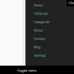 Swipeable Off-canvas Navigation For Mobile – Mobile Swipe Menu
 Lightweight Off-canvas (Push) Menu JavaScript Library – offcanvas.js
 Multifunctional Sliding Drawer Plugin In JavaScript – toolslide.js
 Simple Multi-level Offcanvas Menu In Vanilla JavaScript