


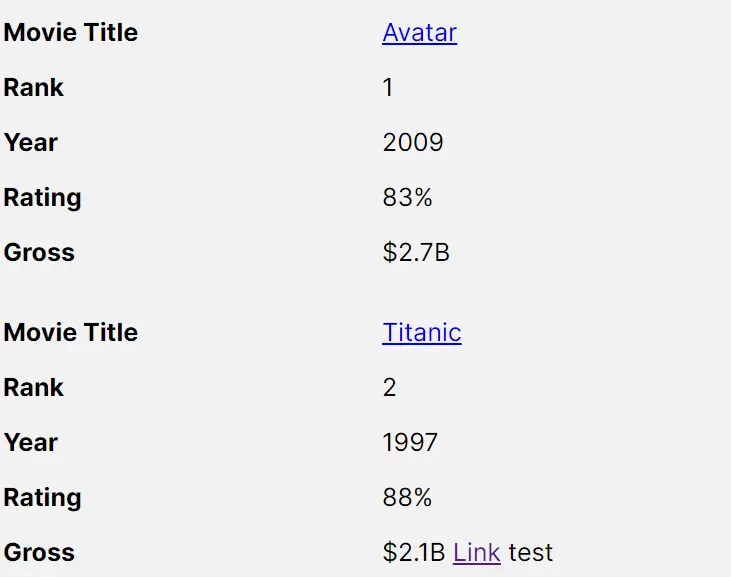
table-saw is a lightweight responsive table Web Component that smoothly transitions table rows and columns into a more readable stacked two-column layout on smaller viewports.
How to use it:
1. Download and import the table-saw as a web component.
<script type="module" src="table-saw.js"></script>
2. Wrap your table element into the table-saw component and specify the breakpoint (default: 39.9375em) in the breakpoint attribute as follows:
<table-saw breakpoint="(max-width: 35em)">
  <table>
    Your Table Here
  </table>
</table-saw>
3. Determine whether to use container queries or media queries. Default: ‘media’.
<table-saw breakpoint="(max-width: 35em)" type="container">
  <table>
    Your Table Here
  </table>
</table-saw>
4. Set the width ratio of the left and right table columns. Default: ‘1/2’.
<table-saw breakpoint="(max-width: 35em)" ratio="1/1">
  <table>
    Your Table Here
  </table>
</table-saw>
5. Determine whether to remove paddings on table cells.
<table-saw breakpoint="(max-width: 35em)" zero-padding>
  <table>
    Your Table Here
  </table>
</table-saw>
6. Determine whether to align text on small screens.
<table-saw breakpoint="(max-width: 35em)" force-align>
  <table>
    Your Table Here
  </table>
</table-saw>
See Also:
 Tiny Touch Carousel Web Component for Modern Apps – Pure Swipe Slider
 Custom Media Player Controls Using Web Components – media-chrome
 Fast Youtube Video Embed With lite-youtube Component
 Fast, Lightweight YouTube Video Embed Web Component – lite-youtube
 iOS Style Dialog Web Component – pure-dialog
 Customizable Rounded & Square Toggle Switch Web Component
 Real-time Input Colorization Web Component – RichInput
 Add Sortable and Filterable Functionalities to HTML Tables with the Action Table Web Component