


The Explodal lets you create a responsive, pretty cool modal window with an explosion effect using pure CSS.
How to use it:
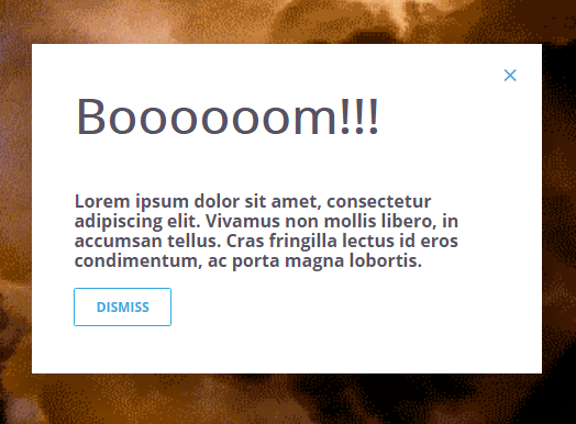
Create the modal window following the html markup like this:
<div id="explode" class="ui--modal explode">
  <div>
    <a href="#close" class="material-icons ui--close">Close</a>
    <h3 class="huge">Modal Title</h3>
    <p>Modal Content Here</p>
    <a href="#close" class="ui--button alt">Dismiss</a>
  </div>
  <div class="bg">
    <img src="assets/img/explode-med.gif" id="boooom">
  </div>
</div>
The primary CSS styles for the modal window.
.ui--modal {
  position: fixed;
  top: 0;
  left: 0;
  width: 100%;
  height: 100%;
  display: flex;
  justify-content: center;
  align-items: center;
  opacity: 0;
  pointer-events: none;
  transition: all 260ms 260ms ease-in-out
}
@media screen and (max-width: 800px) {
.ui--modal { padding: 24px }
}
.ui--modal>div:first-child {
  position: relative;
  background: #fff;
  color: #575265;
  width: 100%;
  min-width: 320px;
  max-width: 580px;
  min-height: 320px;
  padding: 48px;
  box-shadow: 0px 15px 35px 15px rgba(0,0,0,0.2);
  opacity: 0;
  transform: scale(0.5);
  transition: all 260ms 0ms cubic-bezier(0.97, 0.33, 0, -.1)
}
.ui--modal .ui--close {
  position: absolute;
  top: 24px;
  right: 24px
}
.ui--modal p { margin-top: 0 }
.ui--modal .bg {
  position: absolute;
  z-index: -1;
  top: 0;
  left: 0;
  right: 0px;
  width: 100vw;
  height: 100vh
}
.ui--modal .bg img {
  object-fit: cover;
  width: 100vw;
  height: 100vh
}
.ui--modal:target {
  opacity: 1;
  pointer-events: all;
  transition: all 260ms 0ms ease-in-out
}
.ui--modal:target>div {
  opacity: 1;
  transform: scale(1);
  transition: all 200ms 300ms cubic-bezier(0.97, 0.33, 0, -.1)
}
You need a trigger button to toggle the modal window.
<a href="#explode" onclick="document.getElementById('boooom').setAttribute('src', 'assets/img/explode-med.gif');">Toggle</a>See Also:
 Responsive Stacked Card Slider With JavaScript – Deck Slider
 CSS Split Scroll: No-JS Half-and-Half Scrolling Layout
 Minimal Math Captcha JavaScript Library – jCaptcha.js
 JavaScript-powered Screen Recording Tool – ScreenRecorderJs
 String Case Transformations Made Simple With The lucky-case JS Library
 Small JS Library For FLIP Transitions – Flipping.js
 Generate SVG-based Flowcharts From JSON Data – jsontr.ee
 Searchable Tags Input Component For Bootstrap 5