


This JavaScript library provides a custom HTML element <browser-mockup> that creates realistic Chrome browser mockups on the page.
It allows you to display any HTML/CSS content within the browser mockup. No iframes, keeping content accessible and styleable.
You can customize tabs, add icons, and adjust the appearance to match your needs.
Ideal for screenshots and demonstrations where you want to showcase your web content in a familiar browser environment.
How to use it:
1. Download the ‘browser-mockup.js’ script and include it on your webpage as a module:
<script type="module" src="/path/to/vanilla/browser-mockup.js"></script>
2. Or install & import it via NPM:
# NPM
$ npm install @magnit-ce/browser-mockup
import "@magnit-ce/browser-mockup";
3. You can then load web content into the <browser-mockup> element. This content is rendered inside the mockup as if it were within a browser’s body tag:
<browser-mockup
  url="URL displayed on the address bar"
  tabs="Number of random browser tabs"
  collapsed-tabs="Number of collapsed tabs">
  <h1>CSSScript</h1>
  <p>A JavaScript/CSS wesbite.</p>
</browser-mockup>
4. Define and customize tabs using the data-label and data-icon attributes.
<browser-mockup>
  <span slot="tab" data-icon="#" data-label="CSS"></span>
</browser-mockup>
5. Or using child elements:
<browser-mockup>
  <span slot="tab">
    <span class="icon"><img src="custom icon" alt="tab icon" /></span>
    <span class="label">Custom Label</span>
  </span>
</browser-mockup>
6. The utilizes shadowDOM to encapsulate decorative elements. Styling can be achieved by targeting specific parts of the mockup using the CSS ::part() selector. You can customize various aspects, including border radius, margins, shadows, and colors.
browser-mockup{
  --border-radius: 5px;
  --margin: 1em;
  --shadow-color: rgb(0 0 0);
  --box-shadow: 0 0 15px -3px var(--shadow-color);
  --background: canvas;
  --border-color: canvastext;
  --header-background: #2b2b2b;
  --header-font-color: #868686;
  --url-color: #313131;
  --tab-background: #181818;
  --tab-selected-background: #1f1f1f;
  --tab-highlight: #0078d4;
  --tab-selected-font-color: #d7d7d7;
}
// OR
browser-mockup::part(header) {
/* CSS Styles here */
}
browser-mockup::part(tabs) {
/* CSS Styles here */
}
browser-mockup::part(actions) {
/* CSS Styles here */
}
browser-mockup::part(action-minimize) {
/* CSS Styles here */
}
browser-mockup::part(action-maximize) {
/* CSS Styles here */
}
browser-mockup::part(action-close) {
/* CSS Styles here */
}
browser-mockup::part(navigation) {
/* CSS Styles here */
}
browser-mockup::part(history) {
/* CSS Styles here */
}
browser-mockup::part(button-back) {
/* CSS Styles here */
}
browser-mockup::part(button-forward) {
/* CSS Styles here */
}
browser-mockup::part(button-refresh) {
/* CSS Styles here */
}
browser-mockup::part(url) {
/* CSS Styles here */
}
browser-mockup::part(path) {
/* CSS Styles here */
}
browser-mockup::part(body) {
/* CSS Styles here */
}Changelog:
v1.1.1 (11/29/2024)
- fixed forward button setting url to undefined
v1.1.0 (09/28/2024)
- wider support and history management
See Also:
 Browser Detector & UserAgent Parser – browser-dtector.js
 Detect Device/Browser/Viewport Information – Device.js
 Simplify Device and Browser Detection With The brewser JavaScript Library
 Customizable Safari Browser Mockup For The Web – browser-window
 Minimal Browser Detection JavaScript Library – BDL.js
 Macbook (M1) Keyboard Mockup In Pure CSS
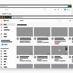 Create A Skeleton Screen From Auto Generated Placeholders – Placeholdifier
 Browser/Device/OS/Screen Detection With Version – braowser.js