


Orbit is a CSS framework that focuses on radial user interfaces. Inspired by space concepts like Big Bang, orbits, satellites, gravitational centers, and gravitational force.
This CSS framework provides a series of CSS classes and web components for creating radial menus, dashboards, orbital maps, and other circular layouts. This can help you create non-linear, radial layouts with ease.
Users can customize Orbit to fit their project needs. The framework comes with detailed documentation to help developers get started quickly. There’s also a community of Orbit users where you can share your work and get help.
How to use it:
1. Download Orbit or install it using a package manager:
# Yarn
$ yarn add @zumer/orbit
# NPM
$ npm install @zumer/orbit
# PNPM
$ pnpm install @zumer/orbit
2. Add Orbit’s files to your HTML document.
<link rel="stylesheet" href="/path/to/orbit.css">
<script src="/path/to/orbit.js"></script>
<!-- OR -->
<link rel="stylesheet" href="https://unpkg.com/@zumer/orbit@latest/dist/orbit.css">
<script src="https://unpkg.com/@zumer/orbit@latest/dist/orbit.js"></script>
3. To create a basic radial layout, use the .bigbang class on a container element. Inside, add a .gravity-spot element. This acts as the center point. Within the gravity spot, add one or more .orbit elements. These will hold the radial elements like .satellite, .vector, .side, or web components such as <o-text>, <o-slice>, and <o-progress>:
- bigbang: This is the main container for your Orbit layout.
- .gravity-spot: This element acts as the center of your radial design.
- .orbit: These are the circular paths around the gravity spot.
- .satellite: These are elements that orbit around the gravity spot.
- .vector: These create straight lines from the center to the edge of the orbit.
- .side: These elements divide the orbit into sections.
- <o-text>: This web component creates curved text that follows the orbit’s path.
- <o-slice>: This component creates pie-slice shapes within the orbit.
- <o-progress>: This creates circular progress bars.
<div class="bigbang">
  <div class="gravity-spot">
    <div class="orbit">
      <div class="satellite">1</div>
      <div class="satellite">2</div>
      <div class="satellite">3</div>
    </div>
    <div class="orbit">
      <o-text>Curved text</o-text>
    </div>
  </div>
</div>
You can customize these elements using CSS variables. For example, you can change the size of the orbits, the color of the satellites, or the speed of animations.
The framework also allows you to create responsive designs that adapt to different screen sizes. You can use media queries to adjust the layout for mobile devices or larger screens.
For more advanced customization, you can extend Orbit’s classes or create your own components that work with the framework.
4. Check out the official documentation for detailed guides and examples on using these elements and customization options.
Changelog:
v1.4.5 (01/22/2026)
- fix –o-angle-composite formular for satellite, side and vector
v1.3.0 (03/25/2025)
- Added New ending shapes
v1.2.2 (03/08/2025)
- O-Arc: add new ending shapes
- O-Arc: fix bug that prevents update text on change
v1.2.1 (02/26/2025)
- Change transition properties to avoid issue when WC is animated.
v1.2.0 (02/06/2025)
- Add intermediate shrink values from 0-100 by 5.
v1.1.0 (01/30/2025)
- fix o-arc styling
- o-progress with new o-arc features
- add ending shapes: circle,bullet,arrow
- close enough with bugs
- Fix gap ratio
- Fix totalLenght()
- Fix textPath
- Remove template
- Fix offset
- Improve themes
- Remove o-text traces
- o-arx tree-shake code
- Fix theme
- fix flip curved text
- fix innerOuter init order
v1.0.0 (12/28/2024)
- Update
See Also:
 Persian/Arabic/English Number Converter – ChangeNumbers
 Advanced Multiple Emails Input Component In JavaScript
 Modern Syntax Highlighter with CSS Custom Highlight API
 Add Custom Navigation Buttons To Scrollable Containers – Carouscroll.js
 Material Ripple Effect In Vanilla JavaScript – Ripplet.js
 Create Social Share Popup Box with Pure JavaScript – needShareButton
 Email Autocomplete In Vanilla JavaScript
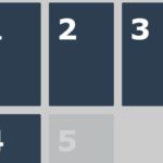 Fade In Elements In Sequence On Page Scroll – Fadin