


With the CSS3 transitions and transforms, we can add a full overlay on an image that reveals animated text captions on hover. Created by pdelsignore.
How to use it:
Insert an image and text captions in a container element with CSS class of ‘box’.
<div class="box"> <img src="1.jpg">
  <div class="overbox">
    <div class="title overtext"> Title </div>
    <div class="tagline overtext"> Tagline </div>
  </div>
</div>
The CSS for the image and the container element.
.box {
  cursor: pointer;
  height: 300px;
  position: relative;
  overflow: hidden;
  width: 400px;
}
.box img {
  position: absolute;
  left: 0;
  -webkit-transition: all 300ms ease-out;
  -moz-transition: all 300ms ease-out;
  -o-transition: all 300ms ease-out;
  -ms-transition: all 300ms ease-out;
  transition: all 300ms ease-out;
}
The CSS to style and animate the overlay.
.box .overbox {
  background-color: #304562;
  position: absolute;
  top: 0;
  left: 0;
  color: #fff;
  z-index: 100;
  -webkit-transition: all 300ms ease-out;
  -moz-transition: all 300ms ease-out;
  -o-transition: all 300ms ease-out;
  -ms-transition: all 300ms ease-out;
  transition: all 300ms ease-out;
  opacity: 0;
  width: 360px;
  height: 240px;
  padding: 130px 20px;
}
.box:hover .overbox { opacity: 1; }
The CSS to style and animate text captions.
.box .overtext {
  -webkit-transition: all 300ms ease-out;
  -moz-transition: all 300ms ease-out;
  -o-transition: all 300ms ease-out;
  -ms-transition: all 300ms ease-out;
  transition: all 300ms ease-out;
  transform: translateY(40px);
  -webkit-transform: translateY(40px);
}
.box .title {
  font-size: 2.5em;
  text-transform: uppercase;
  opacity: 0;
  transition-delay: 0.1s;
  transition-duration: 0.2s;
}
.box:hover .title,
.box:focus .title {
  opacity: 1;
  transform: translateY(0px);
  -webkit-transform: translateY(0px);
}
.box .tagline {
  font-size: 0.8em;
  opacity: 0;
  transition-delay: 0.2s;
  transition-duration: 0.2s;
}
.box:hover .tagline,
.box:focus .tagline {
  opacity: 1;
  transform: translateX(0px);
  -webkit-transform: translateX(0px);
}
See Also:
 Animated CSS3 Hover Caption with Image Zoom Effect
 Image Caption Hover Animations with CSS3 Transitions and Transforms
 Creating Hexagon Buttons with Pure CSS/CSS3
 Neon Style Rotating Borders with Pure CSS/CSS3
 Animated Image Hover Overlay with Image Scale
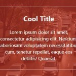 Transparent Image Hover Overlay With Pure CSS/CSS3
 Fully Responsive Background Image Slider with JS and CSS3
 3D Flipping Dropdown Navigation with Pure CSS3
Interesting approach, I was looking for solution like it. It is similar to component described here http://css-workshop.com/hover-box-text-over-images-on-hover-and-more/ but more simple. Thanks!
Brilliant, exactly what I wanted -Except in IE8 the overlay shows straight away with no image or transparency. I have a demo here http://allaboutweb.com.au/test/portfolio2.html