


A CSS3 powered text rotator which allows you to scroll through a list of text like a news ticker.
How to use it:
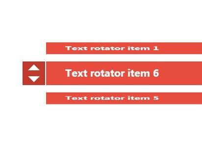
Build the Html structure for a text rotator with up/down navigation arrows.
<div id="rotatio-alsh" class="rotatio-container">
  <a class="rotatio-reset" href="#rotatio-alsh" accesskey="r" tabindex="-1"></a>

  <span id="next1" tabindex="6"></span>
  <span id="previous5" tabindex="10"></span>

  <span id="next2" tabindex="1"></span>
  <span id="previous6" tabindex="11"></span>

  <span id="next3" tabindex="2"></span>
  <span id="previous1" tabindex="12"></span>

  <span id="next4" tabindex="3"></span>
  <span id="previous2" tabindex="7"></span>

  <span id="next5" tabindex="4"></span>
  <span id="previous3" tabindex="8"></span>

  <span id="next6" tabindex="5"></span>
  <span id="previous4" tabindex="9"></span>
  <div class="rotatio-controls">
    <div class="rotatio-arrows"></div>

    <a class="rotatio-anchor" href="#next2" tabindex="-1"></a>
    <a class="rotatio-anchor" href="#previous6" tabindex="-1"></a>

    <a class="rotatio-anchor" href="#next3" tabindex="-1"></a>
    <a class="rotatio-anchor" href="#previous1" tabindex="-1"></a>

    <a class="rotatio-anchor" href="#next4" tabindex="-1"></a>
    <a class="rotatio-anchor" href="#previous2" tabindex="-1"></a>

    <a class="rotatio-anchor" href="#next5" tabindex="-1"></a>
    <a class="rotatio-anchor" href="#previous3" tabindex="-1"></a>

    <a class="rotatio-anchor" href="#next6" tabindex="-1"></a>
    <a class="rotatio-anchor" href="#previous4" tabindex="-1"></a>

    <a class="rotatio-anchor" href="#next1" tabindex="-1"></a>
    <a class="rotatio-anchor" href="#previous5" tabindex="-1"></a>

    <div class="rotatio-swivel">
      <div class="rotatio-item">Text rotator item 1</div>
      <div class="rotatio-item">Text rotator item 2</div>
      <div class="rotatio-item">Text rotator item 3</div>
      <div class="rotatio-item">Text rotator item 4</div>
      <div class="rotatio-item">Text rotator item 5</div>
      <div class="rotatio-item">Text rotator item 6</div>
    </div>
  </div>
</div>
Include the prefix-free JS library to make the text rotator work nicely across the browsers.
<script src="prefixfree.min.js"></script>
Add the following CSS/CSS3 snippets into your document and override the styles to your taste.
.rotatio-container > .rotatio-reset { display: none; }
/***/


.rotatio-container > .rotatio-controls {
  position: absolute;
  margin: auto;
  top: 0em;
  right: 0em;
  bottom: 0em;
  left: 0em;
  width: 50em;
  height: 3em;
  background: #c0392b;
}
.rotatio-container > .rotatio-controls > .rotatio-arrows {
  position: absolute;
  top: 0em;
  left: 0em;
  width: 3em;
  height: 100%;
  border-right: 0.125em solid white;
  box-sizing: border-box;
}
.rotatio-container > .rotatio-controls > .rotatio-arrows::before {
  content: "";
  position: absolute;
  margin: auto;
  top: 0.375em;
  right: 0em;
  left: 0em;
  width: 0em;
  height: 0em;
  border-right: 0.75em solid transparent;
  border-bottom: 0.75em solid white;
  border-left: 0.75em solid transparent;
  display: block;
}
.rotatio-container > .rotatio-controls > .rotatio-arrows::after {
  content: "";
  position: absolute;
  margin: auto;
  right: 0em;
  bottom: 0.375em;
  left: 0em;
  width: 0em;
  height: 0em;
  border-top: 0.75em solid white;
  border-right: 0.75em solid transparent;
  border-left: 0.75em solid transparent;
  display: block;
}
/***/


.rotatio-container > .rotatio-controls > .rotatio-anchor { outline: none; }
.rotatio-container > .rotatio-controls > .rotatio-anchor:active {
  visibility: visible !important;
  z-index: 2147483647;
}
.rotatio-container > .rotatio-controls > .rotatio-anchor:nth-of-type(n + 3) { visibility: hidden; }
.rotatio-container > .rotatio-controls > .rotatio-anchor:nth-of-type(odd) {
  position: absolute;
  top: 0px;
  left: 0px;
  width: 3em;
  height: 50%;
}
.rotatio-container > .rotatio-controls > .rotatio-anchor:nth-of-type(even) {
  position: absolute;
  bottom: 0px;
  left: 0px;
  width: 3em;
  height: 50%;
}
/***/


.rotatio-container > .rotatio-controls > .rotatio-swivel {
  position: absolute;
  right: 0em;
  left: 3em;
  height: 100%;
}
.rotatio-container > .rotatio-controls > .rotatio-swivel > .rotatio-item {
  position: absolute;
  width: 100%;
  height: 100%;
  color: white;
  text-indent: 2em;
  line-height: 2.5em;
  font-size: 1.5em;
  font-weight: bold;
  font-family: monospace;
  background: #e74c3c;
}
/***/


#rotatio-alsh > .rotatio-reset { display: none; }
#rotatio-alsh > .rotatio-controls > .rotatio-swivel {
  animation: rotatio-rotate 36s both linear infinite;
  transform-style: preserve-3d;
}
#rotatio-alsh > .rotatio-controls > .rotatio-swivel > .rotatio-item { backface-visibility: hidden; }

                /***/

                @keyframes
rotatio-rotate { 0% {
transform: rotateX(300deg);
}
 1.5% {
transform: rotateX(360deg);
}
 12.5% {
transform: rotateX(360deg);
}
 14% {
transform: rotateX(300deg);
}
 25% {
transform: rotateX(300deg);
}
 26.5% {
transform: rotateX(240deg);
}
 37.5% {
transform: rotateX(240deg);
}
 39% {
transform: rotateX(180deg);
}
 50% {
transform: rotateX(180deg);
}
 51.5% {
transform: rotateX(120deg);
}
 62.5% {
transform: rotateX(120deg);
}
 64% {
transform: rotateX(60deg);
}
 75% {
transform: rotateX(60deg);
}
 100% {
transform: rotateX(60deg);
}
}

                /***/

                @keyframes
rotatio-next-1 { 0% {
transform: rotateX(60deg);
}
 86% {
transform: rotateX(-20deg);
}
 100% {
transform: rotateX(360deg) rotateX(0deg);
}
}
 @keyframes
rotatio-next-2 { 0% {
transform: rotateX(360deg) rotateX(0deg);
}
 86% {
transform: rotateX(280deg);
}
 100% {
transform: rotateX(300deg);
}
}
 @keyframes
rotatio-next-3 { 0% {
transform: rotateX(300deg);
}
 86% {
transform: rotateX(220deg);
}
 100% {
transform: rotateX(240deg);
}
}
 @keyframes
rotatio-next-4 { 0% {
transform: rotateX(240deg);
}
 86% {
transform: rotateX(160deg);
}
 100% {
transform: rotateX(180deg);
}
}
 @keyframes
rotatio-next-5 { 0% {
transform: rotateX(180deg);
}
 86% {
transform: rotateX(100deg);
}
 100% {
transform: rotateX(120deg);
}
}
 @keyframes
rotatio-next-6 { 0% {
transform: rotateX(120deg);
}
 86% {
transform: rotateX(40deg);
}
 100% {
transform: rotateX(60deg);
}
}

                /***/

                @keyframes
rotatio-previous-1 { 0% {
transform: rotateX(300deg);
}
 86% {
transform: rotateX(380deg);
}
 100% {
transform: rotateX(0deg) rotateX(360deg);
}
}
 @keyframes
rotatio-previous-2 { 0% {
transform: rotateX(240deg);
}
 86% {
transform: rotateX(320deg);
}
 100% {
transform: rotateX(300deg);
}
}
 @keyframes
rotatio-previous-3 { 0% {
transform: rotateX(180deg);
}
 86% {
transform: rotateX(260deg);
}
 100% {
transform: rotateX(240deg);
}
}
 @keyframes
rotatio-previous-4 { 0% {
transform: rotateX(120deg);
}
 86% {
transform: rotateX(200deg);
}
 100% {
transform: rotateX(180deg);
}
}
 @keyframes
rotatio-previous-5 { 0% {
transform: rotateX(60deg);
}
 86% {
transform: rotateX(140deg);
}
 100% {
transform: rotateX(120deg);
}
}
 @keyframes
rotatio-previous-6 { 0% {
transform: rotateX(0deg) rotateX(360deg);
}
 86% {
transform: rotateX(80deg);
}
 100% {
transform: rotateX(60deg);
}
}
/***/


#rotatio-alsh > span[id$="1"]:focus:not(:target) ~ .rotatio-controls > .rotatio-swivel { animation: rotatio-next-1 1s both ease-out !important; }
#rotatio-alsh > span[id$="2"]:focus:not(:target) ~ .rotatio-controls > .rotatio-swivel { animation: rotatio-next-2 1s both ease-out !important; }
#rotatio-alsh > span[id$="3"]:focus:not(:target) ~ .rotatio-controls > .rotatio-swivel { animation: rotatio-next-3 1s both ease-out !important; }
#rotatio-alsh > span[id$="4"]:focus:not(:target) ~ .rotatio-controls > .rotatio-swivel { animation: rotatio-next-4 1s both ease-out !important; }
#rotatio-alsh > span[id$="5"]:focus:not(:target) ~ .rotatio-controls > .rotatio-swivel { animation: rotatio-next-5 1s both ease-out !important; }
#rotatio-alsh > span[id$="6"]:focus:not(:target) ~ .rotatio-controls > .rotatio-swivel { animation: rotatio-next-6 1s both ease-out !important; }
/***/


#next1:target ~ .rotatio-controls > .rotatio-swivel { animation: rotatio-next-1 1s both ease-out; }
#next2:target ~ .rotatio-controls > .rotatio-swivel { animation: rotatio-next-2 1s both ease-out; }
#next3:target ~ .rotatio-controls > .rotatio-swivel { animation: rotatio-next-3 1s both ease-out; }
#next4:target ~ .rotatio-controls > .rotatio-swivel { animation: rotatio-next-4 1s both ease-out; }
#next5:target ~ .rotatio-controls > .rotatio-swivel { animation: rotatio-next-5 1s both ease-out; }
#next6:target ~ .rotatio-controls > .rotatio-swivel { animation: rotatio-next-6 1s both ease-out; }
/***/


#previous1:target ~ .rotatio-controls > .rotatio-swivel { animation: rotatio-previous-1 1s both ease-out; }
#previous2:target ~ .rotatio-controls > .rotatio-swivel { animation: rotatio-previous-2 1s both ease-out; }
#previous3:target ~ .rotatio-controls > .rotatio-swivel { animation: rotatio-previous-3 1s both ease-out; }
#previous4:target ~ .rotatio-controls > .rotatio-swivel { animation: rotatio-previous-4 1s both ease-out; }
#previous5:target ~ .rotatio-controls > .rotatio-swivel { animation: rotatio-previous-5 1s both ease-out; }
#previous6:target ~ .rotatio-controls > .rotatio-swivel { animation: rotatio-previous-6 1s both ease-out; }
/***/


.rotatio-anchor:nth-of-type(11):active ~ .rotatio-swivel { animation: rotatio-next-1 1s both ease-out !important; }
.rotatio-anchor:nth-of-type(1):active ~ .rotatio-swivel { animation: rotatio-next-2 1s both ease-out !important; }
.rotatio-anchor:nth-of-type(3):active ~ .rotatio-swivel { animation: rotatio-next-3 1s both ease-out !important; }
.rotatio-anchor:nth-of-type(5):active ~ .rotatio-swivel { animation: rotatio-next-4 1s both ease-out !important; }
.rotatio-anchor:nth-of-type(7):active ~ .rotatio-swivel { animation: rotatio-next-5 1s both ease-out !important; }
.rotatio-anchor:nth-of-type(9):active ~ .rotatio-swivel { animation: rotatio-next-6 1s both ease-out !important; }
/***/


.rotatio-anchor:nth-of-type(4):active ~ .rotatio-swivel { animation: rotatio-previous-1 1s both ease-out !important; }
.rotatio-anchor:nth-of-type(6):active ~ .rotatio-swivel { animation: rotatio-previous-2 1s both ease-out !important; }
.rotatio-anchor:nth-of-type(8):active ~ .rotatio-swivel { animation: rotatio-previous-3 1s both ease-out !important; }
.rotatio-anchor:nth-of-type(10):active ~ .rotatio-swivel { animation: rotatio-previous-4 1s both ease-out !important; }
.rotatio-anchor:nth-of-type(12):active ~ .rotatio-swivel { animation: rotatio-previous-5 1s both ease-out !important; }
.rotatio-anchor:nth-of-type(2):active ~ .rotatio-swivel { animation: rotatio-previous-6 1s both ease-out !important; }
/***/

.rotatio-swivel > .rotatio-item:nth-of-type(1) { transform: rotateX(360deg) translateZ(3em); }
.rotatio-swivel > .rotatio-item:nth-of-type(2) { transform: rotateX(60deg) translateZ(3em); }
.rotatio-swivel > .rotatio-item:nth-of-type(3) { transform: rotateX(120deg) translateZ(3em); }
.rotatio-swivel > .rotatio-item:nth-of-type(4) { transform: rotateX(180deg) translateZ(3em); }
.rotatio-swivel > .rotatio-item:nth-of-type(5) { transform: rotateX(240deg) translateZ(3em); }
.rotatio-swivel > .rotatio-item:nth-of-type(6) { transform: rotateX(300deg) translateZ(3em); }
/***/


#rotatio-alsh > span:target ~ .rotatio-controls > .rotatio-anchor:nth-of-type(1),
 #rotatio-alsh > span:target ~ .rotatio-controls > .rotatio-anchor:nth-of-type(2) { visibility: hidden; }
#rotatio-alsh > span[id$="1"]:target ~ .rotatio-controls > .rotatio-anchor:nth-of-type(1),
 #rotatio-alsh > span[id$="1"]:target ~ .rotatio-controls > .rotatio-anchor:nth-of-type(2),
 #rotatio-alsh > span[id$="2"]:target ~ .rotatio-controls > .rotatio-anchor:nth-of-type(3),
 #rotatio-alsh > span[id$="2"]:target ~ .rotatio-controls > .rotatio-anchor:nth-of-type(4),
 #rotatio-alsh > span[id$="3"]:target ~ .rotatio-controls > .rotatio-anchor:nth-of-type(5),
 #rotatio-alsh > span[id$="3"]:target ~ .rotatio-controls > .rotatio-anchor:nth-of-type(6),
 #rotatio-alsh > span[id$="4"]:target ~ .rotatio-controls > .rotatio-anchor:nth-of-type(7),
 #rotatio-alsh > span[id$="4"]:target ~ .rotatio-controls > .rotatio-anchor:nth-of-type(8),
 #rotatio-alsh > span[id$="5"]:target ~ .rotatio-controls > .rotatio-anchor:nth-of-type(9),
 #rotatio-alsh > span[id$="5"]:target ~ .rotatio-controls > .rotatio-anchor:nth-of-type(10),
 #rotatio-alsh > span[id$="6"]:target ~ .rotatio-controls > .rotatio-anchor:nth-of-type(11),
 #rotatio-alsh > span[id$="6"]:target ~ .rotatio-controls > .rotatio-anchor:nth-of-type(12) { visibility: visible; }
/***/


#rotatio-alsh > span:focus ~ .rotatio-controls > .rotatio-anchor { visibility: hidden !important; }
#rotatio-alsh > span[id$="1"]:focus ~ .rotatio-controls > .rotatio-anchor:nth-of-type(1),
 #rotatio-alsh > span[id$="1"]:focus ~ .rotatio-controls > .rotatio-anchor:nth-of-type(2),
 #rotatio-alsh > span[id$="2"]:focus ~ .rotatio-controls > .rotatio-anchor:nth-of-type(3),
 #rotatio-alsh > span[id$="2"]:focus ~ .rotatio-controls > .rotatio-anchor:nth-of-type(4),
 #rotatio-alsh > span[id$="3"]:focus ~ .rotatio-controls > .rotatio-anchor:nth-of-type(5),
 #rotatio-alsh > span[id$="3"]:focus ~ .rotatio-controls > .rotatio-anchor:nth-of-type(6),
 #rotatio-alsh > span[id$="4"]:focus ~ .rotatio-controls > .rotatio-anchor:nth-of-type(7),
 #rotatio-alsh > span[id$="4"]:focus ~ .rotatio-controls > .rotatio-anchor:nth-of-type(8),
 #rotatio-alsh > span[id$="5"]:focus ~ .rotatio-controls > .rotatio-anchor:nth-of-type(9),
 #rotatio-alsh > span[id$="5"]:focus ~ .rotatio-controls > .rotatio-anchor:nth-of-type(10),
 #rotatio-alsh > span[id$="6"]:focus ~ .rotatio-controls > .rotatio-anchor:nth-of-type(11),
 #rotatio-alsh > span[id$="6"]:focus ~ .rotatio-controls > .rotatio-anchor:nth-of-type(12) { visibility: visible !important; }
See Also:
 Lightweight & Performant JavaScript Animation Library – MotionFlow
 Interactive 3D Text Spinner Using Pure CSS/CSS3
 Easy Text Typing and Deleting JavaScript Library – TextScript.js
 Customizable Text Rotator In Vanilla JavaScript
 Any Element Rotator CSS Library – fillintheblank
 Apple TV Style Word Rotator With Vanilla JS
 Mimic Human Typing With Write and Delete JavaScript Component
 Rotate Through Text Strings With Typing/Deleting Effects – autoTyper.js