


This is a modern One Page Scroll website template that combines responsive navigation and smooth scrolling animations. It features a collapsible navigation bar that adapts to different screen sizes and section transitions with gradient text effects.
This template suits landing pages, portfolio sites, product launches, and company websites. The fixed navigation bar stays accessible throughout the scroll experience. On mobile devices, the navigation transforms into a hamburger menu with smooth open/close animations. The gradient text effects add visual interest while maintaining readability.
The clean structure works for various content types – from product showcases to team introductions. The responsive design automatically adjusts layouts and navigation for optimal viewing across devices.
How to use it:
1. Define your website sections within the <body> of your HTML document. Each section will occupy the full viewport height. Assign a unique ID to each section, which will be used for navigation. Include a div with the class bg-effect for background styling and another div with the class section-content to hold your section’s text.
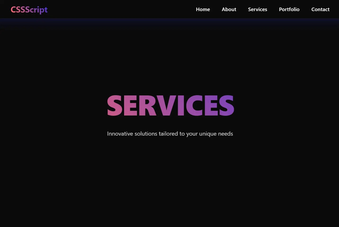
<section id="home">
  <div class="bg-effect bg-effect-1"></div>
  <div class="section-content">
    <h1 class="section-title">Home</h1>
    <p class="section-description">Home Description</p>
  </div>
</section>
<section id="main">
  <div class="bg-effect bg-effect-2"></div>
  <div class="section-content">
    <h1 class="section-title">Main</h1>
    <p class="section-description">Main Section</p>
  </div>
</section>
<section id="footer">
  <div class="bg-effect bg-effect-1"></div>
  <div class="section-content">
    <h1 class="section-title">Footer</h1>
    <p class="section-description">Footer Description</p>
  </div>
</section>
2. Create the navigation bar structure. A nav element with the class navbar will house the navigation. Inside, a div with the class navbar-container will contain the logo, the mobile navigation toggle button, and the navigation links within an unordered list (ul) with the class nav-links. Each link (a element) should have an href attribute that corresponds to the ID of your sections.
<nav class="navbar">
  <div class="navbar-container">
    <div class="logo">Premium</div>
    <button class="mobile-nav-toggle" aria-label="Toggle navigation">
      <span class="bar"></span>
      <span class="bar"></span>
      <span class="bar"></span>
    </button>
    <ul class="nav-links">
      <li><a href="#home">Home</a></li>
      <li><a href="#main">Main</a></li>
      <li><a href="#footer">Footer</a></li>
    </ul>
  </div>
</nav>
3. Include an empty div with the class overlay. This element will be used to darken the background when the mobile navigation is active. Place this element directly after the closing nav tag.
<div class="overlay"></div>
4. Apply the following CSS rules to style your one-page website and navigation bar. This includes setting up the layout, visual effects, and responsiveness.
* {
  margin: 0;
  padding: 0;
  box-sizing: border-box;
  font-family: 'Segoe UI', Tahoma, Geneva, Verdana, sans-serif;
  scroll-behavior: smooth;
}
:root {
  --gradient: linear-gradient(45deg, #ff3366, #ff6b6b, #4834d4, #686de0);
  --glass-bg: rgba(255, 255, 255, 0.05);
  --border: 1px solid rgba(255, 255, 255, 0.1);
  --shadow: 0 8px 32px 0 rgba(31, 38, 135, 0.37);
}
body {
  background: #0a0a0a;
  min-height: 100vh;
}
.navbar {
  position: fixed;
  top: 0;
  left: 0;
  width: 100%;
  padding: 1.2rem 5%;
  backdrop-filter: blur(12px);
  background: var(--glass-bg);
  border-bottom: var(--border);
  z-index: 1000;
  transition: all 0.4s cubic-bezier(0.4, 0, 0.2, 1);
  box-shadow: var(--shadow);
}
.navbar.scrolled {
  padding: 0.8rem 5%;
  background: rgba(10, 10, 10, 0.95);
}
.navbar-container {
  display: flex;
  justify-content: space-between;
  align-items: center;
  max-width: 1400px;
  margin: 0 auto;
}
.logo {
  font-size: 1.8rem;
  font-weight: 700;
  background: var(--gradient);
  -webkit-background-clip: text;
  background-clip: text;
  -webkit-text-fill-color: transparent;
  animation: gradient 8s linear infinite;
  background-size: 300%;
  letter-spacing: -0.5px;
}
.nav-links {
  display: flex;
  gap: 2.5rem;
  list-style: none;
}
.nav-links a {
  color: white;
  text-decoration: none;
  font-weight: 500;
  position: relative;
  padding: 0.5rem 0;
  transition: all 0.3s ease;
  font-size: 1.05rem;
  letter-spacing: 0.3px;
}
.nav-links a::before {
  content: '';
  position: absolute;
  top: -4px;
  left: 0;
  width: 0;
  height: 2px;
  background: var(--gradient);
  background-size: 300%;
  transition: width 0.3s ease;
}
.nav-links a::after {
  content: '';
  position: absolute;
  bottom: -4px;
  right: 0;
  width: 0;
  height: 2px;
  background: var(--gradient);
  background-size: 300%;
  transition: width 0.3s ease;
}
.nav-links a:hover {
  color: #fff;
  text-shadow: 0 0 8px rgba(255, 255, 255, 0.3);
}
.nav-links a:hover::before,
.nav-links a:hover::after {
  width: 100%;
  animation: gradient 8s linear infinite;
}
.mobile-nav-toggle {
  display: none;
  background: none;
  border: none;
  cursor: pointer;
  width: 40px;
  height: 40px;
  position: relative;
  z-index: 1001;
  border-radius: 50%;
  transition: background-color 0.3s ease;
}
.mobile-nav-toggle:hover {
  background-color: rgba(255, 255, 255, 0.1);
}
.mobile-nav-toggle .bar {
  position: absolute;
  left: 50%;
  transform: translateX(-50%);
  width: 20px;
  height: 2px;
  background: white;
  transition: all 0.4s ease;
}
.mobile-nav-toggle .bar:nth-child(1) { top: 14px; }
.mobile-nav-toggle .bar:nth-child(2) { top: 19px; }
.mobile-nav-toggle .bar:nth-child(3) { top: 24px; }
@keyframes gradient {
  0% { background-position: 0% 50%; }
  50% { background-position: 100% 50%; }
  100% { background-position: 0% 50%; }
}
@media (max-width: 768px) {
  .nav-links {
    position: fixed;
    top: 0;
    right: -100%;
    height: 100vh;
    width: 80%;
    max-width: 400px;
    background: linear-gradient(135deg, rgba(10, 10, 10, 0.99), rgba(20, 20, 20, 0.99));
    flex-direction: column;
    justify-content: center;
    align-items: center;
    gap: 2rem;
    transition: all 0.5s cubic-bezier(0.4, 0, 0.2, 1);
    box-shadow: -10px 0 30px rgba(0, 0, 0, 0.5);
    padding: 2rem;
    backdrop-filter: blur(10px);
  }
  .nav-links::before {
    content: '';
    position: absolute;
    top: 0;
    left: 0;
    width: 100%;
    height: 100%;
    background: linear-gradient(45deg, transparent, rgba(255, 255, 255, 0.03));
    pointer-events: none;
  }
  .nav-links.active {
    right: 0;
  }
  .nav-links a {
    font-size: 1.2rem;
    opacity: 0;
    transform: translateX(20px);
    transition: all 0.4s ease;
  }
  .nav-links.active a {
    opacity: 1;
    transform: translateX(0);
  }
  .nav-links a:nth-child(1) { transition-delay: 0.1s; }
  .nav-links a:nth-child(2) { transition-delay: 0.2s; }
  .nav-links a:nth-child(3) { transition-delay: 0.3s; }
  .nav-links a:nth-child(4) { transition-delay: 0.4s; }
  .nav-links a:nth-child(5) { transition-delay: 0.5s; }
  .mobile-nav-toggle {
    display: block;
  }
  .mobile-nav-toggle.active .bar:nth-child(1) {
    transform: translate(-50%, 5px) rotate(45deg);
    width: 24px;
  }
  .mobile-nav-toggle.active .bar:nth-child(2) {
    opacity: 0;
  }
  .mobile-nav-toggle.active .bar:nth-child(3) {
    transform: translate(-50%, -5px) rotate(-45deg);
    width: 24px;
  }
  .overlay {
    position: fixed;
    top: 0;
    left: 0;
    width: 100%;
    height: 100%;
    background: rgba(0, 0, 0, 0.5);
    opacity: 0;
    visibility: hidden;
    transition: all 0.4s ease;
    backdrop-filter: blur(4px);
  }
  .overlay.active {
    opacity: 1;
    visibility: visible;
  }
}
  .section-title {
    font-size: 3rem;
  }
  .section-description {
    font-size: 1rem;
    padding: 0 1rem;
  }
section {
  min-height: 100vh;
  padding: 120px 5% 80px;
  display: flex;
  justify-content: center;
  align-items: center;
  position: relative;
  overflow: hidden;
}
section:nth-child(even) {
  background: var(--section-bg);
}
.section-content {
  max-width: 1400px;
  width: 100%;
  text-align: center;
  position: relative;
  z-index: 1;
}
.section-title {
  font-size: 8vw;
  font-weight: 800;
  margin-bottom: 2rem;
  background: var(--gradient);
  -webkit-background-clip: text;
  background-clip: text;
  -webkit-text-fill-color: transparent;
  animation: gradient 8s linear infinite;
  background-size: 300%;
  line-height: 1.1;
  text-transform: uppercase;
  letter-spacing: -2px;
}
.section-description {
  font-size: 1.2rem;
  max-width: 800px;
  margin: 0 auto;
  line-height: 1.6;
  opacity: 0.8;
  color: white;
}
5. Include the following JavaScript code before the closing body tag to enable the responsive navigation functionality and smooth scrolling.
const navbar = document.querySelector('.navbar');
const mobileNavToggle = document.querySelector('.mobile-nav-toggle');
const navLinks = document.querySelector('.nav-links');
const overlay = document.querySelector('.overlay');
let isMenuOpen = false;
// Scroll effect
window.addEventListener('scroll', () => {
  if (window.scrollY > 50) {
    navbar.classList.add('scrolled');
  } else {
    navbar.classList.remove('scrolled');
  }
});
// Toggle mobile menu
function toggleMenu() {
  isMenuOpen = !isMenuOpen;
  mobileNavToggle.classList.toggle('active');
  navLinks.classList.toggle('active');
  overlay.classList.toggle('active');
  document.body.style.overflow = isMenuOpen ? 'hidden' : '';
}
mobileNavToggle.addEventListener('click', toggleMenu);
overlay.addEventListener('click', toggleMenu);
// Close mobile menu when clicking a link
document.querySelectorAll('.nav-links a').forEach(link => {
  link.addEventListener('click', () => {
    if (isMenuOpen) toggleMenu();
  });
});
// Close menu on escape key
document.addEventListener('keydown', (e) => {
  if (e.key === 'Escape' && isMenuOpen) toggleMenu();
});
// Prevent scroll when menu is open
window.addEventListener('resize', () => {
  if (window.innerWidth > 768 && isMenuOpen) {
    toggleMenu();
  }
});
See Also:
 WCAG Compliant Responsive Dropdown Navigation – accessible-menu
 Accessible Dropdown Nav With Vanilla JavaScript – Clicky Menus
 Build Fullscreen Snap-Scroll Presentations with SnapRollJS
 Build Smooth One-Page Scrolling Websites With ScrollFlow.js
 Two-Dimensional One Page Scroll Navigation with Scroll-Grid
 Responsive Accessible Dropdown Menu Template with Vanilla JavaScript
 CSS Split Scroll: No-JS Half-and-Half Scrolling Layout
 Enhance One-Page Websites with JavaScript Fullpage Slider