


slim-select is a lightweight and dependency-free JavaScript library that creates searchable, accessible, multi-selectable dropdowns from regular HTML select elements.
Features:
- Multi-Select: You can select multiple options with customizable selection limits.
- Real-Time Search: Built-in search input filters options as you type with customizable search functions.
- WCAG 2.1 Level AA Compliant: Implements proper ARIA attributes and keyboard navigation for screen reader users.
- Framework Compatible: Official Vue 3 and React components with full reactivity and TypeScript support.
- Custom HTML Options: Render rich HTML content inside option labels beyond plain text.
- Dynamic Data Management: Programmatically add, remove, or update options through API methods.
- Event Callbacks: Hook into selection changes, dropdown open/close, and search events.
- Addable Options: Allow you to create new options on the fly with validation.
- Performance Optimized: Uses efficient DOM updates and requestAnimationFrame for smooth animations.
- Placeholder Support: Display instructional text when no value is selected.
- Disabled States: Control which options users can select at runtime.
- CSS Customization: Override default styles through CSS custom properties or class inheritance.
- TypeScript Definitions: Full type safety with included TypeScript declaration files.
Use Cases:
- Advanced Form Interfaces: Build complex multi-step forms that need searchable dropdowns with validation rules.
- E-commerce Product Filters: Create filterable product attribute selectors (size, color, brand) with multi-select support.
- Admin Dashboards: Implement user role selectors, status filters, and tag pickers with custom option rendering.
- Data Import Tools: Allow users to map CSV columns to database fields using dropdown selectors with search.
- Survey and Quiz Platforms: Build accessible form controls that work with screen readers for WCAG compliance.
- Configuration Panels: Provide settings interfaces where users need to select multiple options from large lists.
How To Use It:
1. Import slim-select with NPM and import it into your project.
# Yarn
$ yarn add slim-select
# NPM
$ npm install slim-select
// Import the SlimSelect class
import SlimSelect from 'slim-select'
// Import styles (choose one method)
import 'slim-select/styles' // CSS import
// OR
import 'slim-select/scss' // SCSS import for customization
2. Or download the package and load the following files in your HTML document.
<!-- Local -->
<link rel="stylesheet" href="/dist/slimselect.css" />
<script src="/dist/slimselect.js"></script>
<!-- OR from a CDN -->
<link rel="stylesheet" href="https://unpkg.com/slim-select@latest/dist/slimselect.css" />
<script src="https://unpkg.com/slim-select@latest/dist/slimselect.js"></script>
3. Create a standard HTML select element and initialize SlimSelect:
<select id="demo">
  <option value="value 1">JavaScript</option>
  <option value="value 2">CSS3</option>
  <option value="value 3">HTML5</option>
</select>
new SlimSelect({
    select: '#demo'
})
4. The library also supports option groups:
<select id="single-optgroups">
  <optgroup label="JavaScript">
    <option value="value 1">Angular</option>
    <option value="value 2">React</option>
    <option value="value 3">Vue</option>
  </optgroup>
  <optgroup label="CSS">
    <option value="value 4">Bootstrap</option>
    <option value="value 5">Foundation</option>
    <option value="value 6">Bulma</option>
  </optgroup>
</select>
5. And multi-select:
<select id="single-optgroups" multiple>
  <optgroup label="JavaScript">
    <option value="value 1">Angular</option>
    <option value="value 2">React</option>
    <option value="value 3">Vue</option>
  </optgroup>
  <optgroup label="CSS">
    <option value="value 4">Bootstrap</option>
    <option value="value 5">Foundation</option>
    <option value="value 6">Bulma</option>
  </optgroup>
</select>
6. SlimSelect accepts data as an array of option and optgroup objects. You can initialize the select with data instead of relying on HTML markup:
Optgroup Object:
label(string, required): The visible text for the option group header.selectAll(boolean, optional, default: false): Adds a “Select All” option to the group in multi-select mode.closable(string, optional, default: ‘off’): Controls group collapse behavior. Values: ‘off’, ‘open’, ‘close’.options(array, required): Array of option objects belonging to this group.
Option Object:
text(string, required): The display text for the option.value(string, optional): The underlying value. Defaults to text if not provided.html(string, optional): Custom HTML to render instead of plain text.selected(boolean, optional, default: false): Marks the option as initially selected.display(boolean, optional, default: true): Controls visibility of the option in the dropdown.disabled(boolean, optional, default: false): Prevents selection of the option.mandatory(boolean, optional, default: false): Prevents deselection in multi-select mode.placeholder(boolean, optional, default: false): Marks the option as a placeholder that disappears after selection.class(string, optional): CSS class name to apply to the option element.style(string, optional): Inline CSS styles to apply to the option element.data(object, optional): Custom data attributes to attach to the option element.
new SlimSelect({
  select: '#demo',

  // Simple array of options
  data: [
    { text: 'Apple', value: 'apple' },
    { text: 'Banana', value: 'banana' },
    { text: 'Cherry', value: 'cherry' }
  ]

  // OR grouped options with optgroups
  // data: [
  //   {
  //     label: 'Fruits',
  //     options: [
  //       { text: 'Apple', value: 'apple' },
  //       { text: 'Banana', value: 'banana' }
  //     ]
  //   },
  //   {
  //     label: 'Vegetables',
  //     options: [
  //       { text: 'Carrot', value: 'carrot' }
  //     ]
  //   }
  // ]
})
6. All possible configuration options:
disabled(boolean, default: false): Disables the entire select component. Users cannot interact with it.alwaysOpen(boolean, default: false): Keeps the dropdown permanently open. Useful for inline selection interfaces.showSearch(boolean, default: true): Displays the search input field at the top of the dropdown.focusSearch(boolean, default: true): Automatically focuses the search input when the dropdown opens.keepSearch(boolean, default: false): Retains the search query text when the dropdown closes and reopens.ariaLabel(string, default: ‘Combobox’): Sets the ARIA label for screen readers.searchPlaceholder(string, default: ‘Search’): Placeholder text displayed in the search input.searchText(string, default: ‘No Results’): Message shown when search returns no matching options.searchingText(string, default: ‘Searching…’): Loading message displayed during asynchronous search operations.searchHighlight(boolean, default: false): Highlights matching text within options during search.closeOnSelect(boolean, default: true): Automatically closes the dropdown after an option is selected. Set to false for multi-select workflows.contentLocation(DOM element, default: document.body): Specifies where to append the dropdown element in the DOM tree.contentPosition(string, default: ‘absolute’): CSS position property for the dropdown. Values: ‘absolute’, ‘relative’, ‘fixed’.openPosition(string, default: ‘auto’): Controls dropdown opening direction. Values: ‘auto’, ‘up’, ‘down’.placeholderText(string, default: ‘Select Value’): Text shown when no option is selected.allowDeselect(boolean, default: false): Allows users to deselect the current option in single-select mode by clicking it again.hideSelected(boolean, default: false): Removes selected options from the dropdown list in multi-select mode.keepOrder(boolean, default: false): Maintains user selection order instead of DOM order for getSelected() method.showOptionTooltips(boolean, default: false): Displays browser tooltips on hover for options with title attributes.minSelected(number, default: 0): Minimum number of options that must be selected in multi-select mode.maxSelected(number, default: 1000): Maximum number of options that can be selected in multi-select mode.timeoutDelay(number, default: 200): Debounce delay in milliseconds for event callbacks.maxValuesShown(number, default: 20): Number of selected values to display before showing a summary message.maxValuesMessage(string, default: ‘{number} selected’): Template for the summary message. Use {number} placeholder for the count.addableText(string, default: ‘Press “Enter” to add {value}’): Instruction text for the addable option feature. Use {value} placeholder for user input.
new SlimSelect({
  select: '#demo',
  settings: {
    disabled: false,
    alwaysOpen: false,
    showSearch: true,
    focusSearch: true,
    keepSearch: false,
    ariaLabel: 'Combobox',
    searchPlaceholder: 'Search',
    searchText: 'No Results',
    searchingText: 'Searching...',
    searchHighlight: false,
    closeOnSelect: true,
    contentLocation: document.body,
    contentPosition: 'absolute',
    openPosition: 'auto',
    placeholderText: 'Select Value',
    allowDeselect: false,
    hideSelected: false,
    keepOrder: false,
    showOptionTooltips: false,
    minSelected: 0,
    maxSelected: 1000,
    timeoutDelay: 200,
    maxValuesShown: 20,
    maxValuesMessage: '{number} selected',
    addableText: 'Press "Enter" to add {value}'
  }
})
7. Callback functions:
new SlimSelect({
  select: '#demo',

  events: {
    // Custom search function
    // Receives the current search value and existing data
    // Returns a Promise or array of filtered/fetched options
    search: (searchValue, currentData) => {
      // Example: Async API call
      return fetch(`/api/search?q=${searchValue}`)
        .then(response => response.json())
        .then(data => data.results);

      // OR: Synchronous filtering
      // return currentData.filter(item =>
      //   item.text.toLowerCase().includes(searchValue.toLowerCase())
      // );
    },

    // Custom search filter function
    // Returns true to show the option, false to hide it
    searchFilter: (option, search) => {
      return option.text.toLowerCase().includes(search.toLowerCase());
    },

    // Allow users to add new options
    // Returns the new option object or an error message
    addable: (value) => {
      // Validate the input
      if (value.length < 3) {
        return 'Value must be at least 3 characters';
      }

      // Return new option object
      return { text: value, value: value.toLowerCase().replace(/\s/g, '-') };

      // OR: Return a Promise for async validation
      // return fetch('/api/validate', { method: 'POST', body: JSON.stringify({ value }) })
      //   .then(response => response.json());
    },

    // Fires before selection changes
    // Return false to prevent the change
    beforeChange: (newVal, oldVal) => {
      console.log('About to change from:', oldVal, 'to:', newVal);
      // Example: Prevent deselecting the last option
      if (newVal.length === 0) {
        return false;
      }
    },

    // Fires after selection changes
    afterChange: (newVal) => {
      console.log('Selection changed to:', newVal);
    },

    // Fires before dropdown opens
    beforeOpen: () => {
      console.log('Dropdown is about to open');
    },

    // Fires after dropdown opens
    afterOpen: () => {
      console.log('Dropdown is now open');
    },

    // Fires before dropdown closes
    beforeClose: () => {
      console.log('Dropdown is about to close');
    },

    // Fires after dropdown closes
    afterClose: () => {
      console.log('Dropdown is now closed');
    },

    // Global error handler
    error: (err) => {
      console.error('SlimSelect error:', err);
    }
  }
})
8. API methods:
// Store the instance to access methods
const slim = new SlimSelect({
  select: '#selectElement'
});
// Enable the select component
slim.enable();
// Disable the select component (users cannot interact)
slim.disable();
// Get the current data structure as an array
const currentData = slim.getData();
console.log(currentData); // Array of option/optgroup objects
// Replace all options with new data
slim.setData([
  { text: 'New Option 1', value: 'new1' },
  { text: 'New Option 2', value: 'new2' }
]);
// Get currently selected values as an array of strings
const selected = slim.getSelected();
console.log(selected); // ['value1', 'value2']
// Set selected values programmatically
slim.setSelected(['value1', 'value3']);
// Add a single option to the dropdown
slim.addOption({
  text: 'Dynamically Added',
  value: 'dynamic1',
  selected: false
});
// Programmatically open the dropdown
slim.open();
// Programmatically close the dropdown
slim.close();
// Trigger a search programmatically
slim.search('query text');
// Destroy the instance and restore original select element
slim.destroy();
Alternatives:
- Choices.js: Similar feature set with a different API design. Choices.js uses a more verbose configuration object structure. It has better support for tag-style multi-select interfaces.
- Select2: The most popular select library but requires jQuery as a dependency. Select2 has a mature ecosystem support, and plugin options.
FAQs
Q: How do I style the dropdown to match my design system?
A: SlimSelect inherits classes and styles from the original select element. You can also override CSS custom properties or target the .ss-main and .ss-content classes.
Q: Can I use SlimSelect with server-side rendered HTML?
A: Yes. Initialize SlimSelect after the DOM loads using DOMContentLoaded or your framework’s mount lifecycle. The library reads the existing select options and transforms them. No special server-side configuration is needed.
Q: Why is my dropdown not closing after selection in multi-select mode?
A: Multi-select mode keeps the dropdown open by default to allow multiple selections. Set closeOnSelect: false in single-select mode or closeOnSelect: true in multi-select mode to change this behavior.
Q: How do I handle validation errors from the addable option feature?
A: Return a string error message from the addable event callback. SlimSelect will display this message in the dropdown instead of adding the option. For async validation, return a Promise that rejects with an error message.
Q: Does SlimSelect work with forms that use the FormData API?
A: Yes. SlimSelect updates the hidden select element whenever values change. The FormData API reads from the original select element automatically. Form serialization works without additional configuration.
Changelog:
v3.0.0 (01/06/2025)
- Major update
- Updated doc
- Updated demo
See Also:
 Powerful Single & Multiple Select Library – tail.select
 Select Multiple Elements With Mouse Drag & Touch Gestures – Selectables
 Customizable Select Box & Input Field Enhancement Library – Choices.js
 Feature-rich Custom Select JavaScript Library – SimpSelect
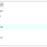 Multi-Select Box With Tree Structured Data Dropdown List – Treeselect
 Bootstrap 5 Select Dropdown Enhancer – AvalynxSelect
 Enhanced Dropdown Select In Pure JavaScript – LC-select
 Enhanced Select Box In Vanilla JavaScript – Select.js
How to retrieve data from multiselect?
You can use mySelect.selected() and it returns an array with selected values
Can I set individual colors for the selected items, if so how?