


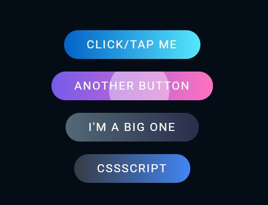
Just another Android-like, animated ripple effect on click/tap, written in pure JavaScript and CSS/CSS3.
How to use it:
1. Create a button on which you want to apply the ripple effect.
<a href="#" class="ripple">Click/Tap Me</a>
2. The main CSS/CSS3 styles for the ripple effect.
// just for demo
a.ripple {
  position: relative;
  display: inline-block;
  padding: 12px 36px;
  margin: 10px 0;
  color: #fff;
  text-decoration: none;
  text-transform: uppercase;
  font-size: 18px;
  letter-spacing: 2px;
  border-radius: 40px;
  overflow: hidden;
  background: linear-gradient(90deg, #0162c8, #55e7fc);
}
// ripple element
a.ripple > span {
  position: absolute;
  background: #fff;
  transform: translate(-50%, -50%);
  pointer-events: none;
  border-radius: 50%;
  animation: ripples 0.6s linear infinite;
}
// ripple animation
@keyframes ripples {
  0% {
    width: 0px;
    height: 0px;
    opacity: 0.5;
  }
  100% {
    width: 500px;
    height: 500px;
    opacity: 0;
  }
}
3. The JavaScript to enable the ripple effect on the button.
const buttons = document.querySelectorAll('a.ripple')
buttons.forEach(button => {
    button.addEventListener('click', function (e) {
        let x = e.clientX - e.target.offsetLeft
        let y = e.clientY - e.target.offsetTop
        let ripples = document.createElement('span')
        ripples.style.left = `${x}px`
        ripples.style.top = `${y}px`
        this.appendChild(ripples)
        setTimeout(() => {
            ripples.remove()
        }, 600)
    })
})
See Also:
 High-performance Ripple Click Effect – chaocore-ripple
 Minimal Ripple Click & Hover Effect – ripple.js
 Dynamic Ripple Click/Tap Effect In JavaScript – rippleEffect
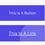 Ripple Effect That Triggers On Click/Tap – Ripple.js
 Highly Customizable Ripple Effect In JavaScript – Ripple.js
 Button Ripple Effect On Click
 Realistic Water Ripple Effect Using WebGL – ripple-effect.js
 Material Ripple Effect In Vanilla JavaScript – Ripplet.js