


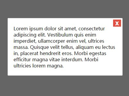
A pure Vanilla JavaScript library to create modal windows that use CSS3 for awesome modal open/close animations.
How to use it:
Download and put the modal.js into your project.
<script src='modal.js'></script>
Create a toggle button to launch a modal window.
<button id="launchModalButton" type="button">Launch Modal</button>
Initialize the modal window with custom content.
var myModal = new Modal({
  content: 'Modal Content'
  // More settings here
});
var launchModal = document.getElementById('launchModalButton');
launchModal.addEventListener('click', function() {
  myModal.open();
});
The basic CSS styles for the modal window.
.des-overlay {
  position: fixed;
  z-index: 9998;
  top: 0;
  left: 0;
  opacity: 0;
  width: 100%;
  height: 100%;
  -webkit-transition: 1ms opacity ease;
  -moz-transition: 1ms opacity ease;
  -ms-transition: 1ms opacity ease;
  -o-transition: 1ms opacity ease;
  transition: 1ms opacity ease;
  background: rgba(0,0,0,.6);
}
.des-modal {
  position: absolute;
  z-index: 9999;
  top: 50%;
  left: 50%;
  opacity: 0;
  width: 94%;
  padding: 24px 20px;
  -webkit-transition: 1ms opacity ease;
  -moz-transition: 1ms opacity ease;
  -ms-transition: 1ms opacity ease;
  -o-transition: 1ms opacity ease;
  transition: 1ms opacity ease;
  -webkit-transform: translate(-50%, -50%);
  -moz-transform: translate(-50%, -50%);
  -ms-transform: translate(-50%, -50%);
  -o-transform: translate(-50%, -50%);
  transform: translate(-50%, -50%);
  border-radius: 2px;
  background: #fff;
}
.des-modal.des-open.des-anchored {
  top: 20px;
  -webkit-transform: translate(-50%, 0);
  -moz-transform: translate(-50%, 0);
  -ms-transform: translate(-50%, 0);
  -o-transform: translate(-50%, 0);
  transform: translate(-50%, 0);
}
.des-modal.des-open { opacity: 1; }
.des-overlay.des-open { opacity: 1; }
.des-close {
  font-family: Helvetica, Arial, sans-serif;
  font-size: 24px;
  font-weight: 700;
  line-height: 12px;
  position: absolute;
  top: 5px;
  right: 5px;
  padding: 5px 7px 7px;
  cursor: pointer;
  color: #fff;
  border: 0;
  outline: none;
  background: #e74c3c;
}
.des-close:hover { background: #c0392b; }
Add custom animations to the modal window using CSS3.
.des-overlay.fade-and-drop {
  display: block;
  opacity: 0;
}
.des-modal.fade-and-drop {
  top: -300%;
  opacity: 1;
  display: block;
}
.des-modal.fade-and-drop.des-open {
  top: 50%;
  -webkit-transition: 500ms top 500ms ease;
  -moz-transition: 500ms top 500ms ease;
  -ms-transition: 500ms top 500ms ease;
  -o-transition: 500ms top 500ms ease;
  transition: 500ms top 500ms ease;
}
.des-modal.fade-and-drop.des-open.des-anchored {
  -webkit-transition: 500ms top 500ms ease;
  -moz-transition: 500ms top 500ms ease;
  -ms-transition: 500ms top 500ms ease;
  -o-transition: 500ms top 500ms ease;
  transition: 500ms top 500ms ease;
}
.des-overlay.fade-and-drop.des-open {
  top: 0;
  -webkit-transition: 500ms opacity ease;
  -moz-transition: 500ms opacity ease;
  -ms-transition: 500ms opacity ease;
  -o-transition: 500ms opacity ease;
  transition: 500ms opacity ease;
  opacity: 1;
}
.des-modal.fade-and-drop {
  -webkit-transition: 500ms top ease;
  -moz-transition: 500ms top ease;
  -ms-transition: 500ms top ease;
  -o-transition: 500ms top ease;
  transition: 500ms top ease;
}
.des-overlay.fade-and-drop {
  -webkit-transition: 500ms opacity 500ms ease;
  -moz-transition: 500ms opacity 500ms ease;
  -ms-transition: 500ms opacity 500ms ease;
  -o-transition: 500ms opacity 500ms ease;
  transition: 500ms opacity 500ms ease;
}
Default settings.
// addional CSS class for the modal
className: 'fade-and-drop',
// display close button
closeButton: true,
// custom modal content
content: "",
// max/min width of the modal window
maxWidth: 600,
minWidth: 280,
// display a fullscreen overlay
overlay: true
See Also:
 Introduce App’s New Features Step By Step – tourMe.js
 Smooth Touch-enabled Selectable Library – selection.js
 Tiny JavaScript Color Picker Library – piklor.js
 Beautify Native Scrollbar With Custom CSS – Slim-scroll
 Silky Smooth Background Image Silder With CSS3 Keyframes
 Material Design Ripple Click Effect With Pure CSS
 Magic Motion Button Using HTML/CSS
 Pure CSS Off-canvas Sidebar Navigation