


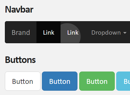
Makes use of CSS transitions and position:absolute to create subtle ripple effects on any clickable elements as you seen in Material Design spec.
See also:
- Tiny Cross-platform Ripple Animation Library – ripple.js
- Material Design Ripple Effects In Vanilla JavaScript – rippleJS
- Material Design Click Ripple Effect In Vanilla Javascript – Material Touch
- Android L Ripple Click Effect with Javascript and CSS3
- Google Material Design Ripple Effects with Wave.js
- Google Material Button Ripple Effects On Click – RippleButtons.js
How to use it:
Link to the required stylesheet:
<link href="ripple.css" rel="stylesheet">
Add the CSS class ‘ripple’ to html element and done.
<button type="button" class="ripple" >Primary</button>
Override the default styles in the LESS:
.ripple {
  position: relative;
  overflow: hidden;
  &:after {
    content: "";
    background: rgba(255,255,255,0.3);
    display: block;
    position: absolute;
    border-radius: 50%;
    padding-top: 240%;
    padding-left: 240%;
    margin-top: -120%;
    margin-left: -120%;
    opacity: 0;
    transition: all 1s;
  }
  &:active:after {
    padding-top: 0;
    padding-left: 0;
    margin-top: 0;
    margin-left: 0;
    opacity: 1;
    transition: 0s;
  }
}
Changelog:
v1.0.8 (03/18/2021)
- Bugfix
See Also:
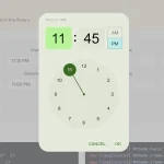 Google Material Inspired Time Picker Component – timepicker-ui
 Material Design-style Time Picker Web Component – clock-timepicker
 Material Design 3 Date Picker with Vanilla JS & Bootstrap 5
 Lightweight Material Design 3 CSS Framework – GMX.css
 Simple Interactive Snackbar & Toast Notification In Vanilla JavaScript – notifyjs
 High-performance Ripple Click Effect – chaocore-ripple
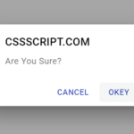 Modern Material Design Dialog Generator In Pure JavaScript – duDialog
 Smooth Snackbar & Toast Notification In JavaScript – js-snackbar