


This is a pure CSS scroller that horizontally scrolls through a set of images once the scroller enters the viewport during vertical scrolling. It remains fixed until all images are displayed, preventing further page scrolling until completion.
The image scroller is ideal for image galleries, portfolios, and websites with storytelling elements. It draws attention to content like featured products, event photos, or visual timelines without requiring additional JavaScript.
How to use it:
1. Add a container section with the “h-scroll” class. Inside, create a “stick” div containing your heading and a “wrap” div with your images:
<section class="h-scroll">
<div class="stick">
<div class="wrap">
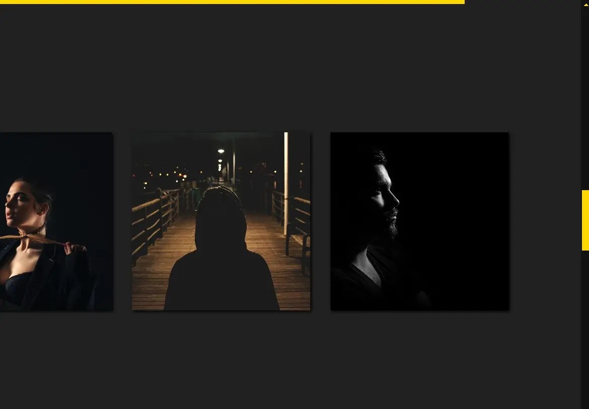
<img src="1.jpg"/>
<img src="2.jpg"/>
<img src="3.jpg"/>
<img src="4.jpg"/>
<img src="5.jpg"/>
...
</div>
</div>
</section>2. Use the following CSS code to style the scroller and create the sticky horizontal scrolling effect.
@property --k {
  syntax: "<number>";
  initial-value: 0;
  inherits: true;
}
section {
  height: 500vh;
  background: #212121;
}
@supports (animation-timeline: view()) {
  section {
    background: linear-gradient(90deg, rgba(255, 215, 0, calc(1 - round(down, var(--k)))) calc(var(--k)*100%), #0000 0) 0 0/100% 0.5rem no-repeat fixed #212121;
    animation: k 1s both;
    animation-timeline: view();
    animation-range: contain;
  }
}
@keyframes k {
  to {
    --k: 1 ;
  }
}
img {
  width: min(30vmax, 70vmin);
  aspect-ratio: 1;
  object-fit: cover;
  box-shadow: 2px 2px 5px;
}
.stick {
  box-sizing: border-box;
  display: grid;
  align-content: center;
  container-type: inline-size;
  position: sticky;
  top: 0;
  padding: 2em;
  height: 100vh;
}
.wrap {
  display: grid;
  grid-auto-flow: column;
  grid-gap: 2em;
  translate: calc(var(--k)*(50cqw - 100%));
}
How it works:
The image scroller uses CSS viewport animations and custom properties to create the scroll effect:
- The section height extends beyond viewport height (500vh) to create scroll space
- Sticky positioning keeps the content fixed during scroll
- A custom property
--ktracks scroll progress - CSS grid creates the horizontal image layout
- Transform translations move images based on scroll position
- Container queries ensure responsive behavior
The animation runs based on the viewport timeline, synchronizing with page scroll position. Images slide horizontally as users scroll vertically, controlled by the --k variable’s progression from 0 to 1.
See Also:
 Smooth, Infinite Scrolling Marquees in Vanilla JavaScript – marquee6k
 Smooth, Infinite, Horizontal Scroller with Progress Tracking
 Pure CSS Responsive Infinite Logo Carousel with Fade Effects
 Create Infinite Scrolling Ribbons with ribbon-tile Web Component
 Dynamic Marquee-like Text Scroller In Vanilla JavaScript
 Create Customizable Omnidirectional Marquees – Manawave
 Seamless Scrolling Marquee Plugin for JavaScript – Smarquee
 Smooth And Customizable Horizontal Scroller – jsmarquee