


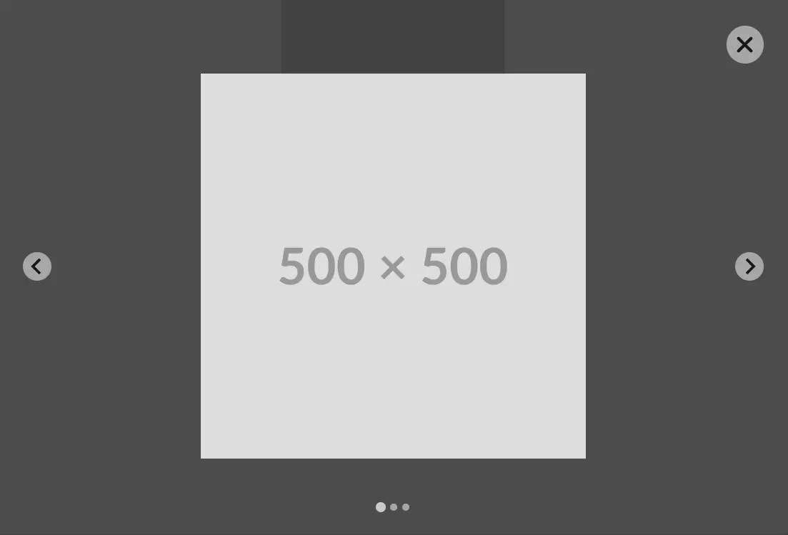
Splidebox is a lightweight JavaScript library that uses Splide.js and TailwindCSS to create responsive, user-friendly gallery lightboxes in your web projects.
Instead of showcasing a static image in a lightbox, Splidebox allows users to switch between a series of images with next/prev buttons, just like in a carousel slider.
How to use it:
1. Get started by loading the necessary TailwindCSS and Splide.js into your document:
<script src="https://cdn.tailwindcss.com"></script>
<link href="/path/to/splide/dist/css/splide.min.css" rel="stylesheet">
2. Download the Splidebox script and include it in your document.
<script src="dist/js/splidebox.min.js"></script>
3. Create an image element that will serve as the trigger to open the gallery lightbox.
<div id="image" class="relative cursor-pointer">
  <img class="w-[250px] w-[250px] m-auto object-cover"
        src="https://placehold.co/300x300"
        alt="Product Image"/>
  <svg class="fa-solid fa-expand w-[32px] h-[32px] z-10 absolute bottom-2 right-2 text-xl"
        style="fill: #54565A"
        xmlns="http://www.w3.org/2000/svg"
        viewBox="0 0 448 512">
        <path d="M32 32C14.3 32 0 46.3 0 64v96c0 17.7 14.3 32 32 32s32-14.3 32-32V96h64c17.7 0 32-14.3 32-32s-14.3-32-32-32H32zM64 352c0-17.7-14.3-32-32-32s-32 14.3-32 32v96c0 17.7 14.3 32 32 32h96c17.7 0 32-14.3 32-32s-14.3-32-32-32H64V352zM320 32c-17.7 0-32 14.3-32 32s14.3 32 32 32h64v64c0 17.7 14.3 32 32 32s32-14.3 32-32V64c0-17.7-14.3-32-32-32H320zM448 352c0-17.7-14.3-32-32-32s-32 14.3-32 32v64H320c-17.7 0-32 14.3-32 32s14.3 32 32 32h96c17.7 0 32-14.3 32-32V352z"/>
  </svg>
</div>
4. Insert an empty <section> element with the ID splidebox-container. This will serve as the container for the lightbox content:
<section id="splidebox-container"></section>
5. Initialize the Splidebox on the container you just created. The code snippet below demonstrates how to specify the trigger element, define image sources, and customize the lightbox:
const lightboxWrapper = document.getElementById('splidebox-container');
lightboxWrapper.Splidebox({
  background: {
    enable: true,
    backgroundColor: 'rgba(0, 0, 0, 0.7)'
  },
  closeWithEscapeKey: true,
  openButtonSelector: '#image',
  closeButtonSelector: '#new_close_button',
  splideboxLabel: 'LeashFox',
  images: [
    './1.jpg',
    './2.jpg',
    './3.jpg',
  ],
  splideOptions: {
    type: 'loop',
    // more Splide.js options
    // https://www.cssscript.com/carousel-splide/
  }
})
6. You can also define the image array in the data-splidebox-images attribute:
<div id="image" class="relative cursor-pointer"
  data-splidebox-images='["./1.jpg","./2.jpg","./3.jpg"]'>
  ...
</div>
Changelog:
07/04/2024
- Added more options
See Also:
 Video/Iframe/Gallery/Inline Content Lightbox Library – Tobii
 Vanilla JS Gallery Lightbox with Touch Support – Web-Thread Lightbox
 Modern JavaScript Lightbox with Zoom & Gallery – Zoomora
 All-in-One Modal Lightbox Solution For Web Developers – DimBox.js
 Vanilla JavaScript Gallery Lightbox with Touch Support – Obsidium
 Lightweight Gallery Lightbox with Zoom, Pan, and Keyboard Navigation – ImageViewer.js
 Simple Gallery Lightbox with Javascript and CSS3 – baguetteBox.js
 Lightweight Image Gallery With Lightbox Popup – havLightbox