


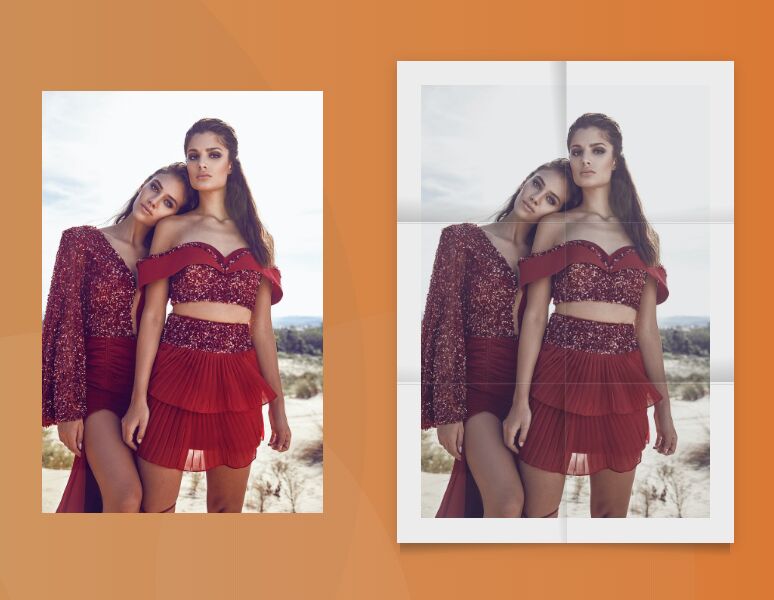
A CSS only folded paper effect that could be used to create realistic folded posters & flyers on the page.
How to use it:
1. Wrap your image into a poster container.
<div class="poster">
  <img src="https://source.unsplash.com/laobUPA4jR8/744x1116" alt="Alt" />
</div>
2. The main CSS to create the folded paper effect.
.poster {
  width: 300px;
  padding: 7%;
  position: relative;
  box-sizing: border-box;
  background-color: #fff;
  box-shadow: 0 3px 12px rgba(0,0,0,0.2);
  -webkit-filter: saturate(70%) contrast(85%);
          filter: saturate(70%) contrast(85%);
}
.poster img {
  width: 100%;
  display: block;
  z-index: 1;
}
.poster:before,
.poster:after {
  content: '';
  width: 100%;
  left: 0;
  position: absolute;
}
.poster:before {
  height: 4%;
  bottom: -4%;
  background-repeat: no-repeat;
  background-image: linear-gradient(177deg, rgba(0,0,0,0.22) 10%, transparent 50%), linear-gradient(-177deg, rgba(0,0,0,0.22) 10%, transparent 50%);
  background-size: 49% 100%;
  background-position: 2% 0, 98% 0;
}
.poster:after {
  height: 100%;
  top: 0;
  z-index: 2;
  background-repeat: no-repeat;
  background-image: linear-gradient(to right, rgba(255,255,255,0.1) 0.5%, rgba(0,0,0,0.15) 1.2%, transparent 1.2%), linear-gradient(to bottom, rgba(255,255,255,0.1) 0.5%, rgba(0,0,0,0.15) 1.2%, transparent 1.2%), linear-gradient(to bottom, rgba(255,255,255,0.1) 0.5%, rgba(0,0,0,0.15) 1.2%, transparent 1.2%), linear-gradient(265deg, rgba(0,0,0,0.2), transparent 10%), linear-gradient(5deg, rgba(0,0,0,0.2), transparent 15%), linear-gradient(-5deg, rgba(0,0,0,0.1), transparent 10%), linear-gradient(5deg, rgba(0,0,0,0.1), transparent 10%), linear-gradient(-265deg, rgba(0,0,0,0.2), transparent 10%), linear-gradient(-5deg, rgba(0,0,0,0.2), transparent 15%), linear-gradient(266deg, rgba(0,0,0,0.2), transparent 10%);
  background-size: 50% 100%, 100% 33.3333%, 100% 33.3333%, 50% 33.3333%, 50% 33.3333%, 50% 33.3333%, 50% 33.3333%, 50% 33.3333%, 50% 33.3333%, 50% 33.3333%;
  background-position: right top, left center, left bottom, left top, left top, right top, left center, right center, right center, left bottom;
}
See Also:
 Underline/Highlight/Strike Text With The textAnnotator Library
 Smooth Accessible Accordion Plugin In Pure JavaScript – Badger Accordion
 Enable Automatic Scrolling On Scrollable Content – Auto-Scroll
 Sliding Drawer Menu In Pure CSS
 Lightweight Retina Ready JS Image Lazy Load Library – Layzr.js
 Encrypt and Decrypt Text Easily with Cryptia
 Smart Image Lazy Load JS Library – image-defer.js
 Custom Accessible Tooltip with Html5 and CSS