


An expanding hamburger menu system that morphs the toggle icon into a sidebar navigation while pushing the main content to the right.
How to use it:
Create the menu toggle button using checkbox and label element as follow:
<input type="checkbox" id="hamburger" name="hamburger"/>
<label for="hamburger"></label>
Create the navigation menu:
<div class="menu-container">
  <div class="menu"></div>
  <div class="links">
  <a href="#">Home</a>
  <a href="#">About</a>
  <a href="#">Contact</a>
  <a href="#">Blog</a></div>
</div>
Add your main content into a DIV container.
<div class="content">
  ..
</div>
The main CSS styles for the sidebar navigation menu.
.menu-container {
  position: absolute;
  width: 5rem;
  height: 5rem;
  overflow: hidden;
  left: 0;
  top: 0;
  -webkit-transition-delay: .3s;
  transition-delay: .3s;
}
.menu {
  position: relative;
  width: 10rem;
  height: 10rem;
  background-color: #1c7cd6;
  border-radius: 100%;
  -webkit-transform: translate(-50%, -50%);
  transform: translate(-50%, -50%);
  -webkit-transition: all .3s;
  transition: all .3s;
}
.menu-container .links {
  position: absolute;
  left: 15vw;
  top: 50vh;
  z-index: 3;
  -webkit-transform: translate(-50%, -50%);
  transform: translate(-50%, -50%);
  text-align: center;
}
.menu-container .links a {
  display: block;
  color: white;
  font-size: 2rem;
  text-decoration: none;
  margin: 3rem;
}
Active the hamburger toggle button.
#hamburger { display: none; }
label {
  position: absolute;
  width: 10rem;
  height: 10rem;
  border-radius: 100%;
  -webkit-transform: translate(-50%, -50%);
  transform: translate(-50%, -50%);
  z-index: 2;
  cursor: pointer;
  tap-highlight-color: transparent;
}
label:before {
  content: "";
  position: absolute;
  top: 65%;
  left: 65%;
  width: 1em;
  height: 0.15em;
  background: white;
  box-shadow: 0 0.25em 0 0 white, 0 0.5em 0 0 white;
  -webkit-transform: scale(2);
  transform: scale(2);
}
#hamburger:checked ~ .menu-container {
  width: 30vw;
  height: 100vh;
  -webkit-transition-delay: 0s;
  transition-delay: 0s;
}
#hamburger:checked ~ .menu-container .menu {
  width: 250vh;
  height: 250vh;
  -webkit-transition: all .3s;
  transition: all .3s;
}
Move the main content to the right when the sidebar nav menu is opened.
.content {
  padding: 3rem 10rem;
  -webkit-transition: all .2s;
  transition: all .2s;
  -webkit-transition-delay: .1s;
  transition-delay: .1s;
}
#hamburger:checked ~ .content {
  padding-left: 35vw;
  -webkit-transition: all .2s;
  transition: all .2s;
  -webkit-transition-delay: 0s;
  transition-delay: 0s;
}
See Also:
 Create Mobile-First Side Menus with SlideReveal.js Library
 Lightweight Off-canvas (Push) Menu JavaScript Library – offcanvas.js
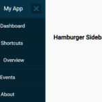 Hamburger Sidebar Navigation In Pure CSS – Sidebar-Menu
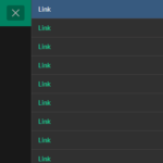 Versatile Offcanvas Menu Plugin With Vanilla JavaScript – hiraku2
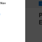 Lightweight Offcanvas Push Navigation In JavaScript – pusha
 Material Design Inspired Off-canvas Push Nav – Material-Menu
 Off-canvas Sidebar Push Navigation In Pure CSS/CSS3
 Off-canvas Mobile Menu In Pure CSS/CSS3