


ElementSnap is a JavaScript library that captures DOM element details through visual selection. You press a keyboard shortcut, click elements on your page, and export their HTML structure with a single action.
The library works across React, Vue, Svelte, and vanilla JavaScript projects. It’s ideal for developers who need to extract element information for bug reports, documentation, or providing context to AI coding assistants.
Features:
- Keyboard Workflow: Activate selection mode with customizable hotkeys (defaults to Ctrl+E).
- Multi-Element Selection: Select up to a specified number of elements before exporting (configurable limit).
- Visual Feedback: Hover and selection states use customizable outline colors for clear identification.
- Framework Agnostic: Works with React, Vue, Svelte, and plain JavaScript.
- Selective Filtering: Exclude specific elements using CSS selectors to avoid capturing unwanted nodes.
- Clipboard Export: Copies formatted HTML output directly to clipboard with optional context notes.
- Modern Browser Support: Built on ES6+ and the Clipboard API for reliable cross-browser functionality.
Use Cases:
- Bug Reporting: Capture exact HTML and styles for reproduction cases.
- UI Documentation: Build component inventories with real DOM examples.
- AI Development: Provide structured context to coding assistants.
- Quick Inspection: Bypass DevTools for rapid element analysis.
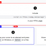
See it in action:
How to use it:
1. Install ElementSnap through npm and import it into your project.
# NPM
$ npm install elementsnap
import ElementSnap from 'elementsnap';
// OR Import the library from the compiled file
<script type="module">
  import ElementSnap from './dist/index.mjs';
</script>
2. Initialize ElementSnap with your preferred configuration. The user workflow in this example:
- Press y
Alt+Qto enter selection mode. - Click on any element to select it. A persistent outline will appear.
- Press
Enterto open the dialog box with the captured element data. - Add optional context notes in the provided textarea.
- Click “Copy to Clipboard” to export the formatted HTML.
- Press
ESCat any time to cancel the selection.
const snap = new ElementSnap({
  // Enable the functionality
  enabled: true,
  // Customize the hotkey combination (optional, defaults to 'ctrl' + 'e')
  hotkey: 'q',
  hotkeyModifier: 'alt',
  // Set a maximum number of elements that can be selected
  maxElements: 5,
  // Customize the colors for hover and selection outlines
  hoverColor: 'var(--accent-color-1)',   // Light Blue
  selectedColor: 'var(--accent-color-2)', // Green
  // Provide a list of CSS selectors to exclude from selection
  excludeSelectors: ['.ignored', '[data-selection-prompt-banner]'],
  // Show the instruction banner at the top when in selection mode
  showBanner: true,
  // Set to true if you want the dialog to open after the first selection
  autoOpenDialog: false,
  // Callback function triggered when the selection changes
  onSelectionChange: (elements) => {
    console.log('Selection changed! Currently selected:', elements.length);
    console.log(elements);
  },
  // Callback function triggered when data is copied to the clipboard
  onCopy: (data) => {
    console.log('Copied to clipboard:');
    console.log(data);
    alert('Element data copied to clipboard! Check the console for details.');
  }
});
3. All default configuration options.
| Option | Type | Default | Description |
|---|---|---|---|
enabled | boolean | true | Enables or disables the library. |
hotkey | string | 'e' | The primary activation key. |
hotkeyModifier | string | 'ctrl' | The modifier key ('ctrl', 'alt', or 'shift'). |
maxElements | number | null | Sets a limit on selections. null is unlimited. |
showBanner | boolean | true | Displays the status banner at the top. |
autoOpenDialog | boolean | false | Opens the dialog immediately after the first selection. |
hoverColor | string | '#000000' | The outline color for the hovered element. |
selectedColor | string | '#000000' | The outline color for selected elements. |
excludeSelectors | string[] | [] | An array of CSS selectors to ignore. |
className | string | '' | A custom class to add to the dialog for styling. |
onCopy | function | null | A callback function that receives the copied data. |
onSelectionChange | function | null | A callback that receives the array of selected elements. |
const snap = new ElementSnap({
  enabled: true,
  hotkey: 'e',
  hotkeyModifier: 'ctrl',
  maxElements: 5,
  showBanner: true,
  autoOpenDialog: false,
  hoverColor: '#0066ff',
  selectedColor: '#00cc66',
  excludeSelectors: ['.ignore'],
  onCopy: (data) => {},
  onSelectionChange: (elements) => {}
});
4. Remove all event listeners and DOM elements created by the instance. This prevents memory leaks when a component unmounts.
snap.destroy()
React Implementation:
Use a ref to store the ElementSnap instance and initialize it in a useEffect hook. The cleanup function calls destroy() to remove event listeners when the component unmounts.
import { useEffect, useRef } from 'react';
import ElementSnap from 'elementsnap';
function App() {
  const snapRef = useRef(null);
  useEffect(() => {
    snapRef.current = new ElementSnap({
      onCopy: (data) => console.log('Copied:', data)
    });
    return () => snapRef.current?.destroy();
  }, []);
  return <div>Press Ctrl+E to start</div>;
}
Vue Integration
Create the instance in onMounted and clean up in onUnmounted. Vue’s composition API makes this straightforward with lifecycle hooks.
<script setup>
  import { onMounted, onUnmounted } from 'vue';
  import ElementSnap from 'elementsnap';
  let snap = null;
  onMounted(() => snap = new ElementSnap());
  onUnmounted(() => snap?.destroy());
</script>
Svelte Setup
Svelte uses similar lifecycle functions. Initialize in onMount and destroy in onDestroy to prevent memory leaks.
<script>
  import { onMount, onDestroy } from 'svelte';
  import ElementSnap from 'elementsnap';
  let snap;
  onMount(() => snap = new ElementSnap());
  onDestroy(() => snap?.destroy());
</script>
Alternatives
- html2canvas: Creates image captures of DOM elements rather than extracting their HTML structure. This approach works well for visual documentation but doesn’t provide the raw markup that ElementSnap focuses on.
- snapDOM: Similar to html2canvas in that it generates image representations of DOM nodes. You’d use this when you need screenshots rather than code extraction.
FAQs:
Q: Can I use ElementSnap in production or should it be development-only?
A: The library is safe for production use if you need element selection features in your shipped application. You can disable it conditionally based on environment variables or feature flags.
Q: What happens if I select elements and then those elements are removed from the DOM?
A: The library maintains references to the actual DOM nodes in its selection array. If those nodes are removed before you copy the data, they’ll still be accessible through the references. The outerHTML property gets captured at copy time, so any dynamic changes to the elements will be reflected in the output.
Q: Can I style the export dialog to match my application’s design system?
A: Yes, use the className option to add a custom class to the dialog container. You can then target child elements with CSS to override the default styles. The dialog uses standard semantic HTML elements, so selectors like .your-class button and .your-class textarea work as expected.
See Also:
 Check The Spacing Between Elements Using The Spacing.js Library
 Validate Links in JavaScript with Dead-or-Alive Library
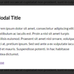 Pretty Simple Modal Window In Pure CSS
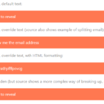 Hide & Encode Email Address To Prevent Spam Bot – jsNoSpam
 WYSIWYG Markdown Editor for Mobile & Desktop Apps – OverType
 Minimal Full Page Scrolling With Vanilla JavaScript – PageScroll
 Motion Blur Effect In JavaScript – MotionBlurJS
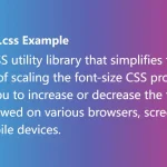 Responsive Text Resize Library – font-size.css