


datelite is a responsive, accessible, mobile-friendly, fully customizable date & date range picker component written entirely in ES6+ JavaScript.
Features:
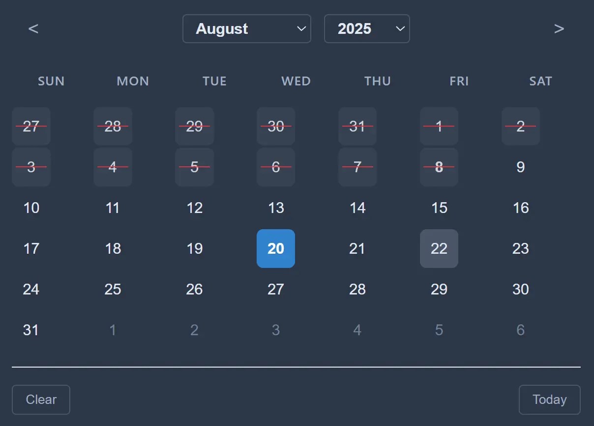
- Multiple Selection Modes: Single date, date range, and multiple date selection.
- Date Blocking: Block specific dates, ranges, weekdays, past/future dates, or implement custom blocking logic.
- Useful API: Over 50 API methods that provide full programmatic control over all functionality.
- Built-in Theming: Default, dark, and minimal themes with CSS custom property support for easy customization.
- Accessibility Compliant: Full keyboard navigation and ARIA label support for screen readers.
- Time Selection: Optional time picker with 24-hour or AM/PM formats and seconds precision.
- Localization Ready: Multi-language support with customizable month and day names.
How to use it:
1. Download and load the datelite’s files in the document.
<link rel="stylesheet" href="src/datelite.css">
<script src="src/DatePicker.js"></script>
2. Create an input field for the date picker.
<input type="text" id="example" placeholder="Select a date">
3. Initialize the date picker with default options.
const myPicker = new DatePicker('#example', {
  // options here
});
4. Customize the date picker with the following options:
mode(string): Sets the selection mode. Can be'single','range', or'multiple'. Default:'single'.format(string): Defines the date format string used for the input field’s value. Default:'Y-m-d'.locale(string): Sets the language for month and day names. Default:'en'.defaultDate(Date|string): Sets the initial selected date when the picker is created. Default:null.inline(boolean): Iftrue, the calendar is displayed directly in the page layout instead of as a popup. Default:false.theme(string): Sets the visual theme. Options are'default','dark', and'minimal'. Default:'default'.minDate(Date|string): The earliest selectable date. Default:null.maxDate(Date|string): The latest selectable date. Default:null.disabledDates(Array): An array of specific date strings (e.g.,'2025-12-25') to disable. Default:[].disabledDaysOfWeek(Array): An array of weekday numbers (0 for Sunday, 6 for Saturday) to disable. Default:[].disabledDateRanges(Array): An array of date range objects (e.g.,{start: '2025-08-01', end: '2025-08-10'}) to disable. Default:[].enabledDates(Array): Acts as a “whitelist.” If set, only dates in this array are selectable. Default:[].disableWeekends(boolean): A shortcut for disabling Saturdays and Sundays. Default:false.blockPastDates(boolean): Blocks all dates before today. Default:false.blockFutureDates(boolean): Blocks all dates after today. Default:false.disableFunction(Function): A custom function that receives a date object and returnstrueto disable it. Default:null.showIcon(boolean): Toggles the visibility of the calendar icon next to the input. Default:true.iconPosition(string): Sets the icon position to either'left'or'right'. Default:'right'.customIcon(string): Allows you to provide your own custom HTML or SVG for the icon. Default:null.iconClass(string): A custom CSS class to apply to the icon element. Default:'datepicker-icon'.iconClickOpens(boolean): Iftrue, clicking the icon opens the date picker. Default:true.position(string): Sets the popup position relative to the input. Can be'auto','above', or'below'. Default:'auto'.firstDayOfWeek(number): Sets the first day of the week (0 for Sunday, 1 for Monday, etc.). Default:0.closeOnSelect(boolean): Iftrue, the calendar closes immediately after a date is selected. Default:true.allowInput(boolean): Iftrue, allows users to type a date directly into the input field. Default:true.clickOpens(boolean): Iftrue, clicking the input field opens the date picker. Default:true.confirmRange(boolean): Inrangemode, this adds “Apply” and “Cancel” buttons to confirm the selection. Default:false.applyButtonText(string): The text for the “Apply” button whenconfirmRangeis enabled. Default:'Apply'.cancelButtonText(string): The text for the “Cancel” button whenconfirmRangeis enabled. Default:'Cancel'.enableTime(boolean): Adds a time selector to the calendar. Default:false.enableSeconds(boolean): Shows the seconds input in the time selector. Default:false.time_24hr(boolean): Iftrue, uses a 24-hour time format instead of AM/PM. Default:true.enableMonthDropdown(boolean): Toggles the month selection dropdown in the calendar header. Default:true.enableYearDropdown(boolean): Toggles the year selection dropdown in the calendar header. Default:true.yearRange(number): Sets the number of years to display before and after the current year in the dropdown. Default:100.minYear(number): Sets an absolute minimum year for the year dropdown. Default:null.maxYear(number): Sets an absolute maximum year for the year dropdown. Default:null.
const myPicker = new DatePicker('#example', {
  mode: "single", // 'single', 'range', 'multiple'
  startDate: null,
  endDate: null,
  minDate: null,
  maxDate: null,
  defaultDate: null,
  enableTime: false,
  enableSeconds: false,
  time_24hr: true,
  locale: "en",
  inline: false,
  firstDayOfWeek: 0, // 0 = Sunday, 1 = Monday
  format: "Y-m-d",
  position: "auto", // 'auto', 'above', 'below'
  theme: "default",
  showWeekNumbers: false,
  weekNumbers: false,
  allowInput: true,
  clickOpens: true,
  closeOnSelect: true,
  disableMobile: false,
  // Icon options
  showIcon: true,
  iconPosition: "right", // 'left', 'right'
  customIcon: null, // Custom icon HTML or SVG
  iconClass: "datepicker-icon",
  iconClickOpens: true,
  // Dropdown options
  enableMonthDropdown: true,
  enableYearDropdown: true,
  yearRange: 100, // Years before and after current year
  minYear: null,
  maxYear: null,
  // Range confirmation options
  confirmRange: false, // Show Apply/Cancel buttons for range mode
  applyButtonText: "Apply",
  cancelButtonText: "Cancel",
  showRangeButtons: false, // Internal flag for showing buttons
  // Date blocking options
  disabledDates: [], // Array of specific dates to disable
  disabledDaysOfWeek: [], // Array of weekdays to disable (0=Sunday, 6=Saturday)
  disabledDateRanges: [], // Array of date ranges to disable [{start: Date, end: Date}]
  enabledDates: [], // Array of only allowed dates (overrides other disabled options)
  disableWeekends: false, // Quick option to disable weekends
  disableFunction: null, // Custom function to determine if date should be disabled
  blockPastDates: false, // Block all dates before today
  blockFutureDates: false, // Block all dates after today
  // Positioning options
  appendTo: null, // Element to append datepicker to (null = auto, 'body' = document.body, or CSS selector/element)
  positionX: null, // Fixed X position (pixels from left)
  positionY: null, // Fixed Y position (pixels from top)
  offsetX: 0, // X offset from calculated position
  offsetY: 0 // Y offset from calculated position
});
5. API methods.
- init(): Initializes the DatePicker. This is usually called automatically by the constructor.
- render(): Renders the calendar UI.
- rerender(): Re-renders the calendar to reflect any state or option changes.
- destroy(): Cleans up the DatePicker instance, removing its DOM elements and event listeners.
- open(): Manually opens the DatePicker popup.
- close(): Manually closes the DatePicker popup.
- toggle(): Toggles the visibility of the DatePicker popup.
- setDate(date): Sets the selected date(s). Accepts a Date object or a valid date string.
- getDate(): Returns the selected date(s). The return type depends on the
mode: aDateobject for single mode, an object{start: Date, end: Date}for range mode, or an array ofDateobjects for multiple mode. - setStartEndDate(startDate, endDate): Sets the start and end dates specifically for
rangemode. - setMinDate(date): Sets the earliest selectable date. Pass
nullto remove the limit. - setMaxDate(date): Sets the latest selectable date. Pass
nullto remove the limit. - showIcon(): Shows the calendar icon next to the input.
- hideIcon(): Hides the calendar icon.
- toggleIcon(): Toggles the visibility of the icon.
- updateIcon(customIcon): Updates the icon to custom HTML/SVG. Pass
nullto revert to the default. - setIconPosition(position): Sets the icon position to either
'left'or'right'. - enableMonthDropdown(): Enables the month selection dropdown in the calendar header.
- disableMonthDropdown(): Disables the month selection dropdown.
- enableYearDropdown(): Enables the year selection dropdown.
- disableYearDropdown(): Disables the year selection dropdown.
- setYearRange(range): Sets the number of years to display in the dropdown relative to the current year.
- setYearLimits(minYear, maxYear): Sets absolute minimum and maximum year values for the dropdown.
- addDisabledDates(dates): Adds one or more dates to the disabled list.
- removeDisabledDates(dates): Removes one or more dates from the disabled list.
- clearDisabledDates(): Clears all individually disabled dates.
- addDisabledDateRange(startDate, endDate): Adds a range of dates to disable.
- removeDisabledDateRange(startDate, endDate): Removes a disabled date range.
- clearDisabledDateRanges(): Clears all disabled date ranges.
- setDisabledDaysOfWeek(days): Sets which days of the week are disabled (0 for Sunday, 6 for Saturday).
- addDisabledDaysOfWeek(days): Adds one or more days to the disabled weekday list.
- removeDisabledDaysOfWeek(days): Removes one or more days from the disabled weekday list.
- setDisableWeekends(disable): A shortcut to enable (
true) or disable (false) weekend blocking. - setBlockPastDates(block): Enables or disables blocking of all dates before today.
- setBlockFutureDates(block): Enables or disables blocking of all dates after today.
- setEnabledDates(dates): Sets a “whitelist” of allowed dates. All other dates will be disabled.
- clearEnabledDates(): Clears the date whitelist.
- setDisableFunction(fn): Sets a custom function that returns
truefor any date that should be disabled. - enableRangeConfirmation(applyText, cancelText): Enables the “Apply” and “Cancel” buttons for
rangemode. - disableRangeConfirmation(): Disables the range confirmation mode.
- getCurrentRange(): Gets the current range selection, including the temporary selection before it’s confirmed.
- setLocale(locale): Sets the language for month and day names using a locale code (e.g.,
'es'). - updateOptions(newOptions): Updates multiple configuration options at once efficiently.
- formatDate(date, format): Formats a Date object into a string using a specified format.
- parseDate(dateStr): Parses a date string into a Date object.
- isSameDay(date1, date2): Checks if two Date objects fall on the same day.
- isDateDisabled(date): Checks if a specific date is disabled according to current rules.
- isDateSelected(date): Checks if a specific date is currently selected.
6. Callback functions.
const myPicker = new DatePicker('#example', {
  onReady: () => {},
  onOpen: () => {}),
  onClose: () => {}),
  onChange: (date) => {}),
  onMonthChange: (month, year) => {}),
  onYearChange: (year) => {}),
  onTimeChange: (time) => {}),
  onSelect: (date) => {}),
  onClear: () => {}),
});
FAQs
Q: Can I use custom CSS frameworks with Datelite’s themes?
A: Yes, the library uses CSS custom properties for theming. You can override them or create entirely custom themes by targeting the .datepicker-container class and its child elements.
Q: How do I handle date validation on the server side?
A: The library provides client-side validation only. Always implement corresponding server-side validation using the same date constraints. The isDateDisabled() method can help you replicate client-side logic on the server for consistency.
See Also:
 Accessible Customizable Date/Time/Date Picker for Modern Web App – FDatepicker
 Versatile Datetime Picker For Bulma – bulma-calendar
 Easy Datetime & Date Range Pickers in Vanilla JavaScript
 Feature-rich Datetime Picker Component With JavaScript
 Full-featured Data & Time Picker Component – Easepick
 Flat Style JavaScript Date Picker – flatpickr
 Lightweight Accessible Date Picker Component – WC Datepicker
 Vanilla JS Date Picker with Range Selection – EssealDatePicker