


ChartUp a simple, flexible, object-oriented, interactive data visualization (chart & graph) library for web and mobile developers.
Features:
- 9 chart types.
- Based on HTML5 canvas.
- With no dependencies.
- Supports all modern browsers.
- Live update.
How to use it:
1. Insert the stylesheet ChartUp.css and JavaScript ChartUp.js into the HTML file.
<link rel="stylesheet" href="./build/ChartUp.css" />
<script src="./build/ChartUp.min.js"></script>
2. Create a basic chart.
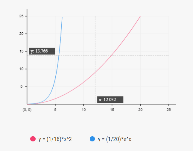
const BaseChart = ChartUp.BaseChart('#BaseChart', {
      interval: [5, 5],
      items: [
        {
          label: 'y = (1/16)*x^2',
          value: function(x) {
            return (1/16)*x*x;
          },
          color: '#f33e6f'
        },
        {
          label: 'y = (1/20)*e^x',
          value: function(x) {
            return (1/20)*Math.pow(Math.E, x);
          },
          color: '#2d91ea'
        }
      ]
});
3. Create a multi-line chart.

const LineChart = ChartUp.LineChart('#LineChart', {
      interval: 20,
      xAxis: Array.from(new Array(6), (x, i) => `DataSet ${i + 1}`),
      items: [{
        label: 'A',
        value: Array.from(new Array(6), x => Math.ceil(Math.random()*60)),
        color: '#f33e6f'
      },
      {
        label: 'C',
        value: Array.from(new Array(6), x => Math.ceil(Math.random()*60)),
        color: '#2d91ea'
      }]
});
4. Create a column chart.

const PillarChart = ChartUp.PillarChart('#PillarChart', {
      interval: 20,
      xAxis: ['Jan', 'Feb', 'Mar', 'Apr', 'May', 'Jun'],
      items: [{
        label: 'A',
        value: Array.from(new Array(6), x => Math.ceil(Math.random()*60)),
        color: color.red
      },
      {
        label: 'B',
        value: Array.from(new Array(6), x => Math.ceil(Math.random()*60)),
        color: color.blue
      }]
});
5. Create a scatter chart.

const PointChart =  ChartUp.PointChart('#PointChart', {
      interval: [5, 5],
      defaultRadius: 4,
      items: [{
        label: 'A',
        value: Array.from(new Array(30), n => [Math.random()*65, Math.random()*30, Math.floor(Math.random()*10)]),
        color: color.red
      },
      {
        label: 'B',
        value: Array.from(new Array(20), n => [Math.random()*40, Math.random()*30, Math.floor(Math.random()*5)]),
        color: color.blue
      }]
});
6. Create an area chart.

const AreaChart = ChartUp.AreaChart('#AreaChart', {
      interval: 20,
      xAxis: Array.from(new Array(new Date().getFullYear() - 2010), (y, i) => new Date().getFullYear() - i).reverse(),
      items: [
        {
          label: 'A',
          color: color.red,
          value: Array.from(new Array(new Date().getFullYear() - 2010), x => Math.ceil(Math.random()*30)),
        },
        {
          label: 'B',
          color: color.blue,
          value: Array.from(new Array(new Date().getFullYear() - 2010), x => Math.ceil(Math.random()*30))
        }
      ]
});
7. Create a pie chart.

const PieChart = ChartUp.PieChart('#PieChart', {
      radius: 130,
      items: [{
        label: 'A',
        value: Math.ceil(Math.random()*100),
        color: color.red
      },
      {
        label: 'B',
        value: Math.ceil(Math.random()*100),
        color: color.blue
      }]
});
8. Create a ring chart.
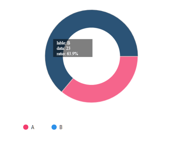
const AnnularChart = ChartUp.AnnularChart('#AnnularChart', {
      radius: 130,
      width: 50,
      items: [{
        label: 'A',
        value: Math.ceil(Math.random()*100),
        color: color.red
      },
      {
        label: 'B',
        value: Math.ceil(Math.random()*100),
        color: color.blue
      }]
});
9. Create a polar chart.

const PolarChart = ChartUp.PolarChart('#PolarChart', {
      radius: 140,
      interval: 20,
      items: [{
        label: 'A',
        value: 15 + Math.ceil(Math.random()*100),
        color:color.red
      },
      {
        label: 'B',
        value: 10 + Math.ceil(Math.random()*100),
        color: color.blue
      },
      {
        label: 'C',
        value: 10 + Math.ceil(Math.random()*100),
        color:color.red
      },
      {
        label: 'D',
        value: 10 + Math.ceil(Math.random()*100),
        color: color.blue
      }]
});
10. Create a radar chart.
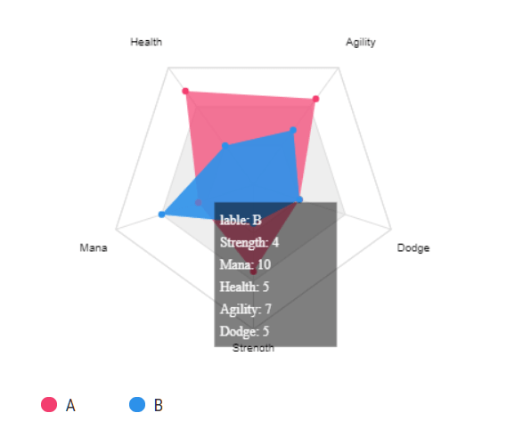
const RadarChart = ChartUp.RadarChart('#RadarChart', {
      radius: 130,
      interval: 5,
      index: ['Strength', 'Mana', 'Health', 'Agility', 'Dodge'],
      items: [
        {
          label: 'A',
          value: Array.from(new Array(5), x => Math.ceil(Math.random()*15)),
          color: color.red
        },
        {
          label: 'B',
          value: Array.from(new Array(5), x => Math.ceil(Math.random()*15)),
          color: color.blue
        }
      ]
});
11. Update (add & remove) data.
instance.addItem({
  label: label
  value: value
  color: color
});
instance.removeItem(label);
12. Global configs.
const _Gconfig = {
  defaultColor: '#000',
  edge: [20, 20],
  showLabel: true
};
See Also:
 Google Style Toast & Snackbar Popup In JavaScript – Material Toast
 Secure Random Number Generator – Rando.js
 Mobile-friendly Background Carousel – Suwa.js
 Minimal Fullscreen Slider with Pure JavaScript
 Fullscreen Automatic Slideshow with JavaScript and CSS3
 Lightweight JS Library For Responsive Embedded Content – reframe.js
 Draggable, Resizable & Rotatable Plugin – Drag-resize-rotate-library
 Airplane Contrails Animation In Vanilla JavaScript – contrails.js