


peggrid is a lightweight, vanilla JavaScript Data Grid that creates interactive data tables from a simple array of objects.
Features
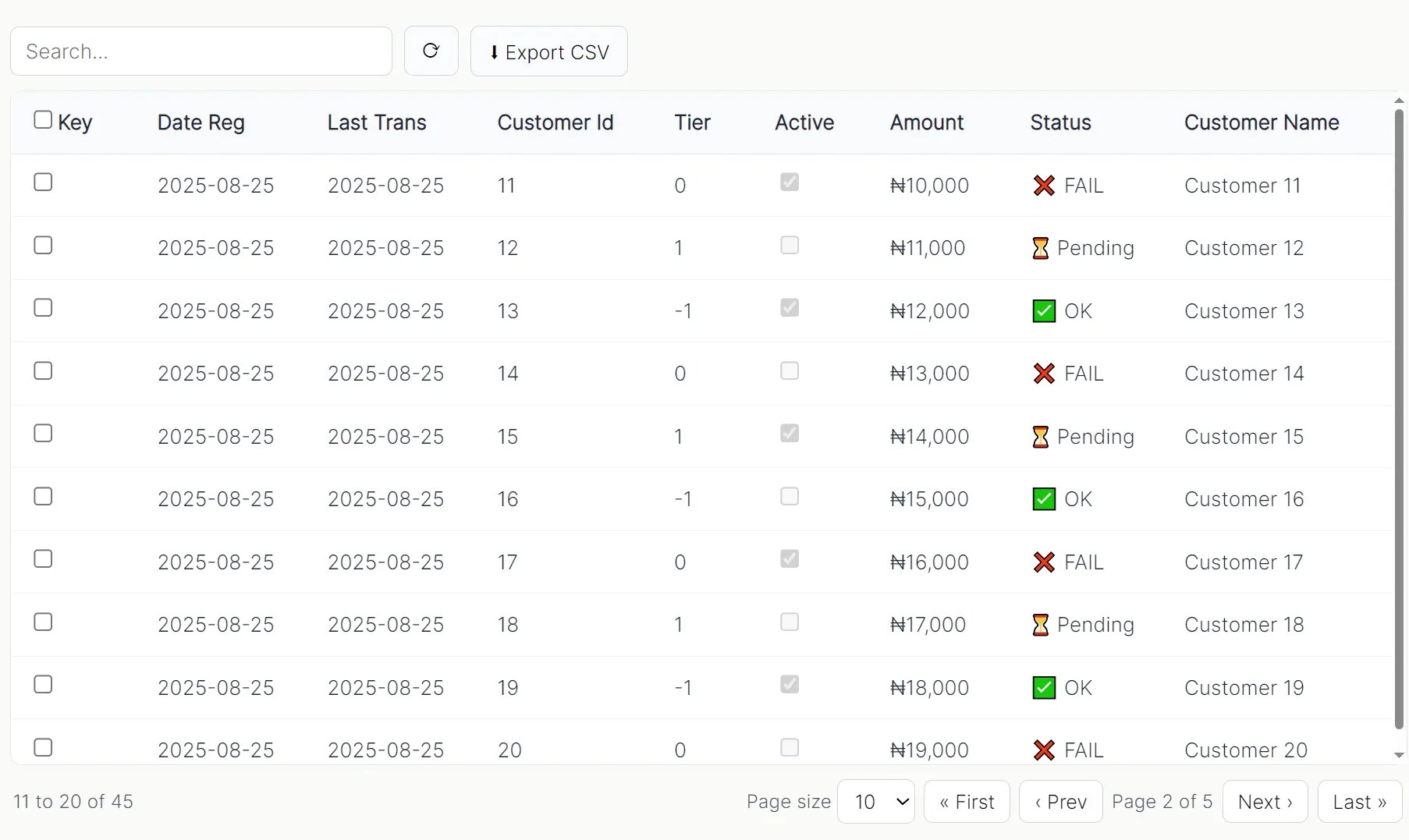
- Global Search: A single search box to filter data across specified columns.
- Column Sorting: Clickable column headers to sort data in ascending or descending order.
- Pagination: Client-side pagination with controls for page size and navigation.
- Row Selection: Support for both single and multi-row selection using checkboxes.
- Skeleton Loading: A built-in loading state that shows a skeleton UI while data is being prepared.
- CSV Export: A one-click function to export the currently filtered data to a CSV file.
Use Cases
- Admin Dashboards: Display customer data, orders, or user accounts with search and filtering capabilities.
- Data Analysis Tools: Present datasets with sorting and export functionality for business analysts.
- Report Interfaces: Create interactive reports where users need to drill down into specific data subsets.
- Content Management: Manage large lists of content items with bulk selection and export capabilities.
How to use it:
1. Load the stylesheet ‘peggrid.css’ and JavaScript ‘peggrid.css’ in the document.
<link rel="stylesheet" href="peggrid.css">
<script src="peggrid.js"></script>
2. Create an empty DIV container element for the data grid.
<div id="grid"></div>
3. Prepare your data as an array of objects with consistent properties:
const userData = [
  { id: 1, name: "John Doe", email: "[email protected]", status: "active" },
  { id: 2, name: "Jane Smith", email: "[email protected]", status: "inactive" }
  // More data objects...
];
4. Initialize PegGrid with your data and column configuration. Note that each column supports multiple configuration options:
- field: The data property key to display.
- label: Header text for the column.
- width: Fixed width in pixels for the column.
- sortable: Enable click-to-sort functionality on the header.
- filter: Include this column in global search operations.
- checkboxSelection: Transform this column into a selection checkbox.
- valueFormatter: Function to format cell values before display.
- icon: Function to render icons or formatted text based on cell values.
- render: Complete custom HTML renderer for maximum flexibility.
const grid = new PegGrid("#grid", {
  data: userData,
  search: true,
  pagination: { pageSize: 10, pageSizes: [5, 10, 25] },
  columns: [
    {
      field: "id",
      label: "ID",
      width: 80,
      checkboxSelection: true,
      sortable: true
    },
    {
      field: "name",
      label: "Full Name",
      width: 200,
      sortable: true,
      filter: true
    },
    {
      field: "email",
      label: "Email Address",
      width: 250
    },
    {
      field: "status",
      label: "Status",
      width: 120,
      icon: (value) => value === "active" ? "✅ Active" : "❌ Inactive"
    }
  ]
});
5. API methods and event handlers.
grid.refresh(newData): Replaces the grid’s data with a new array and re-renders.grid.getSelectedRows(): Returns an array of the currently selected data rows.grid.exportToExcel(filename): Triggers a CSV download of the current view.grid.onRowClick = (row) => {}: A callback function that fires when a row is clicked.grid.onSelectionChange = (rows) => {}: A callback that fires when a row’s selection checkbox is changed.
FAQs:
Q: How do I load data from an API?
A: Fetch your data using fetch or another AJAX client first. Once you have the array of data, you can either pass it into the PegGrid constructor or, if the grid is already initialized, call grid.refresh(yourApiData).
Q: Can PegGrid handle server-side pagination?
A: PegGrid handles pagination client-side by default. For server-side pagination, use the refresh() method to load new data as users navigate pages. You’ll need to implement the server communication logic separately and call grid.refresh(newPageData) when receiving new data.
Q: How do I customize the styling and appearance?
A: PegGrid uses standard CSS classes that you can override in your stylesheet. The library doesn’t enforce strict styling constraints, so you can customize colors, fonts, and spacing to match your application’s design system.
Related Reading:
See Also:
 High Performance Table Data Presentation Library – regular-table
 Lightweight Vanilla JS Data Grid for Modern Web Apps – BWDataTable
 Advanced Data Grid/Table Library in Vanilla JavaScript – VanillaGrid
 Interactive And Customizable Data Table/Grid Web Component – Active Table
 Full-featured Data Table JavaScript Library – Grid.js
 Full-feature Online Spreadsheet In Vanilla JavaScript – Luckysheet
 Editable Spreadsheet Style Data Grid Library – simple-data-table
 Feature-rich Data Grid Library – FathGrid