


A minimalist CSS framework built on top of Milligram.css to provide a set of styles and UI components for developers aiming to craft a website or a concise web page swiftly.
Install & Import:
# Yarn
$ yarn mgplus
# NPM
$ npm i mgplus
<!-- Core -->
<link rel="stylesheet" href="/path/to/mg-plus.css" />
<!-- Additional UI Components -->
<script src="/path/to/mg-plus-extensions.js"></script>
Preview:

Form Controls
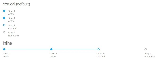
Timeline
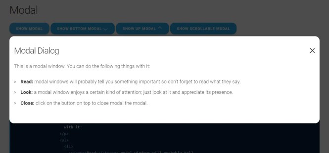
Modal

Alerts
Changelog:
v1.4.5 (0723/2025)
- Added a “Customization” section to the demo, showcasing configurable CSS variables for colors, typography, borders, shadows, grid, and z-index.
- Updated modal component to include a dropdown example and removed unused data-orientation attributes for cleaner markup.
- Improved responsive display section with better descriptions and examples for progressive and exclusive display behaviors.
- Adjusted SCSS variables to use CSS custom properties for z-index values, enabling easier customization.
- Updated modal z-index values to dynamically calculate based on the maximum z-index variable.
- Refined input[type=”range”] styling by adjusting width and adding border-radius for consistency.
- Removed commented-out clipboard button code from registerDemoFeatures method.
- Fixed minor formatting issues in index.html and other demo sections for better readability.
v1.4.4 (07/17/2025)
- Update
v1.4.3 (06/18/2025)
- Minor improvements
- BREAKING CHANGE: use scoped classes for modal orientation
- Updated helper classes for border styling
v1.4.2 (05/02/2025)
- Disabled grid gutter feature => removed default spacing between columns , use mg-gap instead
- Fixed mg-select default sizing inside a group
v1.4.1 (04/23/2025)
- Adjust default styling for nav buttons
v1.4.0 (03/12/2025)
- Add new timeline representation
- Few fixes and adjustments
- BREAKING CHANGE: js plugins interface and naming , rewrited to typescript
v1.3.6 (02/16/2025)
- Update
v1.3.5 (01/22/2025)
- Update
v1.3.4 (11/19/2024)
- Update
v1.3.3 (11/17/2024)
- Add customization css variable for font size without breaking components
- Change css helpers name for positioning and display
v1.3.2 (11/09/2024)
- css helper naming
v1.3.1 (10/25/2024)
- renamed margin and padding helpers
- renamed special icons for toogle, dropdown and collapse
v1.3.0 (09/21/2024)
- Add mg-gap for flexbox use ( mg-col – mg-row)
- Some fixes
v1.2.9 (09/08/2024)
- Add mg-progress component
- Few styling adjustments and fixes
- Add search icon to native css icons
v1.2.8 (08/24/2024)
- few fixes related to inputs controls
- reworked js plugin for nocode and seamless integration
v1.2.7 (08/22/2024)
- Few fixes , icon styling adjustments
- Breaking change: for components which depends of removed mg-icon-close helper
- Add new mg-input helper to compose input with icons
v1.2.6 (08/09/2024)
- Fixes/adjust default colors
v1.2.5 (04/10/2024)
- update
v1.2.4 (03/20/2024)
- dom plugins : auto load theme switcher with autorun option
v1.2.3 (03/20/2024)
- Improved darkmode feature by adding new plugin
v1.2.2 (02/15/2024)
- Fixes/dark theme behavior
See Also:
 Terminal-Inspired CSS Library for Retro Web UI – WebTUI
 Terminal Style CSS Framework – terminal.css
 Classless CSS Framework with Georgia & Verdana Typography System – MCSS
 Windows 7 CSS Framework – 7.css
 Minimal Classless CSS Framework – Simple.css
 Zero-Class Web Development with launch.css Framework
 Vanilla CSS Design System: Lightweight & Modular
 Responsive Classes CSS Framework – Prime.css