


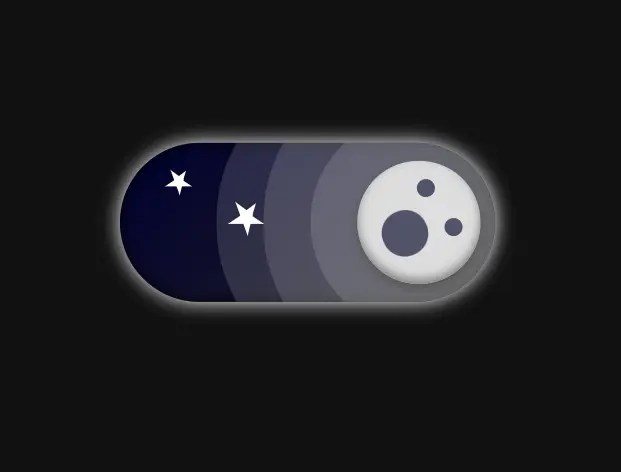
A pure CSS implementation that transforms a standard checkbox input into a creative, animated toggle switch.
It uses CSS animations and transformations to slide a handle between “on” and “off” states, which offers an interactive way for users to switch between light and dark modes on your site.
How to use it:
1. Code the HTML for the toggle switch.
<label class="container">
  <input type="checkbox" id="toggle"/>
  <span class="slider round">
    <div class="background"></div>
    <div class="star"></div>
    <div class="star"></div>
  </span>
</label>
2. The necessary CSS rules.
/* variables */
:root{
  --dark: #111111;
  --sun: #ffd700;
  --sun-shadow: #987416;
  --moon: #dddddd;
  --moon-shadow: #808080;
  --star: #ffffff;
  --cloud: #ffffff;
  --crater: #535370;
  --shadow-01: #80808077;
  --shadow-02: #ffffff22;
  --shadow-03: #555555;
  --white: #ffffff;
  --background-day: linear-gradient(skyblue, cadetblue);
  --background-night: linear-gradient(-45deg, #222, #000030);
}
.container{
  position: relative;
  display: inline-block;
  width: 80px;
  height: 34px;
  -webkit-transform: scale(3);
  transform: scale(3);
}
.container input{
  opacity: 0;
  width: 0;
  height: 0;
}
.slider{
  position: absolute;
  cursor: pointer;
  inset: 0;
  background: var(--background-day);
  box-shadow: inset 0 0 3px;
  -webkit-transition: 0.4s;
  transition: 0.4s;
  filter: drop-shadow(0 0 2px var(--dark));
  overflow: hidden;
  z-index: 1;
}
.slider::before{
  position: absolute;
  content: "";
  height: 26px;
  width: 26px;
  left: 4px;
  bottom: 4px;
  background-color: var(--sun);
  -webkit-transition: 0.4s;
  transition: 0.4s;
  box-shadow:
    inset 0 -1px 2px var(--sun-shadow),
    0 1px 2px var(--shadow-01),
    0 0 0 10px var(--shadow-02),
    0 0 0 20px var(--shadow-02),
    10px 0 0 20px var(--shadow-02);
}
input:checked + .slider{
  background: var(--background-night);
  filter: drop-shadow(0 0 2px var(--white));
}

input:checked + .slider:before{
  background: var(--moon);
  -webkit-transform: translateX(180%);
  -ms-transform: translateX(180%);
  transform: translateX(180%);
  box-shadow:
    inset 0 -1px 2px var(--moon-shadow),
    0 1px 2px var(--shadow-03),
    0 0 0 10px var(--shadow-02),
    0 0 0 20px var(--shadow-02),
    -10px 0 0 20px var(--shadow-02);
}
.slider::after{
  content: "";
  position: absolute;
  background: var(--crater);
  width: 4px;
  height: 4px;
  border-radius: 50%;
  bottom: 65%;
  right: 16%;
  box-shadow:
    -8px 7px 0 3px var(--crater),
    2px 10px 0 var(--crater)
  ;
  -webkit-transition: .4s;
  transition: .4s;
  -webkit-transform: scale(0) rotate(360deg);
  transform: scale(0) rotate(360deg);
  filter: saturate(.75);
}
input:checked + .slider::after{
  -webkit-transform: scale(1) rotate(-24deg);
  transform: scale(1) rotate(-24deg);
}
input:checked + .slider .background{
  -webkit-transform: translateY(260%);
  transform: translateY(260%);
  opacity: 0;
}
.star{
  -webkit-transform: scale(0);
  transform: scale(0);
  -webkit-transition: .4s;
  transition: .4s;
}
input:checked + .slider .star{
  position: absolute;
  width: 0;
  height: 0;
  border: 10px solid transparent;
  border-bottom: 7px solid var(--star);
  transform: rotate(35deg);
  border-top: none;
  margin: 5px 0;
  -webkit-transform: scale(.3) translate(50%);
  transform: scale(.3) translate(50%);
}
input:checked + .slider .star:last-child{
  -webkit-transform: scale(.4) translate(225%, 300%);
  transform: scale(.4) translate(225%, 300%);
}
input:checked + .slider .star::before,
input:checked + .slider .star::after{
  content: "";
  position: absolute;
  width: 0;
  height: 0;
  border-top: none;
}
input:checked + .slider .star::before{
  border: 3px solid transparent;
  border-bottom: 8px solid var(--star);
  -webkit-transform: rotate(35deg);
  transform: rotate(35deg);
  top: -7.5px;
  left: 1.5px;
}
input:checked + .slider .star::after{
  border: 10px solid transparent;
  border-bottom: 7px solid var(--star);
  -webkit-transform: rotate(70deg);
  transform: rotate(70deg);
  top: -7px;
  left: -4.5px;
}
.slider.round {
  border-radius: 34px;
}
.slider.round:before {
  border-radius: 50%;
}
.background{
  position: absolute;
  width: 10px;
  height: 10px;
  background: var(--cloud);
  border-radius: 50%;
  bottom: 0;
  right: 0;
  box-shadow:
    0 -10px 0 8px var(--cloud),
    -10px 0px 0 8px var(--cloud),
    -45px 4px 0 5px var(--cloud),
    -60px 0px 0 3px var(--cloud),
    -29px 2px 0 8px var(--cloud)
  ;
  -webkit-transition: .4s;
  transition: .4s;
}
See Also:
 12 Animated Accessible Toggle Controls – Theme Toggles
 Customizable Dark Mode Toggle Component In TypeScript
 Minimal Automatic Dark Mode Library – Darkify
 Customizable Rounded & Square Toggle Switch Web Component
 Smooth Dark & Light Mode Toggling Library for Web App – DayniteJS
 Accessible Performant Toggle Switch In Pure JavaScript – simple-switch
 Auto and Manual Dark Mode Switch in JavaScript – dark-light-toggle
 Implement System-Aware Dark Mode with ThemeToggle.js