


roughViz.js is a fancy & sweet JavaScript charting library that plots your data sets in hand-drawn SVG charts just like XKCD style plots.
Supported chart types:
- Column chart
- Horizontal bar chart
- Pie chart
- Donut chart
- Line Chart
- Scatter chart
How to use it:
1. Install, download, and import the roughViz.js library in the document.
# NPM
$ npm install rough-viz --save
<script src="dist/rough-viz.min.js"></script>
2. Create a column chart.
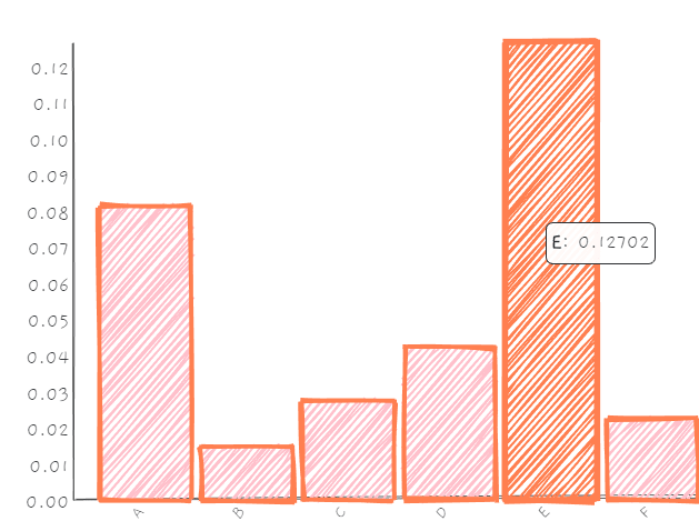
new roughViz.Bar({
    element: '#chartContainer',
    data: [[1,2], [5, 6], [8,8], [5, 100], [200, 10], [50, 50]],
    title: 'Letters',
    labels: 'letter',
    values: 'frequency',
    width: window.innerWidth,
    stroke: 'coral',
    strokeWidth: 3,
    color: 'pink',
    fillWeight: 1.5
});
3. Create a basic horizontal bar chart.
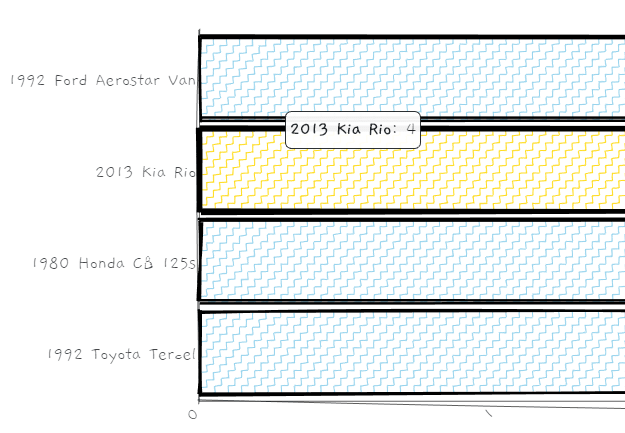
new roughViz.BarH({
    element: '#chartContainer',
    title: "Vehicles I've Had",
    titleFontSize: '1.5rem',
    legend: false,
    margin: {top: 50, bottom: 100, left: 160, right: 0},
    data: {
      labels: ['1992 Ford Aerostar Van', '2013 Kia Rio', '1980 Honda CB 125s', '1992 Toyota Tercel'],
      values: [8, 4, 6, 2]
    },
    xLabel: 'Time Owned (Years)',
    strokeWidth: 2,
    fillStyle: 'zigzag-line',
    highlight: 'gold'
});
4. Create a donut chart.

new roughViz.Donut({
    element: '#chartContainer',
    legend: false,
    data: {
      labels: ['JNCO Jeans', 'Sweat Pants', 'Jorts'],
      values: [20, 10, 2]
    },
    title: 'Pants I Got Clowned On For Wearing In High School',
    titleFontSize: '2rem',
    labels: 'letter',
    values: 'frequency',
    width: window.innerWidth,
    stroke: 'coral',
    color: 'pink',
    fillWeight: 1.5,
});
5. Create a pie chart.

new roughViz.Pie({
    element: '#chartContainer',
    titleFontSize: '1.5rem',
    legend: false,
    margin: {top: 50, bottom: 100, left: 40, right: 100},
    data: {
      labels: ['useful', 'no', 'lol idk man'],
      values: [2, 8, 4]
    },
    strokeWidth: 3,
    fillStyle: 'zigzag-line',
    highlight: 'gold',
});
6. Create a line chart. Note that the library also allows you to load data sources (e.g. csv, tsv) from an external file.

let ttop = 50;
    let rright = 20;
    let bbottom = 45;
    let width = 300;
new roughViz.Line({
    element: '#vis0',
    data: 'data.csv',
    title: 'Line Chart',
    y: 'favorites',
    y2: 'retweets',
    y3: 'tweets',
    yLabel: 'hey',
    colorVar: 'continent',
    highlightLabel: 'country',
    highlight: 'red',
    fillWeight: 2,
    roughness: 3.5,
    width: window.innerWidth / 1.2,
    height: 500,
});
7. Create a scatter chart.

new roughViz.Scatter({
    element: '#vis1',
    data: {
      x: [1, 2, 3, 7, 5, 9],
      y: [240, 40, 40, 160, 100],
    },
    title: 'Some Random (x,y) Data',
    width: 400,
    roughness: 0,
    radius: [25, 10, 40, 30, 60],
    fillWeight: 3,
    axisRoughness: 1,
    height: 450,
    colors: ['green', 'red', 'blue', 'black']
});
8. All possible options.
axisFontSize: '1rem',
axisRoughness: 0.5,
axisStrokeWidth: 0.5,
bowing: 0,
color: 'skyblue',
fillStyle: '', // hachure, cross-hatch, zigzag, dashed, solid, zigzag-line
fillWeight: 0.5,
font: 'Gaegu',
highlight: 'coral',
innerStrokeWidth: 1,
interactive: true,
labelFontSize: '1rem',
margin: {top: 50, right: 20, bottom: 70, left: 100},
padding: 0.1,
roughness: 1,
simplification: 0.2,
stroke: black,
strokeWidth: 1,
title: '',
titleFontSize: '1rem',
tooltipFontSize: '0.95rem',
xLabel: '',
yLabel: ','
// for donut, line, pie charts
legend: 'true',
legendPosition: 'right', // or 'left'
// for line chart
circle: true,
circleRadius: 10,
circleRoughness: 2,
// for scatter
colorVar: : false, // If input data is csv or tsv, this should be an ordinal column with which to color points by. curbZero [boolean]: Whether or not to force (x, y) axes to (0, 0).
highlightLabel: '', // If input data is csv or tsv, this should be a column representing what value to display on hover. Otherwise, (x, y) values will be shown on hover.
Changelog:
11/22/2023
- v2.0.5
10/01/2023
- v2.0.2
09/30/2023
- Update
12/03/2019
- Fixed: Do not overwrite 0 values with defaults.
11/17/2019
- v1.0.3
See Also:
 Customizable SVG Avatar Generator In JavaScript – Avataaars.js
 Set & Get Query Parameters In URL – hashparser
 Stylish Image Slider with Pure Javascript and CSS/CSS3 – Karrot Slider
 Simple Masonry Grid Layout With Flexbox – simple-masonry.js
 Mobile-friendly Multimedia Storytelling Library – zuck.js
 Beautiful HTML5 Video Player In Pure JavaScript – Ckin-Video-Player
 Ditch the Jumpy Scrolling: Boost Your Site’s Navigation Experience With HD-Smooth-Scroll
 Create Cool Particle Animation Effects With Proton.js
hello.. my name is rohim.. how to create this chart with rough roughviz on blogspot post?help me please..