


A card-style expandable & collapsible fullscreen navigation menu made with JavaScript and CSS/CSS3.
How to use it:
1. Code the HTML for the card menu.
<nav class="nav">
  <ul class="nav__items">
    <li class="nav__item nav__item--active">
      <a class="nav__item-link" href="#">
        <svg class="nav__item-icon" width="32px" height="32px" aria-hidden="true">
          <use xlink:href="#home" />
        </svg>
        Home
      </a>
    </li>
    <li class="nav__item">
      <a class="nav__item-link" href="#">
        <svg class="nav__item-icon" width="32px" height="32px" aria-hidden="true">
          <use xlink:href="#portfolio" />
        </svg>
        Portfolio
      </a>
    </li>
    <li class="nav__item">
      <a class="nav__item-link" href="#">
        <svg class="nav__item-icon" width="32px" height="32px" aria-hidden="true">
          <use xlink:href="#about" />
        </svg>
        About
      </a>
    </li>
    <li class="nav__item">
      <a class="nav__item-link" href="#">
        <svg class="nav__item-icon" width="32px" height="32px" aria-hidden="true">
          <use xlink:href="#contact" />
        </svg>
        Contact
      </a>
    </li>
  </ul>
  <svg class="nav__arrow" width="12px" height="6px" aria-hidden="true">
    <polyline fill="none" stroke="currentColor" stroke-width="2" points="1,1 6,5 11,1" />
  </svg>
</nav>
<!-- SVG Icons -->
<svg display="none">
<symbol id="home" viewBox="0 0 32 32">
<g fill="currentColor">
<polygon points="16 0,0 10,0 32,10 32,10 16,22 16,22 32,32 32,32 10"/>
</g>
</symbol>
<symbol id="portfolio" viewBox="0 0 32 32">
<g fill="currentColor">
<path d="M30,8h-6v-2c0-1.1-.9-2-2-2H10c-1.1,0-2,.9-2,2v2H2c-1.1,0-2,.9-2,2V26c0,1.1,.9,2,2,2H30c1.1,0,2-.9,2-2V10c0-1.1-.9-2-2-2Zm-20-1c0-.55,.45-1,1-1h10c.55,0,1,.45,1,1v1H10v-1Z"/>
</g>
</symbol>
<symbol id="about" viewBox="0 0 32 32">
<g fill="currentColor">
<path d="M16,0C7.163,0,0,7.163,0,16s7.163,16,16,16,16-7.163,16-16S24.837,0,16,0Zm2,22c0,1.1-.9,2-2,2s-2-.9-2-2v-6c0-1.1,.9-2,2-2s2,.9,2,2v6Zm-2-10c-1.105,0-2-.895-2-2s.895-2,2-2,2,.895,2,2-.895,2-2,2Z"/>
</g>
</symbol>
<symbol id="contact" viewBox="0 0 32 32">
<g fill="currentColor">
<path d="M30,4H2c-1.1,0-2,.9-2,2v14c0,1.1,.9,2,2,2h3.169l5.417,5.417c.778,.778,2.051,.778,2.828,0l5.417-5.417h11.169c1.1,0,2-.9,2-2V6c0-1.1-.9-2-2-2ZM5,8h6c.55,0,1,.45,1,1s-.45,1-1,1H5c-.55,0-1-.45-1-1s.45-1,1-1Zm0,4h14c.55,0,1,.45,1,1s-.45,1-1,1H5c-.55,0-1-.45-1-1s.45-1,1-1Zm22,6H5c-.55,0-1-.45-1-1s.45-1,1-1H27c.55,0,1,.45,1,1s-.45,1-1,1Z"/>
</g>
</symbol>
</svg>2. The required CSS styles.
:root {
  --hue: 223;
  --bg: hsl(var(--hue),10%,90%);
  --fg: hsl(var(--hue),10%,10%);
  --primary: hsl(var(--hue),90%,55%);
  --trans-dur: 0.3s;
  font-size: calc(16px + (20 - 16) * (100vw - 320px) / (1280 - 320));
}
.no-scroll {
  overflow: hidden;
}
.nav {
  position: fixed;
  top: 0;
  text-align: center;
  text-transform: uppercase;
  width: 100vw;
}
.nav__arrow,
.nav__items {
  z-index: 0;
}
.nav__arrow,
.nav__item {
  color: hsl(0,0%,0%,0.7);
}
.nav__arrow {
  display: block;
  pointer-events: none;
  position: absolute;
  top: 3em;
  left: calc(50% - 0.375em);
  width: 0.75em;
  height: 0.375em;
  transition:
  opacity 0.15s 0.15s ease-in-out,
  transform 0.15s 0.15s ease-in-out;
}
.nav__items {
  list-style: none;
  position: relative;
  width: inherit;
}
.nav__item {
  background-color: hsl(var(--hue),90%,70%);
  box-shadow: 0 0 0 hsla(0,0%,0%,0.3);
  font-size: 0.75em;
  font-weight: 600;
  letter-spacing: 0.25em;
  position: absolute;
  width: 100%;
  height: 25vh;
  min-height: 8rem;
  transition:
  box-shadow var(--trans-dur) ease-in-out,
  transform var(--trans-dur) ease-in-out,
  visibility var(--trans-dur) steps(1);
  transform: translateY(calc(-100% + 4rem));
  visibility: hidden;
  z-index: 0;
}
.nav__item:nth-of-type(2) {
  background-color: hsl(3,90%,70%);
  z-index: -1;
}
.nav__item:nth-of-type(3) {
  background-color: hsl(33,90%,70%);
  z-index: -2;
}
.nav__item:nth-of-type(4) {
  background-color: hsl(153,90%,40%);
  z-index: -3;
}
.nav__item-link {
  background-color: hsla(0,0%,100%,0);
  color: inherit;
  display: flex;
  flex-direction: column;
  justify-content: flex-end;
  align-items: center;
  padding: 1.5rem;
  text-decoration: none;
  transition: background-color 0.15s ease-in-out;
  width: 100%;
  height: 100%;
}
.nav__item-link:focus {
  background-color: hsla(0,0%,100%,0.2);
  outline: transparent;
}
.nav__item-icon {
  display: block;
  margin: 0 auto 1.5em;
  opacity: 0;
  pointer-events: none;
  width: 2em;
  height: 2em;
  transition:
  opacity var(--trans-dur) ease-in-out,
  transform var(--trans-dur) ease-in-out;
  transform: scale(0);
}
.nav--open {
  overflow-x: hidden;
  overflow-y: auto;
  height: 100%;
}
.nav--open .nav__arrow {
  opacity: 0;
  transform: scale(0);
  transition-delay: 0s;
}
.nav--open .nav__item-icon {
  opacity: 1;
  transform: scale(1);
  transition-delay: 0.05s;
  transition-timing-function: cubic-bezier(0.42,0,0.58,1.5);
}
.nav--open .nav__item {
  box-shadow: 0 0.5em 0.5em hsla(0,0%,0%,0.3);
  transform: translateY(0);
  transition-duration: var(--trans-dur), var(--trans-dur), 0s;
  visibility: visible;
}
.nav--open .nav__item:nth-of-type(2) {
  transform: translateY(100%);
}
.nav--open .nav__item:nth-of-type(2) .nav__item-icon {
  transition-delay: 0.1s;
}
.nav--open .nav__item:nth-of-type(3) {
  transform: translateY(200%);
}
.nav--open .nav__item:nth-of-type(3) .nav__item-icon {
  transition-delay: 0.15s;
}
.nav--open .nav__item:nth-of-type(4) {
  transform: translateY(300%);
}
.nav--open .nav__item:nth-of-type(4) .nav__item-icon {
  transition-delay: 0.2s;
}
.nav:not(.nav--open) .nav__item--active {
  box-shadow: 0 0.5em 0.5em hsla(0,0%,0%,0.3);
  visibility: visible;
  z-index: 1;
}
/* `:focus-visible` support */
@supports selector(:focus-visible) {
  .nav__item-link:focus {
    background-color: hsla(0,0%,100%,0);
  }
  .nav__item-link:focus-visible {
    background-color: hsla(0,0%,100%,0.2);
  }
}
/* Dark theme */
@media (prefers-color-scheme: dark) {
  :root {
    --bg: hsl(var(--hue),10%,20%);
    --fg: hsl(var(--hue),10%,90%);
  }
}
3. Initialize the card menu.
window.addEventListener("DOMContentLoaded",() => {
  const nav = new CardNav("nav");
});
class CardNav {
  constructor(qs) {
    this.overflowClass ="no-scroll";
    this.openClass = "nav--open";
    this.activeClass = "nav__item--active";
    this.el = document.querySelector(qs);
    this.el?.addEventListener("click",this.toggle.bind(this));
  }
  toggle(e) {
    e.preventDefault();
    const { target } = e;
    if (target.hasAttribute("href")) {
      const { body } = document;
      const { overflowClass, openClass, activeClass, el } = this;
      // toggle class to open or close
      el.classList.toggle(openClass);
      if (el.classList.contains(openClass)) {
        body.classList.add(overflowClass);
      } else {
        body.classList.remove(overflowClass);
        // take the class from the previously active item…
        const active = el?.querySelector(`.${activeClass}`);
        active.classList.remove(activeClass);
        // …and give it to the newly active item
        target.parentElement.classList.add(activeClass);
      }
    }
  }
}
See Also:
 Morphing Fullscreen Hamburger Navigation With JavaScript And CSS3
 Basic Fullscreen Navigation In Vanilla JavaScript
 Morphing Fullscreen Hamburger Menu With Pure HTML/CSS
 CSS Only Togglable Fullscreen Side Navigation
 CSS Only Fullscreen Sliding Navigation Menu
 Pure CSS / CSS3 Fullscreen Hamburger Menu
 Fullscreen Hamburger Navigation With JavaScript And CSS
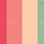 Fullscreen Overlay Navigation with Velocity.js and CSS3