


This is an attractive animated web button you’ve seen on modern SaaS and AI tool websites. Built with only HTML and CSS/CSS3.
It features a glowing light strip that moves smoothly along the button’s border, illuminating the section the light touches. This makes it perfect for prominent buttons like “Download,” “Try It Now,” or “Sign Up.”
How to use it:
1. Create a container div with two child elements – one for the moving light and one for the button content.
<div class="myBtn">
  <div class="moving-element"></div>
  <div class="element">CSSScript</div>
</div>
2. Set up the basic button appearance with positioning, dimensions, and background styles. Make sure the button is large enough to showcase the animation and has proper padding and borders.
.myBtn {
  position: relative;
  width: 400px;
  height: 200px;
  margin: 50px;
  /* Make sure you have enough space to display the animation */
  border-radius: 30px;
  overflow: hidden;
  padding: 1px;
}
.element {
  background: rgba(9, 9, 11, 0.38);
  border: 1px solid rgb(30, 41, 59);
  width: 100%;
  height: 100%;
  border-radius: 30px;
  -webkit-backdrop-filter: blur(24px);
  backdrop-filter: blur(24px);
  box-sizing: border-box;
  color: #cbacf9;
  display: flex;
  align-items: center;
  justify-content: center;
  font-size: 60px;
}
.moving-element {
  position: absolute;
  top: 0;
  left: 40px;
  width: 80px;
  height: 80px;
  background-image: radial-gradient(#cbacf9 40%, transparent 80%);
  border-radius: 40px;
  animation: moveAround 8s linear infinite;
  transform: translate(-40px, -40px);
}
3. Define the animation sequence with keyframes to make the glowing strip move smoothly around the button’s edges:
@keyframes moveAround {
  0% {
    left: 40px;
    top: 0px;
  }
  28.93% {
    left: 360px;
    top: 0px;
  }
  33.99% {
    left: 400px;
    top: 40px;
  }
  44.82% {
    left: 400px;
    top: 160px;
  }
  49.88% {
    left: 360px;
    top: 200px;
  }
  78.81% {
    left: 40px;
    top: 200px;
  }
  83.87% {
    left: 0px;
    top: 160px;
  }
  94.70% {
    left: 0px;
    top: 40px;
  }
  100% {
    left: 40px;
    top: 0px;
  }
}
See Also:
 Simplest Pure JavaScript Popup library – popup.js
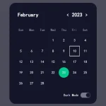 Bootstrap 5 Calendar Component With Dark Mode
 Minimalist Table Sort Library – sorttable.js
 Reveal Elements With 15+ CSS Powered Animations On Scroll – scrollCue.js
 SVG To PNG & Base64 Converter In JavaScript – svgToPng
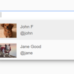 @mention Autocomplete In ES6 JS
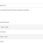 JavaScript Library For Parsing, Formatting and Validating Phone Numbers – front.phone
 Spotlight-style Element Highlighting Library – limelight.js