


CSS Motion is a lightweight, framework-agnostic animation library that creates smooth, performant animations triggered by viewport visibility.
It works with vanilla JavaScript, React, Svelte, and other frameworks through a CSS-only animation approach that respects user preferences for reduced motion.
Features:
- CSS-Only Animations: Animations run entirely in CSS for optimal performance and smooth frame rates.
- Intersection Observer: Uses native browser APIs for efficient viewport detection without polling.
- Rich Animation Presets: Ships with a set of pre-configured animations, including fade, slide, scale, blur, and rotation effects.
- Tree-Shakeable Architecture: Import only the functions you need to minimize bundle size.
- Composable Configuration: Mix multiple animation effects and timing functions through the merge utility.
See It In Action:
Use Cases:
- Scroll-triggered content reveals: Animate sections, cards, or text as users scroll down the page.
- Staggered list animations: Create cascading effects for product grids, feature lists, or timeline elements with built-in stagger utilities.
- Performance-critical animations: Replace heavy JavaScript animation libraries with lightweight CSS transitions for better frame rates.
How To Use It:
1. Install & import the library into your project.
# NPM
$ npm install css-motion
@import 'css-motion/styles';
import { initObserver, presets, getVarsStyle } from 'css-motion';
2. You can also load the library from a CDN:
import { initObserver, presets, getVarsStyle } from 'https://cdn.jsdelivr.net/npm/css-motion/dist/index.esm.js';3. Use the getVarsStyle function to generate the necessary CSS custom properties and then add the required classes to your element.
// Initialize once
initObserver();
const element = document.querySelector('.my-element');
// Get animation styles from a preset
const animation = presets.slideUp(0.1, '20px', 0.5); // (delay, distance, duration)
element.style.cssText += getVarsStyle(animation);
// Add classes to enable the animation
element.classList.add('css-motion', 'css-motion--view');
4. For multiple elements with staggered timing:
const items = document.querySelectorAll('.animate-item');
items.forEach((item, index) => {
  const animation = mergeConfigs(
    presets.fadeIn(),
    stagger(index, 0.1)
  );
  item.style.cssText += getVarsStyle(animation);
  item.classList.add('css-motion', 'css-motion--view');
});
5. The React adapter provides both component and hook APIs. Components handle the ref attachment and style application automatically:
import { AnimateOnView, AnimateOnLoad } from 'css-motion/react';
import { presets } from 'css-motion';
function MyComponent() {
  return (
    <>
      <AnimateOnLoad animation={presets.fadeIn()} className="card">
        Animates immediately on mount
      </AnimateOnLoad>
      <AnimateOnView animation={presets.slideUp()} className="card">
        Animates when scrolled into view
      </AnimateOnView>
    </>
  );
}
For cases requiring more control, use the hook API:
import { useAnimateOnView } from 'css-motion/react';
import { presets } from 'css-motion';
function MyComponent() {
  const { ref, style, className } = useAnimateOnView(presets.rotateIn(), {
    threshold: 0.5,
  });
  return (
    <div ref={ref} style={style} className={className}>
      Custom animation with hook API
    </div>
  );
}
6. The Svelte package provides a convenient animate action. You can use animate.onView to trigger the animation when the element enters the viewport or animate.onLoad for an immediate animation.
<script>
  import { animate } from 'css-motion/svelte';
  import { presets } from 'css-motion';
</script>
<!-- Animates when it enters the viewport -->
<div {...animate.onView(presets.fadeIn(), { class: 'card' })}>
  This animates into view.
</div>
<!-- Animates immediately on component load -->
<div {...animate.onLoad(presets.slideUp(), { class: 'card' })}>
  This animates on load.
</div>
7. The library includes 12 preset animations. Each preset accepts optional parameters for customization:
- fadeIn(delay?, duration?): Simple opacity transition from zero to one.
- slideUp(delay?, distance?, duration?): Combines fade with vertical translation from bottom.
- slideDown(delay?, distance?, duration?): Combines fade with vertical translation from top.
- slideLeft(delay?, distance?, duration?): Combines fade with horizontal translation from left.
- slideRight(delay?, distance?, duration?): Combines fade with horizontal translation from right.
- blurUp(delay?, blur?, distance?, duration?): Adds blur filter to vertical slide animation.
- scaleIn(delay?, scale?, duration?): Combines fade with scale transformation starting below one.
- scaleOut(delay?, scale?, duration?): Combines fade with scale transformation starting above one.
- rotateIn(delay?, rotate?, scale?, duration?): Combines fade, rotation, and scale effects.
- dramatic(delay?, duration?): Complex preset combining blur, slide, scale with custom cubic-bezier timing.
- bounceIn(delay?, duration?): Scale effect with bounce timing function.
- zoomIn(delay?, scale?, duration?): Combines scale and blur for zoom effect.
presets.fadeIn(0.1, 0.5);  // 0.1s delay, 0.5s duration
presets.slideUp(0.1, '20px', 0.5);  // Custom distance
presets.scaleIn(0.1, 0.9, 0.5);  // Custom scale factor
8. API methods:
- initObserver(): Initializes the global Intersection Observer instance. Call once during application startup. Required for vanilla JavaScript implementations but handled automatically in React and Svelte adapters.
- getVarsStyle(config): Generates a CSS string containing custom property declarations from an animation configuration object. Append this string to element inline styles.
- mergeConfigs(…configs): Combines multiple animation configuration objects into a single config. Later arguments override earlier ones for conflicting properties.
- stagger(index, delay): Generates a configuration object with a delay calculated from an index and base delay value. Useful for creating sequential animation effects.
9. Configure animations through the AnimationConfig interface:
| Property | Type | Description |
|---|---|---|
| duration | number | Animation duration in seconds |
| delay | number | Animation delay in seconds |
| timing | TimingFunction | CSS timing function string |
| translateX | CSSLength | Initial X-axis translation |
| translateY | CSSLength | Initial Y-axis translation |
| scale | number | Initial scale factor |
| rotate | CSSAngle | Initial rotation angle |
| blur | CSSLength | Initial blur amount |
| opacityStart | number | Starting opacity value (0-1) |
| opacityEnd | number | Ending opacity value (0-1) |
const customAnimation = {
  duration: 0.8,
  delay: 0.2,
  timing: 'cubic-bezier(0.34, 1.56, 0.64, 1)',
  translateY: '30px',
  scale: 0.95,
  opacityStart: 0,
};
10. Control viewport detection behavior through IntersectionObserverOptions:
| Property | Type | Description |
|---|---|---|
| threshold | number | Percentage of element visibility required to trigger (0-1) |
| rootMargin | string | Margin around viewport for early/late triggering |
| once | boolean | Whether animation triggers only once or repeats |
<AnimateOnView
  animation={presets.fadeIn()}
  observerOptions={{ threshold: 0.5, rootMargin: '50px', once: true }}
>
  Content
</AnimateOnView>
11. Animations are controlled through CSS variables that map to configuration properties:
| Variable | Purpose |
|---|---|
| –anim-duration | Controls animation duration |
| –anim-delay | Controls animation delay |
| –anim-timing | Sets timing function |
| –anim-translate-x | Sets initial X translation |
| –anim-translate-y | Sets initial Y translation |
| –anim-scale | Sets initial scale factor |
| –anim-rotate | Sets initial rotation |
| –anim-blur | Sets initial blur amount |
| –anim-opacity-start | Sets starting opacity |
| –anim-opacity-end | Sets ending opacity |
12. The library applies specific classes to elements:
- .css-motion: Base class containing common animation properties and transition declarations.
- .css-motion–load: Applied to elements that animate immediately using the
@starting-styleCSS feature. - .css-motion–view: Applied to elements that animate on viewport intersection.
- .in-view: Automatically added by the Intersection Observer when an element enters the viewport threshold.
Alternatives:
- AOS (Animate On Scroll): A popular and lightweight library that also triggers CSS animations on scroll. AOS is attribute-driven (e.g.,
data-aos="fade-up"). - ScrollReveal: Another classic in this space, ScrollReveal is also lightweight and offers a simple API for revealing elements on scroll.
- 10 Best Scroll-triggered Animation Plugins With JavaScript
FAQs:
Q: Can I create custom animations beyond the provided presets?
A: Build custom animations by passing configuration objects directly to animation functions. Combine multiple effects using mergeConfigs(). For example, create a custom diagonal slide by merging translateX and translateY properties with a fade effect. The configuration interface accepts any valid CSS values for transforms, timing functions, and other properties.
Q: Why aren’t my animations triggering when elements enter the viewport?
A: Check that you’ve imported the CSS stylesheet and, for vanilla JavaScript, called initObserver(). Verify elements have both the css-motion and css-motion--view classes applied. The element must also have the inline styles from getVarsStyle() applied.
Q: How do I implement animations that repeat each time an element enters the viewport?
A: Set the once option to false in the observer options. The default behavior triggers animations once, but passing { once: false } in the observerOptions parameter makes the Intersection Observer continuously monitor the element. The animation will play each time the element crosses the visibility threshold.
See Also:
 Modern Vanilla JS Library for Scrollytelling – Scrolleo
 Animate Elements On Scroll With Parallax Effect – locomotive-scroll
 Lightweight & Performant JavaScript Animation Library – MotionFlow
 Lightweight Modern Animation on Scroll Library (5.7KB) – aos.js
 Animate On Scroll Using CSS @keyframes – Scrollerful.js
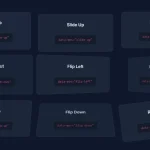 High-Performance CSS Scroll Animations with MOS.js
 Performance-First Scroll Animation Library – WavBlock
 Tiny Framework-Agnostic Scroll Animation Library – USAL.js