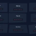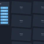
animate-vanilla.css is a lightweight CSS animation library that enables you to create smooth, performant animations without writing custom CSS or relying on heavy JavaScript libraries.
It currently comes with three animation types: traditional class-triggered animations, scroll-driven animations that progress as users scroll, and view-triggered animations that activate when elements enter the viewport. All of these use the same unified system of CSS variables for configuration.
See It In Action:
How to use it:
1. Download and load the animate-vanilla.css in your document.
<link rel="stylesheet" href="animate-vanilla.css" />
2. Create a basic animation on the element you specify:
- Add the
.animateclass to the element you want to animate - Define the starting and ending states using CSS variables
- Add the
.activeclass to trigger the animation
<h2 class="animate"
    style="
    --opacity-from: 0;
    --opacity-to: 1;
    --y-from: 20px;
    --y-to: 0;">
  Fade in and Slide up
</h2>
3. Create an animation that will automatically progress as the element enters the viewport and continues scrolling through the defined range.
<div class="box animate animate-timeline-scroll"
     style="
     --opacity-from: 0;
     --opacity-to: 1;
     --y-from: 30px;
     --y-to: 0;
     --range-start: entry 10%;
     --range-end: entry 50%;">
</div>
4. Create an animation that will automatically run as the element enters the viewport.
<div class="box animate animate-timeline-view"
     style="
     --opacity-from: 0;
     --opacity-to: 1;
     --scale-from: 0.8;
     --scale-to: 1;
     --range-start: entry;
     --range-end: contain;">
</div>
5. All possible CSS variables.
--props: Properties to animate. Default:all--duration: Animation duration. Default:1s--ease: Timing function. Default:ease--delay: Animation delay. Default:0s--x-from: Initial horizontal position. Default:0--x-to: Final horizontal position. Default: Same as--x-from--y-from: Initial vertical position. Default:0--y-to: Final vertical position. Default: Same as--y-from--z-from: Initial depth position. Default:0--z-to: Final depth position. Default: Same as--z-from--scale-from: Initial scale. Default:1--scale-to: Final scale. Default: Same as--scale-from--rotate-from: Initial rotation. Default:0deg--rotate-to: Final rotation. Default: Same as--rotate-from--opacity-from: Initial opacity. Default:1--opacity-to: Final opacity. Default: Same as--opacity-from--bg-from: Initial background color. Default:initial--bg-to: Final background color. Default: Same as--bg-from--color-from: Initial text color. Default:initial--color-to: Final text color. Default: Same as--color-from--width-from: Initial width. Default:auto--width-to: Final width. Default: Same as--width-from--height-from: Initial height. Default:auto--height-to: Final height. Default: Same as--height-from--filter-from: Initial CSS Filter. Default:initial--filter-to: Final CSS Filter. Default: Same as--filter-from--range-start: When animation starts (timeline animations). Default:normal--range-end: When animation ends (timeline animations). Default:normal
6. The library also provides several built-in easing presets. To use them, add one of the easing classes to your element:
.ease-power1-out: Gentle deceleration.ease-power2-out: Moderate deceleration.ease-power3-out: Strong deceleration.ease-power4-out: Stronger deceleration.ease-back: Slight overshoot.ease-elastic: Springy overshoot
<div class="animate ease-power2-out"
     style="
     --opacity-from: 0;
     --opacity-to: 1;
     --duration: 0.7s;">
</div>
Performance Tips:
I’ve found that for the smoothest results, especially on lower-powered devices, it’s best to stick to animating transform and opacity. You can explicitly limit the animation to these properties using --props: transform, opacity;. If you’re animating a lot of elements, consider adding will-change: transform, opacity; to your CSS to give the browser a heads-up.
Alternatives:
- Pure CSS Keyframes: You can always write your own
@keyframesanimations. This gives you maximum control, but it can become verbose and hard to manage for complex animations or multiple elements. This library is more concise and easier to reuse. - Animate.css: A popular library of pre-built CSS animations. It’s great for quickly adding common animations, but it’s less flexible than this library. You’re limited to the animations it provides, and customizing them can be tricky. This library gives you more fine-grained control.
- GSAP (GreenSock Animation Platform): A powerful JavaScript animation library. GSAP is incredibly versatile and can handle almost any animation imaginable. However, it’s a JavaScript dependency, which adds to your page load size. This CSS Animation Library is a much lighter-weight solution for cases where you don’t need GSAP’s full power. GSAP shines on more complex animations.
This CSS animation library is a good choice when you need simple to moderately complex animations, want to keep your code lightweight, and prefer a declarative approach using CSS variables. If you need highly complex, synchronized animations, or require precise timeline control, GSAP might be a better fit. For simple “canned” animations, Animate.css is a viable option.
FAQs:
Q: Can I use this with React, Vue, or Angular?
A: Absolutely. The library is framework-agnostic. You can add and remove classes using your framework’s preferred method for manipulating the DOM. For example, in React, you’d use className and conditional rendering or a library like classnames to toggle the .active class.
Q: How do I create staggered animations?
A: Use the --delay variable. Set different delay values for each element you want to stagger.
<div class="animate" style="--y-from: 30px; --opacity-from: 0; --delay: 0s;"></div>
<div class="animate" style="--y-from: 30px; --opacity-from: 0; --delay: 0.1s;"></div>
<div class="animate" style="--y-from: 30px; --opacity-from: 0; --delay: 0.2s;"></div>
Q: What if I want to animate from a value to the element’s default state?
A: Set the --*-to variable to the default value for that property. For example, to animate from y: 20px to the element’s default vertical position, use --y-from: 20px; --y-to: 0;.
Q: Can I chain animations?
A: Not directly within the library itself. However, you can use JavaScript’s transitionend or animationend events to trigger subsequent animations. This gives you full control over the sequence.
Q: What happens if I define a CSS variable multiple times (e.g., inline and in a stylesheet)?
A: The most specific rule wins, following the standard CSS cascade. Inline styles will override styles defined in a stylesheet.


