The Button widget allows you to add fully customizable call-to-action buttons to your design. You can easily change the text, link, alignment, icons, size, and styling to match your layout perfectly.
How to Use Button Widget of Easy Elements
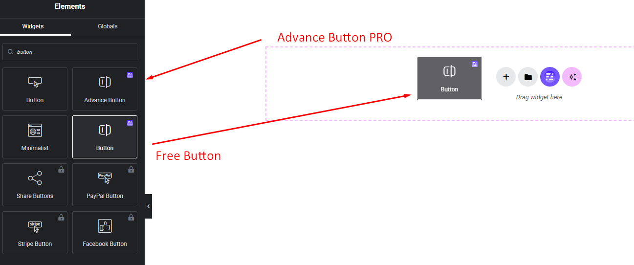
Step to Add Button Widget:
Select the Button widget from the left panel, then drag and drop it into your desired area on the canvas.
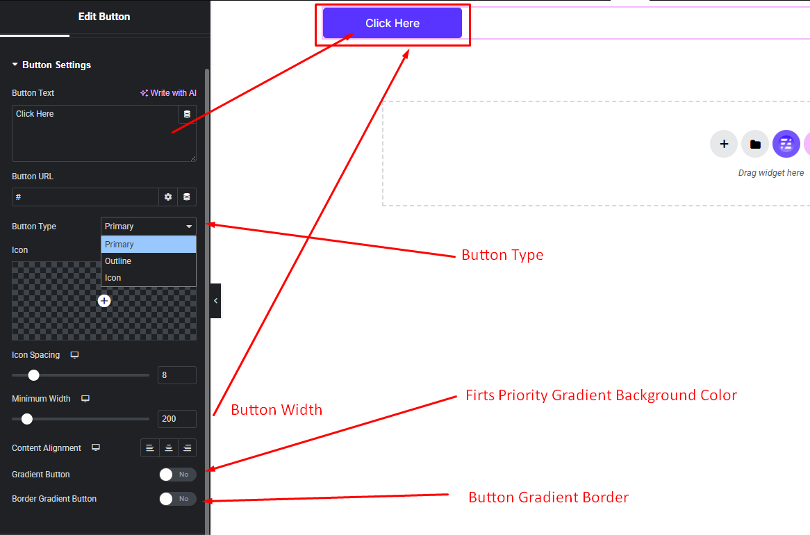
Button Features & Settings:
Configure every aspect of your button widget including button types, icon settings, button gradient bg and border and more settings.
- Button Text
- Button Url
- Button Type
- Button Icon
- Icon Spacing
- Icon Position
- Button Min Width
- Button Alignment
- Default Gradient BG
- Gradient Border Color
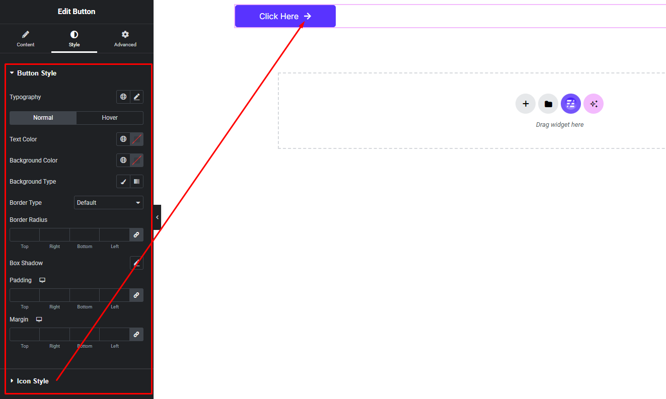
Customize Button Style:
Easily customize your widget’s appearance including size, color, background, spacing, and more—all from the Style panel.
- Button Size, Color, Background, Gradient Background etc.
- Button Hover Color, Background, Gradient Background etc.
- Button Icon Normal Style
- Button Icon Hover Style
Watch this video with all settings changes and previews.
Video Coming Soon


