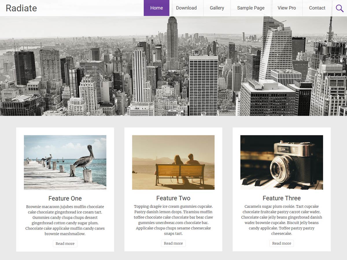
Header image not responsive
-
Hello again,
How come header image is not responsive on mobile? All the rest is working good.
I tried to add this “width: 100%; !important” in the img.header-image line but still not working.
Please help.The page I need help with: [log in to see the link]
-
I have this problem too and now because Google sees the site as not mobile-friendly, it’s been unindexed. Please tell me how to make the header responsive!!
Hello,
Can you please try adding below CSS in Additional CSS of Customizer?#parallax-bg{ background-size : 100%; }Please let us know if this doesn’t help you.
Thanks.
Thank you Shreejana, it works but as you can see, now the image is under the white stripe of the site title and there is a lot of white space between the image and the featured boxes:
https://www.responsinator.com/?url=https%3A%2F%2Fwww.riparazioniinfissi.roma.it%2FHi Shreejana, yes, same problem as Sviytus. Now the header is the correct width. but it’s hidden under the top part of the page
Hello,
We will check on it and let you know.
Thanks.
I also have this exact issue. Once the above CSS was added the image is hidden under the header menu bar when viewing on mobile.
Hi @albow44,
Could you please provide your site URL so that I can inspect the issue.
Thanks and Regards,
Milan.Hey!
Same trouble here..
http://www.cactuslabs.ee/rahel/Thanks in advance!
Hi @klxhzm @albow44 @lauralsweet @svitus,
We will be releasing an update soon fixing this header image responsive issue.
Thanks and Regards,
Milan.Thanks a lot!
Hi @svitus,
I looked into your site i.e https://www.riparazioniinfissi.roma.it/ and most probably you have added the below code in your customizer CSS which was previously suggested by my colleague, please remove that.
#parallax-bg { background-size: 100%; }In another context @svitus @klxhzm @albow44 @lauralsweet, our team sat down and talked about this topic and came to conclusion that the header image have a parallax effect and it’s intended to display images that aren’t textual or informative images which seems like it’s not responsive in mobile view.
I’ll like to inform you that it’s not an issue that needed fixing so it won’t be included in our upcoming update.
Thanks and Regards,
Milan.Hey,
Very sorry to hear that. Guess I’ll have to find a different theme then.
@rubick322
This is a very disappointing and seemingly lazy answer. Now, I will basically have to start my entire project all over with a different theme. This will definitely be reflected in a review of this theme.I have contacted ThemeGrill’s main support about this issue, which I hope can be resolved and actually fixed in a timely manner.
Since nowadays more than 3 billion people worldwide use a smartphone, this is a serious problem not a point of view.
Good luck.
The topic ‘Header image not responsive’ is closed to new replies.
