Description
AlertsDLX offers beautifully styled alerts, callouts, and notification boxes for Gutenberg (the Block Editor), Full-Site Editing (FSE), the Classic Editor, or anywhere blocks and shortcodes are supported, including most page builders.
This plugin is a clean and modern timesaving solution to quickly adding customizable alerts, with a focus on being lightweight and user friendly.
Coupled with a free plugin like Block Visibility, your imagine can really go wild. For example, you can create an “Empty Cart” alert for WooCommerce or Easy Digital Downloads when a cart is empty. Create dismissible alerts for site-wide notices, or per-page notifications that can be dismissed.
Quick Links
AlertsDLX Docs | AlertsDLX Home | Shortcode Usage | Support
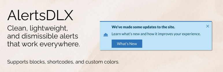
Check out the demo above for most alert types and variations.
Major features
- Four modern alert styles: Material, Bootstrap, Chakra, and Shoelace.
- Use pre-selected colors, styles, and variants, or choose custom for your own branded colors.
- Add your own SVG icons, or choose from the ones included. Include a custom image if desired.
- Add dismissble alerts, and have it remember the user’s choice.
- Add an optional title, description, and button.
- Mark an Alert Block as Editorial, and have it only visible in the block editor.
- Shortcode/page builder support: use AlertsDLX anywhere shortcodes are supported.
- Lightweight: the plugin only loads what is needed where it’s needed.
Blocks are styled with inspiration from:
Each Alert can have built-in icons or you can set your own with SVGs.
Icons included are from:
Development
Development happens on GitHub. Please check out the GitHub code repository for AlertsDLX.
❤️ Please help spread the word about this plugin through your kind review.
Screenshots

Dismissible alert with custom image icon selected, and alert button displaying. 
Adding the alert box via the block editor shows four alert types. 
Edit the icon, add an alert button, and create a dismissible alert easily in Gutenberg (the Block Editor). 
Block editor sidebar options showing style, alert settings, variants, and custom colors. 
Add a shortcode wherever shortcodes are supported, such as a form plugin, page builder, or widget. 
Each alert type supports light and dark mode colors.
Blocks
This plugin provides 4 blocks.
- Shoelace Alert An alert and notification block inspired by Shoelace.
- Chakra Alert An alert and notification block inspired by Chakra UI.
- Bootstrap Alert An alert and notification block inspired by Bootstrap.
- Material UI Alert An alert and notification block inspired by Material UI.
Installation
- Search for AlertsDLX on the Add Plugins screen.
- Install and activate.
FAQ
-
Does AlertsDLX work with the Classic Editor and Page Builders?
-
Yes. AlertsDLX works with the Classic Editor via its shortcode support.
-
Does AlertsDLX work with Elementor or Divi?
-
Yes, via the built-in shortcode, you can output in just about any page builder, including Elementor and Divi.
-
Does AlertsDLX work with shortcodes?
-
Yes, via the built-in shortcode.
-
Does this work with the Block Editor (aka, Gutenberg)?
-
Yes, AlertsDLX comes with four blocks, one for each style of alert (Bootstrap, Chakra, Material, and Shoelace). The blocks are fully featured, and are native to the block editor.
-
What alert styles does the plugin support?
-
Can I create dismissible notices?
-
Yes, each alert can be dismissed, and can be set to expire after a certain amount of time. For example, create a terms of service alert on the homepage that can be dismissed, with the expiration lasting a week.
-
Where are the admin settings?
-
There are no admin settings for this plugin. Please use the included blocks or shortcode to output the alerts notification.
-
Can I use custom colors?
-
Yes, you can customize the colors via the shortcode or built-in blocks by selecting “Custom” as a block style.
-
Can I use my own custom SVG icons?
-
Yes. The icon picker allows you to enter an SVG. For the shortcode, you must supply your own SVG.
-
Can I use my own custom images?
-
Yes. It’s recommended to use a square image, and there is a built-in cropper available. Custom images look best center-aligned.
-
Does AlertsDLX work on Multisite?
-
Yes. There are no admin options, so there’s nothing to configure on a network.
-
Can I show alerts on specific posts or pages?
-
AlertsDLX can be used in conjunction with free plugin Block Visibility to display a notification under certain conditions. While AlertsDLX in itself is not a site-wide notification tool, it can be used as one if put in a global template such as with FSE.
-
Does the plugin support countdowns?
-
AlertsDLX does not support countdowns or auto-expiration. If you need an alert to auto-expire, I suggest using it with Block Visibility and setting a date-based visibility setting.
-
Can I disable the custom font used (Lato)?
-
Yes, you can improve performance further by disabling the custom font supplied with AlertsDLX and supplying your own. Please see disabling custom fonts in AlertsDLX
-
How can I get support or leave a feature request?
-
Please leave a note on our support page or leave a detailed support request here on .org.
Reviews
Contributors & Developers
“Alerts DLX – Alert Box, Callout Box, and Notifications” is open source software. The following people have contributed to this plugin.
Contributors
Translate “Alerts DLX – Alert Box, Callout Box, and Notifications” into your language.
Interested in development?
Browse the code, check out the SVN repository, or subscribe to the development log by RSS.
Changelog
2.3.1
- Released 2025-12-13
- Fix: Disabling the Lato font via filter wasn’t loading the alternate stylesheet font.
2.3.0
- Released 2025-12-08
- New: Added ability to add custom image via block or shortcode.
- New: Can disable custom fonts and use your own via WP filters.
2.2.3
- Released 2025-12-06
- Fixed shortcode CSS not loading on the frontend.
2.2.2
- Released 2025-12-05
- Fixed frontend rendering for those not using footer hooks.
- Fixed SVG default icon size, to prevent jumping when rendering.
- Fixed shortcode not rendering due to editorial blocks parameter.
2.2.0
- Released 2025-11-13
- Consolidated light and dark stylesheets, saving over 200kb in size.
- Tested with WP 6.9.
2.1.2
- Released 2025-09-06
- Bug fix: several fonts were out of proportion, so this has been addressed with this update.
- Bug fix: several custom colors were missing for button styles.
- Bug fix: section and font styles were being overridden by themes causing the boxes to look warped.
2.1.0
- Released 2025-08-10
- New feature: Place blocks in “Editorial Only” mode so they only show up in the block editor and not the frontend.
- New feature: Thenme colors are now included when choosing custom colors.
- New feature: Added block manifests to speed up block loading time and performance.
2.0.2
- Released 2024-08-23
- Some minor copy updates.
2.0.1
- Released 2024-08-22
- Fixing Shoelace dark mode styles not aligning properly.
- Fixed Chakra UI styles where info icon was the wrong color.
2.0.0
- Released 2024-07-21
- New feature: Added a close button and dismissible alerts. You can set an expiration to hide the alert for a certain time after user action.
- New feature: Advanced setting in the blocks to allow for custom inner blocks.
- New feature: Custom colors. Set custom colors for eåçh alert type and variation.
- Block tweaks: The options for showing sections in the block is now near the top and open by default.
1.4.0
- Released 2024-03-12
- Reworked markup for better style compatibility and less conflicts.
- Testing with WP 6.5.
1.3.5
- Released 2023-12-09
- Selecting block styles resulted in a JS error. This has been fixed.
1.3.1
- Released 2023-10-21
- Several performance improvements to the frontend. Previously the frontend was loading all styles and scripts for all alert types. Now it only loads the styles and scripts for the alert type(s) being used on the page.
1.3.0
- Released 2023-09-23
- Added support for shortcodes.
- Read the announcement post.
- See shortcode usage.
1.2.5
- Released 2023-09-10
- Optimizing scripts and styles to only load when needed to prevent unnecessary style loading.
1.2.1
- Released 2023-04-16
- Hot fix for outputting the block description.
1.2.0
- Released 2023-04-16
- Added Shoelace alert styles.
- Changing internal structure to innerBlocks.
1.1.0
- Released 2022-10-01
- Added Darkmode for Chakra and Material alert boxes.
1.0.5
- Released 2022-09-12
- Fixed “error” alert styles in the block editor/frontend.
- Updated SVG icons for .org.
1.0.1
- Released 2022-09-11
- Added transforms to the blocks so that they are interchangeable.
1.0.0
- Released 2022-09-09
- Initial release.