Description:
A Redux based toast message provider crafted for React Native.
Simple, customizable, easy to set up and use.
How to use it:
1. Install and import the component.
# NPM
$ npm i react-native-redux-alert --save
2. Add the alertReducer to your store.
import { createStore, combineReducers } from 'redux'
import { alertReducer } from 'react-native-redux-alert'
const reducers = combineReducers({
  alertReducer,
})
export default createStore(reducers)
3. Mount the Alert into the component.
import React from 'react'
import { Provider } from 'react-redux'
import { SafeAreaView } from 'react-native'
import { Alert } from 'react-native-redux-alert'
import store from './src/redux/store'
import Home from './src/Home'
const App = () => (
  <Provider store={store}>
    <SafeAreaView style={{ flex: 1 }}>
      <Home />
      <Alert />
    </SafeAreaView>
  </Provider>
)
4. Call the toast messages by dispatching the appropriate action.
import React from 'react'
import { Button, View } from 'react-native'
import { actions } from 'react-native-redux-alert'
const Home = ({ dispatch }) => {
  const warningHandler = () => {
    dispatch(actions.showWarning('A warning message!', 2500))
  }
  return (
    <View>
      <Button title={'Warn'} onPress={warningHandler} />
    </View>
  )
}
5. Possible props for Alert.
/** containerStyles prop is used as a style for Animated.View container */
containerStyles: PropTypes.object, // eslint-disable-line
/** Styles for the text shown in the Alert */
textStyles: PropTypes.object, // eslint-disable-line
/** Styles for the icon shown in the Alert */
iconStyles: PropTypes.object, // eslint-disable-line
/** Specifies if useNativeDriver should be used for animations of Alert, default: `true` */
useNativeDriver: PropTypes.bool,
/** Specifies if useNativeDriver should be used for animations of Alert, default: `false` */
showIcon: PropTypes.bool,
/** The transition animation. Currently 'fade' is the only one supported. */
transition: PropTypes.oneOf(['fade']),
/** Enable animations, default: `true` */
animated: PropTypes.bool,
/** A function which is called after the alert has been shown for `duration` milliseconds. *You should not change this prop unless you know what are you doing!* */
hide: PropTypes.func.isRequired,
message: PropTypes.string,
duration: PropTypes.number,
type: PropTypes.oneOf(['info', 'success', 'error', 'warning']),
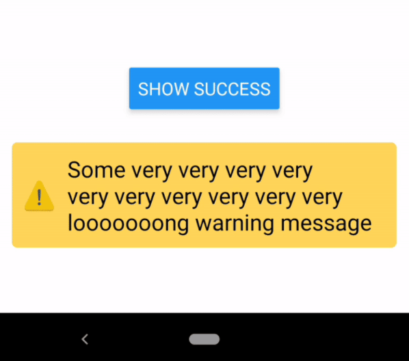
Preview: