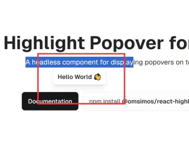
Description:
An easy-to-use and composable React component that displays a customizable popover above the selected text. Great for social sharing and inline editing.
How to use it:
1. Install and import the selection-popover.
# NPM
$ npm i selection-popover
import * as Selection from 'selection-popover';
2. Basic usage.
export default () => (
  <Selection.Root>
    <Selection.Trigger />
    <Selection.Portal>
      <Selection.Content>
        <Selection.Arrow />
      </Selection.Content>
    </Selection.Portal>
  </Selection.Root>
);


