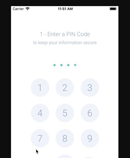
Description:
This is a configurable and animated keypad component for React Native.
It provides a simple way to implement PIN entry, passcode screens, and other secure input forms within your mobile applications.
Features
- ✨ Animations are handled with React Native Reanimated for a smooth user experience.
- 🎨 Built-in light and dark themes are available for quick styling.
- 🔧 Style properties are highly configurable to match your application’s design.
- 📏 The required PIN length is adjustable to fit different security requirements.
- 🚫 A shake animation provides clear visual feedback for incorrect entries.
- 👆 Biometric authentication button support for Face ID or Touch ID.
See It In Action

Use Cases
- Application Lock Screen. Secure your application at launch with a required PIN.
- Payment Confirmation. Verify user identity with a PIN before processing a transaction.
- Parental Controls. Restrict access to certain content or settings behind a passcode.
- Two-Factor Authentication. Allow users to enter a time-sensitive code sent to their device.
- Secure Settings Access. Protect sensitive application settings from unauthorized changes.
How to Use It
1. Install the keypad component
For npm:
npm install react-native-keypad-componentFor yarn:
yarn add react-native-keypad-component2. This component depends on react-native-reanimated and react-native-gesture-handler. You must install them separately.
yarn add react-native-reanimated react-native-gesture-handler3. You must follow the installation instructions for React Native Reanimated to configure the necessary native code modifications.
4. For quick setup, a CLI tool can add the component’s source code directly into your project.
npx rn-keypad-cli@latest5. Import the component and provide the onPinEntered callback function. This function receives the completed PIN.
import React from 'react';
import Keypad from 'react-native-keypad-component';
export default function App() {
  function handlePinCompletion(pin) {
    // Validate the entered PIN
    console.log('Entered PIN:', pin);
  }
  return <Keypad onPinEntered={handlePinCompletion} pinLength={4} />;
}
6. You can customize the keypad’s behavior and appearance through its props.
onPinEntered: A callback function that runs after the user enters the complete PIN.onPinErrored: A boolean that triggers the shake animation to indicate an error.onDigitPressed: A callback function that runs when any digit button is pressed.onBackspacePressed: A callback function that runs when the backspace button is pressed.errorMessageComponent: A function that returns a custom React component to display error messages.pinLength: A number that determines how many digits the PIN should have.style: An object for applying custom styles to the main keypad container.buttonStyle: An object for applying custom styles to each button on the keypad.buttonTextStyle: An object for applying custom styles to the text inside each button.keypadTextSize: A number that sets the font size of the text on the keypad buttons.disableKeypadBackground: A boolean that removes the background color from the keypad buttons.usesFaceId: A boolean that shows or hides a button for biometric authentication.keypadRadius: A number that controls the border radius of the keypad buttons and PIN dots.theme: A string, either ‘light’ or ‘dark’, to set the overall color scheme.keypadColor: A string that sets a custom background color for the keypad buttons.textColor: A string that sets a custom color for the text on the keypad buttons.dotColor: A string that sets the color of the filled PIN dots.emptyDotColor: A string that sets the color of the empty PIN dots.dotWidth: A number that defines the width of each PIN dot.dotHeight: A number that defines the height of each PIN dot.gridGap: A number that specifies the spacing between the keypad buttons.renderFaceIdIcon: A function that returns a custom React component for the Face ID/Touch ID icon.applyBackgroundToFaceIdButton: A boolean that applies the standard button background to the Face ID button.
import React, { useState } from 'react';
import { View, Text } from 'react-native';
import Keypad from 'react-native-keypad-component';
export default function SecureScreen() {
  const [showError, setShowError] = useState(false);
  function validatePin(pin) {
    if (pin !== '1234') {
      setShowError(true);
      setTimeout(() => setShowError(false), 2000); // Hide error after 2 seconds
    } else {
      setShowError(false);
      // PIN is correct, proceed
    }
  }
  const CustomErrorMessage = () => (
    <Text style={{ color: 'red', textAlign: 'center' }}>
      Incorrect PIN.
    </Text>
  );
  return (
    <View style={{ flex: 1, justifyContent: 'center' }}>
      <Keypad
        onPinEntered={validatePin}
        onPinErrored={showError}
        errorMessageComponent={CustomErrorMessage}
        pinLength={4}
        theme="dark"
        keypadColor="#1A1A1A"
        textColor="#FFFFFF"
        dotColor="#007AFF"
      />
    </View>
  );
}
This example demonstrates how to control the error state and customize the keypad’s colors for a dark theme. The errorMessageComponent prop accepts a function that returns a React component, which gives you full control over the error message’s appearance.
FAQs
Q: How do I handle incorrect PIN entries?
A: You can manage incorrect PINs by using a state variable in your component. Pass this state to the onPinErrored prop. When onPinErrored is true, the keypad will display a shake animation.
Q: Can I change the keypad’s appearance?
A: Yes, the component offers several props for customization. You can choose between ‘light’ and ‘dark’ themes or specify custom colors for the buttons, text, and dots using props like keypadColor, textColor, and dotColor.
Q: Is it possible to add Face ID or Touch ID?
A: Yes, you can enable a biometric authentication button by setting the usesFaceId prop to true. You can also provide a custom icon for the button with the renderFaceIdIcon prop.
