Description:
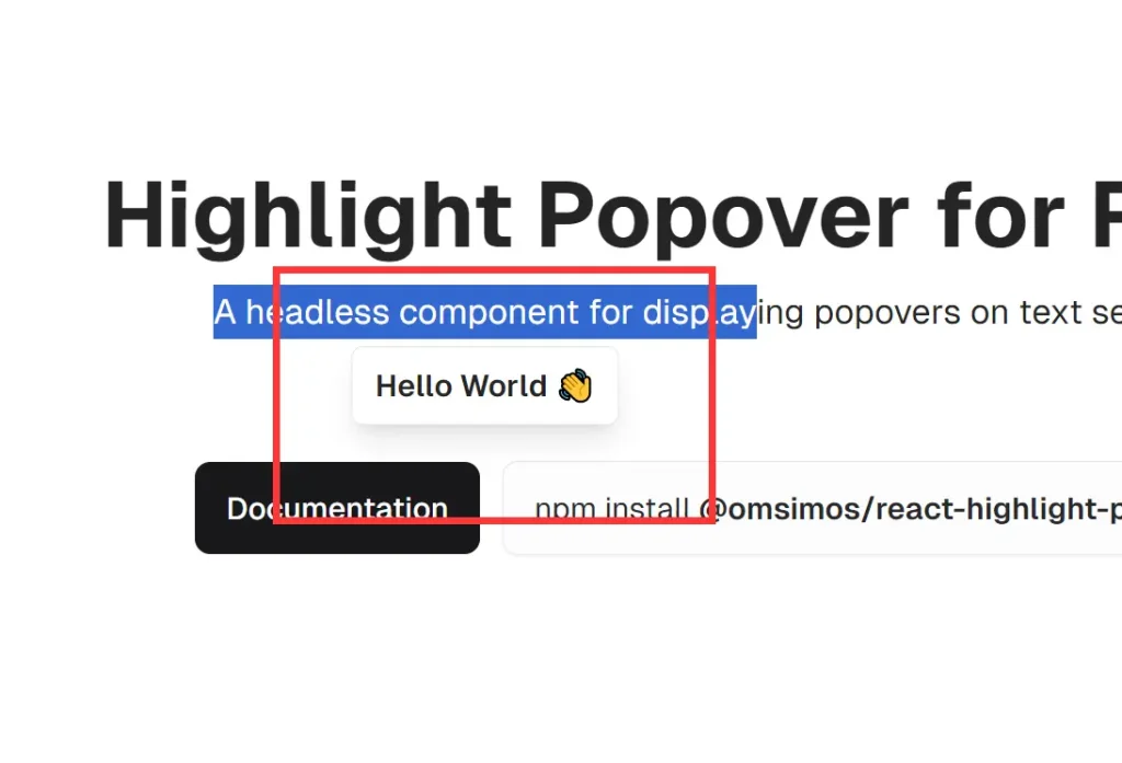
react-highlight-popover is a lightweight, zero-dependency React component that allows you to create customizable popovers triggered by text selection.
Key Features
- Zero external dependencies for lighter bundle size
- Headless architecture for complete style control
- Smart positioning with automatic text selection tracking
- Configurable minimum selection length
- Position offset customization
- Event lifecycle callbacks
- React hooks for state management
- Component reusability across projects
Use Cases
- Interactive Definitions: Display definitions or explanations of selected words within a document or article.
- Inline Editing: Create a popover containing editing controls when text is selected.
- Contextual Actions: Offer actions like “Copy,” “Share,” or “Translate” based on selected text.
- Sentiment Analysis: Display the sentiment of selected text using a natural language processing API.
- Annotation Tools: Build collaborative annotation features within a document editor.
- Social Media Quote Sharing: Create sharing buttons that appear when users select text to post on social platforms
Installation
npm i @omsimos/react-highlight-popoverUsage
Here’s a basic example of how to implement the HighlightPopover component:
import { HighlightPopover } from '@omsimos/react-highlight-popover';
function App() {
  const renderPopover = ({ selection }) => (
    <div className="bg-white border rounded p-2 shadow-lg select-none">
      You selected: {selection}
    </div>
  );
  return (
    <HighlightPopover renderPopover={renderPopover}>
      <p>
        This is a sample text. Try selecting some words to see the popover in action.
      </p>
    </HighlightPopover>
  );
}
export default App;
API
The HighlightPopover component accepts the following props:
children(React.ReactNode): Required content that triggers the popover.renderPopover(function): Required function for rendering the popover content.className(string): Additional CSS class for styling the wrapper element.offset(object): Offset for adjusting popover position.zIndex(number): Sets the z-index of the popover.alignment(string): Determines the alignment of the popover.minSelectionLength(number): Minimum text length required for activation.onSelectionStart(function): Callback for when text selection starts.onSelectionEnd(function): Callback for when text selection ends.onPopoverShow(function): Callback for when the popover is displayed.onPopoverHide(function): Callback for when the popover is hidden.
useHighlightPopover Hook
The useHighlightPopover hook provides access to the internal state of the HighlightPopover component. It returns an object containing the following properties:
- showPopover: A boolean indicating whether the popover is currently visible.
- setShowPopover: A function to manually control the visibility of the popover.
- popoverPosition: An object containing the current position of the popover with properties
topandleft. - currentSelection: A string representing the currently selected text.
- setCurrentSelection: A function to manually update the current text selection.
Example of Using the useHighlightPopover Hook
Here’s a basic example demonstrating how to use the useHighlightPopover hook within a custom popover component:
import { HighlightPopover, useHighlightPopover } from '@omsimos/react-highlight-popover';
function CustomPopover() {
  const { currentSelection, setShowPopover } = useHighlightPopover();
  return (
    <div className="bg-white border rounded-md p-2 shadow-lg select-none">
      <p>You selected: {currentSelection}</p>
      <button className="font-semibold" onClick={() => setShowPopover(false)}>Close</button>
    </div>
  );
}
function App() {
  const handleSelectionStart = () => console.log('Selection started');
  const handleSelectionEnd = (selection) => console.log('Selected:', selection);
  const handlePopoverShow = () => console.log('Popover shown');
  const handlePopoverHide = () => console.log('Popover hidden');
  return (
    <HighlightPopover
      renderPopover={() => <CustomPopover />}
      offset={{ x: 0, y: -10 }}
      minSelectionLength={5}
      onSelectionStart={handleSelectionStart}
      onSelectionEnd={handleSelectionEnd}
      onPopoverShow={handlePopoverShow}
      onPopoverHide={handlePopoverHide}
    >
      <p>
        This is a more advanced example. Try selecting at least five characters
        to see the custom popover with a close button.
      </p>
    </HighlightPopover>
  );
}
export default App;
Related Resources
- React Documentation: React Official Docs – A comprehensive resource for learning and understanding React.
- Styled Components: Styled Components – A library for styling React components using tagged template literals.
- React Hooks: React Hooks Documentation – A guide on using hooks to manage state and lifecycle in React applications.
Preview