Description:
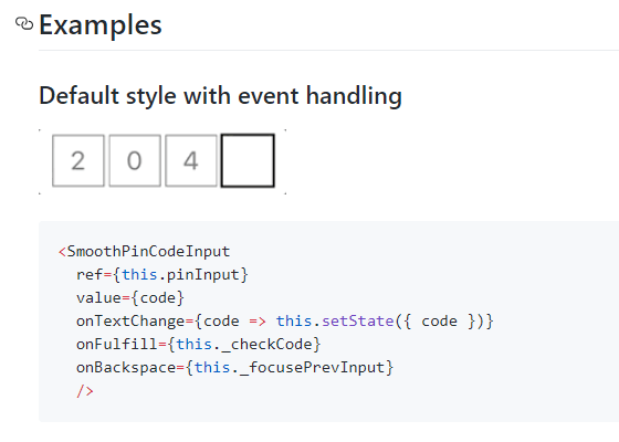
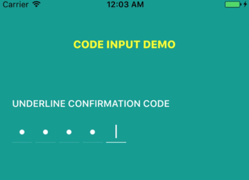
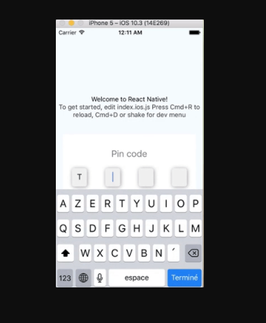
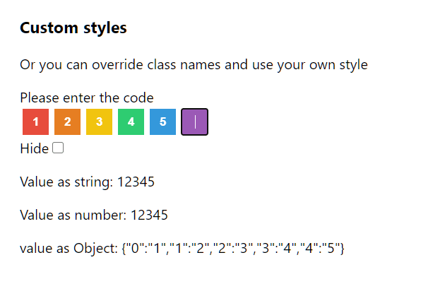
Pin Input is a React component that creates PIN and OTP input fields in React applications.
It helps web developers handle one-time passwords, verification codes, and other segmented input scenarios without external dependencies.
Features
- No External Dependencies: Functions without relying on external libraries, minimizing bundle size and potential conflicts.
- Flexibility: Supports both controlled and uncontrolled component behavior, offering adaptability to different form management strategies.
- Form Library Compatibility: Integrates smoothly with popular form libraries such as react-hook-form, enhancing form validation and management capabilities.
- Accessibility & Simplicity: Prioritizes accessibility and ease of use. Features include copy-paste support, input masking, auto-focus, and callbacks for complete and incomplete input.
- Customization: While inherently style-agnostic, it allows for styling customization using CSS or CSS-in-JS solutions.
Use Cases
- Two-Factor Authentication: Implement secure two-factor authentication by utilizing PinInput to capture verification codes sent via SMS or email.
- Password Reset: Facilitate user-friendly password resets by employing PinInput to gather the reset codes delivered to users.
- Secure Forms: Enhance the security of sensitive forms by incorporating PinInput for fields requiring confidential information like PINs or access codes.
- E-commerce Checkout: Utilize PinInput during checkout processes for secure input of gift card or promotional codes.
- User Verification: Verify user identities through one-time PINs entered using the PinInput component.
Installation
- Copy the Component: Copy the
pin-input.tsxfile into your React project. - Integrate into Your Application: Use the component as outlined in the usage section below. No additional setup or installation of libraries is necessary.
- Customize as Needed: Feel free to apply your own styles using any CSS framework of your choice.
Usage
Controlled Pin Input Example
Here’s a basic implementation of the Pin Input component in a controlled manner:
function ControlledPinInput() {
  const [pinInput, setPinInput] = useState("");
  return (
    <PinInput
      className="flex h-10 space-x-4"
      value={pinInput}
      onChange={setPinInput}
      onComplete={(str) => console.log("completed", str)}
    >
      {Array.from({ length: 4 }, (_, i) => (
        <PinInputField key={i} component={Input} />
      ))}
    </PinInput>
  );
}
Uncontrolled Pin Input Example
For an uncontrolled implementation, use the following code snippet:
function UncontrolledPinInput() {
  return (
    <PinInput
      className="flex h-10 space-x-4"
      defaultValue=""
      onComplete={(str) => console.log("completed", str)}
      autoFocus
    >
      <PinInputField component={Input} />
      <PinInputField component={Input} />
      <Separator orientation="vertical" />
      <PinInputField component={Input} />
      <PinInputField component={Input} />
    </PinInput>
  );
}
React Hook Form Integration with Zod
Here’s how to integrate the Pin Input with React Hook Form and Zod for validation:
const formSchema = z.object({
  otp: z.string().min(1, { message: "Please enter your OTP code." }),
});
export default function MyComponent() {
  const form = useForm({
    resolver: zodResolver(formSchema),
    defaultValues: { otp: "" },
  });
  function onSubmit(data) {
    console.log({ data });
    form.reset();
  }
  return (
    <Form {...form}>
      <form onSubmit={form.handleSubmit(onSubmit)}>
        <PinInput {...form.register("otp")}>
          {Array.from({ length: 7 }, (_, i) => (
            <PinInputField key={i} component={Input} />
          ))}
        </PinInput>
        <Button type="submit">Verify</Button>
      </form>
    </Form>
  );
}
Related Resources
- React Hook Form: Official Documentation – A powerful library for managing form state in React applications.
- Zod: Zod Documentation – A TypeScript-first schema declaration and validation library.
- Tailwind CSS: Tailwind CSS Documentation – A utility-first CSS framework for creating custom designs.
- Formik: Formik Documentation – A popular library for handling forms in React applications.
Preview

