Description:
A simple and customizable switch UI component for React Native.
How to use it:
1. Install and import the switch component.
# Yarn
$ yarn add react-native-switch-toggles
# NPM
$ npm i react-native-switch-toggles
import Switch from 'react-native-switch-toggles';
2. Add the switch component to the app.
const [isEnabled, setIsEnabled] = React.useState(false);
<Switch
  size={50}
  value={isEnabled}
  onChange={(value) => setIsEnabled(value)}
  activeTrackColor={"#45D058"}
  renderOffIndicator={() => <Text style={{ fontSize: 24 color: 'red' }}>OFF</Text>}
  renderOnIndicator={() => <Text style={{ fontSize: 24, color: 'green' }}>ON</Text>}
/>
3. Available component props.
/**
 * size of the switch
 */
size?: number;
/**
 * switch on/off state value
 */
value: boolean;
/**
 * enable/disable switch
 */
disabled?: boolean;
/**
 * callback on switch value change
 */
onChange: (value: boolean) => void;
/**
 * track color when switch value is true
 */
activeTrackColor?: string;
/**
 * track color when switch value is false
 */
inactiveTrackColor?: string;
/**
 * thumb color when switch value is true
 */
activeThumbColor?: string;
/**
 * thumb color when switch value is false
 */
inactiveThumbColor?: string;
/**
 * render a custom view on switch track when the switch value is true
 */
renderOnIndicator?: () => React.ReactNode;
/**
 * render a custom view on switch track when the switch value is false
 */
renderOffIndicator?: () => React.ReactNode;
/**
 * ender a custom view on switch thumb when the switch value is true
 */
renderActiveThumbIcon?: () => React.ReactNode;
/**
 * render a custom view on switch thumb when the switch value is false
 */
renderInactiveThumbIcon?: () => React.ReactNode;
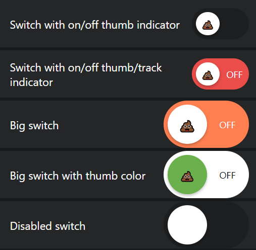
Preview: