Description:
React Native Selector is a beautiful, advanded dropdown component that allows you to select single or multiple options from a list.
Features
- 🔍 Searchable: Includes optional search functionality to filter through a list of options.
- 🎨 Highly Customizable: Offers custom styles for all parts of the component for complete visual control.
- 📱 Cross-platform: Functions consistently across iOS, Android, and Web environments.
- ♿ Accessible: Developed with accessibility considerations to support all users.
- 🚀 TypeScript Support: Comes with full TypeScript support and type definitions for improved development workflows.
- 🎯 Expo Compatible: Works smoothly within Expo projects without extra configuration.
- 🔧 Flexible Rendering: Allows for custom render functions for both the options list and the selected value display.
- 🎯 Multiple Selection: Supports both single and multiple selection modes to fit different use cases.
- 📍 Modal Positioning: Provides options to position the selection modal in the center or at the bottom of the screen.
- 🎨 Custom Icons: Supports the use of custom arrow and checkmark icons.
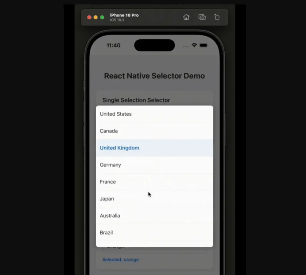
Preview
Use Cases
- Product variant selection in e commerce applications.
- Country or region pickers in form workflows.
- Category filtering in content based apps.
- Settings toggles with disabled option states.
- Multi tag selection in content creation interfaces.
How to Use It
1. Install and import the rn-selector in your app.
npm install rn-selectorimport React, { useState } from 'react';
import { View, StyleSheet } from 'react-native';
import { Selector } from 'rn-selector';2. Define your selection options with label value pairs.
const countryOptions = [
  { label: 'United States', value: 'us' },
  { label: 'Canada', value: 'ca' },
  { label: 'Mexico', value: 'mx', disabled: true },
];
3. Implement the selector with required props.
export default function CountryPicker() {
  const [country, setCountry] = useState('');
  return (
    <Selector
      options={countryOptions}
      selectedValue={country}
      onValueChange={(value) => setCountry(value)}
      placeholder="Select your country"
      searchable={true}
      primaryColor="#3b82f6"
    />
  );
}
4. For multiple selections, set the multiple prop to true. The selectedValue should be an array, and the onValueChange callback will return an array of the selected values.
const categoryOptions = [
  { label: 'Technology', value: 'tech' },
  { label: 'Health', value: 'health' },
  { label: 'Finance', value: 'finance' },
];
export default function App() {
  const [selectedCategories, setSelectedCategories] = useState([]);
  return (
    <View style={styles.container}>
      <Selector
        options={categoryOptions}
        selectedValue={selectedCategories}
        onValueChange={(values) => setSelectedCategories(values)}
        placeholder="Select categories"
        multiple={true}
        doneButtonText="Confirm"
      />
    </View>
  );
}
const styles = StyleSheet.create({
  container: {
    flex: 1,
    justifyContent: 'center',
    padding: 16,
  },
});
5. You can customize the component’s appearance using styling props. For example, you can enable the search functionality and apply custom colors.
<Selector
  options={options}
  selectedValue={selectedValue}
  onValueChange={setSelectedValue}
  searchable={true}
  searchPlaceholder="Search for an option..."
  primaryColor="#007bff"
  style={{ borderColor: '#007bff', borderWidth: 1 }}
  dropdownStyle={{ backgroundColor: '#f8f9fa' }}
  textStyle={{ color: '#343a40' }}
/>
6. All possible component props.
Core Props
options: An array of option objects to be displayed in the selector.selectedValue: The currently selected value. For multiple selections, this should be an array of values.onValueChange: A callback function that is triggered when the selected value changes.placeholder: The text displayed when no option is selected.disabled: A boolean that, when true, disables the entire selector component.multiple: A boolean that, when true, allows for the selection of multiple options.
Search Props
searchable: A boolean that enables a search input field to filter the options.searchPlaceholder: The placeholder text for the search input field.placeholderSearchTextColor: Sets the color of the search input’s placeholder text.noResultsText: The text that appears when a search returns no matching options.
Modal & UI Props
modalPosition: Determines the position of the modal, either'center'or'bottom'.modalBackgroundColor: Sets the background color of the modal overlay.maxHeight: Defines the maximum height of the dropdown list.primaryColor: The main color used for selected items and action buttons.doneButtonText: The text for the “Done” button, which is shown in multiple selection mode.
Custom Icons Props
iconCheck: Allows you to provide a custom component for the checkmark icon in multiple selection mode.customArrow: Allows you to provide a custom component for the dropdown arrow icon.
Custom Render Props
renderOption: A function to customize the rendering of each option in the list.renderSelectedOption: A function to customize the display of the selected value.
Styling Props
style: Applies custom styles to the main selector button.containerStyle: Applies custom styles to the root container of the component.dropdownStyle: Applies custom styles to the dropdown container.optionStyle: Applies custom styles to each individual option item.selectedOptionStyle: Applies custom styles specifically to the selected option items.textStyle: Applies custom styles to the text within options and the selected value display.placeholderTextStyle: Applies custom styles to the placeholder text.searchInputStyle: Applies custom styles to the search input field.
FAQs
Q: Can I disable specific options in the list?
A: Yes, you can disable an option by adding a disabled: true property to the option object in the options array.
Q: How can I programmatically close the selector modal?
A: When using the renderOption prop, the function receives an onClose parameter. You can call this function to close the modal after a selection is made.
Q: Is it possible to change the icons for the dropdown arrow and the multiple selection checkmark?
A: Yes, you can provide your own React components to the customArrow and iconCheck props to replace the default icons.
Q: How does the component handle long lists of options?
A: The component uses a scrollable view for the options list and has a maxHeight prop to control the maximum height of the dropdown, which helps manage long lists. The searchable prop also improves usability with extensive lists.
Q: Can I customize the display of the selected value?
A: Yes, the renderSelectedOption prop allows you to provide a custom render function to control how the selected option or options are displayed in the selector button.


