Description:
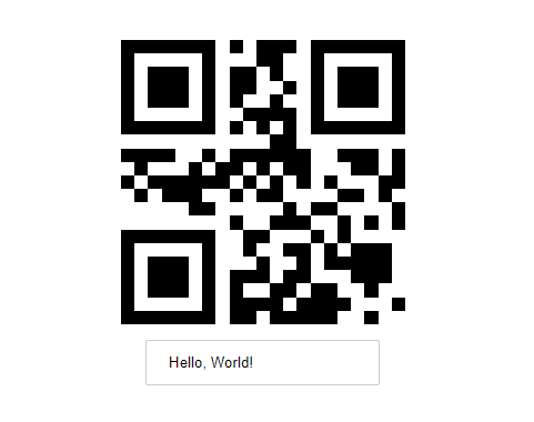
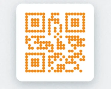
Cuer is a React component that uses the qr library to generates clean, customizable QR codes in your React apps.
Features
- 🎨 Customizable Arena: Add logos or images to the QR code center.
- 🔧 Composable Architecture: Use individual components for precise control over QR elements.
- 🎯 Finder Pattern Control: Modify the color and corner radius of position markers.
- 🔷 Cell Customization: Adjust the appearance of individual QR code cells.
- 🌈 Color Configuration: Change foreground color using CSS values.
- 📏 Size Flexibility: Set dimensions using standard CSS units.
Preview

Use Cases
- Product Packaging: Generate branded QR codes with company logos for physical products.
- Event Tickets: Create customized QR codes with event branding for ticket validation.
- Marketing Materials: Produce stylized QR codes that match campaign visual identity.
- Document Verification: Implement QR codes with organizational branding for secure documents.
How to Use It
1. Install the cuer package from npm.
npm i cuer2. Import and use the Cuer component in your React application. The value prop is required and specifies the data to be encoded in the QR code.
import { Cuer } from 'cuer';
export function App() {
  return <Cuer value="https://reactscript.com" />;
}
3. For more advanced customizations, you can use the composable components. This approach gives you granular control over the different parts of the QR code. For instance, you can change the fill color of the finder patterns and the data cells separately.
import { Cuer } from 'cuer';
export function App() {
  return (
    <Cuer.Root value="https://your-website.com">
      <Cuer.Finder fill="navy" />
      <Cuer.Cells fill="skyblue" />
      <Cuer.Arena>
        <img
          src="https://example.com/your-logo.png"
          style={{ width: '100%', height: '100%', objectFit: 'cover' }}
        />
      </Cuer.Arena>
    </Cuer.Root>
  );
}
The arena prop can accept either a URL string for an image or a React node for more complex content in the center of the QR code.
4. Component Props:
size: The width and height of the QR code. It accepts any valid CSSwidthvalue and defaults to"100%".value: The string data to encode in the QR code. This prop is required.arena: Content to display in the center of the QR code. It accepts a URL string for an image or a React node for custom components.className: A string for applying custom CSS classes to the root SVG element.color: The foreground color of the QR code. It defaults to"currentColor".
FAQs
Q: What is the default size of the QR code?
A: The default size is “100%”, which makes it responsive to the parent container’s width.
Q: What type of content can be encoded in the QR code?
A: The value prop accepts a string, allowing you to encode URLs, text, or any other string-based data.
Q: Is it possible to change the shape of the QR code cells?
A: The Cuer.Cells component has a radius prop that you can use to create rounded cells.
Q: How does the arena prop work with different content types?
A: If you provide a string, it will be rendered as an img tag. If you pass a React node, it will be rendered as is in the center of the QR code.
Q: Can I control the error correction level?
A: The current implementation uses default error correction suitable for most use cases.


