
- How to create the Button block
- Settings for the PublishPress Button block
- Text size and colors in the PublishPress Button block
- Borders in the PublishPress Button Block
- Margin and padding in the PublishPress Button block
- Hover effects in the PublishPress Button block
- Nofollow and noreferrer support (Pro)
- Google font support (Pro)
- Icon support (Pro)
- Default settings for all your PublishPress Button blocks
The “Button” block is is available in the PublishPress Blocks plugin. This block is based on the default Button block in Gutenberg.
This improved version of the button block has tons of extra features including advanced styling such as hover, margin, border, padding, shadows and more.
How to create the Button block #
You can create a PublishPress Button block by clicking the “Button – PublishPress” button in the PublishPress Blocks section.

After you have selected the “Button – PublishPress” you'll see a new block that looks like this screenshot below:

Settings for the PublishPress Button block #
In the right sidebar, you can adjust some settings for the Button block:
The Styles area gives you 4 predefined styles:
- Default
- Outlined
- Squared
- Squared Outline
The Button link area gives you 2 choices:
- Link URL
- Open in new tab: On/Off.

Text size and colors in the PublishPress Button block #
There are three options for customizing the test size, background color and text color for the button:
- Text size
- Background color
- Text color

Borders in the PublishPress Button Block #
There are 4 customization options for the color and style of the borders of your buttons:
- Border radius
- Border style: solid, dotted, ridge,…
- Border Color
- Border width

Margin and padding in the PublishPress Button block #
You can control the margin and padding for all four sides of your button:
- Margin: top, right, bottom and left.
- Padding: top, right, bottom and left.

Hover effects in the PublishPress Button block #
You can can choose settings that control what visitors see when they hover over your buttons:
- Color Settings:
- Background color
- Text color
- Shadow color
- Shadow:
- Opacity
- Transition speed
- Shadow H (horizontal) offset
- Shadow V (vertical) offset
- Shadow blur, spread)
- Shadow spread

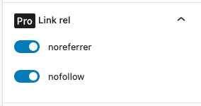
Nofollow and noreferrer support (Pro) #
This feature requires the Pro version of the PublishPress Blocks plugin.
In the Pro version of the PublishPress Blocks plugin, you are able to add the nofollow and noreferrer to the rel attribute for your buttons. Look for the “Link rel” panel.
Google font support (Pro) #
This feature requires the Pro version of the PublishPress Blocks plugin.
In the Pro version of the PublishPress Blocks plugin, you can choose between 1400 available Google fonts to customize the button text. Look for the “Font” panel.

- Font family. Choose between 1400 available Google fonts
- Font weight + Style. (when Font family is different to “default”)
Icon support (Pro) #
This feature requires the Pro version of the PublishPress Blocks plugin.
In the Pro version of the PublishPress Blocks plugin, you can add icons to your Buttons. Do it through the “Icon” panel in the sidebar.

- Display icon
- Icon library (Material icon)
- Icon size (px)
- Icon color. Leave blank to use the same color from the text button.
- Icon position
- Icon spacing. Spacing between icon and text.

Default settings for all your PublishPress Button blocks #
You can set default options for every PublishPress Button block added to your site. This is possible with the PublishPress Blocks default configuration feature and it allows you to create a consistent look-and-feel for all your buttons.
- Go to “Blocks” in your WordPress admin menu, then “PublishPress Blocks”.
- Click the “Button” settings icon.

- Adjust the default settings and click “Save”.
