Your AI tools launch directory. Ship smarter.
A startup directory and product launch platform for AI tools. Discover new launches, compare workflows, and submit your startup for a paid listing.
- Launches today
- 5
- Active directory
- 55
- Top categories
- 20
Daily launches
Curated drops land daily. Spot new AI products before the crowd.
Quality filters
Only practical, usable tools. No noise, no empty hype.
Community signals
Real upvotes drive trending. The strongest tools rise.
Launching today
Spark is a no-code platform for turning an idea into a business and reaching a first customer. It is built for people who want to create an app, website, class, membership, chatbot, shop, coaching offer, newsletter, or game without needing to code. Instead of only building an app, Spark helps build the whole business: sites and hosting, accounts and payments, emails, marketing, and the backend tools needed to run the business. You describe what you want in plain language, and Spark creates the apps and pages you need, with accounts, data, and payments built in. The result is a working online business rather than a disconnected set of tools. Many business ideas stall because the first version requires many separate pieces: a website, hosting, sign-in, payment processing, email, and internal tools for fulfillment or operations. Spark is positioned as the fastest way to go from idea to first customer, and it addresses that fragmentation by making these pieces part of the same build. Customers can sign up, subscribe, and pay from the first version, while hosting and email are already set up. The site states that there is nothing to wire together. That matters for solo founders and small teams who want to validate a paid offer quickly rather than spend their early effort connecting infrastructure. Spark's core capability is creating apps and pages from plain-language descriptions. The FAQ says no coding knowledge is required: you describe what you want, and Spark creates the apps and pages you need. Accounts, data, and payments are built in. When you want changes, you ask for them the same way. The website illustrates this with a request to build a site that turns people's photos into postcards to their future self and charges $5 to mail one. The displayed build steps show the app and website being built, sign-in and a postcard shelf being added, the $5 charge for printing and mailing a card being set up, a marketing plan being reviewed, and the site being published live at prettypostcard.com. Payments and sign-in are presented as built-in from the first version. Customers can sign up, subscribe, and pay you, with hosting and email already set up. The content says taking payments requires a paid plan, and you tell Spark what you want to sell and how much to charge. A screenshot of PrettyPostcard's Sales tool shows $85 earned, 17 cards paid to post, and a chart of cards a week. This shows how the payment setup connects to business tracking. Spark also builds pages only you and your team see, such as PrettyPostcard's Postbox, which lists every paid card waiting to be mailed, each with its address and a Mark as posted button. That turns a payment into an operational workflow. Spark also helps you find customers. It researches your market, writes a marketing plan with you, and helps with newsletters and analytics as you grow. The PrettyPostcard example shows a marketing plan with six channels ranked and short-form video up next. Another screenshot shows a marketing analysis titled 'Where Pretty Postcards can win.' These features are aimed at the part of a business that comes after the build: understanding where the offer can compete, choosing channels, and learning from analytics while growing. The combination of marketing research, planning, newsletters, and analytics is included alongside the site-building and payment tools rather than left as a separate function. The overall approach is to start from a plain-language description of the business and have Spark generate the needed apps, pages, accounts, data, and payments. Publishing is part of the flow: the site says publishing is free on a spark.site address, while taking payments and using your own domain need a paid plan from $25 a month. A free plan includes one-time credits so you can try building with Spark, and no credit card is required to build for free. This structure lets someone begin with an idea, create a working offer, and move to a paid plan when they need payment collection or a custom domain. The PrettyPostcard walkthrough demonstrates the sequence from a prompt to a live site at prettypostcard.com. The stated outcome is speed from idea to first customer. Because Spark builds the whole business rather than just an app, a creator can present an offer, collect sign-ups and payments, and use team-facing tools to run fulfillment. The site provides examples: Game Assets offers sprite and tileset packs for indie game developers, with a free sample and $16 to $24 a pack; FatFIRE Math provides free tools and calculators for the Fat FIRE community along with a $399/year private membership group; and SeattleCrime is an up-to-date map of police reports in Seattle supported by donations and sponsorships. These examples show different business models, including paid packs, memberships, and donation-supported public resources. Spark lists many concrete business ideas: a renter Q&A chatbot, knife-skills classes, a supper club, a neighborhood tool library, a home-inspection helper, swim training plans, dog walking with booking, a weekend baby course, ski tuning with delivery, sleep coaching sessions, college essay coaching, a synth newsletter, a tutoring service, weekend pottery classes, a sourdough starter shop, batch-cooking workshops, a coffee-tasting club, Couch-to-5K coaching, golf swing reviews, freelance invoicing, a poker trainer, a baseball-card newsletter, a wedding-speech service, an AI image-prompt library, a 3D game-asset library, a 3D-printing model shop, a realtor listing writer, wedding-planner templates, drone footage for realtors, a campaign planner for DMs, a sneaker price tracker, a chess-opening trainer, a vintage-watch newsletter, a comic grading guide, an estate-sale newsletter, a homebrewing course, a hot-sauce club, a knitting pattern club, a fly-fishing guide, a foraging course, and a pickleball ladder. The site also organizes examples by type: App, Classes, Membership, Chatbot, Shop, Coaching, Newsletter, and Game. The PrettyPostcard example is an app that charges $5 to print and mail a postcard. Spark is for anyone who wants to build a business without coding. The FAQ says no coding knowledge is required, and the site states that anyone can build a business. The examples address indie game developers, the Fat FIRE community, local public-interest projects, coaches, teachers, newsletter writers, shops, and service providers. Pricing starts free without a credit card; the Free plan includes one-time credits, and publishing is free on a spark.site address. Taking payments and using your own domain require a paid plan from $25 a month. The content does not describe a specific technology stack or third-party integrations beyond hosting, email, payments, and domains. Spark's primary value proposition is the shortest path from an idea to a paying customer. It combines site and app creation, built-in accounts and payments, hosting and email, team-facing operational pages, and marketing support in one place. For people with a business idea who do not want to wire together separate tools, Spark offers a way to build the whole business, publish it, and start finding customers.
MPC Unity is a web product that places real mining assets in the language of global capital markets and makes mining information verifiable on chain. It connects real mining projects with structured data, professional verification, and digital registries, positioning itself as a trust layer for mining information. The site describes the product as being in the design and build stage. Users join Unity by connecting a wallet, verifying the community and their email, and receiving a Unity certificate; the mine opens behind that certificate. From there, the experience includes quests, Crew, digs in My Mine, refining and registering ore, invitations, and weekly standings. Everything a user does writes a record under their own wallet. The background context presented by MPC Unity is a need for trusted mining information. The product frames real mining assets as something that should be expressed in the language of global capital markets while remaining verifiable on chain. Its stated role is to be the trust layer for mining information by combining structured data, professional verification, and digital registries. That matters because the content repeatedly emphasizes verifiability and records that live on chain under the user’s wallet. The FAQ states that records cannot be edited afterwards, including by the product team. The product also states that it is not an investment solicitation or offering and is for institutional review purposes only. These statements define the context: MPC Unity is presented as a way to organize and verify mining information rather than as an investment offer. One core feature group is wallet-based entry and the Unity certificate. The first step is to join and take the certificate. A user connects a wallet, verifies the community and email, and then the Unity certificate is minted to them. The mine opens behind the certificate. The FAQ explains that a wallet is the account here, so users can connect the one they already use or install one and come back. It also states that MPC never sees or holds keys. Telegram is used as a community membership check: the community group is where the project answers questions, and the check that the user joined it is what one of the join steps reads. The FAQ says it is a membership check and nothing is posted for the user. This group of features establishes identity and access around a wallet, a community check, an email, and a certificate. A second feature group is quests and Crew. Quests pay Crew, which is described as the balance the mine runs on. The whitepaper check-in comes round once a day. The website also points to a related MPC site for community check-in, where users can record daily participation. That related site is separate, currently has no rewards, and opBNB BNB gas fees apply. Crew is therefore tied to quest completion and daily check-in activity. The FAQ says users get Crew from quests, ore and goods from the mine, and a place in the weekly standings. This feature group gives users a way to earn the balance needed for mining activity and to maintain daily participation through a check-in flow. A third feature group is digging in My Mine and writing records. A dig spends 3 Crew and writes a record. A day allows up to 20 digs, and the record is what the standings read. This means the act of digging is not only a way to spend Crew; it also produces the record used for standings. The content emphasizes that everything a user does writes a record under their own wallet. The FAQ reinforces that records live on chain under the wallet and cannot be edited afterwards, by the product team either. Digging therefore connects activity, record creation, and weekly standings in one loop. The explicit limit of 20 digs per day and the cost of 3 Crew per dig define how the activity is constrained. A fourth feature group is refining and registering ore. Five of one grade fuse into one of the next grade. A registered ore pays credit over 15 days. This is a separate progression from digging: ore can be refined by combining five units of one grade into one unit of the next grade, and registration is tied to a credit that pays over 15 days. The content does not define the credit further, but it does state the 15-day period and the registration outcome. This feature group adds a transformation step and a registration step after ore is obtained, giving users a way to work with ore beyond the initial dig. The FAQ also mentions ore and goods from the mine as part of what users get. A fifth feature group is inviting partners and climbing through Ventures. When an invited partner completes the entry exam, the inviter earns 10 Crew and the partner receives 30 Crew once. The reward is claimed in Ventures. Active partners also improve the inviter’s mining bonuses. This feature group links invitations to an entry exam, one-time Crew rewards, a claim location called Ventures, and mining bonuses tied to active partners. The content states the exact Crew amounts and the one-time nature of the partner reward. It also connects partner activity to mining bonuses, which gives invitations a role beyond the initial reward. The product’s overall approach is built around a five-step run. The steps are: join and take the certificate; clear quests to earn Crew; dig; refine and register; invite and climb. The page says that is the whole run and that five steps are involved, with the first one taking a couple of minutes. Records are written on chain under the user’s wallet. The FAQ explains a relayed path: the relayed path sends records for the user, so the user pays no gas on it. Sending a record from the user’s own wallet is also offered, and that path pays its own gas. This is the unique operational model described: a wallet-based account, a certificate-gated mine, quests that pay Crew, digs that spend Crew and write records, refining and registration, invitations through Ventures, and a choice between a relayed record path and a self-sent record path. The benefits and outcomes stated in the content are concrete and activity-based. Users get Crew from quests, ore and goods from the mine, and a place in the weekly standings. Everything they do writes a record under their own wallet. The Unity certificate is minted to them and the mine opens behind it. A registered ore pays credit over 15 days. Invited partners can receive 30 Crew once, and inviters can earn 10 Crew when a partner completes the entry exam, with active partners improving mining bonuses. The FAQ says the relayed path means no gas is paid on it by the user, while the self-send path pays its own gas. The content does not promise financial returns, and it explicitly states that the product is not an investment solicitation or offering and is for institutional review purposes only. Concrete use cases follow directly from the described steps. A new user can connect a wallet, verify the community and email, and receive the Unity certificate so the mine opens. A participant can complete quests to earn Crew and use the daily whitepaper check-in. A user can record daily participation on the related MPC community check-in site, noting that it is a separate site with no rewards currently and that opBNB BNB gas fees apply. A user can spend 3 Crew per dig, perform up to 20 digs in a day, and rely on the resulting record for weekly standings. A user can refine five ore of one grade into one of the next grade and register ore for credit over 15 days. A user can invite a partner who completes the entry exam, claim 10 Crew in Ventures, and see the partner receive 30 Crew once. A user can also choose the relayed path to send records without paying gas on it, or send a record from their own wallet and pay that path’s gas. The target users, integrations, and technical details are described in specific terms. The product is web-based at app.globalmpc.tech, with a related MPC site for community check-in. A wallet is required as the account, and users can connect an existing wallet or install one and return. The join flow checks community membership and email, and Telegram is used as a membership check. Records live on chain under the user’s wallet. The content mentions opBNB BNB gas fees for the related check-in site, and it mentions Google Analytics as optional analytics that sends visit data to Google and uses analytics cookies, with first-party audience measurement when enabled. The page states that wallet, account, email, and registration details are not sent to Google and that rejecting analytics does not affect any product feature. The content does not state pricing. It also states that the product is in the design and build stage and is for institutional review purposes only. In summary, MPC Unity’s primary value proposition is mining RWA, on chain, with real mining assets expressed in the language of global capital markets and made verifiable on chain. It combines structured data, professional verification, and digital registries as a trust layer for mining information. Users join with a wallet, receive a Unity certificate, earn Crew through quests and check-ins, dig in My Mine, refine and register ore, invite partners through Ventures, and build on-chain records under their own wallet. The product is presented as being in the design and build stage, not as an investment solicitation or offering, and for institutional review purposes only.

LiteDAW is a free mobile recording studio for iPhone, iPad and Android that turns an idea into a song on your phone. It brings multitrack recording, dedicated instrument studios and a multitrack arrangement together in one focused workspace, so you can bring a backing track, find your voice and build the rest of the song around it. The app describes itself as "the real studio, on your phone" and as "your pocket recording studio" — a place where an idea becomes a take and a take becomes a song. It is made for capturing a vocal performance and shaping a full arrangement without leaving the song behind, and it works without requiring an account. The product is explicitly framed as "more than a voice memo." The core idea on the site is keeping the music moving: a focused workspace for the whole process, where you can record another take, find the right part, and shape an arrangement without leaving the song behind. The workflow is presented in three stages — record, arrange, finish — from first take to final mix. Rather than treating capture and arrangement as separate tasks, LiteDAW keeps them in the same place, so an initial idea, a vocal take or a backing track can grow into a structured song. That matters for anyone writing or demoing music on a phone, where the gap between having an idea and completing it is often the point where the idea is lost. The recording stage centers on the voice. You import a backing track and record vocals over it, with count-in and loop recording to help you capture performances in context. Alternate takes let you keep the performances you want instead of committing to a single pass, so you can try a part again and compare versions. This combination — a backing track as the foundation, a count-in to land the entrance, loop recording for repetition, and alternate takes for choice — supports the site's framing of "bring a backing track, find your voice, build the rest around it." It is a vocal-first way of starting a song rather than a blank timeline. Arrangement happens on a multitrack timeline. Clips can be moved, split, trimmed and repeated, so the shape of the song can be edited as it develops. Fades and optional section markers are available as the arrangement takes shape, helping to define transitions and identify parts of the song. Because these tools sit inside the same focused workspace as recording, the arrangement can be adjusted while the song is still in progress rather than in a separate pass. The stated goal is to "find the shape of the song" — moving from a collection of takes toward a structure with distinct sections and a clear flow. Beyond vocals, LiteDAW provides separate instrument studios that keep controls close to the part you are making. Keys Studio offers notes, chords and strums, with a piano keyboard, diatonic chord buttons, instrument choices and tone controls visible on the keys screen. Drum Studio covers grooves, rolls and individual hits, including drum patterns that can be built alongside recorded audio. Sampler Studio lets you bring in your own samples and sounds. A chord progression area is also listed alongside these studios. The site's summary of this approach is to "give every part its place" — play a chord, write a drum part, or bring in your own sample, with each instrument's controls grouped in its own studio instead of mixed into a single control panel. Finishing the song is handled inside the same app. You balance levels and pan, add built-in effects, and then export your audio. A portable project can also be saved so you can pick up where you left off, keeping the work editable rather than only producing a finished file. The site groups these as the final stage of the workflow: give every part its place, then export the mix. For a phone-based process, having mixing, effects and export in the same place as recording and arrangement means the song does not have to be moved elsewhere to be completed. The overall approach is a single, focused workspace organized around the song rather than around menus. Recording, instrument studios and the multitrack arrangement sit together, and the interface is shown on iPhone with an audio backing track alongside recorded audio, keys and drum patterns. The instrument studios are deliberately separated so the controls for each part stay near the part being played. The project file is portable, the app works without an account, and the workflow is presented as a sequence — record, arrange, finish — that mirrors how a song comes together from a first idea to a final mix. For users, the stated outcome is turning an idea into a song on your phone, moving from a take to a finished arrangement without abandoning the song mid-process. Count-in, loop recording and alternate takes help preserve the performances worth keeping. A multitrack timeline with move, split, trim and repeat makes it possible to shape structure as the song develops. Keys, drums and sampler studios let you add parts around a melody, and built-in effects with level and pan control let you finish and export. Saving a portable project means the work remains available to continue later, and because no account is required, the process stays local to the device. Concrete scenarios described in the content include importing a backing track and recording vocals over it, then trying alternate takes with count-in and loop recording to land the performance. Another is shaping an arrangement by moving, splitting, trimming and repeating clips, adding fades, and optionally placing section markers as the song takes shape. A third is building music around a melody by playing chords and strums in Keys Studio, writing a drum part with grooves, rolls or individual hits in Drum Studio, or bringing in your own samples in Sampler Studio. A fourth is finishing: balancing levels and pan, adding built-in effects, exporting the audio, and saving a portable project to pick up where you left off. LiteDAW is free for iPhone, iPad and Android, with downloads available on the App Store and Google Play. It is positioned for people who want a recording studio on their phone — recording vocals, arranging tracks, playing keys and drums, and shaping sound — as well as for anyone who wants more than a voice memo when an idea arrives. The app works locally and requires no account. Its tools are aimed at the full path from a first take to a final mix rather than at a single step of it. LiteDAW's value proposition is straightforward: a free, account-free mobile studio that keeps an idea, a take and a song in one place. With backing-track import, vocal recording with alternate takes, a multitrack timeline for arrangement, Keys, Drum and Sampler studios for additional parts, built-in effects, audio export and portable project saving, it offers a focused path from first take to final mix on the device where inspiration finds you.

Gaka is a Mac utility for people who would rather keep their hands on the keyboard than reach for a mouse. Its central promise is stated plainly: it opens your apps and files and moves your windows without a click. You type a few letters to open anything, press ⌃⌘V to bring up what you copied, and hold ⌘⌃ to move the window under the pointer. The product describes itself as fast, light and fun to use, and as something made for people who care about their tools — a small, deliberate app for Mac users who treat launching and window handling as part of a daily workflow rather than an afterthought. The friction Gaka targets is small but constant. On a Mac, opening an app usually means leaving what you are doing, finding the Dock or the Applications folder, and clicking; moving a window usually means grabbing it and dragging, then dragging again when it is not quite in the right place. Each action takes only a second, but repeated across a working day they add up, and they break the rhythm of typing. Gaka's answer is to turn these everyday actions into keyboard gestures: a few letters to open anything, a shortcut to reach what you copied, and a held modifier combination to reposition the window that currently sits under the pointer. The app also takes an explicit position on how software should be sold and run — own it forever, no subscription, no telemetry, no VC — which the site sums up as it should be. The search side of Gaka is a single keyboard-driven surface for the things a Mac user reaches for most often. App search covers launching applications; file search covers finding files; web search covers searching the web; and bookmark search covers your bookmarks. Menu search lets you search through menus, and System Settings search covers the system's settings panes. Apple Shortcuts are also part of the searchable set, so the shortcuts you have built are reachable from the same place as everything else. The value is in consolidation: instead of remembering which app holds which item and where its icon lives, you type a few letters and open the result, without moving your hands off the keys. The window side of Gaka is built around the same no-click principle. You can move windows and resize them, snap them to zones, and switch spaces instantly. You can throw windows to a space, show spaces in the menu bar, and use a window switcher to jump between open windows. The most distinctive interaction is the one described up front: hold ⌘⌃ and the window under the pointer moves with it, so you never have to hunt for a title bar or drag a window by hand. Snapping to zones gives windows predictable landing places, and throwing a window to a space moves it out of the way to another desktop in one gesture. Showing spaces in the menu bar keeps that structure visible, and the window switcher provides a keyboard route between open windows rather than a click through a stack. The utility features round out the day-to-day set. Clipboard history, reached with ⌃⌘V, brings back what you copied, so an earlier copy is not lost when you copy something new. Copy screenshots is included, alongside snippets and emoji for inserting prepared text and characters. Folder browsing lets you work through folders, a calculator handles quick arithmetic, stay awake keeps the machine from sleeping, and Night Light adjusts the display for evening work. Together these are the small, frequently used actions that otherwise send you to separate apps or system panels. Under the hood, Gaka is described as plain AppKit, no Electron. That detail matters because a native AppKit build avoids bundling a browser runtime, which is consistent with the app's stated character of being fast and light. The interaction model follows from that: a keyboard-first launcher, a held-modifier window move, and utilities surfaced through shortcuts rather than toolbars. The app is also meant to be adjusted to taste — the site's appearance section simply says change the appearance to your liking — so the look of the tool is something you set rather than something you accept. The outcomes Gaka promises are stated directly: it is fast, light and fun to use, and it removes clicks from launching and from window handling. Because the window you are working with can be moved by holding ⌘⌃, the action stays where your attention already is. Because clipboard history is one shortcut away, copied material stops being a single-use item. And because the app is a one-time purchase with no subscription and no telemetry, the ownership model is part of the benefit: you buy it, you keep it, and nothing is reported back. A 14-day free trial lets you test that model before committing. Typical use looks like this. You are typing and need another app, so you type a few letters and it opens. You need a file, a bookmark or a settings pane, and the same search surface finds it. The window in front of you is not where you want it, so you hold ⌘⌃ and it moves under the pointer. You want it somewhere predictable, so you snap it to a zone, or you throw it to another space and switch spaces instantly without leaving the keyboard. You copy something, copy something else, then press ⌃⌘V to get the first item back. You insert a snippet or an emoji, run a quick calculation in the calculator, browse a folder, keep the Mac awake while a task runs, and turn on Night Light as the evening goes on. Menus and System Settings are searchable rather than clickable throughout. Gaka is aimed at Mac users who care about their tools — the kind of people who want launching and window management to happen from the keyboard and who prefer to own software outright rather than rent it. It is a macOS app built in AppKit with no Electron, sold as a one-time purchase with a 14-day free trial, with no subscription and no telemetry. Those details are the whole positioning: a fast, light, fun launcher and window manager that you buy once and keep. The takeaway is simple. Gaka is a Mac app launcher and window manager built on one idea — open your apps and move your windows without a click — delivered in a native, lightweight package that you own forever, with no subscription and no telemetry.
Punk is a tool for building Meta ad audiences from real-world behavior. Instead of letting Meta's algorithm decide who should see an ad, advertisers describe the physical places their customers go — a store, a gym, a restaurant, an event, or a competitor's business — and Punk builds a Meta audience from the devices that were physically there. The product is aimed at advertisers, small businesses, growing teams, and agencies who want to control exactly which phones their Facebook and Instagram ads are delivered to, without needing deep technical skills or an agency retainer. Before Punk, places were not targetable in this way. As the site puts it, Meta decides who sees your ad and you hope its algorithm finds the right people. Standard targeting options are limited to interests, demographics, and broad locations with a one-mile minimum. Real-world location data, meanwhile, was reserved for enterprises with huge budgets and teams manually processing it. Punk positions itself as closing that gap: the same kind of location-based targeting that once required enterprise resources is made available at a self-serve price point, run by AI agents rather than a manual data team. Punk's core workflow has three steps. First, describe: the advertiser describes where their customers go, how often they go there, and when. The place can be a store, an event, or any place customers spend their time. Second, resolve: Punk resolves the devices that visited the chosen places into a Meta audience. Third, launch: the advertiser uploads creative and activates the campaign directly from Punk, with no technical knowledge needed. Alternatively, the audience can be exported to Meta Ads Manager and the campaign finished there. Behind the audience building is what Punk calls identity resolution at scale. Punk brings billions of consented location and behavioral touchpoints from apps and websites into one place, sourced every day from multiple data providers. That data bank is what the platform searches when an advertiser asks for an audience. The site illustrates the concept with examples of real-world visit patterns — a gym member visiting three times a week, a dog park regular visiting five times a week, a Whole Foods shopper visiting twice a week — showing how place type and visit frequency combine into a describable audience profile. Punk's specialized AI agents do the searching. They handle location resolution, geospatial querying, behavior matching, and device identification across the data bank. Every audience then runs through a privacy engine before syncing to Meta. Punk states that it is designed to let advertisers build and activate audiences without accessing people's raw device identifiers, and that the underlying data is processed behind the scenes to create audiences for advertising. The site also displays badges for a Meta approved safe workflow alongside USA and Canada privacy compliance. Advertisers can target everyone who went to a specific place in a specific window — for example, everyone who went to Orangetheory classes in Toronto last month — and can refine a request by how recently or how often people visited. Punk notes that audience availability depends on coverage for the places and visit patterns chosen. Suggested starting points on the site include stealing competitors' customers, retargeting store visitors, targeting a whole event, and targeting the places that matter to the advertiser. Punk frames its difference from standard Meta targeting across four dimensions. On who sees your ad: Meta decides who sees the ad and you hope the algorithm finds the right people, whereas with Punk you choose the audience your ads are delivered to. On what you can target: interests, demographics, and broad locations with a one-mile minimum, versus exact devices based on where people go and how often they go there. On expertise required: learning Meta Ads Manager or hiring an agency to run basic campaigns, versus running hyper-targeted campaigns just by chatting with Punk. On access to the data: location data reserved for enterprises, versus Punk's agents doing that work at scale for $79/month. Every device Punk finds is securely added to a Meta Custom Audience you can target with ads. From there, advertisers either launch the campaign directly from Punk using a connected Meta ad account or export the audience to Meta Ads Manager and finish the setup there. The Growth plan lists campaign analytics among its inclusions, alongside location-based device targeting and Punk to Meta audience export. The stated benefit is control: the advertiser picks which phones get the ads rather than leaving delivery to the algorithm's guess. Because audiences can be built around visits to competing businesses, advertisers can go after competitors' customers. Because they can be built around a whole event, advertisers can reach everyone who attended. And because the whole request is expressed in plain English and reviewed before launch, campaigns that previously required Meta Ads Manager expertise or an agency can be run by chatting with Punk. Concrete scenarios named on the site include targeting everyone who went to Orangetheory classes in Toronto last month, stealing competitors' customers, retargeting store visitors, targeting a whole event, and targeting the places that matter to the advertiser. The FAQ broadens this to audiences around visits to stores, gyms, restaurants, events, competing businesses, or other relevant places, refined by how recently or how often people visited. Agencies and large media buyers have a further path: Punk Concierge audiences, built live on a call with a Punk Pro. Punk is a paid subscription with three published plans, each priced per account plus a percentage of Punk ad spend, with ad spend paid directly to Meta. Growth is $79/month for small businesses, plus 6.5% of Punk ad spend, and includes 12M tokens (about 4 generated audiences), location-based device targeting, Punk to Meta audience export, and campaign analytics. Pro is $229/month for growing businesses and teams, plus 3.5% of ad spend, and adds Punk Concierge audiences, 36M tokens (about 12 generated audiences), up to 10 Meta ad accounts priced per account, and dedicated support. Expert is $729/month for large media buyers and agencies, plus 1.5% of ad spend, and adds 120M tokens (about 40 generated audiences), a weekly one-on-one with the founder, and early access to new features. Usage beyond a plan's included tokens is billed separately, and the site points to its pricing page for current rates. Advertisers can start free, describe an audience in a chat interface, review it, and then launch or export it, and those who want more hands-on help can use Concierge or book a call. The site positions Punk as usable without technical skills, with the audience managed through a connected Meta ad account. Punk's primary value proposition is simple: pick any place, and show your ads to the devices that were physically there. By turning real-world behavior into a targetable Custom Audience and handling the data work with AI agents, it gives advertisers a direct say in who sees their ads — with a Meta approved safe workflow and USA and Canada privacy compliance built in.
The archive
AdChef® is an AI advertising studio that turns a website, brief, or idea into professional, brand-ready ads in minutes. From a single platform, users create AI video ads, UGC videos, product ads, static creatives, carousels, and animated HTML5 rich media. Logos, colors, and creative assets are kept together in one workspace so that every output stays on brand. The product is built for marketers, agencies, creators, and businesses that want to produce more ad creatives with less effort, and it positions itself simply as every AI tool for ads, in one studio. The site frames AdChef around removing the usual blockers to getting an ad made. In its own FAQ it answers three practical objections: you do not need a polished brief or marketing jargon to start, you can use the product without a designer, and you do not have to build a full campaign to make a single ad — you can choose the format that suits your next promotion. AdChef also emphasises keeping momentum while an idea is fresh: try a new angle, change the look, and make another version. Instead of a long production cycle, the studio is designed for rapid iteration on creative direction, with each version waiting for the user's approval before it goes further. The core of the studio is four ways to create: image ads, video ads, carousels, and HTML5 rich media. All four sit in one place, which means a single idea can be expressed as a still, a clip, a swipeable carousel, or an interactive rich media unit without leaving the workspace. Formats are made for the channels ads actually run on — social, display, and more — from the same studio. AdChef also separates the kinds of work it can produce: brand films, described as cinematic spots planned and cut shot by shot by agents; product films, built from packshots, textures, and close-ups that sell the product; and creator videos, creator-style testimonials and hauls made for paid social at 9:16. Personalization is handled at the set level rather than one ad at a time. A user connects a sheet of products, locations, or audiences, and AdChef turns one concept into a matched set of ads — a version for every row and every placement, still on brand. Copy, product, and offer can be personalized per row; every size is generated together; and the whole set can be reviewed before it ships. The site's example shows a fictional brand, Driftwell, with rows for runners, parents, and students, each carrying a different product and offer, rendered across 9:16, 1:1, and 300×250 placements from the same underlying idea. Behind the creative is a model garden that brings image, video, voice, and music models into one kitchen. On the video side the studio lists Veo 3.1 from Google, Seedance 2.5 from ByteDance, Kling 3.0 from Kuaishou, Runway Gen-4.5, Hailuo 2.3 from MiniMax, Wan 3.0 from Alibaba, LTX 2.3 from Lightricks, and Imagine Video 1.5 from xAI. Image models include Nano Banana 2 and Imagen 4 from Google, GPT Image 2.5 from OpenAI, Seedream 5 from ByteDance, FLUX 3 from Black Forest Labs, Ideogram 3.0, and Recraft V4.1. For voice and music, Eleven Voice and Eleven Music from ElevenLabs are available. Several models carry an agents' pick label, and users can either choose a model directly for control or let AdChef's agents select the right one for each placement. Creatives come out as layered, editable ads rather than flat exports. Users can tweak copy or swap a product without regenerating the whole piece, working directly on elements such as headline text, a shop-now button, the product image, and the background fill. Brand consistency is handled through brand knowledge that sticks: users bring logos, colors, and approved claims, and every agent reads the guidelines before it writes a word. The site illustrates this with retrieved brand guidelines for 2026, an approved claim such as zero sugar, and flavor datasheets, all available to the agents as they generate copy. Beyond single ads, AdChef supports campaigns planned end to end — strategy, audiences, hooks, and a slot for every placement across a flight, illustrated on the site as a two-week schedule carrying both image ads and video ads. The working method is deliberately simple: bring an idea, a product, an offer, or even a hunch, and your logos, colors, and approved claims come along automatically; then either pick a model from the garden or let the agents pick the one that suits each placement; then review every version, download, or request another version while the idea is still fresh. A brand kit is applied throughout, carrying your logo, brand colors, and headline type. The agents' choices are visible in the workflow — for example, selecting Veo 3 plus Seedance 2.5 with Eleven Voice for a given job. The stated outcome is straightforward: produce more ad creatives with less effort. Users do not have to write a polished brief, and they do not need a designer — they can review the result and adjust it before downloading, or bring their own photos and creative direction. Because every size is generated together and every version waits for approval, teams see the whole set before anything ships. Iteration is treated as the normal mode of working rather than an exception, so a new angle or a changed look is a small step rather than a new production cycle. Brand compliance is supported by brand kits and by agents that read guidelines and approved claims before generating copy. Concrete workflows described on the site include creator-style UGC for paid social, shown as 9:16 testimonials and hauls produced through a UGC pipeline; brand films at 16:9 planned and cut shot by shot; product films built from packshots, textures, and close-ups; and display or rich media placements such as 300×250 units generated alongside vertical and square versions. Personalization sets cover scenarios where one campaign needs a different product, offer, or audience per row — for example a discount for one segment and free shipping for another. Teams can also build ads through MCP-compatible assistants or the REST API from their own applications. AdChef is aimed at marketers, agencies, creators, and businesses, with a separate enterprise track for organisations that need creative production across brands and channels. Team workspaces include roles and permissions, credit controls that check requests against the workspace balance, usage visibility for credit transactions and generation usage, multi-factor authentication, and shared brand assets, and each workspace's brands stay with its members. Developers can connect AdChef to Claude, ChatGPT, Cursor, VS Code, or their own platform through MCP or a REST API, with tools for creating static, video, carousel, and rich media ads, listing brands, and checking generation status. Pricing is per seat per month: Starter at $30 with 15,000 credits, display, image and video ads, UGC with library avatars, one brand, and MCP access; Pro at $100 with 50,000 credits, campaigns, brand personas, 4K export, five brands, and five parallel runs; Business at $300 with 150,000 credits, unlimited brands, ten parallel runs, and Slack support; and custom Enterprise plans with 200K credits per seat, contracted seats and invoicing, REST API and white-label, and a dedicated success team. Taken together, AdChef's proposition is one studio for the whole ad-making job: a starting idea, a brand kit, a garden of best-in-class models, and a studio for editing, personalizing, and planning, all in one place. For marketers, agencies, creators, and businesses, the value is speed and volume without losing brand consistency — more creative variations, in more formats and more placements, produced with less effort and reviewed before they ship.
Bastion is a macOS menu-bar application that supervises Model Context Protocol (MCP) servers on your Mac instead of letting each editor spawn its own copy. Each client — Claude Code, Claude Desktop, Cursor, VS Code, Codex, the Terminal — is wired to a local gateway URL rather than to a command line, and Bastion keeps exactly one child process per profile alive behind it. The gateway answers on loopback at 127.0.0.1:8720, with one route per profile and server, such as http://127.0.0.1:8720/s/prod/shopify. Credentials move out of configuration files and into the macOS Keychain, and every tool call crossing the gateway is recorded. It is built for developers running MCP servers across several editors and several accounts on the same Mac at once. The problem Bastion addresses is duplication and plaintext secrets. Every MCP client spawns its own copy of every stdio server, each with its own environment, so four servers kept in a .mcp.json file could hold real secrets in plaintext — readable by anything running as the same user, and one careless git add away from being published. The site cites four public trackers, none of them Bastion's, documenting six processes for three configured servers on every Claude Desktop restart, roughly 3.5 GB of MCP processes at idle with 82 children from one OpenCode launch, and 5.7 GiB across 60 subprocesses. It also notes that the requests to read credentials from the Keychain instead of a config file, and to share a single process, were closed as not planned. Nothing was auditable and nothing was shared, which is the shape of the problem Bastion is built around. Profiles are the core abstraction. A profile is a named credential and configuration set — prod/shopify, staging/shopify, acme/keycloak, lab/unifi-network — so one installed server can serve two accounts without either knowing about the other. The documentation calls a single global instance unusable, because it would be one identity, and every repository already carries different credentials for the same server. In the Shopify pane, prod is running while staging names the one variable it is waiting for and has therefore never started. The environment table underneath is the server's own, read from its manifest rather than typed here, and the values behind the secret badges sit in the Keychain: the pane can set one and cannot show you one. Write permissions are granted per profile, not per process — which a process boundary could never express — so lab/unifi-network with writes on beside home/unifi-network with them off is expressible. The gateway serves HTTP to clients and stdio to the child. Each client's mcp.json entry is rewritten: the command, its arguments and three environment variables — a store domain, a client id and a Shopify client secret in plaintext — are removed and replaced with one URL pointing at the Bastion gateway, so what leaks from a leaked .mcp.json is a revocable loopback token rather than the credential itself. Five security rules landed in the first commit that opened a socket rather than in a hardening pass afterwards: bind 127.0.0.1 explicitly and never 0.0.0.0, validate Origin to refuse the page-you-visited case, validate Host as the anti-rebinding rule, require a per-client bearer token minted at wiring time and kept in the Keychain, and never place secrets in a config file. The refusal order is load-bearing: a foreign Origin is refused before the token is even read, which the site says is the ordering CVE-2025-49596 lacked. A make audit loopback-only check over lsof, along with assertions that a foreign Origin and a rebound Host are refused and that profiles.json holds no secret value, is part of the project. The runtime answers each client's initialize from a single handshake performed once at spawn, which the 2026-07-28 stateless-first revision makes correct rather than a hack. Each client's request ids are remapped into the supervisor's own numbering and back again, so two clients using id 1 at the same moment cannot receive each other's answers. When a child dies, every client waiting on it is told, with a count, alongside backoff and a circuit breaker. Because a shared gateway sends every tool definition to a client before it can call anything, Bastion offers Load tools on demand: prod/appstore-connect is 85 tools and about 26.2k tokens, while serving three tools — bastion_search_tools, bastion_describe_tool and bastion_call_tool — brings the same profile in at about 0.4k, with the full searchable index costing 3.2k only if something asks for it. Every call then reaches the editor as bastion_call_tool, or bastion_call_write_tool for a write, so the editor's approval rules cover a server's reads and writes rather than each individual tool. Bastion decides per server, and Claude Code and Claude Desktop, which already load schemas on demand, are served the real list. The record is a record of requests, not a sandbox. Bastion sees the JSON-RPC frames crossing the gateway down to what each tool was called with — profile, method, tool name, arguments, results and outcome — and never records credentials: they are redacted before the row is written rather than filtered out afterwards. No argument and no result is written to disk unless you ask for an audit log, which is chained, so an edited or missing record shows. The site is explicit that Bastion does not see what a server then does over the network or on the filesystem. The app is a window rather than a background process: a Running pane lists each started profile and names its clients twice over, once by the identity its bearer token was issued to and once by what the client calls itself; a Stats pane ranks what each server's tool list costs on every connect and charts calls per day with failures stacked; a Log pane shows timestamped calls with their JSON arguments and results; a Claude Code pane shows the config file it is about to write, with hand-configured servers listed underneath untouched; and a Chat pane loads one profile's tools into the on-device model so you can try a tool before wiring it up. Bastion ships with nothing installed. A catalog of forty-three servers is available to install from, and anything else on npm is added by package name. Thirty packages are fetched on demand into Bastion's own directory and run with the Node runtime inside the app; twelve endpoints are servers their own vendors operate, so nothing is installed and no process is started, with Bastion adding the Keychain credential, one identity per profile and the audit line; Xcode's own server is a command that ships inside Xcode, run and supervised without installing anything. Thirty-seven entries sit behind a write gate that is off until a profile turns it on, and six are read-only with no mutating tool registered at all. Twenty-three packages carry a signed attestation tying the npm version to the repository it links to. What stays closed is how a request picks one: a client names a profile and a server id, never a path and never a command line. Use cases follow directly from that structure. A developer with separate production and staging Shopify stores wires both through one installed server and switches identities by profile rather than by editing files. Someone running Claude Code, Cursor, VS Code and a terminal against the same server gets one supervised process with four attached clients instead of four copies. A team that needs to know what an agent actually did reads the log, which records the tool name, the arguments and the result for a profile that opts in. Anyone unsure whether a server is worth wiring can load its tools into the on-device Chat pane first. And a developer who wants writes off in one context and on in another enables the write gate per profile. Bastion requires macOS 26 or later and binds loopback only. It is a paid app: $14.99 once, €14.99 in the EU with VAT included, with no subscription and no per-seat tier. The licence is issued to you rather than to a machine, covers every 1.x release on every Mac you own, and is verified offline as an Ed25519 signature the app checks locally — no activation call and no licence server. A 30-minute trial runs the whole app rather than a crippled version, and there is a thirty-day full refund with no reason needed. The bundle carries its own Node, and the app holds exactly four entitlements: its identity, its team, its own keychain and iCloud sync. Known gaps are published rather than discovered after paying: server-initiated sampling, elicitation and roots are refused with an explanatory error, a remote server's write gate is a filter rather than a boundary, a remote rate limit is shared across every client behind one profile, list_changed and subscriptions/listen cannot be routed, and Mcp-Param headers are forwarded but not validated. The summary takeaway is that Bastion makes MCP servers a single supervised thing on your Mac rather than a copy per editor: one process per profile, credentials held in the Keychain, a per-profile write gate, an auditable record of every call, and a gateway hardened with the rules a loopback daemon holding every credential you own should have had from the start.

The Margin is a family organizer and planner that keeps boards, notes, money, meals, chores, routines and a family chat in one app. Its own summary describes it as one app for the lists, notes, money, meals and family plans that usually live in five different ones. It is built for households and small teams who want the week in one place, and it keeps a full copy of your workspace in a database on each device, so a page opens without waiting on a server and the app keeps working with no signal. Margin Intelligence, the assistant built into it, answers from what you have put in, and on paid plans your own AI tools can read and write to the same records over MCP. The starting point on the site is the paper week. People have run their weeks from paper for a long time: a ledger for money, a journal for the day, tally marks for a habit. The Margin keeps the same lists and does the copying for you. Recurring cards come back on their own, streaks count themselves, and every device you use has the same page. The comparison the site draws is between writing the same list out again every week and having the recurring ones already added, with the completion time, the streak count and the budget position carried forward, on every device. Planning lives in boards. Cards carry due dates, labels, checklists, comments and the people on them; the weekly planner lays the dated cards out by day, and Google Calendar sync runs both ways so a meeting and a deadline sit on one page. The calendar colors each event by person and can pull dates out of a school letter you photograph or forward. Anything else goes to one inbox: type it, forward an email, or save a web page. Boards also hold recurring cards, checklists and templates, habits and streaks, a focus timer on the card you are on, and whiteboards. A whole board, or just one note, checklist or whiteboard, can be shared, and you can see who else has it open right now. Free allows 5 boards; Google Calendar sync starts on Pro, live presence on Family and Team. Routines turn the habits and chores you already keep into an ordered set of steps. Each step links to a habit, a chore or a checklist item you have, and you run one step at a time, with a timer if you want one. A weekly timetable sits on the calendar, exams from a datesheet have revision placed in your free time, and a My week view gathers every workspace on one page with clashes marked. You can start from a photo of a timetable or a chore chart. Free includes three routines and one week's timetable; Pro opens every routine and timetable; Family adds the kids' step-by-step routines with stars and everyone's timetable side by side; Team adds shared timetables. Notes stay markdown. Linking one note to another with two square brackets makes the other note list it underneath as a backlink. Folders, a daily journal, earlier versions you can restore and one search for everything sit alongside. A Notion or Obsidian export comes in with its folders, and lists can be brought from Todoist, Trello or Keep. Anything sealed in the Vault opens with your passphrase; while it is locked it is hidden on screen, and neither Margin Intelligence nor an AI you connect can read it. The Vault is on every plan, with 100 notes on Free. Money covers income, spending and debts in any currency. You log what you spend, record what comes in, and on Pro set budgets; the month view shows what share of a normal month's income the budgets already promise, measured against your usual pay rather than whatever has landed so far. Recurring salary is supported, and debts carry due dates. Lend someone fifty and the debt keeps track of it: if they are on The Margin too they see it on their side, and when one of you marks it paid the other confirms. Spending, income and debts are on every plan including Free; budgets start on Pro. The family hub adds chores, allowance and points. Chores rotate between the people on them and a parent checks them off; allowance pays out on its day, savings jars fill up, and points go to houses in a cup that runs by the season. Kids spend points on rewards a parent puts on the shelf. Children get profiles a parent manages, with no email address and no password, and a kitchen display mode lets a tablet or TV on the wall read like a wall calendar that knows the time, arranged from widgets for every part of Margin, where anyone can tick a chore or add to the list as themselves. Costs can be split and settled up. This is the Family plan, for up to 6 people. In the kitchen, recipes are kept and can be pulled in from a link or a photo. The week's dinners are planned with who is cooking each night, and the plan puts the ingredients on a shared shopping list sorted by aisle. Whoever goes to the store claims the run, so two people don't come home with the same milk, and the list can be sent to someone with no account. There are ideas for tonight from what is in the pantry and a step-by-step cook mode. Recipes and a shared shopping list are on every plan, with 25 recipes and 30 list items at a time on Free; the meal plan is on Family. Chat holds threads with the family, with a friend you have connected with, or with everyone in a workspace, with pictures, reactions and @mentions, and kids' profiles can join; a message written on a train with no signal sends when you are back. A team workspace shares boards, notes and chat and is billed per seat, with a hub showing who is carrying what, access roles and agents on the roster. The break room holds seven small games — The Week, Table for Six, Paper Plane, Loose Ends, plus Volley, Stack and Catch the Tasks — playable calm or against a timer, with bests following you to the phone. Margin Intelligence is the AI in the app. Ask what your week looks like, or whether anyone mentioned the wedding, and it answers from your notes, cards, calendar and money, even when the note never used the word. It asks before it changes anything, and it recognises that the Sarah in a note, on a card and in a split dinner is one Sarah. Every fifteen minutes or so it reads what is new, works out who and what keeps coming up, links things that belong together, and keeps a short list of what it has learned about you that you can read and correct under Settings, Your Brain. The Mind page draws people, projects and notes as a map; new tags, links and merge suggestions wait in a review queue on Organize. Background work runs on weave credits — 25 a month on Free, 150 on Pro — and AI actions are 75 a month on Free and 600 on Pro. The Margin speaks MCP, with 463 tools across boards, notes, money, habits, meals, recipes, chat and the household. Connecting a desktop assistant, an editor like Cursor or VS Code, Windsurf, n8n, or an agent you wrote is done over OAuth, access is per workspace and revocable at any time, and an agent's changes look like your own work with a small mark showing who asked and through which connection. Agent pacts let two or more AI agents split one job under rules the server enforces while a person makes the final decisions. A public sandbox gives any agent a made-up household, deleted about an hour after the last call. Connecting your own agent is on Pro, Family and Team. Because your device keeps a real database rather than a cache, your own writing never waits for the network, and an agent working on the server's copy does not queue behind your edits or the other way round. Changes made offline wait on the device and go up by themselves when there is a signal. On a phone, themarginapp.com is added to the home screen and installs from the browser, with push notifications; native iPhone and Android apps are with testers and coming soon to the App Store and Google Play, sharing the same account. Everything can be exported as JSON or Markdown on every plan, Free included. Plans start with a free tier that has no end date: boards, notes, habits, money, recipes and chat for you and one other person, with 5 boards, 100 notes, 10 habits, 25 recipes, a 30-item shared shopping list and 75 AI actions a month. Pro adds 600 AI actions, 150 weave credits, a morning brief, outside assistants over MCP, Google Calendar and Sheets sync, webhooks and GitHub. Family is one price for up to 6 people and adds the household side; Team is billed per seat with team agents and 50 agent pacts. Craft is part of the pitch: eight themes, some light and some dark, each with its own typefaces and colours, and each setting how things move. You can look around before signing up: Try it now opens the real app in a browser with a made-up family already in it, keeps your changes for two days, and lets you sign up from inside and keep the whole workspace. The through-line is the same list, less copying: one workspace where the week, the home and the people in it are carried forward automatically, readable offline, and editable by you and, if you choose, by an assistant you trust.

GitThul is a free, open-source graphical Git client for Linux, Windows and macOS that brings repositories, history, conflicts and a terminal into a single desktop application. The project describes itself as a comfortable way to work with Git: you can organize your repositories, follow their history, resolve conflicts and run commands in the same application. It is built for developers who want a visual interface over Git while still keeping a real terminal close at hand, and it is presented as free for everyone on Linux, Windows and macOS. The application's own framing of the problem is straightforward: Git work spans several activities — organizing repositories, following history and branches, resolving conflicts and running commands — and GitThul's answer is to keep them in one application rather than spread across separate tools. Its feature summary reads simply as "Repositories, history, conflicts and a terminal." A commit graph sits alongside staging, a three-panel conflict view and an integrated terminal, so reviewing what changed and deciding what goes into a commit happen in the same place. The product also states that it does not send usage statistics, and that fetch, pull and push run only when you request them. GitThul organizes work around what the project calls Spaces: you group your repositories in Spaces and open the project you want to work on. Instead of facing one flat list of folders, you decide which repositories belong together and move between them from a single place. From there the app presents the GitWorking graph, where you can explore the working graph and browse commits, local and remote branches, tags, stashes and worktrees. Having all of those references visible in one graph means you can see where a branch sits relative to others, where a tag was placed, or what a worktree represents before deciding what to do next. The graph is the visual anchor of the application, and the project's screenshots show commit history and staging presented together. Conflicts get a dedicated view. GitThul resolves conflicts by letting you compare both versions and edit the result in a view with three panels — one for each version and one for the result you are producing. That layout keeps the incoming and current versions visible at the same time as the file you are writing, so working through a conflicted merge becomes a matter of reading and editing rather than reconstructing context. The integrated terminal sits alongside the graph: you can run commands next to it, with terminal tabs and split panels, so the command line does not have to live in a separate window while you review changes. Between the three-panel resolver, the terminal and the graph, reviewing, fixing and committing stay within one interface. GitThul also addresses the mistakes that happen during everyday work. Undo and redo cover staging changes, commits and other supported local operations from the current session; undoing a normal commit leaves its changes staged, and redo restores the saved result. That detail matters because it lets you reshape a commit without losing work you had already prepared. Separately, repository safeguards check the repository state before writing: if GitThul detects incompatible changes made since an operation was prepared, it stops that operation to avoid overwriting newer work. On the privacy side, the application does not send usage statistics, and fetch, pull and push run when you request them rather than on their own. Appearance and environment are configurable. The application offers seven themes, adjustable interface density and five languages, and you can save Git profiles. Interface density is meaningful in a tool that stacks a commit graph, a staging area, a three-panel resolver and terminal panels in one window — you can decide how much information fits on screen. Git profiles let you save and reuse distinct Git configurations. Savvy readers will notice that no repository layout assumptions are imposed: Spaces group whatever repositories you already have, and the graph reads the branches, tags, stashes and worktrees that exist in them. Overall, the approach is to keep the visual Git workflow and the command line in the same window: the graph and staging area handle review and preparation, the three-panel view handles conflicts, and the terminal handles everything you would rather type. Undo, redo and the pre-write repository check sit underneath as a safety layer around the write operations, so the speed of a graphical client does not come at the cost of surprise overwrites. The stated benefits follow directly from that arrangement. Because commit history, selective staging, conflict resolution and the terminal are in one application, you do not have to switch between a visual client and a shell to complete a single task. Because staging is part of the same view as the graph, you review changes and choose what goes into each commit in one pass. Because undoing a normal commit leaves its changes staged, recovering from a poorly shaped commit is a short step rather than a rebuild. And because the application sends no usage statistics and only fetches, pulls or pushes when asked, the network activity that touches your repositories stays under your control. Concrete workflows map cleanly onto the features. Preparing a commit: open a repository from its Space, review the change in the graph and staging area, select what should go in, and commit. Undoing that commit: use Undo from the current session, find the changes still staged, adjust and commit again, or Redo to restore the saved result. Investigating history: browse commits, local and remote branches, tags, stashes and worktrees in the GitWorking graph before acting. Resolving a merge: open the three-panel view, compare both versions and edit the result. Running a quick command: open a terminal tab or split panel next to the graph instead of leaving the app. Managing several projects: group them into Spaces and switch between them as you move from one to another. GitThul is aimed at developers working with Git on desktop. It ships for Linux, Windows and macOS and is described as free for everyone, which is reinforced by its open-source nature and a public GitHub repository. The project is maintained with voluntary support through Ko-fi, and the application remains free regardless. The Support Graph brings together GitThul releases and messages from people who support the project, and supporting on Ko-fi lets you add your own message as a Support Commit — a way to appear in the project's history rather than simply funding it. In short, GitThul's value proposition is a comfortable, unified way to work with Git: repositories grouped into Spaces, history and branches in the GitWorking graph, staging and commits in the same view, conflicts resolved in three panels, and a terminal with tabs and split panels right beside it — free, open source, and without usage telemetry.
Bappfy is an AI app builder that turns a written description of an app into a real, working mobile application. You describe what your app should do in your own words, optionally attaching a sketch or screenshot, and Bappfy plans the screens and the data behind them before writing production-ready Expo and React Native code screen by screen. The same single project ships as an iOS app, an Android app and a live website at its own address, so the outcome is not a mockup or a prototype but software that runs on real devices. Bappfy is aimed at makers, founders and teams who have an app idea but do not want to write code or start from a template, while still giving developers the option to download the generated code and continue in their own tools. Bappfy positions itself against two common alternatives. The first is writing the app by hand, which the site addresses directly by stating that no coding knowledge is needed: you describe the app and review the plan while Bappfy writes the code. The second is template-driven no-code tooling, which Bappfy rejects explicitly with the line 'No code. No templates.' It also stresses that the output is 'Expo and React Native code that runs on iOS and Android — not a mockup', and that there is 'No lock-in, ever' because the full source code can be downloaded or pushed to GitHub. The stated purpose is to make the distance between an idea and a shipped app short enough that a single person can cross it. The first step in the Bappfy workflow is describing the app. You type what your app should do in your own words, and you can attach a sketch or a screenshot if you already have one. Bappfy then proposes a plan: the screens the app will contain and the data behind them. The plan is readable rather than code. The example shown on the site lists a Home screen with a streak card and today's habits, an Add habit screen with a name, icon and reminder time, a Habit detail screen with a history calendar and stats, and a Settings screen with notifications and theme. Nothing is built until you approve, and you can change anything by chat before a single line is built. Once the plan is confirmed, Bappfy builds the app screen by screen, live. The site shows a progress indicator such as 'Building screen 3 of 4' alongside the generated file being written, for example app/index.tsx, so you can see the code for the screen being produced as the project takes shape rather than waiting for one opaque result. Each screen is written as Expo and React Native code, and you can test on your phone before exporting for the App Store and Google Play. Because screens are built one at a time and each is a discrete unit of work, a change is scoped to the screens it touches instead of forcing a complete rebuild of everything. Every Bappfy project is more than a mobile app. The same project becomes three outputs: an iOS app, an Android app, and a live website at its own address, typically something like yourapp.expo.app published through your own Expo account. Anyone can open the website in a browser on desktop or mobile without installing anything, which makes it easy to share a working version of the app with people before or instead of a store release. The site describes this as 'App + website' — one project, publish all three. Because all three come from the same project, you are not maintaining separate codebases for the web and for each mobile platform. Bappfy includes the full source code. You can download the complete project or push it to your own GitHub repository. The site states that there is no lock-in, ever, and that the code generated for your project is yours to publish, sell or change under the Terms of Service. For developers, this means Bappfy can be the starting point of a project that continues in their own tools. For non-technical founders, it means the app can be handed to a developer, an agency or a future team without a rebuild, because the deliverable is a real Expo and React Native project rather than a hosted black box you cannot take with you. Editing is done by chat. You ask for a change in plain language and Bappfy rebuilds only the screens that the change touches, rather than regenerating the whole project. You can also click any element to edit it directly. Themes are handled separately: five themes ship with every app, and switching between them happens in a click with nothing to rebuild. Together, chat editing, click-to-edit and instant themes cover the adjustments that come up most often after a first build — a changed layout, a different label, a new colour scheme — without requiring you to plan everything perfectly the first time. Bappfy provides a real backend when the app needs one. You can connect a database, sign-in and file storage. This matters because many app ideas stall at the point where they need to store data or identify a user: a habit tracker needs to remember habits and streaks, a social feed needs posts and profiles, an expense manager needs transactions. Rather than leaving those parts as placeholders, Bappfy lets you attach the services the app needs in order to actually run. The site describes apps built with Bappfy as able to go from a quick prototype to a full app with sign-in and data. Store publishing is handled through export. Bappfy produces .apk, .aab and .ipa files through your own Expo account, and you publish them with your own developer accounts. The site is explicit that builds run through your own Expo account and that release happens through your own App Store and Google Play developer accounts, which keeps ownership and control with you rather than routing the release through Bappfy. Pro and Business both list iOS and Android exports (.ipa, .aab, .apk) and website publishing, so shipping to all three platforms is part of the standard paid tiers rather than a separate add-on you buy later. Monetisation is available on the Pro and Business plans. You add your own AdMob account and earn from your apps. The site notes a specific design decision: the banner gets its own space, so it never covers your screens. That detail matters for anyone who has used ad-supported apps where an overlay banner hides content or blocks a button. Because you connect your own AdMob account, ad revenue goes to you rather than through Bappfy. Ads are listed as a Pro and Business capability rather than an extra purchase, so they arrive with the entry paid tier and above. Bappfy runs on credits. Each new screen uses 10 credits, so a small four-screen app is about 40 credits. Pro includes 100 credits every month — roughly two small apps — with unlimited projects and up to 10 screens each. Business includes 400 credits every month, roughly ten small apps, with unlimited projects and up to 20 screens each. Credit packs can be added at any time when you need more, starting from $16. This model ties cost to the size of the app you build rather than to seats or to time, which suits people who build occasionally as well as teams that build in bursts. The site shows the kinds of apps people build with Bappfy in a gallery of examples: a habit tracker with a weekly streak and daily habits, a food delivery app listing nearby restaurants with delivery times and ratings, a fitness coach showing today's plan with exercises, sets and reps, an expense manager tracking spending and transactions, a travel planner holding an itinerary across days, and a social feed with posts and activity. The demo prompt used on the page is a habit tracker with streaks, daily reminders and a dark theme, planned across Home, Add habit, Habit detail and Settings screens. These examples share a pattern: small, focused, data-backed mobile apps that an individual could realistically ship. Pricing is published openly. Pro is $19 per month for makers shipping their own apps. Business is $59 per month and is marked as best value, aimed at agencies and teams building for clients. Enterprise is custom, with volume credits, custom limits for screens and projects, invoicing, custom payment terms and direct support by email. A compare-all-plans link and a sales contact address are provided. The site answers common questions directly: you do not need to know how to code, you own the apps you make, your app can also be a website, and you can publish to the App Store and Google Play with Pro. The through-line of Bappfy is that the output is real. You start with one sentence, approve a plan of screens and data, and end with React Native code you can test on a phone, export as .apk, .aab and .ipa files, publish as a live website, and download or push to GitHub as your own. No code, no templates, no lock-in — with credits that scale to the size of the app you build and plans that start at $19 per month. For anyone with an app idea and no wish to write the code themselves, that is the promise: your app starts with one sentence.

Quotify 2 is an iPhone and iPad app built around a simple idea: keep the words that move you. It saves the quotes you love from books, articles, podcasts, X and Instagram posts, and conversations, and then brings them back on your Home Screen and Lock Screen so the lines you wanted to remember stay in view. Instead of leaving favourite passages scattered across a camera roll, a notes app or a social feed, Quotify gathers them into one library and puts them back in front of you. The app is free on iPhone and iPad, there is no account to create inside the app, and Quotify 2 is described by its maker as the biggest update since the original launch in August 2022 and is ready for iPhone Duo. The product began with a familiar problem. Quotify's maker, Jay Hickey, built the first version because the lines he underlined in books, heard on podcasts, saw in X or Instagram posts, or screenshotted kept getting lost in his camera roll. Nothing was wrong with collecting them in the moment; the problem was that the moment passed and the words never came back. Quotify answers that by keeping every saved line in one library and returning it to the places a phone user already looks: the Home Screen and the Lock Screen. When someone asked back in 2022 how Quotify was different from simply putting a screenshot on a Home Screen, the answer was that the widget rotates through your quotes. With Quotify 2, you get to pick exactly which quotes it rotates through. Capturing a quote is the core of the product, and the release adds several new ways to do it. Smart Photo to Quote, free for everyone, lets you snap a book page or an e-reader screen, or pick a screenshot or a photo of a sign, and Quotify pulls out the quote and the author, so nothing has to be retyped. Sharing an X or Instagram post to Quotify saves both the quote and the link; on X it includes who posted it, and on Instagram it reads the quote from the image. Beyond that, you can share from Safari and the page link comes with the quote, say a quote out loud with Record, or use the new Create Quote action in Shortcuts. Each route exists so that saving a quote takes the shape of whatever you were already doing: reading, scrolling, listening or talking. Getting quotes back is handled by widgets and reminders. Quotes appear on the Home Screen and Lock Screen, and Rotation controls which of them the widgets and daily reminders display. You can show everything you have saved, just your Favorites, a single author, or any field you have added, which makes the widget a curated surface rather than a random shuffle. The detail that made Quotify distinct from a static screenshot in 2022 was rotation, and Quotify 2 turns that into a choice. Choosing which quotes the widgets show is a Premium capability, while the everyday experience of seeing quotes on the Home Screen and Lock Screen remains part of the free app. Quotify 2 also connects your library to AI chats. By adding Quotify at mcp.quotify.to, assistants including Claude, Claude Code, Codex, ChatGPT, Cursor, Grok Bot and Muse can find your saved quotes and, if you allow it, save new ones. The maker is explicit about the limits of that access: it can't edit or delete anything. This is a Premium feature, and it extends the library beyond the phone screen so that the quotes you have collected can be surfaced inside the AI tools you already use, whether you are writing, coding or simply thinking out loud. Sending quotes back out is covered by a new Share Quote sheet. It produces Story, Square and Wide images with an accent color, with one tap to Instagram Stories, so a saved line can become something to post rather than something to keep to yourself. That completes the loop the tagline implies: capture the words that move you, keep them visible, and share the favorites that might move someone else. Overall, the product works as a single loop of capture, keep and share. Quotes enter the library from books, articles, podcasts, social posts, Safari pages, voice recordings, Shortcuts or photos; they live in one library instead of being scattered; they resurface automatically on the Home Screen and Lock Screen through rotating widgets and daily reminders; they can be looked up or added to from connected AI chats; and they can be turned into shareable images. A fresh design accompanies this release, and the app still requires no account to create inside the app, with Premium adding private iCloud sync and export anytime. The outcome for users is that the lines worth keeping stop disappearing. A passage underlined in a book, a sentence heard on a podcast, or a post seen on X or Instagram becomes part of a library that shows up on the device's most-viewed surfaces instead of sinking into a camera roll. Because Rotation can be limited to Favorites, a single author, or any field you have added, the quotes on display stay relevant to whatever you are reading or thinking about at the time. Sharing is handled inside the same app, so inspiration can pass to other people without leaving Quotify. Concrete use cases follow directly from those capture paths. You can photograph a page of a book or an e-reader screen and let Smart Photo to Quote extract the quote and the author instead of retyping them. You can share an article from Safari so the quote arrives with its page link, or share an X or Instagram post so the quote, the link and, on X, the poster are all saved. You can speak a quote out loud with Record when your hands are busy, or trigger the Create Quote action from Shortcuts. You can send a Favorites-only selection to your widget, or ask Claude, ChatGPT, Cursor or another connected assistant to find a quote you saved earlier. And you can turn a favorite into a Story, Square or Wide image for Instagram Stories with a chosen accent color. Quotify 2 is aimed at people who collect language: readers who underline passages, listeners who hear a line on a podcast, and anyone who screenshots posts on X or Instagram and wants to keep them. It runs on iPhone and iPad, supports Home Screen and Lock Screen widgets, and requires no account to create in the app. The free tier covers capturing quotes and seeing them on your screens, including Smart Photo to Quote for everyone. Premium adds the ability to choose which quotes your widgets show, the AI chat connection through mcp.quotify.to, private iCloud sync and export anytime. The app is a second launch from a product first released in August 2022, and many of the features in this release came from user requests emailed over the years. The takeaway is straightforward: Quotify 2 is a quote library that comes back to you. It removes the friction from saving a line, whether that line comes from a page, a podcast, a post, a sign or a conversation, and it makes sure the words that moved you appear again on the Home Screen and Lock Screen rather than getting lost.

Kovmere is a service that checks whether AI assistants recommend a business when buyers ask questions. It is aimed at businesses and marketing teams that want to understand their presence in AI answers, and it produces a dated report showing which brands AI recommends for the buyer questions, the sources those answers cite, and a Fix package with editable drafts. Users provide a website and an email address, and Kovmere writes buyer questions from the site. The report is delivered by email, no sign-up is required, and users can create an account later with the same email. A Check costs $19 once, usually arrives in about 20 minutes, and fixes follow within about two hours. The problem Kovmere addresses is that buyers increasingly ask AI assistants for recommendations, and a business may not appear in those answers even when it is well known. The site uses a TidyCal example to show that even a well-known brand is never recommended on half of its buyer questions: TidyCal was recommended in 16% of buyer answers and was absent from 9 of 18 buyer questions. The example also lists other appointment scheduling brands recommended by AI, including Calendly, Cal.com, Acuity Scheduling, and Setmore. Kovmere is designed to make this kind of visibility measurable, so businesses can see where they stand and what to change rather than guessing. Kovmere measures AI visibility by asking up to five AI engines: OpenAI, Perplexity, Gemini, Google AI Overviews, and Claude. It asks the buyer questions on every engine three times each. The Product Hunt description says Kovmere asks 18 questions your buyers ask, three times each. The website says the questions are written from the user's site and then kept fixed so later checks compare like with like. The report shows how often each AI engine recommends the business. The TidyCal example breaks this down by engine with percentages for Gemini, Claude, Google AI Overviews, OpenAI, and Perplexity. Kovmere states that these are search API measurements, not results from anyone's personal app. The report shows who AI recommends instead of the business and which pages the answers cite. In the TidyCal example, Kovmere displays a chart of who AI recommends for online appointment scheduling, with Calendly at 37%, Cal.com at 29%, Acuity Scheduling at 18%, TidyCal at 16%, and Setmore at 12%, based on 255 buyer answers. It also shows the buyer questions and how many times the business was recommended, such as 12/15, 1/15, and 0/15 for specific questions. This helps a user see the gap between the questions buyers ask and the answers AI gives, and it identifies the cited pages that may influence those answers. The Fix package contains ready-to-edit changes, in the order to do them. A Check includes up to 3 fixes of any kind and a brand-fact review. Pro includes up to 12 fixes a month and re-measurement. The fixes can cover changing the site by strengthening an existing page, creating a page or section, building a comparison or alternatives page, or recommending the right content format. They can also make information easier to use through technical files ready to install, simulated crawler checks, structured data, and internal links and page structure. In addition, fixes can improve what AI and other sites see through a review of cited pages, directory and profile opportunities, outreach to a specific source, and a brand-fact review. Kovmere says each package uses only what the measurement supports. Kovmere does not change the website for the user. Users receive the report and editable materials, decide what to change, and publish with their usual tools. Nothing is published or sent on the user's behalf. Kovmere also does not promise that a fix will make AI recommend a business; it describes a fix as a reasoned recommendation based on the measured answers and the user's own pages. Pro asks the same questions again so users can see what changed after they publish. Kovmere offers a $19 one-time Check with one website and one benchmark. The Check shows who AI recommends instead and includes up to 3 fixes ready to edit, and no sign-up is needed. There is no free trial, and nothing renews. For ongoing work, Pro costs $49 per month and includes a monthly benchmark plus 3 weekly pulses, up to 12 fixes a month, and changes after each fix. Pro can be canceled anytime with no annual contract. Agency Portfolio costs $129 per month and includes Pro for 3 client websites, with a separate page for each client website; additional client websites cost $39 per month. Prices are in US dollars. Kovmere covers businesses in the United States, the United Kingdom, Canada, Australia, Ireland, and New Zealand. At checkout, users choose where their buyers are. ChatGPT, Perplexity, and Google AI Overviews are then asked as a buyer in that country, while Gemini and Claude answer from their usual location. If an engine cannot be measured, it is marked "not measured" with the reason and is never counted as zero. If the first measurement still cannot complete after one automatic re-run, the payment is refunded automatically. The process has three steps and requires no call or setup. First, the user enters a website, and Kovmere writes the buyers' questions from the site. Second, Kovmere asks the AI engines every question on every engine three times. Third, the user gets a report and fixes showing where they stand and what to change first. The report is usually ready in about 20 minutes, and fixes follow within about two hours. Users can name the competitors they watch, and the fixed questions allow later checks to compare like with like. Kovmere is useful for businesses that want a clear first look at their AI visibility before making changes. A Check provides one website and one benchmark, showing who AI recommends instead and up to 3 fixes. Marketing teams can use Pro to make changes and see what happens next through a monthly benchmark, three weekly pulses, and up to 12 fixes a month. Agencies can use Agency Portfolio to manage Pro for three client websites, each with a separate page, and add more client websites for $39 per month. The service is also relevant for companies outside the US that want AI engines asked as a buyer in their country. The primary value of Kovmere is that it turns AI recommendations into a measurable report with cited sources and editable fixes. It shows the buyer questions, the engines, the competitors who are recommended, and the pages cited, then provides changes based only on what the measurement supports. Users remain in control of publishing, and Pro allows re-measurement to see what changed after a fix. For $19, a Check offers a no-sign-up way to see whether AI recommends a business and what to improve.
Clutch is an NBA player prop terminal delivered as a web application. It presents every game of the day alongside the opening Pinnacle line for each player prop, season and last-10 hit rates, injury reports and game context. The product describes itself as a way to read the NBA market in numbers: every day Clutch collects opening lines, game-by-game history, injuries and the context of every game, and it states that it shows verifiable data only. Clutch is explicit that it is a data tool rather than a prediction service, repeating that there are no picks, no betting advice and no sportsbook links. It is built for people who want to examine the numbers behind NBA player prop markets themselves, and it offers a free account with the full terminal as well as a paid Pro tier. The product's stated design choices point to a specific problem in player prop research. Lines move, and once a line has moved the historical comparison is no longer clean — which is why Clutch saves the first Pinnacle line for every player when it is posted and never overwrites it, so that the comparison with history stays honest. A second problem is trust in percentages: Clutch shows, under every percentage, how many games it is based on, and states that hit rates are only displayed with at least five games in the sample. The site also draws a clear line around what it will not do, listing picks, betting advice and sportsbook links as things it does not provide, and disclosing that pace, balance and garbage time are estimates rather than official data. The first pillar of the terminal is lines. Clutch records the opening Pinnacle line — the first line for every player — saved when it is posted and never overwritten. Opening lines and odds are part of the free tier, and they are also part of the featured view of the day: the site lists every game of the day with its scheduled start time, from CLE @ NYK and BOS @ TOR through to GSW @ HOU, so a user can move from the slate into a specific matchup and read the number the market started from. Because the opening number is preserved rather than replaced by the current number, a user comparing a player's results against that day's line is comparing against the same number the market opened at, which is the basis for the honest historical comparison the site describes. The second pillar is history. Clutch shows every game of this season and last, with the result against that day's line, and reports hit rates over 5, 10 and 20 games, home or away, and against the same opponent. The free tier includes the season hit rate and the last-10 hit rate; the Pro tier adds game-by-game history across two seasons, head-to-head splits, last 5 and last 20 windows, home and away splits, streak data, DVP and hit rate on historical lines. The on-site hit rate table illustrates the format: a player, the game, the market, the line, the season hit rate and the sample, for example a points line of 8.5 with a 100% season hit rate across 8 games, or a rebounds line of 6.5 at 89% across 9 games. The site describes this as the share of games this season in which the player beat today's line, only with at least 5 games, and labels it descriptive data, not advice. The third pillar is context. Clutch surfaces injuries and game-level information: absences, pace, balance and garbage-time risk, plus spread, total and win probability taken from the market and updated every hour. The featured-today module shows how these are presented. Pace is expressed as a percentile of the expected total against the other 29 teams, with the fastest and slowest games of the slate called out and the slowest described as fewer expected possessions and therefore fewer chances for every market. Balance scores a game from 0 to 100, where 100 means a coin-flip game according to the market spread. Garbage time is shown as the probability of a final margin of 15 points or more, flagged as the highest risk on the slate. Injuries come from the ESPN report and are refreshed every hour. Clutch is unusually explicit about its method and sources. Lines and odds come from Pinnacle via The Odds API. Stats and box scores come from stats.nba.com and ESPN. Injuries come from the ESPN report and are updated every hour. Alongside the sources, the site publishes what it does not do — picks, betting advice, sportsbook links — and what it discloses: pace, balance and garbage time are estimates, not official data, and under every percentage the site shows how many games it is based on. That disclosure matters because two of the featured-today cards are built directly on those estimated metrics. For users who want to check the reasoning rather than take a number on faith, Clutch links to a dedicated method page that describes the approach in more detail. The practical benefit is that a user can assemble a full picture of a player prop in one place instead of stitching it together from several sources. The line, the historical results against that line, the sample size behind the percentage, the injury status and the shape of the game are all on the same screen. Because the opening line is preserved and the sample is always disclosed, the numbers can be judged on their own terms rather than taken on trust. And because Clutch does not publish picks or advice, the tool stays a research surface: it informs a decision without making one, which is exactly what the site promises when it says data only, no picks. Typical workflows follow the pillars. A user opens the slate for the day and picks a game, then reads the hit rate table to see which players beat today's line most often this season and how large the sample is. They open the player page to walk the game-by-game history against the line, and in Pro to check head-to-head, last 5 and last 20, home and away splits, streaks and DVP. Before finalising anything they check the injury report and the game context — pace for possessions, balance for how close the market expects the game to be, and garbage-time risk for the chance of a blowout. The featured-today cards let a user scan the slate for the fastest, slowest, closest and highest-risk games at a glance. Clutch is free to start. The Free plan costs $0 forever and includes a free account with the full terminal, every game of the day, opening lines and odds, season and last-10 hit rate, and injuries plus game context. Pro is sold as a Season Pass for $69, one payment valid until July 31, 2027, or $14 per month, and adds game-by-game history across two seasons, H2H, last 5 and last 20, home and away, streak, DVP and hit rate on historical lines. The product is web-based. Beyond the terminal, the Product Hunt listing also mentions free calculators and open data studies. In short, Clutch is a numbers-first NBA player prop terminal: preserved opening Pinnacle lines, game-by-game history with disclosed sample sizes, and hourly injury and game context, all presented as data only with no picks and no betting advice. The free tier covers the daily slate, and the Pro Season Pass unlocks two seasons of depth.

Monclers describes itself as the operating system for AI UGC at scale: a single workspace where teams clone viral reactions onto AI avatars, spin up TikTok slideshows, edit the results and schedule hundreds of posts. The stated promise is content creation with no filming, no editing and no prompt engineering — one video concept can become hundreds of posts. It is aimed at people and teams who run short-form social accounts, particularly on TikTok, and who need a repeatable way to produce original-looking creator-style video and carousel content without a camera, an editor or a retainer for paid creators. Everything described on the site lives in one pipeline, from discovering a proven hook through to publishing on connected accounts. The problem Monclers addresses is stated plainly on the site: reposting the same clip gets flagged as duplicate content, yet running many accounts by hand means the same hooks and different faces every single day. The founders write that they were running dozens of TikTok accounts manually and automated the whole pipeline, then turned it into the tool they wished they had. The site also argues that most stacks staple together a dozen half-built tools — a content library, a slideshow cloner, a face-swap video tool, a timeline editor, several model subscriptions, paid UGC creators and a separate scheduler — costing $250+ per month plus a lot of glue. Replacing that patchwork of apps, freelancers and spreadsheets with one workspace where every step hands off to the next is the core proposition. The remix engine is the centrepiece. Rather than re-uploading a clip, Monclers re-performs one viral reaction on different avatars, rooms and outfits so that every account can post something original and hooks can be A/B tested at scale. UGC Reactions uses motion-control video models to clone any viral reaction onto your avatars; the site shows Kling 3 Motion Control rendering at 720p or 1080p with reference images, batch generation ×4 so you can pick the best take, and free retries on failures. A single generation is listed at 48 credits, and renders are described as taking minutes. A prompt box and a 'clone this viral react' entry point let users describe the content they want, with sample formats such as talking head, slideshow, reaction, product demo and hook test. AI Avatars let you upload a selfie or design a character with AI, keeping faces consistent across endless scenes — the site explicitly supports making videos with your own face. Slideshows target what the site calls TikTok's easiest format to scale: paste any viral carousel or simply type a topic, and the AI director writes the slides, picks on-aesthetic images with matching hooks and fonts, then hands you an editor for the final 5%. A shown workflow reads a TikTok carousel with vision OCR, rewrites hooks for your brand, finds on-aesthetic backgrounds and produces a ready set of seven slides to export or post. The timeline editor covers trim, split, added text, music and voice changes, plus a one-click 'make more' that renders variations in a batch — the site's answer to repetitive editing work. Scheduling connects multiple TikTok accounts and is pitched as filling a week of posts in under an hour. The brand reader learns your product, audience and voice from a dropped URL. MCP for Claude lets you ask in chat and have Claude drive your real workspace, with the same agent available inside Claude through MCP. Teams and credits adds shared workspaces, invite links and one credit pool, with the ability to separate niches across workspaces. Muse is the in-product AI producer: tell it what you want and it searches the library, reads your brand, creates avatars, writes slideshows and queues renders, asking before it spends a credit or running on autopilot within a set limit. It spans 20+ tools across every engine, uses approval cards or an auto mode with a spend cap, and is the same agent reachable through Claude via MCP. Overall the workflow is three steps. Pick a proven hook by browsing 10,000+ viral reactions, each analyzed by AI for niche, emotion and hook, or paste any TikTok link to import it as a template. Cast your AI avatar so it re-performs the reaction with the same timing and energy, new face and new room. Then generate, polish in the timeline editor and schedule straight to every TikTok account. The site stresses that two engines and eight tools form one pipeline built in-house and wired together, so a hook you find becomes a posted video without a single export. Stated outcomes include 20+ posts per month per workspace, a library of 10,000+ analyzed viral reactions to start from, and millions of lifetime views generated. On detection, the site says outputs are tuned for short-form with real-room lighting, natural motion and native-feeling captions so they read as creator content rather than 'AI slop' — which the site says is exactly why they perform. The inspiration library tags every clip by AI for niche, emotion, hook and on-screen text, and lets you favourite, filter and turn any clip into a template in one click, or import your own from TikTok, Instagram and YouTube; niches shown include Fitness, Beauty, SaaS, Finance, Education, Food, Gaming, Wellness, Fashion, Productivity, Pets and Travel, with emotions such as Shocked, Mind blown, Laughing, Disbelief, Excited, Cringe, Proud and Relieved. Concrete scenarios in the content include running many TikTok accounts for one niche and needing each to post something original rather than a duplicate; A/B testing hooks at scale by re-performing the same reaction on different avatars, rooms and outfits; producing TikTok slideshows from a viral carousel or a typed topic; remaking trending reactions for your brand, with the example of asking Muse to find three trending fitness reactions and remake them with an avatar named Luke; filling a week of scheduled posts in under an hour; keeping a consistent AI character across scenes; and creating from inside Claude via MCP. Batch ×4 generation with free retries on failures supports picking the best take per hook. Monclers targets small teams, high-volume teams and agencies — the three plan tiers are named accordingly — along with anyone running multiple TikTok accounts or dozens of short-form accounts by hand. Integrations named include TikTok posting and scheduling, imports from TikTok, Instagram and YouTube, a brand reader that takes a URL, and Claude via MCP. Model access spans Veo 3.1, Kling 3 Motion Control, Seedance 2.0, Nano Banana, GPT Image, MiniMax Hailuo, Wan Animate, PixVerse, Grok Imagine, Whisper and Kling 2.6. Pricing is stated as: Starter at $49/month with 300 credits, 1 workspace, unlimited slideshows and variants, reaction library access, posting and scheduling, the Muse agent and extra credits at $0.16; Pro at $79/month for the first month after a 20% discount, then $99/month, with 700 credits, 5 workspaces and extra credits at $0.14; Agency at $159/month for the first month, then $199/month, with 1,700 credits, 10 workspaces and extra credits at $0.12. Credit use varies by model and settings, purchased credits never expire, prices are in USD excluding taxes, and cancellation is anytime with no contracts or fees. In short, Monclers positions itself as the operating system for AI UGC: a cheaper-than-one-editor, faster-than-a-full-team workspace where viral reactions become original avatar-led videos, topics become slideshows, and editing and scheduling sit next to an agent that can run the whole pipeline. The primary value proposition is scale without filming — one video and hundreds of posts, produced in one workspace.

mySHOP is a mobile app that gives an Etsy shop a personal coach called Spryte, together with a profit and expense tracker built for the same shop. It is made for handmade and small Etsy sellers who run their shop on their own and want to be told what to do next instead of being shown another dashboard. Spryte reads the seller's own orders, listings and Etsy fees, then answers questions in plain words and returns one clear next step, ranked by impact. The app also works out what the seller really keeps after Etsy's fees, ads, shipping and the costs the seller logs. mySHOP runs on iPhone and Android, and every feature, including voice, is included in a single price. Etsy gives sellers the numbers but nobody tells them what those numbers mean. Views go up while sales stay flat, and after redoing the photos, the title and the price, the seller is left wondering whether the listing was ever the problem. A listing can be deactivated with an email that does not say why, sending the seller to a policy page they read twice and still do not understand. Everyone says to get ready for the busy season, but last year's rush is a blur and stocking up tends to happen in the middle of it rather than before it. The alternatives are paying a coach by the hour or learning to love spreadsheets. mySHOP exists for the seller who would rather ask someone who has already read every order and listing in the shop. The core of the app is a conversation. A seller opens mySHOP and asks anything about the shop, whether that is how the month is going, why a listing is not selling, or whether to charge more for an item that keeps selling out, and Spryte answers from the shop's own numbers rather than from general advice. The site draws an explicit contrast with a general AI chatbot: asked whether to raise the price of a star ornament that keeps selling out, a general assistant produces a balanced list of considerations because it has no idea what the seller charges, while Spryte already knows the price, the two sell-outs and when the ornament sells. Answers come with the one thing to do next, and suggestions are ranked by impact so the seller knows where to start. mySHOP reviews and scores every listing out of ten. An opened listing shows its review out of ten, five parts displayed as bars, and the three fixes that matter most, biggest first. The point is deliberate restraint: not forty SEO tips, three things, ordered by how much they matter, each with a button that puts them on the seller's to-do list. Because the app connects through Etsy's own sign-in with read-only access, Spryte cannot edit a listing, change a price or publish anything. When it suggests a better title or new tags, the seller makes the change in Etsy themselves, which keeps the seller in charge of the shop at all times. Receipts and expenses are handled inside the same chat. Etsy knows what came in, but only the seller knows what the boxes, the postage and the glass blanks cost. A seller can snap a paper receipt with the phone, pick a photo already taken, or choose a PDF invoice sitting in email; mySHOP reads the receipt and fills in who was paid, the total, the date and a category, and the seller checks it against the receipt before tapping Add it. Alternatively the seller types it to Spryte or taps the microphone and says it out loud, for example that they spent forty two dollars on glass blanks today, and Spryte puts up a card with the name, the amount, the date and the category, with Save, or simply saying yes, and an Undo on the card. Subscriptions and ads budgets are entered once as every month, every three months or every year and count towards every month they cover, while a single purchase counts on the day it happened. Nothing moves the profit figure without the seller saving it, and every expense stays theirs to change or delete. The app also handles the day-to-day running of the shop. Spryte speaks first every time the app is opened: a greeting, how the month is going, what is selling, and anything that needs a decision as a card; if nothing does, it says so and leaves the seller alone. Every order waiting to ship is listed soonest first with the ship-by date Etsy gave it, and opening one shows the personalization, the gift note and the buyer's note together in one place so nothing gets missed in the rush. The make list groups everything waiting to ship by item, so all five ornaments get made in one sitting instead of order by order, with a tick box per order or the whole lot added to the to-do list in one tap. Spryte also learns the shop's busy months from its own orders and brings them up while there is still time to make stock, and a light bulb offers the questions worth asking this week. Getting started takes about two minutes. The seller connects their Etsy shop through Etsy's own sign-in, which gives Spryte read access to listings, orders and Etsy fees and no ability to change anything in the shop. Spryte then reads the shop; the first read takes a few minutes, and after that it keeps up with new orders and listings on its own. While that happens, a short chat covers the seller's goals and when their busy months fall. From then on Spryte speaks first whenever the app is opened. Beyond typing, the seller can tap the microphone and say it, and Spryte answers out loud in a voice chosen from four. Suggestions arrive as cards with easy answers such as "I'll restock it", and saying yes to a suggestion lands it on a to-do list that fills itself, with Spryte asking first every time. The outcome mySHOP aims at is that the seller always knows their next best step. Instead of decoding charts, they get a sentence about how the month is going and a ranked shortlist of what to fix. Instead of guessing at margin, they see the money that is really theirs: what each order sold for, less the Etsy fees on it, less the costs they logged. Instead of being surprised by the busy season, they get a reminder while there is still time to make stock. The site is careful about the promise it makes: nobody honest can promise sales, but the seller can spend their roughly twenty minutes a day on the things that make the biggest difference. Typical moments in the app are concrete. A seller opens it and reads that two things need them, one of which is a low-stock card. They ask what has to go out today and work down the orders in ship-by order, with the gift note and personalization already in front of them. They ask what to make this week and work through the make list item by item. They open a listing that is not selling and get a score out of ten with three fixes. They say they spent forty two dollars on glass blanks today and confirm the card Spryte puts up. At the end of the month they ask how much they actually kept and get an answer built from their sales, Etsy's fees and the costs they logged. Before a busy month they get a prompt to stock up. mySHOP is built for the seller who does it all: someone who sells on Etsy and makes every decision alone, who wants to be told what to do next rather than shown another dashboard, who would rather talk to their shop than learn a spreadsheet, and who has about twenty minutes a day for the business side. The site is equally clear about who it is not for: sellers who want to bulk-edit hundreds of listings at once, who want a keyword research database, or who run several shops from one login. Those are jobs for a listing manager or a keyword tool, and some sellers use one of those alongside mySHOP. Pricing is one plan, with a 7-day free trial that requires a card, then $20 a month or $199 a year with every feature included, voice too, cancellable at any time. mySHOP is an independent app made by Greenstone Market LLC and is not affiliated with, endorsed by or certified by Etsy; it connects to the shop through Etsy's official sign-in and Etsy's API. mySHOP's value proposition is simple: a coach that has actually read your shop, plus an honest view of what you keep. Spryte reads every order, listing and fee, answers from your own numbers rather than from forum posts, and hands back one clear next step at a time. The expense and profit tracking close the loop by turning sales into the money that is really yours. For an Etsy seller working alone, that is a coaching relationship and a bookkeeping habit in one app, for less than one coaching call a year.
ClearWeek 2027 is a 172-page digital planner supplied as a single landscape PDF file. Its stated purpose is to help you organise your year, plan each week, track habits and reflect on your progress — all in one place, under the line "Make space for what matters in 2027." It is built for people who plan digitally with a stylus, and it is designed to be imported into GoodNotes, Notability or another PDF annotation app for use on an iPad. Everything the planner contains — the year overview, monthly calendars, weekly spreads and notes pages — lives inside that one document. The planner's approach is to keep yearly, monthly and weekly planning inside one connected file rather than spread across separate tools. ClearWeek is structured around a clear weekly rhythm: you see the full year at a glance, move into a month, then into a specific week, and return to your Year Overview as you plan. The product frames its goal simply as making 2027 easier to plan, one week at a time. Because the file is hyperlinked, you are not expected to scroll through 172 pages in order; the month tabs and date links exist to move you around the planner as your session shifts from year to quarter to week. The first layer of the planner is yearly and quarterly planning. ClearWeek opens with a cover, a Start Here guide and a Year Overview, where you can see the full year at a glance with US federal holidays marked. From there, the planner includes Big 3 goals — a place to name the priorities that matter most for the year — plus four quarterly planning pages, one for each quarter, so the year is broken down into manageable blocks. A dedicated time-off planner lets you plan days away alongside the rest of the year rather than tracking them separately. Having the year overview, goals, quarterly pages and time off in one place means your annual intentions stay visible instead of being written once and forgotten. The second layer is the monthly sections. ClearWeek contains 12 monthly sections, and each one includes a calendar, a monthly reset and a habit tracker. The monthly reset gives you a defined point in the month to step back and re-establish your focus, while the habit tracker is where you record recurring behaviours across the month — the planner specifically notes a deep-work row inside that tracker, so focused work is tracked alongside other habits. Because each month has its own calendar and reset, the monthly layer acts as a bridge between the annual goals and the week-by-week execution, letting you check in on habits and re-plan without starting from a blank page. The third and largest layer is weekly planning. ClearWeek includes 53 weekly plan-and-review spreads, one for every week of the dated calendar. Each week is organised around your Top 3 priorities, so the week begins with an explicit statement of what matters most. Weekday focus blocks let you make room for focused work across the days of the week, and a Waiting On list keeps track of items that depend on other people so follow-ups are easier to track. Each week closes with a Friday shutdown checklist and a weekly review, giving you a repeatable moment to reflect and reset before the next week starts. There is also space to record wins throughout the year instead of trying to remember them later, and meeting notes can be turned into action items with an owner and a due date. The fourth layer is notes and longer-cycle reviews. ClearWeek contains 15 notes pages, including meeting notes, a project tracker, a follow-up log, a decision log, a brain dump, dot-grid pages and lined pages. These pages give you somewhere to capture material that does not belong on a calendar — decisions you have made, projects in flight, items awaiting a response, or unstructured thoughts. For the longer view, the planner includes Quarterly Wins Logs and a two-page year-end review, so the wins you record week by week feed into a quarterly record and then into a structured review of the whole year. In practical terms, ClearWeek works in three steps. You purchase and download the PDF, import it into GoodNotes, Notability or another PDF annotation app, and then write and plan using your stylus or the app's annotation tools. The planner uses a 2027 dated calendar with a Monday start; the dated weeks run from December 28, 2026 to January 2, 2028. Navigation relies on hyperlinked tabs and date links: you use the hyperlinked month tabs to jump between months, tap date links to open a week, and return to your Year Overview as you plan. The product notes that hyperlinks may behave differently depending on which PDF annotation app you use. The intended outcome, as described, is to make 2027 easier to plan one week at a time and to help you make space for what matters. The structure supports that in a few concrete ways: the full year stays visible with holidays marked, each week is anchored by three priorities, focus blocks protect time for focused work, a Waiting On list reduces the effort of tracking follow-ups, and the Friday shutdown checklist and weekly review create a built-in reflection loop. Recording wins as they happen, then rolling them into Quarterly Wins Logs and a year-end review, means your record of the year is built continuously rather than reconstructed from memory. Typical use cases described in the planner include running a weekly plan-and-review ritual around Top 3 priorities and weekday focus blocks; converting meeting notes into action items with an owner and a due date; tracking monthly habits, including a deep-work row, in each monthly section; planning time off and keeping important dates in view against a year overview that marks US federal holidays; and keeping projects, follow-ups and decisions in dedicated notes pages and logs. The quarterly planning pages and Quarterly Wins Logs support periodic check-ins, while the two-page year-end review closes the cycle. ClearWeek is aimed at people who plan with a stylus on an iPad and who use a PDF annotation app such as GoodNotes or Notability. It is a digital PDF download only — no physical product is shipped — and it is designed for iPad and landscape use. The file is a single PDF of about 2.6 MB (described as approximately 3 MB) and is for personal use. The planner does not include daily planning pages or sticker packs, so it is focused on yearly, quarterly, monthly and weekly planning rather than daily pages or decorative stickers. At the time of writing, the planner is listed at $14 and discounted to $8, with $6 off applied at checkout using the code CLEARWEEK8. There is no API, no account layer and no separate app — the PDF itself is the product. In summary, ClearWeek 2027 is a hyperlinked, 172-page landscape digital planner for the 2027 calendar year, combining a year overview, Big 3 goals, four quarterly planning pages, 12 monthly sections with calendars, resets and habit trackers, 53 weekly plan-and-review spreads, 15 notes pages, Quarterly Wins Logs and a two-page year-end review into a single PDF for GoodNotes, Notability and other PDF annotation apps. Its value proposition is straightforward: make space for what matters in 2027 by planning one week at a time inside one connected, navigable document.
Willder is a context layer that syncs your apps, agents and teams, so that every agent on a team works from the same knowledge. The product is in early access and is built around a simple promise: better context, tighter control and smoother coordination for every agent on your team. It works in three steps. First, knowledge is saved once — a decision you made is kept for every agent. Second, agents already know it: the next agent starts with it and no one explains it again. Third, you choose who sees what, and access can be taken away. Willder is aimed at teams running multiple AI agents such as Claude Code and Codex CLI, and its engine is MIT-licensed and self-hostable. In the product demo, Claude Code saves the fact "Launch moves to Friday." to Willder with memory_ingest, and the reply says it is stored and readable now. The problem Willder addresses is that agents otherwise start from zero. Each agent redoes work another agent already did, rules get explained more than once, and each agent can see more than it should. Willder's team describes the core issue plainly: a system prompt that says "only discuss project X" is an instruction, not a boundary. A folder of markdown is a good memory for one agent, but the situation changes when several agents, run by several people, share it. Willder is positioned as the layer that carries decisions, rules and facts between agents and keeps them under a single set of access rules, so coordination does not depend on a human retelling context to each new agent session. Shared knowledge is the first pillar. When an agent saves what it learned, the next agent starts with it. The demo shows Codex asking when the launch is, and its memory_query reading "Launch moves to Friday." together with the agent that wrote it, on its next call. Sharing is scoped: only agents you shared a fact with receive it, and shared agents only. This means a decision written once is available to the agents that need it, rather than being restated in every prompt or copied between tools. Rules work the same way: write a rule once, and every agent you share it with gets it. The content frames this as agents picking up each other's work rather than redoing it. Access control is the second pillar, and it is enforced with per-agent tokens. Each agent gets its own scoped, revocable token, limited to what you share with it. An agent reads only what its person may see, and every read and write is logged with who did it. Taking access away is immediate for new requests: the demo shows a token being revoked, its next call receiving HTTP 401 "Invalid or unknown capability token," and the refusal being written to the audit log. Likewise, an agent on a Marketing token asking the same question gets "No facts found." Willder is explicit about the limit: revoking access cannot erase information already received, and an answer already given cannot be taken back. Permissions are decided in the database rather than in the prompt. Consistency between agents is the third pillar. Willder versions facts, refuses stale writes, and tells each agent what changed, so there are no silent overwrites between agents. This covers the case of two agents claiming one task at once and the case of two agents writing the same fact at once; the later agent is told. In the published test, 30 such conflict cases across 12 read paths were checked and every one was caught. Deletion is also handled: delete data once and it leaves every live store within a minute, though backups are not covered yet. Unplugging an app stops its data from showing. Overall, Willder brings three things under one roof: your apps, your agents and your team. Connectors bring apps in under the same rules, with GitHub, Google Drive, Slack, Figma and PostHog available and Gmail, Notion, Linear, Jira and Google Calendar planned. On the agent side, Claude and Codex are supported, with Hermes, OpenClaw, Grok, Cursor, Gemini, GitHub Copilot, Windsurf and Perplexity planned. Agents run end to end with Claude Code, Codex CLI, Goose, LangChain / LangGraph, OpenAI Agents SDK and Vercel AI SDK. On the team side, a directory of people with roles such as QA, Engineer, Design, PM, Sales, Support, Data, Ops, Legal and Marketing is used to decide who can read a source: bring a source in and choose who can read it. Willder's engineering posts describe using vector RAG, graph RAG and a database together, because none of them alone decides who may see a result, which version is current, and where a deletion has to reach. Willder publishes measured results from its live product. With six agents writing, a new fact reached the other agents in a median of 538 milliseconds under normal load; the median stayed under one second in all three load conditions, and 95% arrived within 1.6 seconds in the slowest. In an access test, 75 agent reads were checked against each person's permissions, including after access was removed, and none went past them, while all 30 conflict cases were caught. On the GateMem benchmark, five of the 21 episodes (140 checks) scored 71.3 on the live product, with answers produced by GPT 5.4 and scored by GPT 4o as the judge as in the GateMem paper; private details leaked in 6.7% of privacy checks and deleted ones in 4.4% of deletion checks, and a Claude judge scored the same answers 76.5. A separate projection based on 48 saved agent sessions replayed under the current design estimates a median of 19.8% fewer tokens per task, likely between 6.7% and 26.2%, if agents take the same steps as before — a figure that is projected, not yet measured live. The benefits follow from those mechanics: agents stop redoing each other's work, no one explains the rules twice, and each agent sees only what it should. Teams get a record of who read or changed what, which supports review and accountability. Because reads are never charged and data is never locked in — read, export and delete always work — teams can try Willder on their own problem without committing their information to a closed store. Deletion propagating to every live store within a minute supports data-handling expectations, with the acknowledged gap that backups are not yet covered. Concrete use cases described in the content include an engineering team where Claude Code records a decision and Codex picks it up on its next call; a shared rule written once and inherited by every agent it is shared with; an access change where a revoked token's next call is refused and the refusal is logged; a marketing-scoped agent asking a question and correctly finding no facts; and two agents contending for the same task or the same fact, where the later one is told rather than silently overwriting. Broader scenarios include bringing GitHub, Google Drive, Slack, Figma and PostHog content under the same access rules, and self-hosting the MIT engine. On pricing, plans are published but marked as planned, not for sale yet. Free gives room to try Willder on your own problem with a monthly allowance and storage. Solo starts from $20 per month for one person and all their agents, with heavier use adding credits, and the first 100 accounts get Solo free for a year as founding members. Team starts from $25 per person per month with a minimum of two people, giving the team's agents one shared place with access rules and a record of reads; the allowance and storage grow with each person. Reads are never charged — the allowance counts writes, synced items and Willder's own agents — and if it did not help, the next month is free. Hosting it yourself is free under the MIT licence. Willder compares itself with Mem0, Zep, Supermemory and Hindsight on six capabilities and credits those tools with leading on recall benchmarks and number of connectors. In summary, Willder's value proposition is that agents stop starting from zero while staying inside boundaries you set. It combines shared, versioned knowledge with per-agent scoped tokens, logged reads and writes, conflict detection and deletion that reaches every live store, and it does so across the apps, agents and people a team already uses.

Searchunk is an AI-powered search layer for image and video archives. It reads your archive with AI wherever it lives — in cloud storage such as Amazon S3, Google Cloud Storage or Azure Blob Storage, or in folders on your own computer — and lets you find any frame by describing it in your own words. Instead of relying on file names, folder structures or hand-typed tags, you type a phrase such as "dog running on the beach" and Searchunk returns the best matching images and video frames in seconds. The product is aimed at companies and teams that keep large photo and video collections and need to retrieve a specific shot quickly. Searches work in both English and Turkish, and the original files never leave the storage the customer already uses. Most media archives are not organized around the way people actually remember images. A photo might be called IMG_4471.HEIC, DSC08812.JPG, P1030127.jpg or export-final.webp, and the moment someone needs it — a sign outside a veterinary clinic, a dog on a beach, a particular scene in a video — the file name offers no help. Folder structures capture only the broadest categories, and hand-typed tags require someone to sit down and label thousands of files in advance, which rarely happens consistently and almost never keeps pace as new material arrives. Video makes the problem sharper, because a single clip can hold dozens of distinct scenes and the relevant one may last only a few seconds. Searchunk addresses this by indexing what is actually visible in each image and each scene of each video, so retrieval depends on content rather than on how someone once named a file. A large part of an archive's meaning is written rather than photographed. Searchunk reads the text in images, so signs, labels, posters and screens become searchable. The website illustrates this with a frame showing a green veterinary clinic sign reading "SAHİL VETERİNER": typing that phrase brings the frame up, even though the file itself gives no hint of the sign. Alongside the text, the AI records what it sees in a frame — the example lists a vet clinic, a shop front, a green sign and a paw print. Searchunk also understands Turkish, including endings: a search for "kuşlar" also finds files described as "muhabbet kuşu", and typing Turkish words without Turkish letters still works. Videos are split into scenes and each scene is searched on its own. Results show timestamps such as 00:42 next to a matching clip, and clicking a result starts the video playing right at that moment rather than at the beginning. Combined with the ranking behaviour — the best frames come first, with visible match scores such as 94% or 41% — this turns a long recording into something closer to a set of individually findable shots. Because each scene is treated separately, a specific few seconds inside a longer MP4, MOV, WEBM, MKV, AVI or M4V file can be located directly by describing it, and the results page can be filtered between all results, images and videos. Searchunk connects to wherever the archive already lives instead of requiring it to be uploaded somewhere new. Supported sources include Amazon S3, Google Cloud Storage, Azure Blob Storage, OVHcloud, Wasabi, Backblaze B2, Cloudflare R2, DigitalOcean Spaces, Scaleway, Hetzner, Akamai (Linode), Exoscale SOS, IONOS, Contabo, Oracle Cloud, IBM Cloud, IDrive e2 and any S3-compatible storage, plus folders on your computer via a small agent for Windows, macOS or Linux. Setup takes a few minutes. After that, sources are checked regularly: new, changed and deleted files are handled automatically, so new files join the indexing queue on their own and the archive does not need to be re-submitted each time it grows. The workflow the website describes has three steps. First you connect your archive by selecting a storage service or installing the agent for a local folder; your files stay where they are. Second, Searchunk's AI looks at every image and every scene of your videos, capturing objects, the setting, the colours and the text on signs. Third, you search by describing what you have in mind, in English or Turkish, and the best frames come first. Every search runs in both languages. Behind this sits a semantic search model: content is indexed up front and queries are matched against what was seen, not against metadata. Because the product is an index rather than a hosting service, it does not take over the archive. Originals are not copied; only search data and small previews are kept, and the agent on a computer sends only downscaled frames. Every AI model runs on Searchunk's own servers, so images are never sent to outside AI services. Storage credentials are stored encrypted, and each company's data is kept apart and never mixes with another company's searches. A privacy notice explains which data is processed and why. Practically, this means a team gets fast, description-based retrieval without moving large amounts of media, without changing its storage provider, and without exposing its archive to third-party AI vendors. Searchunk is built for teams as well as individuals. Colleagues at a company's domain can be invited, and everyone searches the same archive. For integration into other tools, an API key unlocks the same search from an application or workflow; the documentation shows a call to the searchunk.com API endpoint with a bearer token and a JSON body containing a query such as "dog running on the beach". Accounts are opened with a company e-mail address — addresses from free services such as Gmail, Hotmail or Outlook are not accepted. Typical use is retrieval inside an existing collection: a team member remembers a sign reading "Sahil Veteriner" and finds the frame without knowing the file name; an editor needs the moment at 00:42 of a long video and jumps straight to it; a photographer searches a personal folder on their computer for a dog running on a beach. Because the same search is available through the API, the capability can be embedded in internal tools or other workflows, and because new, changed and deleted files are handled automatically, the archive stays searchable as it evolves without manual re-tagging. Searchunk indexes images in JPG, PNG, WEBP, AVIF, HEIC, GIF, BMP and TIFF, and videos in MP4, MOV, WEBM, MKV, AVI and M4V; documents such as PDFs are not indexed. Every new company account indexes its first 250 images and videos free, with no setup fee and no credit card required, and every feature is included, including inviting teammates. Files beyond the limit are not indexed while the quota stands, but searches keep working; a higher quota can be requested from the dashboard, and indexing picks up where it stopped once it is raised. The service is currently in public beta, so occasional outages and changes are expected. Searchunk's value proposition is narrow and practical: that frame in your archive is one sentence away. By indexing images and video scenes with AI, keeping originals in the customer's own storage, running every model on its own infrastructure and accepting natural language in English and Turkish, it removes the dependency on file names, folder hierarchies and manual tags. Teams connect a source, describe what they need, and get the best frames first — without moving their archive or changing where it lives.
Sage2 is an API product from Levanto Labs that turns live human language into structured data and decisions your software can act on. It is built for developers who need their applications to understand what a customer has said, extract the specific details that matter, and keep a running decision about what should happen next. The launch announcement describes it as extraction and streaming decisions for software that needs to act on human language, delivered as two separate API operations that work together inside an application. Rather than asking a language model to both answer and supply machine-readable facts, Sage2 supplies the fields and the decisions while the language model responds and your own code validates and executes the next step. The problem Sage2 addresses is a familiar one for anyone building conversational software. A customer tells your agent what they want, and the application then needs three things at once: the details required to find an offer, a decision about what to do next, and a way to keep both current when the customer changes their mind. Language models are good at responding in prose, but an application needs machine-usable facts and a stable answer to a business question before it can call a tool or prepare a quote. Sage2 is positioned as the set of building blocks that fills that gap, so developers do not have to infer structure from free text or rebuild the picture of the conversation each time something changes. The first building block is extraction, described in the announcement as the words-to-data half of the product. A developer defines the fields the application needs, giving each field a type and a definition, and posts the raw text to the extraction endpoint at sage.levanto.ai/v1/extract with an API key. In the published example, a customer says "I want a midsize SUV for up to $450 a month," and the request asks for three fields: a vehicle of type text, a monthly_limit of type money, and a term of type duration. Sage2 returns the vehicle as "midsize SUV" and the monthly limit as $450 USD, while the loan term comes back as null because the customer has not specified one. When the customer later adds "over 60 months," the term becomes P60M, an ISO 8601 duration that code can use directly. Supported types include text, numbers, money, dates, times, and durations, and a request can ask for one value or for every matching mention. Each extracted value is linked to its position in the input, and each result carries the text it came from plus a probability. That traceability lets an application inspect the source, check the result, and ask for anything still missing before it calls a tool — the null loan term in the example is exactly the signal a workflow would use to prompt the customer for a duration. The announcement also notes that extraction returns typed values rather than loose strings, which means downstream code can compare, format, and validate them without additional parsing. The second building block is streaming decisions. An answer can change while a conversation is still happening, so Sage2 lets a server connect to wss://sage.levanto.ai/v1/stream, authenticate with the same bearer key, and send a start frame that declares the questions to be answered. In the example, a single yes/no question asks whether the customer has explicitly accepted the current offer and asked for a quote. The client then appends new text as it arrives, and Sage keeps the accumulated context so only the new text needs to be sent. In the documented scenario, an offer alone is not acceptance, an objection keeps the answer at "no", and when the customer accepts the revised offer the answer flips to "yes". Sessions support up to 32 questions and 16,384 tokens of context and questions. The two operations are designed to be composed. The announcement lays out a three-step pattern: extract the customer's requirements such as vehicle, budget, and term; decide whether the customer has agreed; and act, with your own code preparing the quote. Extraction and streaming decisions are separate API operations that work together in the application: you extract the requirements, search eligible offers, and keep checking whether the customer wants to proceed; when the answer changes, your code can prepare the quote. Responsibility is split deliberately — your language model responds, Sage supplies the fields and the decisions, and your application validates the offer and executes the next step. Sage2 also supports reasoning, web grounding, and vision in beta. The methodology is configuration over prompting. Instead of engineering a prompt that asks a model to both converse and emit structured output, a developer declares the schema — field names, types, and definitions for extraction, and question identifiers, kinds, and instructions for decisions. Because questions are declared up front and carried inside a session, the decision stays a stable, inspectable object rather than a fresh interpretation of the whole transcript on each turn. The client only appends new text, which keeps the integration small and the context consistent. The announcement recommends starting with one workflow, defining its fields and questions, and evaluating the results on representative inputs before connecting them to automated actions. For users, the payoff is software that knows what to do next. Typed values with source positions and probabilities make results auditable and let an application detect missing information instead of guessing. Streaming answers let a workflow react the moment intent changes rather than after the conversation ends, so an application can hold an offer, respond to an objection, or prepare a quote at the right moment. Keeping the decision logic in the API means the response text and the business decision stay in sync even as the customer negotiates. And because extracted values arrive in standard forms such as ISO 8601 durations, they can flow directly into existing code paths. The announcement describes several concrete settings. In auto financing, a customer states a vehicle and a monthly budget, the application extracts those figures, searches eligible offers, and watches for acceptance before preparing a quote; the term can be requested when it is missing. The same pattern is said to work for support requests, document processing, and agent tool selection, where an agent must choose the next tool based on what a user has said. Developers can try their own inputs in the playground at playground.levanto.ai and copy the cURL or WebSocket examples into an integration. Sage2 is aimed at developers building applications that must act on human language — the announcement speaks directly to teams integrating APIs rather than to end users. Both operations are available today with an existing Sage API key, and the documentation for extraction and streaming is linked from the launch post. A free start is offered through the Levanto platform sign-in, where you can continue with Google or with an emailed six-digit code; the post itself does not publish plan or pricing tiers. Sage2's value proposition is narrow and practical: two APIs, one for turning words into typed data and one for keeping a decision current as a conversation streams in, composed by your own code into a workflow that can act. For teams that need reliable structure and an up-to-date answer rather than more prose, that split between extraction, decision, and action is the whole point.

Archie is a native macOS app that keeps your screenshots in your Mac's notch, ready to edit and drag wherever you need them. It describes itself simply: "I keep your screenshots ready to edit and share right in your notch." The app adds a small shelf to the notch area of the screen with three tabs — Screenshots, Image to Text, and File Tray — so the captures and files you are working with stay one hover or one tap away. Archie is built for Mac users who take screenshots constantly and want them close at hand without letting them pile up across the desktop. It works with a notch and also offers a "Without Notch" display mode, requires macOS 13 Ventura or later, and is sold as a $9.99 one-time purchase with a free 3-day trial and no credit card required. Screenshots have a habit of scattering. They land on the desktop, get buried in a default folder, and multiply until the desktop itself becomes the clutter you were trying to avoid. Archie's approach is summed up in its own framing: "Keep screenshots close, without keeping them everywhere. Save the useful ones. Let the rest go when you are ready." The product page puts it as a small checklist for a calmer desktop — put screenshots in one place, pin the ones you want to keep, and copy the text you need from an image. The app also promises "a little less clutter" and "a little more room for what you are working on," positioning itself around a clear desktop and a faster path from capture to use. The Screenshots tab is the center of the app. New macOS screenshots and recordings save to a dedicated screenshots folder (shown in settings as ~/Desktop/Screenshots), which Archie describes as keeping your desktop clear of screenshots. From the notch shelf you can hover an item and act on it, with a context menu offering Pin (⌘P), Copy (⌘C), Open With, Image to Text (⌘T), Show in Finder (⌘F), and Move to Trash (⌘⌫). Listing entries can be grouped by date, with dividers such as Today, Yesterday, and Previous 7 days, so you can find screenshots by when you took them. Pinning keeps the screenshots you want to save — pinned items stay even when auto-clean runs. Auto-clean is the housekeeping layer. Described as "clear old captures on your schedule," it moves old screenshots and recordings to Trash, including existing ones, while pinned items stay put. The setting offers a Never option alongside time-based choices such as 7 days. Related settings let you control the capture flow itself: screenshot notifications show a toast when a new screenshot is saved, auto-copy new screenshots copies each new capture for pasting with ⌘V, and "Skip Floating Thumbnail" applies system-wide, even when Archie isn't running, with Never, 1 day, 3 days, 7 days, and 30 days options. Group by date is also exposed as a setting. Image to Text turns screenshots into copy you can use. The tab invites you to "Drop a screenshot here to grab its text" or to use the currently selected screenshot, then shows an analyzing state before presenting the extracted text with a Copy action. It is presented as a way to copy text straight from a screenshot, which means you can pull a line out of an image without retyping it. The same capability is reachable from the screenshot context menu through the Image to Text shortcut (⌘T), so the transformation is available directly from the shelf. File Tray is the third tab and works as a holding area for non-screenshot files. You drop files in or press ⌘V to paste, and Archie describes it as "holding your files here for later, always available from notch." You hover on the tab to open it, and files sitting in the tray can be copied, shown in Finder, removed individually, or cleared from the File Tray altogether. The demo shows mixed items such as a text file, a Figma file, and a zip archive living alongside folders, so the tray can hold working material that is not an image at all. The built-in editor is where screenshots get turned into something shareable. Four tools are described on the site. Hide private details lets you blur names, emails, and anything you want to keep private. Highlight what matters lets you point things out with arrows, shapes, and drawings. Crop the extra keeps just the part you want to share. Add context lets you add a note or guide someone through numbered steps. The editor window shows undo and redo controls, a Copy & Close action, and fit and zoom controls, so a capture can be annotated and sent without opening a separate image editor. Archie's overall approach is proximity. Instead of a separate window, a menu bar dropdown, or a desktop folder you have to navigate to, the shelf lives in the notch and is reached by hovering or tapping. The same surface holds your recent screenshots, your OCR tool, and your file tray, and the app offers both a notch and a non-notch presentation so the shelf still works on Macs without a notch. Because it is a native macOS app, the screenshots folder, notifications, floating thumbnail behavior, and Finder integration all tie into standard Mac conventions — the app can even skip the floating thumbnail system-wide when it isn't running. The benefits follow from that design. Your desktop stays clear because captures go to a dedicated folder rather than scattering across it. Old captures clear themselves on a schedule you choose, so the folder does not silently grow forever, while anything you pin survives. Screenshots remain available for editing and dragging from the notch, image-to-text saves you from retyping what is already visible in an image, and the file tray keeps working files at hand instead of buried in a downloads folder. Payment is a single $9.99 purchase with no subscription, and you can try it free for three days without a credit card. Concrete workflows map onto the tabs. Capture a screenshot, hover the notch, and drag it straight into a chat or document. Take a screenshot of a receipt, invoice, or error message and run Image to Text to copy the contents instead of typing them. Screenshot a dashboard and use the editor to blur revenue figures or names before sharing, then add arrows and numbered steps to walk a colleague through what changed. Keep a set of reference files in the File Tray and paste them into an email with ⌘V. Let auto-clean sweep week-old captures into the Trash while pinned screenshots for an ongoing project stay exactly where you left them. Archie runs on macOS 13 Ventura or later and is distributed as a direct Mac download. It is aimed at people who work screenshot-first — designers referencing interfaces, developers capturing errors and settings, support and sales people sharing annotated visuals, and anyone who wants a tidier desktop without adopting a full asset management system. Everything the app does happens around the notch shelf: capture organization, image-to-text extraction, file holding, and quick annotation, tied together by keyboard shortcuts and a settings panel for folder location, auto-clean, notifications, auto-copy, grouping, and the floating thumbnail. In short, Archie's value proposition is a small, focused Mac app that keeps screenshots close without keeping them everywhere. It replaces a scattered desktop with one dedicated folder, a notch shelf, and a set of editing and text-extraction tools reachable in a hover — for a one-time $9.99, with a free 3-day trial to see whether the notch earns its place in your workflow.
Rainbrand is brand infrastructure for AI agents and products. It turns brand identity, guidance and assets into shared context that agents and products can use and update, so that the agents doing more of your work every day can actually work with your brand. Rainbrand builds and maintains shared brand context from your websites, brand guides and files, and supplies the guidance and assets each task needs for marketing campaigns, websites, slides, email, video and more. It is built for teams, agencies and companies that want one maintained system plugged into the tools they already use, whether they are using agents directly or embedding brand context into their own product. The problem Rainbrand addresses is stated plainly in its manifesto: agents do more of your work every day, but none of them have your brand. Custom instructions, a custom GPT or a Claude Project can work when brand guidance is only needed in one tool and you are happy to update it by hand. Rainbrand instead maintains shared guidelines and assets across connected AI tools, gives each task a relevant Brief, and checks work against the brand through Reviews. The site frames this as brand infrastructure: one maintained system plugged into the tools you already use, so you do not have to reinvent that part of the stack yourself. Rainbrand gathers brand context from multiple inputs. It reads files including your brand guide, logos and fonts; it can import your website; and it brings Figma and other assets and files into one place. All of this feeds a shared brand context layer that Rainbrand maintains. Rather than a static document, this becomes a source that connected agents and products can query. The stated benefit is that all assets live in one place and the context stays current as brands evolve. A central feature is the Brief. Agents request a Brief to get the guidance and assets each task needs, so brand guidance is chosen for the specific task at hand. The content describes creating with brand guidance and assets chosen for the task, then reviewing and refining as needed. Briefs are also available through the API: the documented example posts a task such as "Launch poster" along with a brand session ID to the briefs endpoint. Generation can happen in two ways. Teams can generate with their own tools, keeping their models, tools and workflow while Rainbrand supplies the brand context, or they can generate through the AI Gateway. Rainbrand does not replace the models or tools; it supplies the brand context around them. Reviews let teams check images before they ship. Rainbrand checks work against your brand, including AI images, pages and slides submitted as visual captures. A Review checks logo, colours, typography and copy, and returns a verdict of pass, fail, uncertain or not applicable, along with a reason and evidence pictures where available. Agents can then use the findings to revise the work. Overall, Rainbrand works as a layer between brand definition and the tools that produce output. You add your brand to Rainbrand and connect your AI tools. For each task, the AI assistant requests a Brief with the brand guidance and assets it needs. Rainbrand supplies that context while you keep your models, tools and workflow. When a brand is updated and the edit is applied in Rainbrand, connected AI tools use the new version the next time they request a Brief; existing outputs do not change. Edits can be prepared by asking your agent or by using the API, then reviewed and applied. For users, the stated outcomes are on-brand creative without rebuilding the stack, shared guidelines across multiple AI tools instead of hand-maintained instructions in one tool, and a check against the brand before work ships. Customers describe Rainbrand as a brand brain from which all their assets are generated, and as a way to fetch each customer's brand and generate accurate, on-brand creative for their ads. A founder without a design background describes being able to turn ideas into great design without hiring a designer for the small stuff. Concrete workflows described include marketing campaigns, websites, slides, email and video generation with agent guidance and assets. Agencies keep each client as a separate brand in a Rainbrand team, with its own guidelines, brand voice and assets, and the AI assistant requests a Brief for the selected brand so client guidance stays separate. Teams can also embed Rainbrand into their own products through the REST API, as Revnu did inside its AI growth product. Review workflows cover checking AI images, pages and slides before they ship, with agents using findings to revise. Rainbrand is available to connect with ChatGPT and Codex through a plugin, Claude through a connector, Claude Code through a plugin marketplace install that includes its Skill and MCP connection, and Cursor by adding Rainbrand to the Cursor MCP configuration and signing in from the Cursor CLI. It also works with Higgsfield and any other AI tool that supports MCP. For product embedding, an API key is created in account settings and brands are listed through the REST API. Plans start at $20 a month for Plus with one seat; Pro starts at $35 a month with unlimited seats. Every plan includes API and MCP access; Max and Scale also include unlimited seats. Plans include credits for usage, including brand additions, and there is no limit on the number of brands you can add, though adding a brand uses credits. Rainbrand's primary value proposition is a maintained, shared brand layer for agents and products: one system that supplies brand guidance and assets per task, checks output against the brand, and stays current as brands evolve, while teams keep the models, tools and workflow they already use.

OpusClip 4.0 is an AI video editing tool that takes a raw take and turns it into finished, ready-to-publish video content. In the company's own words, it "edits your whole video, from raw take to every format you post." You drop in raw footage or paste a link, switch on what you want applied — speech cleanup, captions, B-roll and more — and a finished video comes back. The product is built for people who now have to make video content, from founders and operators to a dentist answering patient FAQs on camera every week or someone teaching their 3,000 followers how to make high-protein meals. Its stated purpose is to give a "team of one" some of the range that media companies get from a room full of editors. The background explains why the product changed shape. OpusClip was originally built to "slice a clean fish": people brought finished videos, such as a podcast episode that was already edited or a keynote someone had cleaned up, and OpusClip found the best moments and turned them into clips. That worked — scroll your feed for a few minutes and there's a good chance you'll see a clip that came through OpusClip. But what people bring has changed. More and more, it is a raw take that nobody has had time to edit. As the company puts it, "the edit is where things stall." Founders film in one take because they know they'll never get around to cutting it, and post it as is; many already have their next good video on their phone, filmed weeks ago and never edited. For a while, OpusClip kept making clipping better and left the hardest part — the edit itself — to the user. OpusClip 4.0 takes that on. Auto-edit is the headline capability. Built for talking videos, it lets you drop in raw footage or paste a link and then switch on speech cleanup, captions, B-roll and more. What comes back is a finished video rather than a rough cut. For the audience the product describes — founders and operators who say they almost never enjoy editing — this removes the step that previously stalled their content. Instead of posting a single unedited take because cutting it would never happen, a creator can hand over the raw recording and receive something publishable, with clean speech, on-screen captions and B-roll already applied. Every format addresses the reality that one video is rarely enough. A single edit can become whatever you need that week: 60 to 90 second highlight clips, a 3 to 5 minute extended cut, or a quick lo-fi update. Recipes make that repeatable. Most people make the same kind of video over and over, so you can save your own setup as a Recipe — or start from one of OpusClip's — and your next video gets edited the same way. This matters for consistency: once you have found a look and structure that works for your audience, you don't have to rebuild it from scratch each time you record. Viral Hook and Motion Graphics cover two tasks that, according to the company, editors spend hours on. Viral Hook gives your first few seconds a hook style drawn from a template library, targeting the opening moment that decides whether a viewer keeps watching. Motion Graphics turns what you say into animated icons, numbers and charts on screen, so spoken points become visual elements automatically. AI Producer extends editing into tools people already use: if you work in ChatGPT or Claude, you can edit from there with the OpusClip plugin — show it a style you like and it edits your footage to match. Taken together, the product's approach is to own the entire path from raw recording to finished, formatted output. Clipping isn't going anywhere — it's still what OpusClip is best known for and is still getting better — but it is now one part of the platform. The method is style-driven and repeatable: you supply the footage (or a link), you choose the treatments to apply, you can preserve a setup as a Recipe, and you can demonstrate a preferred style to the AI Producer plugin rather than describing it in detail. One edit then fans out into multiple formats, so the same source material serves the different places you post. The intended benefits follow directly from that. A solo creator gets a wider range of output without hiring editors, matching the observation that people who stay top of mind post often in a lot of formats — something media companies achieve with a room full of editors and a founder with a phone and a packed calendar usually cannot. Time previously spent on cutting, captioning, hook writing and motion graphics is redirected into recording. Content that would otherwise sit unedited on a phone can be shipped. Concrete scenarios appear throughout the announcement. A founder recording a two-minute product update on their phone between meetings is the person the team kept picturing. A dentist answering patient FAQs on camera every week is another fit, as is someone teaching their 3,000 followers how to make high-protein meals. The original workflow still applies: an already-edited podcast episode or a cleaned-up keynote can be mined for the best moments and turned into clips. On top of that, a single recording can be delivered as a 60 to 90 second highlight clip, a 3 to 5 minute extended cut, or a quick lo-fi update, and the same Recipe can be reused the next time that format is needed. OpusClip 4.0 runs through a web dashboard at clip.opus.pro, where you can sign in, sign up for free, or paste a link or upload footage. Pricing information in the announcement includes a Free Forever Plan described as letting you create and post one short video every day for free, plus a Pro monthly plan for which new users are offered 40% off the first month. The wider Opus platform also includes OpusSearch, which uses AI to surface the exact clip you need from hours of footage in seconds, and Agent Opus, which the site describes as running the entire video pipeline — research, scriptwriting, storyboarding, motion, voice and edit. The company says OpusClip is used by more than 20 million creators and brands. In short, OpusClip 4.0's value proposition is that the edit no longer has to be the bottleneck. One raw take goes in, and finished videos in the formats you actually post come out — cleaned up, captioned, styled with hooks and motion graphics, and repeatable through Recipes, so a team of one can publish like a much larger operation.

Videco is an AI content studio and video hosting workspace built for marketing teams. Its purpose is to turn every video into a content campaign: teams upload product demos, webinars, interviews, and other recordings, and Videco helps them find the best moments inside those files, turn them into branded short-form videos, share personalized landing pages, capture leads, and host everything in one workspace. The product combines two ways of working in a single place — an AI-assisted creation side that repurposes long-form recordings into clips and copy, and a hosting side that delivers video through a customizable player, watch pages, and embeds. As the site describes it, teams can create more from the videos they already have, or simply keep video hosting simple: upload once, create more, share anywhere. The problem Videco addresses is stated directly on its site: most teams already have the footage, but the hard part is finding what is worth posting. Valuable videos sit unused after they are published, and repurposing one recording traditionally means pulling together an editor, a transcription tool, and several separate apps. Videco's positioning is that a team should not need an editor, a transcription tool, and several separate apps just to repurpose one recording, and that clips should ship without a full edit stack. By keeping moment discovery, clip creation, branding, hosting, sharing, and measurement in one workspace, Videco keeps the source video and the assets created from it connected instead of scattered across tools. Content Studio is the creation side of Videco. A team uploads a demo, webinar, interview, or other recording, and the AI finds standout moments — useful insights, product benefits, and segments that can stand on their own. From that one source, Content Studio generates short clips, blog drafts, and social posts automatically. The short clips are vertical, with captions and framing suggested from the recording, ready to polish and post. Blog and long-form copy become article outlines and posts that match what was actually said on camera, and social posts and hooks, including LinkedIn threads, are generated alongside the clips in the same project. Editing is designed so teams do not have to start over. Users trim clips, refine captions, adjust framing, and preview the result in one focused editing experience, then review, make final adjustments, and export for their preferred channels. A brand kit keeps every clip on-brand: the team's colors, logo, caption styling, and motion templates create a consistent look, and motion design options give videos a polished presentation. For client-facing work, client review links let a team send content packs for approval on a magic link, so clients can approve or request changes without logging in. The hosting side gives videos somewhere to live and be delivered. Teams upload, organize, and manage videos without building their own media infrastructure. A player that fits the brand can be embedded anywhere, and public watch pages ship schema.org VideoObject JSON-LD automatically so search engines can understand hosted demos, webinars, and product videos without bolting on a separate SEO stack. Search-friendly metadata — title, description, thumbnail, and duration — flows from the video already managed in Videco, and structured data lives on watch pages so embeds stay lightweight for the site layout. Analytics help teams monitor video engagement and understand how people interact with their hosted content. Landing pages and leads extend a share link beyond simple playback. Instead of a bare watch page, teams can build a personalized landing page on their /v/ link with merge tags such as {{name}}, CTAs, Calendly or Cal.com embeds, and a lead form. Personalized URLs pass name, company, or rep in the query string and reflect it in headlines and copy automatically; a scheduling embed can be revealed after a watch threshold and closed with an end card. Every submission lands in a Leads inbox, where users filter by video, see URL context on each row, and export CSV for a CRM or outreach stack. The link itself stays the same Videco share slug, so the enhanced page can be toggled on when it is ready to publish. Videco describes its approach as Repurpose, Refine, Brand, Host, Share, Measure. A recording is uploaded once and stays in the library as the source; moments are pulled out of it; clips are refined and branded; exports are produced; the source and the resulting assets are organized together; and hosting, watch pages, and analytics deliver and measure the result. The site frames this as one recording producing multiple posts: long-form video stays in the Videco library while vertical short-form exports are created from it, without rebuilding a separate stack. The stated benefits are practical. Teams stop letting valuable videos sit unused after publication, and long-form recordings become short, focused content an audience can actually watch and engage with. Teams avoid needing an editor, a transcription tool, and several separate apps, and clips ship without a full edit stack. Content stays consistent because brand colors, logo, caption styling, and motion templates are applied in the same place the video is edited. Hosting and delivery come with search-friendly structured data built in, and lead capture is attached to the same link people watch on, so a viewer can move from watching to booking or submitting a form. Because everything lives in one workspace, the source and its derivative assets stay connected. Concrete workflows follow that structure. A marketing team takes an existing webinar, finds the moments worth sharing, exports vertical clips with captions, and pairs them with social posts and a blog draft from the same source. A product team turns a demo recording into short clips for launch content while the full demo stays hosted and embeddable. A sales or outreach motion uses a personalized /v/ landing page that reflects the prospect's name or company, reveals a Calendly embed after a watch threshold, and captures a form submission into the Leads inbox for CSV export. Developers and product teams host, embed, share, and deliver video through a player and API, and public watch pages carry VideoObject markup for search. Videco serves two audiences in one workspace: marketing teams that want to turn existing recordings into short-form content, keep it on-brand, and prepare their next campaign, and developers and product teams that need to host, embed, share, and deliver video through a player and API designed for their workflow. It still works as straightforward video hosting on its own for teams that only need a library and player. The site lists video API and developer tools alongside hosting, player, motion and captions, analytics, and Content Studio, and promotionally mentions 30% off paid plans with a code. In short, Videco's primary value proposition is that existing recordings can do more. Upload once, create clips, blog drafts, and social posts, apply consistent branding, host and embed the result, personalize the share link with lead capture, and measure viewing — all inside one workspace rather than a stack of separate tools.

MachineMail is an email API built for AI agents, giving each agent a real inbox it can sign up with, wait on, and reply from. The product positions itself as email for AI agents: every agent gets its own inbox for $0, mail arrives as agent-safe text with a trust level attached, and the agent reads it over MCP wherever it runs. Inboxes are not tied to a human operator — an agent can create one with a single API call, or a catch-all domain can generate addresses on demand. The site describes the product as offering email inboxes for humans and bots, with permanent addresses such as [email protected] sitting alongside ephemeral runner addresses that expire automatically. Everything an agent needs in order to read mail — connection, address provisioning, content sanitisation and delivery — is exposed through one Streamable HTTP MCP server or the underlying API. Agents increasingly need to complete tasks that only email can unlock: signing up for a service, receiving a one-time code, waiting for a human reply, or accepting an invoice. Handing an agent a shared human mailbox is risky, because an inbox is an untrusted input channel — anyone can send anything, including instructions aimed at the model. MachineMail frames this as the core problem: nothing in the inbox can hijack it. Instead of passing raw MIME to an agent, the service inspects every inbound message and produces a trust report and a trust level before the agent sees any of it. The stated purpose is to make email safe for agent consumption while still giving agents a genuine, working address rather than a stub. Connection happens from any MCP client. MachineMail runs a single Streamable HTTP server, and clients either sign in with OAuth or pass an API key, which the site notes is useful in CI. The documented command is `claude mcp add --transport http machinemail https://mcp.machinemail.dev/mcp`. The site lists Claude Code, Codex, OpenCode and Copilot as supported clients, and the signup page says the product works with Cursor, Codex, Claude Code and OpenCode, offering a copyable agent prompt. Because the interface is a standard MCP endpoint over HTTP rather than a bespoke SDK, an agent running in a local editor, a hosted environment or a CI pipeline can attach to the same server. Connecting is step one of the documented flow, followed by addresses, trust and delivery. Each agent gets its own inbox. Addresses can be created explicitly with one API call, or implicitly through catch-all domains: point a domain at MachineMail and any address on it works, with the inbox appearing on first delivery. The site's example domain, acme.dev, shows a mix of addresses — [email protected] expiring in 24 hours, [email protected] expiring in 23 hours, [email protected] expiring in 6 days, and permanent addresses like [email protected] and [email protected]. That mix illustrates the intended pattern: short-lived addresses for one-off tasks and durable ones for standing roles. The site states there are no inbox fees — $0 per inbox and trust report on every plan — with the Free plan covering 3,000 messages a month and paid plans starting at $9. The trust layer is the product's central differentiator. Every inbound message gets a trust report and a trust level before an agent is allowed to see it. Content is converted into agent-safe text, and hidden instructions are removed before the agent reads a word. The site illustrates this with a message from paypa1-payouts.ru that fails DMARC authentication, has a link with a display mismatch, and carries the hidden text "ignore previous instructions" — the hidden portion is stripped and the message is assigned the level quarantined. The trust report lists every reason it used, and the underpinning checks combine SPF, DKIM and DMARC alignment, your allow and block lists, prior correspondence, link and attachment checks, and a classifier. Rather than asking an agent to judge a sender's claims, MachineMail gives it a pre-computed verdict and the evidence behind it. Trust resolves to five levels, and the documented guidance is that your agent acts on the level, never on what the sender says. A verified message is one the agent can act on; a known message is one it summarises; an unknown message it reads only; a suspicious message it uses for reasons only; and a quarantined message is withheld entirely. That ladder lets developers encode a policy once — for example, allow automatic action only on verified mail, summarise known senders, and escalate the rest to a human or a log — instead of writing per-sender heuristics. Because the level is attached to the message rather than inferred by the model at read time, the decision is consistent across agents and can be inspected after the fact in the trust report. Delivery is exposed two ways: webhooks and MCP. Webhooks are signed, retried for five days, and replayable from the dashboard, with events such as inbox.created, message.received, message.received.quarantined and message.bounced. Bounces are reported with retry behaviour visible in the event stream — the site's example shows a 503 that retries and then succeeds. On the MCP side, wait_for_message holds the call open until mail lands, for up to a minute, which removes polling loops from agent code. The site's example shows a wait returning the sender [email protected], a verified trust level, and the body "Your code is 482 913". In practice webhooks suit applications that own their own queue and processing, while wait_for_message suits an agent that needs to pause mid-task and resume the moment a message arrives. The Free plan costs $0 and covers 3,000 messages a month; paid plans start at $9 a month, and the Product Hunt launch offers 50% off any plan for three months. Message counting is defined precisely: each inbound delivery and each outbound send counts as a message, while spam, quarantined and rejected mail do not count, and neither do drafts until they are sent. That definition matters for agents working with untrusted inboxes, because the messages most likely to arrive in bulk — spam and quarantined content — are the ones excluded from the quota. API keys are self-serve: create a free account and make keys in the dashboard under API keys, with no sales call required. Agents can provision themselves. The documented flow: paste the agent prompt into Claude Code, Cursor or any MCP client; the agent registers itself through auth.md, receives a sandbox key and one ephemeral inbox, and displays a six-digit code; you enter that code at /claim to bind the agent to your organization. Ephemeral inboxes are cleaned up by a reaper that deletes the inbox along with its messages, raw MIME and attachments, then emits an inbox.expired event. Receiving new mail before expiry pushes the deadline out, so an address that is still in active use does not disappear mid-conversation. Together, self-registration and automatic expiry let a developer spin up agents without manual mailbox administration, while keeping a human approval step — the six-digit claim code — between a new agent and an organizational account. The site's own examples sketch the use cases: signup and OTP addresses such as [email protected] and [email protected] for services that verify by email; an invoice-intake address that lives for days rather than minutes; and standing addresses like [email protected] and [email protected] for testing and support workflows that involve both humans and bots. The wait_for_message tool points at flows where an agent must pause for an inbound code or reply, such as a verification step in the middle of a longer task. Webhook events with replay suit teams that want to process mail in their own stack and re-run failed deliveries from the dashboard. MachineMail is aimed at developers building agent workflows — teams using MCP clients like Claude Code, Cursor, Codex, OpenCode or Copilot, and engineers wiring agents into CI with an API key. It fits wherever an agent needs a genuine address but the operator does not want an untrusted inbox flowing straight into a model. The proposition is narrow and concrete: real inboxes for agents, free at $0 with 3,000 messages a month, a trust report on every message, and an API described as AgentMail-compatible. The value is that email becomes a usable tool for agents without becoming a new attack surface.

Hookdeck Inspect is a free webhook tester that creates a live test URL you can paste into any webhook provider, with no account and no setup. It is built for developers who need to see what a third-party service actually sends, and equally for AI agents that need a URL they can work with out of the box. Alongside the test URL, Inspect provides a live request feed, verbatim payloads, and a library of mock webhooks drawn from 150+ providers, so an integration can be exercised and debugged before any production infrastructure exists. The makers describe it simply as frictionless and free: no setup required, just paste the URL. Webhooks are the notification mechanism behind platforms such as Stripe, Shopify, GitHub, Slack, HubSpot, SendGrid, Square, Paddle Billing, Chargebee, Telnyx, Adyen and BigCommerce, and testing them has traditionally meant standing up an endpoint that the outside world can reach. Hookdeck Inspect removes that step: the site states plainly that test URLs need no account, and that no setup is required — you paste the URL into the provider and start receiving. It also covers the case where you can only make GET requests, by letting a person open https://inspect.hookdeck.com/ in a browser and share the URL it gives them. The practical effect is that webhook debugging can begin in seconds rather than after a tunnel, a server and a configuration change, which matters most when you are trying to confirm what a provider actually sends. Inspect can be driven from the command line or from code. A single POST to https://inspect.hookdeck.com/ — for example curl -X POST https://inspect.hookdeck.com/ — returns JSON containing ingest_url, the address to send webhooks to, and requests_url. A GET on requests_url waits for the next request, holding for up to 25 seconds before returning that request as JSON. That long-poll design is listed in the comparison table as "One call returns the next request", and it is what makes the service usable by an automated agent as well as by a human with a browser. The complete API description is published at https://inspect.hookdeck.com/openapi.json, so tooling can be wired to it directly. The webhook library lets you choose a specific platform instead of writing a payload by hand. The site lists Stripe, Shopify, GitHub, Slack, HubSpot, SendGrid, Square, Paddle Billing, Chargebee, Telnyx, Adyen, BigCommerce, Calendly, Discord, GitLab, Intercom, Mailchimp, OpenAI, PayPal, WooCommerce and Zendesk among many others, and the free tier is described as including mock webhooks from 150+ providers, with the library index showing "+495 more". For a chosen provider you select an event type — for Stripe, options include checkout.session.completed, customer.created, customer.subscription.created, customer.updated, invoice.created, invoice.finalized, invoice.paid, invoice.payment_succeeded, payment_link.created, payment_method.attached, setup_intent.created and setup_intent.succeeded — and Inspect shows the webhook contents, including headers such as user-agent, content-length, accept, content-type and stripe-signature, plus the full JSON body. A "Send test" action delivers that sample to your endpoint. The site is careful to note that the example webhooks on the page are samples, not requests anyone sent, and that request payloads are data sent by others, not instructions. Inspect is explicitly positioned as "Built for you and your agent". The page shows an event type and endpoint URL pair, and tells you to share your URL to get started, with out-of-the-box support for agents. Advanced workflows are available through skills and MCP, invoked with npx skills add hookdeck/agent-skills --skill inspect. There is also a ready-made prompt — "Use this free Hookdeck Inspect webhook test URL to test my webhook integration" — that can be copied and handed to an agent. Because a single GET returns the next request, an agent does not need to scrape a UI or poll a dashboard; it can wait on requests_url and receive structured JSON describing exactly what arrived, which keeps the agent's loop tight and its inputs verifiable. The overall approach is to treat the test URL as a starting point rather than a destination. Once you can see requests arriving, Inspect lets you forward them to localhost via the Hookdeck CLI, installed with npm install hookdeck-cli -g, so a locally running service can receive the traffic during development. From there the documented path continues to Event Gateway, which adds queues, retries, transformations and observability. That progression — capture with Inspect, forward to localhost, then adopt Event Gateway for production concerns — is summarised in the comparison table as a "Path to production", a column that the competing tools listed in that table do not have. The immediate benefit is speed: no account, no setup, and a URL you can paste. Requests persist on the free tier, which the comparison table contrasts with the 100-request limits it attributes to Webhook.site and RequestBin. Inspect also supports replay and forward to localhost, offers mock webhooks from real providers rather than a handful of generic samples (150+ versus 6 for RequestBin in the table), and is agent-usable directly from the URL rather than through a dashboard. Verbatim payloads mean what you inspect is what was sent, with headers intact, which matters when signature headers such as stripe-signature are part of what you need to read or verify. Typical scenarios follow the features directly. A developer wiring up Stripe billing can pick checkout.session.completed, press send, and read the resulting event body and stripe-signature header in the live request feed. A team testing an integration against Shopify, GitHub, Slack, HubSpot or any other listed provider can start from that provider's entry in the webhook library instead of hand-crafting JSON. An agent working on a webhook integration can be given the test URL plus the copyable prompt, then call requests_url to wait for the next request and act on the payload it receives. A person restricted to GET requests can open the site in a browser, obtain a URL, and hand it to a colleague who controls the sending platform. Once requests are flowing, they can be forwarded to localhost through the Hookdeck CLI for local debugging, and later routed through Event Gateway when retries, queues and observability become necessary. Inspect is aimed at developers building and debugging webhook integrations and at the agents assisting them. Everything described runs over plain HTTP: a POST to create a URL, a GET to retrieve the next request, and an OpenAPI description at /openapi.json for tooling. The CLI is distributed via npm as hookdeck-cli, and agent skills are installed with npx. Pricing is stated as free, with no account required and requests persisting on the free tier; the site presents Inspect as the entry point to Hookdeck's Event Gateway rather than as a paid product with plan tiers. Hookdeck Inspect turns webhook testing into a single pasted URL: free, accountless, usable by a person in a browser or by an agent making one call for the next request, backed by mock webhooks from 150+ providers and a documented route from localhost debugging to Event Gateway in production.

Cedric AI for Meetings is an AI meeting assistant that works before, during, and after a call. It joins meetings on Google Meet, Zoom, and Microsoft Teams, where it can take notes, answer live questions, share its screen and present a deck or page slide by slide, or attend on your behalf when you cannot be there. The product is built for teams whose work happens in conversations: the site lists sales, recruiting, marketing, user research, engineering, finance, healthcare, media and podcasting, and venture capital. Its purpose is to carry the meeting and the work around it — notes, minutes, decisions, action items, and follow-ups — so you review and approve output instead of producing it from scratch. Most meeting tools record. Cedric is positioned as a meeting AI assistant rather than only an AI meeting note taker: it actively participates in the conversation and handles the work around it. The problem it addresses will be familiar to anyone who runs client calls, pipeline reviews, or internal check-ins. People join late and miss context. People cannot attend at all and send nobody. Someone has to write the recap, update the CRM, file the notes, and chase the next step. And decisions made out loud are easily lost once the call ends. Cedric is designed so the call produces the record and the follow-up work in the same pass, with the approvals left in human hands. Cedric can take the presentation. Inside a live call he shares his screen and presents a deck or a page, slide by slide. Participants can ask for a specific slide — the page shows someone saying “Cedric, show the pricing slide” — or ask him to move to the next slide, and he can take questions at the end. Pages he builds in the workspace can be loaded straight into a call, connecting preparation and presentation. During the call he can also answer questions using your workspace, connected tools, or the web. He says what he is checking while he works and gives the answer out loud, so the room hears the sourcing rather than a silent lookup. Someone who joins late can ask what they missed and be brought up to speed on the conversation so far. Before a booked meeting Cedric asks what matters: goals, topics to watch for, and what not to say. You prepare the agenda and review attendees and open commitments with him, and behavior profiles let him adapt how he participates in each person's calls. When he joins, you choose his role. As Assistant, the default, he takes notes, keeps the meeting on its agenda, and does what you ask during the call. As Note-taker only he stays silent for the whole call and you get the notes and action items afterwards. As Attend for me, he joins in your place, asks your questions, answers from what he knows, and briefs you after. Listener and Moderator (beta) roles are also described, with the moderator able to moderate the discussion. Several Cedrics can join the same call. The team's Listener can stay in the meeting while a Stand-in represents an absent colleague, or two absent people can each send their own. Tiles carry distinct labels such as “Cedric for Ana” or “Cedric (moderator)” so it is clear who each one represents. Saying “Cedric” addresses the Listener, and everyone's notes draw from one shared meeting record. In the example shown on the page, a single record for a weekly pipeline call at 11:00 serves the whole group rather than splitting the conversation into separate copies. Cedric is also an AI meeting note taker. Every call ends with AI meeting notes and AI meeting minutes: a searchable transcript, a clear summary, the decisions, and the action items, ready to review and share. Decisions are separated from open questions, and action items carry owners and deadlines where they were agreed. In the sample record on the page, a 31-minute, four-person check-in yields a summary line about a confirmed two-week pilot, a decision that the pilot sits on the standard plan, action items assigned to Lucia and Ana with days attached, and an open question about who joins from the client's IT team. Meeting knowledge stays connected to the people, decisions, and preferences remembered across the workspace. Each meeting has a dedicated page in the dashboard with Notes, Transcript, and Follow-ups, and you can search that record or ask Cedric about earlier conversations — who owns a next step, or what a client requested. The page shows the pattern: a teammate asks @Cedric who owns the Meridian onboarding plan and gets the owner, the deadline, and the meeting where it was agreed. Nothing has to be reconstructed by hand from a recording. After the call, Cedric drafts the work in your tools. On the page, a single call produces six drafts: a recap email in Gmail, a deal moved to pilot in HubSpot, call notes on the account in Zoho CRM, a pilot plan page in Notion, a Google Ads campaign, and a LinkedIn post. You review each one, and nothing goes out until you approve it. The FAQ adds that he can create tasks in connected project management tools, add meeting information to CRM records, book follow-up meetings, and run reminders and multi-day follow-ups, with available capabilities determined by the tools you have connected. The overall approach is one loop with a human checkpoint. Invite Cedric to the call and choose his role, brief him on what matters, then ask questions or let him present while he works from your workspace, connected apps, and the web. Afterwards, review the transcript, summary, decisions, and action items, then approve the follow-up work across your connected tools. The same meeting record sits underneath all of it, so preparation, participation, notes, and follow-ups refer back to one source. Cedric works with Google Meet, Zoom, and Microsoft Teams; you reach him through the browser, Slack, Microsoft Teams, Discord, or Telegram; and he connects to Google Calendar, Gmail, HubSpot, Notion, Outlook, Salesforce, Slack, and, per the FAQ, 3,200+ other tools. The stated benefit is that the call stops being the end of the work and the start of a second job. If you join late, Cedric catches you up. If you cannot join, he represents you within a brief and brings back the decisions and next steps. Commitments get captured with owners and deadlines instead of evaporating. Follow-up work arrives as drafts you approve, so speed does not come at the cost of control. And because his shared memory ties conversations to people and preferences, you can ask questions across meetings rather than digging through recordings. Sales is the case the page develops in most detail: a deal recap summarizing customer goals, objections, requirements, and agreed next steps; a follow-up email drafted from what the buyer actually discussed; and proposed CRM call notes and task updates in the connected CRM. The same mechanics carry into the other functions the page names — recruiting, marketing, user research, engineering, finance, healthcare, media and podcasting, and venture capital. Concrete scenarios shown or described include presenting a pricing deck to a client and taking questions at the end, sending a Stand-in when a colleague is absent, asking who owns an onboarding plan agreed in a previous check-in, and telling Cedric to send a revised quote after the call so he drafts it and checks before it sends. The page does not publish a conventional price list. It offers a free start, plus a welcome gift of $100 free and $50 more with the code PRODUCTHUNT2026. Figures that appear inside the demos on the page include a standard plan at 12 seats for $108/mo, or $1,296 per year, and a seat price of nine francs a month for twelve weeks. Live joining, recording imports, and other capabilities depend on the meeting platform and the connected integration, and the browser dashboard and chat integrations are places to work with Cedric rather than identical conferencing surfaces. Cedric's proposition is narrow and concrete: an AI meeting assistant that presents, answers, notes, and attends, then turns the conversation into drafts you approve. For teams whose commitments are made on calls, that closes the gap between what was said and what gets done.
Greta.sh is an AI app builder and vibe coding platform that turns a plain-language description into a live website or full-stack web app. You describe your business or your idea the way you would explain it to a friend — no special skills required — and Greta builds the site, puts it live, and keeps adding pages that you review and approve. The platform presents itself as one place built to do it all: from first idea to live product, it provides the tools to design, build, launch, manage and grow. It supports two starting points, a self-growing website and a full-stack web app, and offers a "which one do I need?" prompt to help you pick. The stated purpose goes beyond simply shipping a page: Greta.sh is built to grow your presence in Google and AI search with content you approve, so the site keeps working after launch. The problem Greta.sh addresses is stated directly: you built a website or app, so why is nobody visiting? Getting found on Google and on AI tools like ChatGPT and Perplexity takes months of SEO and AEO work, which is a separate discipline from building the product itself. Greta.sh targets that gap by finding what customers search for, writing pages that answer those searches, and getting you showing up on Google, ChatGPT and elsewhere. The Product Hunt listing frames the shift as building a "customer magnet" rather than just a website, and describes Greta.sh as a growth engineering platform for vibe coding, so that shipping faster is paired with getting discovered. The build side of the platform begins with its Full Stack feature, which lets you build a full app, website and tools without writing a single line of code. Rather than stitching together a builder, a host and a set of add-ons, the platform covers the product from first idea to live product in one place. Templates support this: the site advertises more than 100 templates, and the flow is deliberately short — find a template you like, click it, and Greta.sh does the rest. Template examples shown include an e-commerce frontend, a marketing template, an analytics dashboard, a content OS dashboard and creative agency websites. For people who would rather start from a description than a layout, the primary path is simply to describe the business and let Greta build. The growth side is where the product is most distinctive. In self-growing website mode, Greta.sh finds what customers search for, writes pages that answer those searches, and works to get you showing up on Google, ChatGPT and everywhere else. Every new page goes through your review and approval, so the site grows with content you have signed off on rather than publishing unchecked material. This combines classic SEO — ranking in Google — with AEO, the practice of being surfaced by answer engines and AI assistants. Instead of a one-time launch followed by silence, the site is designed to keep adding pages that address real questions people ask. Greta.sh connects to the tools around the build. Through MCP, you connect your tools, systems and data so everything works together smoothly, and the Product Hunt description notes that you can run it all from Claude, ChatGPT or Cursor by asking it to build, grow, publish or report. The connector list on the site spans Claude, Gemini, OpenAI, GitHub, Slack, MongoDB, Google Analytics, Stripe, AWS SES, Resend, Netlify and xAI, with the message that no switching is needed because Greta.sh connects to your stack from day one. Supporting features round out the platform: a Domain feature to launch your brand online with your own custom domain in minutes, and an Asset Manager that keeps files, images, videos and content in one clean, organized place. The workflow is presented in four steps. Step one is to describe your idea — just type what you want to make, like you are talking to a friend, with no special skills needed, just your idea. Step two is seeing it built, as the idea starts turning into something visible on the screen. Step three is bringing your own tools: connect Claude, Gemini, Slack, GitHub and more, and Greta.sh brings it all together. Step four is deploying with one click, where everything from your domain to search ranking to safety checks just works, so you can build today and launch today with no waiting around. Combined with the growth loop, the method is: prompt, build, deploy, then keep approving new pages that expand search coverage. The promised outcome is visibility without a separate SEO project. Because the platform writes pages based on what customers actually search for and routes them through your approval, the work of getting discovered becomes part of running the site rather than a campaign bolted on afterwards. Deployment is designed to be immediate — build today, launch today, no waiting around — and the one-click flow claims to handle domain, search ranking and safety checks. For teams already vibe coding, the appeal is keeping the speed of AI-assisted building while adding a repeatable way to keep publishing content for Google and AI search. Concrete scenarios follow from the described features. A founder with an idea can describe the business, have Greta build the site and put it live, then keep approving new pages as the site grows. A team that has already shipped an app but sees no traffic can use the self-growing mode to find search demand, publish answering pages, and target both Google and AI assistants such as ChatGPT and Perplexity. Builders who prefer working inside an AI assistant can run build, grow, publish and report commands through MCP from Claude, ChatGPT or Cursor. Others start from one of the 100+ templates, picking a marketing site, e-commerce frontend, analytics dashboard or content dashboard, and connecting services like Stripe, MongoDB, Google Analytics, GitHub or Slack as needed. Greta.sh is aimed at people who want to go from idea to live product without writing code, and at teams using vibe coding who want growth built into the process. The platform lists two build paths — self-growing website and full-stack web app — and connects outward to Claude, Gemini, OpenAI, GitHub, Slack, MongoDB, Google Analytics, Stripe, AWS SES, Resend, Netlify and xAI. Support scales with plan: community support on Free, email support from Starter, and priority support on Pro and Business, which indicates a free entry point alongside paid tiers. The Product Hunt topics place it under Marketing and SEO, alongside its identity as a no-code app builder and AI website builder. Taken together, Greta.sh's value proposition is a single platform where an idea becomes a deployed, full-stack website that continues to grow its own search presence. Build with a prompt or a template, connect your tools, deploy in one click, and keep approving pages that answer what customers search for — so the site is not just live, but findable on Google and in AI search.
Embage is a no-code platform for building AI chat and voice agents that talk to your customers. You choose whether the agent handles support, sales or feedback, shape its tone, and put it live on your website as a chat window, a browser-based voice agent, or both — and on Telegram for chat. The agent answers from your own documents, acts inside the tools you already use through sub-agents, and leaves your team a scored record of every conversation. It is built for teams that want customer conversations handled automatically without writing code or installing anything, and it can be live in three steps: build, connect and embed. Embage frames the underlying problem simply: most companies throw the conversation away. Visitors arrive, ask questions, and leave, and whatever they said is lost unless someone happens to be watching. Embage positions its agent as a way to answer 24/7 while your team sleeps, to save every chat as a lead, ticket or feedback record, and to end each conversation with a next step — a score and a follow-up — rather than a raw transcript nobody reads. That framing runs through the whole product: the conversation is treated as data worth keeping and acting on, not just a support cost. Chat and voice both run live on your site. You can add a chat window, a voice agent, or both, and chat agents can also answer on Telegram. Voice runs in the browser with nothing for visitors to install, and visitors can interrupt mid-sentence instead of waiting for the agent to finish. At any point the conversation can be handed off to your team. Because the voice agent acts mid-call, it can book meetings and save records while it is still talking, and when a human takes over their replies are spoken aloud to the visitor. The same documents, tools and scored record apply whether the conversation happens by chat or by voice. The knowledge base is what the agent answers from. You upload files or add web pages, and the agent searches them before it answers rather than improvising. Supported formats include PDF, Word, PowerPoint, Excel, CSV and Markdown. Articles can be edited in place so answers update to match, and questions the agent could not answer are surfaced as knowledge gaps — a direct signal of what your documentation is missing. This keeps replies grounded in your own material and gives the team a feedback loop for improving it over time. The datastore turns chats into records. While the agent talks, it saves tickets, leads and feedback, using templates for tickets, a sales CRM, feedback and events. It asks for missing fields before saving, so a half-complete ticket does not land in your queue, and every row can be filtered, edited and acted on afterwards. That means the outcome of a conversation is structured data your team can work with, rather than free text someone has to re-read and retype into another system. Sub-agents are how the agent does the work rather than only describing it. They are workflows written in plain English that call your tools mid-conversation, connected through 360+ apps with one-click sign-in — Zendesk, Shopify, HubSpot, Gmail, Salesforce, Google Calendar, Google Meet, Slack and Stripe among them. Every tool call is logged. The contrast Embage draws is between the old sequence — leave the chat, search the docs in another tab, do the task in Shopify — and running the sub-agent, where the knowledge base is checked, the workflow is done and the reply is ready, all inside the conversation. Embage lets you bring your own model key. You can pick from 200+ models, or plug in your own key so your agent's replies bill to your provider rather than to Embage credits. Connection is through OpenRouter or Vercel AI Gateway, and a different model can be assigned to each agent and each sub-agent. Keys are encrypted and never shown again after they are entered. Mixed model choice matters because different agents and sub-agents have different jobs, and the option to run on your own key changes the cost profile: on the Free plan, chat replies on your own API key use zero Embage credits. After the conversation ends, Embage evaluates it. Every chat receives a 0–100 score plus a sentiment reading and a summary, action items with a priority and an owner, and a note of what your docs are missing. A conversation record might show a score, a short description of what the customer asked, a next step marked high priority, and a knowledge gap such as international returns. This is the second half of the product's promise: the interaction is not finished when the visitor leaves, because the record of it continues to drive follow-up work. Getting an agent live follows three steps. First you build: pick support, sales or feedback, and shape its tone — no code involved. Second you connect: add your docs, your forms and the apps you use. Third you embed: paste one snippet on your site, or connect Telegram. From there the agent runs on the channels you connected, using the same knowledge base, the same sub-agents and the same scored record, whether a customer reaches it by chat window, browser voice or Telegram. The stated outcomes follow from those pieces. The agent answers while the team is unavailable, including 24/7, so visitors are not left waiting. Every conversation becomes a lead, ticket or feedback record instead of disappearing when the tab closes. Questions that the agent cannot answer become visible knowledge gaps instead of silent failures. And each conversation closes with a score, a summary and a prioritized next step, so follow-up starts from a structured record. Because the voice agent acts mid-call, booking and record-saving happen during the conversation rather than afterwards. In support, the agent handles questions such as changing a delivery address on an order, starting a return within the free 30-day window, or looking up a refund, while the outcome is logged as a ticket. In sales, it qualifies visitors and saves them into a sales CRM template, then books meetings through connected calendar tools. In feedback collection, responses land in the datastore as feedback records. With voice enabled, an agent can act as a receptionist that books a demo for a specific slot and confirms it out loud. Each of these sessions is then scored and summarised, and the lead quality or follow-up work is attached to the record. Embage is in early access and priced to match usage. The Free plan costs $0 forever and is enough for a website agent if you bring your own OpenRouter or Vercel AI Gateway key, with chat replies using 0 Embage credits; it includes 200 knowledgebase searches, 500 datastore writes and 250 integration calls per month plus the website chat embed. Starter is $19/month with 1,000 AI credits, 100 voice sessions, 1,000 knowledgebase searches, 1,000 datastore writes and 200 integration calls, aimed at small businesses adding support, leads and feedback to a site. Pro is $59/month with 3,800 AI credits, 500 voice sessions, 1,500 knowledgebase searches, 10,000 datastore writes and 300 integration calls, positioned for growing teams using Embage as a daily AI receptionist. Enterprise is custom, for teams needing custom limits, dedicated support and security and deployment review. Paid plans are free for 7 days, voice is priced per session, and no credit card is required to start. Taken together, Embage is a way to put a working agent on your website and Telegram that answers from your own material, performs tasks in your connected tools, keeps every conversation as structured data, and reports back on what happened. Its value proposition is that the conversation is captured, acted on and analysed rather than thrown away.
Screen Studio is a screen recorder built for macOS that handles the hard parts of screen recording for you: zooms, motion, sound, and framing. Instead of handing you a raw capture and leaving the polish to you, it produces recordings where every demo and tutorial comes out looking finished, with the promise of beautiful screen recordings in minutes. The app is downloaded directly for Mac, and the site recommends macOS 13.1 or later. Before you even have the app on the machine you are recording on, you can ask Screen Studio to email you a link that you open once you are back on your Mac, so getting started does not depend on remembering a URL. Raw screen recordings are rarely good enough to publish as they are. The moment you capture a workflow, the interesting detail is usually too small to read, the pointer jumps around, the frame is awkward, and the audio and framing need work before anyone would want to watch it. Those are the tasks most recorders leave to a separate video editor. Screen Studio is positioned around the idea that the recorder itself should handle zooms, motion, sound, and framing, so the output is polished without a second tool or a second pass. Focus and zoom is framed on the site as the answer to detail that stays too small to read: you pick the parts worth a closer look, and Screen Studio animates every zoom and lays out the frame for you. Zoom is the core of the product. The Focus and Zoom section leads with the promise that nothing stays too small to read, and the workflow is to pick the parts of the recording worth a closer look while Screen Studio animates every zoom and lays out the frame automatically. There are two zoom styles to choose from, Classic zoom and Loupe zoom, and every animation is created automatically rather than keyframed by hand, so each zoom is balanced for you. Screen Studio 4.0 introduces Glass Loupe, described as a zoom that magnifies one detail, so a specific field, a line of code, or a small control can fill the frame. The 4.0 release also delivers sharper zooms, which matters because a zoom that magnifies a small region depends entirely on how clean the source pixels are. Screen Studio 4.0 adds a set of editing and privacy capabilities. Edit by transcript lets you edit your video the way you edit text, turning the transcript into the editing surface instead of a timeline. Split screen is available, including for vertical video, so two views can share the frame rather than a single full-screen capture. Camera cutout places you in the video without your background, so a presenter can appear over the recording. Privacy is handled by hiding sensitive data and faces automatically, which removes the manual step of blurring or covering information before a recording is shared. These features sit alongside the existing animation and framing work rather than replacing it. Capture and output are covered by the capabilities the site lists around the recorder: recording iOS devices such as iPhone and iPad on a Mac over USB, recording the webcam on Mac, and recording system audio on Mac. Presentation details are also part of the toolset. You can show keyboard shortcuts, increase cursor size, apply cursor motion blur, hide the static mouse cursor, loop the cursor position, and create loopable screen recordings. Framing and background details include hiding desktop icons, changing the screen recording wallpaper, and adding iPhone or iPad frames. On the output side, the site mentions vertical video and social media video formats, exporting video to GIF, transcript generation, ProRes, and exports that are up to 4x faster in version 4.0. Overall the product works as a single path from capture to finished video. You record the screen on a Mac, the recorder captures the motion and the sound, and the editor turns the raw take into something watchable: zooms are added where detail needs to be legible and animated automatically, the frame is laid out for you, the cursor is smoothed and styled, and the video is edited through the transcript or through split screen and camera arrangements. Export options then determine how the finished piece is delivered, from ProRes for quality to GIF for quick sharing. The through-line is that the decisions people usually make manually, frame by frame, are made for them. The stated benefit is time and consistency. Recordings come out polished, and they come out in minutes rather than after a long editing session. Sharper zooms and faster exports in 4.0 shorten the loop between recording and publishing, while automatic hiding of sensitive data and faces reduces the risk of publishing something that should not be public. Because zoom, motion, sound, and framing are handled, the person recording does not need video editing skills to produce a demo or a tutorial that looks deliberate. Automatic animation of every zoom also means the result stays consistent from one recording to the next. Screen Studio lists product demos, courses, tutorials, and social posts as the things people make with it. For product demos, it means walking through a feature and zooming into the interface detail viewers need to see. For courses and tutorials, it means recording lessons, showing keyboard shortcuts, and framing the capture so the material is readable. For social posts, it means vertical video and social media video for platforms such as TikTok, YouTube, and Instagram, which the site references as tutorial destinations. The showcase collects published posts from companies including Stripe, Notion, GitHub, Shopify, Framer, Supabase, Sentry, and Webflow, showing recordings being used in public product and developer communication. Screen Studio is made for macOS users who publish screen recordings: product marketers, developer advocates, educators, designers, and founders creating demos and tutorials. The site says thousands of people use it for product demos, courses, tutorials, and social posts, and it displays the logos of companies where it is used, including Salesforce, Amazon, Adobe, Vercel, Google, Figma, Microsoft, Shopify, Stripe, GitHub, Notion, and many others. The product is distributed as a Mac download with macOS 13.1 or later recommended, and the site positions it as an alternative to other recording tools such as Loom and Tella. In short, Screen Studio is a macOS screen recorder whose value proposition is that the hard parts of screen recording, namely zooms, motion, sound, and framing, are handled for you. Version 4.0 builds on that with Glass Loupe, split screen for vertical video, edit by transcript, camera cutout, automatic hiding of sensitive data and faces, sharper zooms, ProRes, and up to 4x faster exports, so a single recording pass can become a finished demo, lesson, or social video.

Riverside Agents is a team of AI specialists built only for video, designed to take on the production work around a recording so the person in charge can stay in the director's chair. The team is made up of four named agents — Producer, Editor, Clipper and Marketer — that cover prep, editing, clipping and publishing. Riverside frames the product around a simple shift: where a creator or business team used to be the whole team, they now act as the director while the agents handle the prep, editing, clipping and publishing. Users choose how much to hand off or do by hand, and nothing is published until they approve it. The agents work natively inside Riverside's own tools, which are built for conversations and talking head videos. The problem the product addresses is the sheer number of separate jobs involved in publishing video consistently. Preparing a session, running the recording, editing the episode, finding the moments worth sharing, writing captions and scheduling posts all traditionally fall on the same person. Riverside describes the old reality bluntly: "You used to be the whole team." General-purpose AI assistants, the site argues, do a bit of everything, which means they are not specialized for video and do not have direct access to your recordings or to video production tools. Riverside Agents are presented as the alternative — specialists that only do video, each running on proprietary AI built for its one job, working natively inside Riverside so they can reach your recordings and the platform's production tools directly. That focus is also positioned as a speed advantage: the site states you can edit, clip and publish full episodes without hitting your AI usage limit halfway through. The Producer preps the session and helps you run it. In the site's example, a user asks the Producer to prepare them for an interview with a guest about growing a design studio past 20 people. The Producer returns a plan with eight questions spanning from first client to first hire, plus three talking points to come back to if the conversation drifts. It also preps the studio itself — loading a saved two-person layout, loading the brand kit and pinning the script — and reports back that the studio is set and ready to check. The Producer is described as the agent that "runs your show," with the stated outcome that you walk in ready and confident because your questions, script and studio are already prepared. The Editor turns a raw recording into a standout episode. According to the FAQ, it tightens the pacing, cleans up the audio, switches layouts, and adds your branding and captions, then suggests what would take the episode further, such as B-roll or motion graphics. It also handles pause and filler-word cleanup and builds rough cuts. In the on-page examples the Editor reports that it tightened the intro so you get to the guest faster, and when a user types "Tighten the open," it replies that it cut 21 seconds of preamble in about a minute. Users retain the final say on every change, and the site notes that if you do know your way around an edit, you can direct every detail. The Clipper finds your best moments and cuts them for social. It produces vertical clips from a finished recording — the site shows two finished vertical video clips made from a recording and a Clipper message reporting that it made two clips from Episode 42, or found two clips that will land with the audience. A phone lock-screen example shows a Clipper notification reading "I cut 4 clips. Jump in to review them." The stated outcome for creators is that the agents cut clips, write captions and fill your calendar, so you stay consistent without the grind, and that the agents can also find the best moments in old recordings and turn them into new posts so you can repurpose your back catalog. The Marketer writes your captions and schedules every post. It drafts your posts, captions and newsletter, and fills your calendar with scheduled posts — the site's example shows the Marketer reporting that two posts are scheduled. Critically, nothing gets published until you approve it; the agents draft the content, but publishing waits on your sign-off. You can step in at any point, change anything, or keep any step manual. For businesses, the agents can also support webinar prep: sharing a brief lets the agents build the registration page, invites, run of show and Q&A. The overall approach is that the agents do not wait to be asked. The moment you stop recording, they come back with how to edit it and which clips to cut, so the work keeps moving without you having to initiate each step. Interaction is conversational — you tell the team what you want in plain words and it suggests the edits, clips and posts that get you there. Everything the agents do on web they also do on mobile, so you can review clips, approve posts or tweak an edit on the go. The site also emphasizes that edits come back at the speed you work, so you are not waiting between rounds, and that each agent runs on proprietary AI built for its specific job rather than a general-purpose model. The benefits stated on the page follow from that structure. Creators walk in ready to record rather than scrambling to prep; they get studio-level edits with suggested cuts, B-roll and motion graphics that make the show look polished; they post consistently because clips, captions and the calendar are handled; and they can repurpose old recordings into new posts. For businesses, the agents enable producing videos at scale without a video team — record once and turn it into on-brand videos for every channel — capturing customer testimonials from customer interviews as polished testimonials and quotes, keeping every recording on brand through the brand kit, and keeping every channel active. The FAQ adds that no editing experience is required, since you can simply describe what you want in plain words. Concrete use cases named on the site include podcast and interview prep, where the Producer generates questions, talking points and a pre-configured studio; episode editing, where the Editor tightens pacing, cleans audio, switches layouts and adds branding and captions; social clipping, where the Clipper produces vertical clips from the best moments; and publishing, where the Marketer writes captions and schedules posts. For creators the page also lists repurposing a back catalog of old recordings into new posts. For businesses it lists webinar preparation with a registration page, invites, run of show and Q&A; producing videos at scale for every channel; capturing customer testimonials from interviews; keeping every recording on brand; and showing up on every channel with clips and posts from each recording. Riverside Agents are included in every Riverside plan, and Riverside can be tried free for 14 days. What the agents can do depends on your plan, the same as the rest of Riverside, and features that run on AI credits — such as video enhancement — still use credits when an agent applies them. The product is presented for creators and businesses alike: podcasters, video creators, marketers and teams without a dedicated video team who record conversations and talking-head videos. It sits natively alongside Riverside's recording, editing, clipping and publishing tools rather than acting as a separate add-on. In summary, Riverside Agents positions itself as the first team of AI agents built only for video, covering prep, editing, clipping and publishing while keeping the user in the director's chair. The value proposition is specialization plus control: proprietary agents focused on one job each, working inside the tools built for conversations and talking head videos, returning results fast and publishing nothing without approval.

magpie is a visual library app that brings everything you save into one place. Its own summary is direct: everything you've saved, in one visual library. Rather than leaving references scattered across apps, magpie gathers your saves from Instagram, X, TikTok, Reddit, Pinterest, Cosmos, Are.na, GitHub and your browser's bookmarks, and presents them as a single browsable collection of images, video saves and links. Each save is tagged by AI, so the library can be searched by what is actually in it, or by colour, rather than by the caption someone wrote or the account that posted it. The stated purpose is simple: give people who collect visual references a permanent, searchable home for them. It is built for anyone who saves things they intend to use later — designers, art directors, studios and other creatives working with visual references — rather than for people who save casually and never come back. The problem magpie addresses is familiar to anyone who collects references: your saves live in many different places. A poster might be saved on Instagram, a type treatment on Cosmos, a photograph on Are.na, a video on TikTok, and a repository on GitHub, with the rest arriving through browser bookmarks. Each of those platforms has its own way of organising and finding things, and none of them knows about the others. The content also has a habit of disappearing — posts get deleted, accounts go away, and the thing you saved is no longer there when you need it. magpie's answer is to keep everything you have saved, even when the post is gone, and to make the whole collection findable from one place instead of five. Capture is built around the places you already save from. The product lists Instagram, X, TikTok, Reddit, Pinterest, Cosmos, Are.na, GitHub and your browser's bookmarks as sources, and its browser support covers Chrome, Safari and Firefox. The site also describes being able to paste a link anywhere, so a reference can be added without first navigating back to the app. Everything you save lands in the same library. In the sample library shown on the site, that library holds 265 saves — a mixed set of brand identities, packaging, editorial photography, motion work, film stills and travel imagery, each shown with the domain it came from, such as instagram.com or cosmos.so. The AI layer is what makes that mixed collection searchable. Because saves are tagged by AI based on what is in them, you can search by meaning instead of by the words attached to a post — the site's example is a search for somewhere by the sea, which surfaces images of coastlines, beaches and water without relying on captions. The same tagging supports searching by colour, so you can pull together the saves that are mostly one particular blue. Combined with the promise that saves are kept even when the post is gone, the tagging is what turns a pile of bookmarks into a reference library you can actually query later. Search is presented as a single bar that doubles as an input for requests. It reads find, or ask, and is available from a keyboard shortcut (⌘K) as well as on screen. The asking side goes beyond retrieval: in the sample shown on the site, the request references for a calm hardware launch returns saves that magpie has picked, each with a reason attached, and then makes a project of them. So the same bar can either find a specific thing you remember saving or assemble a reasoned starting point for something you are about to work on. Browsing the library is flexible. The interface supports rows and cells as layout options, with grid and canvas views alongside them, plus simple zoom controls for moving between an overview of many saves and a closer look at a few. Saves can be grouped into collections — the site shows an Instagram collection of posters and prints — and video saves open and play directly inside magpie rather than sending you back to the source. Between the search bar, the AI projects and the collection views, the library can be read at several levels: everything at once, a themed subset, or a set assembled for a particular brief. The outcome magpie is built around is continuity. Because your saves are kept even when the post is gone, a reference you found two years ago is still there when a project needs it, which is not true of a bookmark pointing at a deleted account. Because everything lands in one library instead of several, you search once rather than repeating the same search across Instagram, Pinterest, Are.na and your bookmarks. And because the AI tags by content and colour, you can search for what a save looks like rather than for what you remembered typing when you saved it. Concrete uses appear throughout the product's own material. One example is finding a reference by mood: a search for somewhere by the sea, or browsing the saves that are mostly one of a particular blue. Another is assembling references for a brief by asking for them — references for a calm hardware launch — and receiving a set of saves with a stated reason for each, organised as a project. Another is reviewing a themed collection, such as posters and prints saved from Instagram, or opening a video save and letting it play in place. Another is adding to the library while browsing, either by saving from a supported platform or by pasting a link wherever you happen to be. magpie is presented as an app you download for Mac, with a free way to start, and it works alongside the browsers its users already save from — Chrome, Safari and Firefox. Its natural audience is people whose work depends on visual reference: designers collecting identities, packaging and typography; art directors gathering campaign and editorial imagery; studios building mood and direction; and anyone who treats saves as raw material for future projects rather than as a private archive to scroll once. Taken together, magpie's value proposition is that the things you save should be treated as a library, not as a feed. One visual library collects them, AI tagging makes them searchable by meaning and colour, and the saves are kept even when the original post is gone — so the references you gathered stay usable long after you saved them.

AI Manga Translator is an online tool at aimangatranslate.org that translates the text inside manga, manhwa and manhua page images and returns a translated page image. It detects speech bubbles and captions, erases the original lettering, and places the translation back on the artwork, so readers see the dialogue beside the panels instead of copying lines into a separate translator. It is built for readers of Japanese manga, Korean manhwa and Chinese comic images who want to follow a page in their own reading language, and for people who already have a chapter as image files or a CBZ/ZIP archive. The product covers single pages, batches of up to 20 images, whole chapters in archive form, image URLs, and images already loaded on a webpage through a Chrome extension. A single page translation is included with no credit card required, so a reader can judge the result before committing to a chapter. Reading a translated page usually means leaving the page. A reader takes a screenshot, copies a line, translates it somewhere else, then hunts for the same spot on the page again — all just to find out what happens next. The site describes this friction directly: copying dialogue line by line, losing track of who said what, and repeating the same steps for every page of a chapter. Short replies are especially awkward, because the speaker, the expression and the previous panel may explain more than the words alone. Unfamiliar characters should not mean more typing, and a reader should not have to crop every speech bubble by hand. Keeping the translation on the artwork preserves the context — character, expression and panel order — that gives a line its meaning, and the aim stated on the site is to reduce the manual work between seeing a page and understanding it. The single page translator is the entry point. You upload a complete PNG, JPG, JPEG or WebP page up to 15 MB, choose the language you want to read in, and receive a translated image with the dialogue placed back on the page. You can review the text and the artwork before downloading, and you can inspect a local preview of your file before signing in — starting the translation itself requires an account. The site suggests choosing a page with ordinary speech bubbles and enough dialogue to tell whether the translation is useful, rather than a cover with a single title, and using a page you know first so you can check important lines against the original. The website tools offer 133 reading languages, with English, Simplified Chinese, Japanese, Korean, Spanish, French, German and Portuguese listed among the choices. For longer material there are dedicated workflows. The batch translator accepts up to 20 separate image files at 15 MB each, processes them in queue order, and lets you download completed pages as separate images; you can open a finished translation while later pages are still processing, so you start reading before the batch finishes. If a page fails, it shows its own error message and can be retried without losing the pages already completed. The CBZ translator takes one CBZ or ZIP archive of up to 100 MB containing up to 50 supported images (15 MB per image, 200 MB extracted total), sorts numbered filenames naturally, and exports an ordered CBZ or ZIP once all selected pages finish. Original archive metadata is not retained. The manga URL translator lets you paste links and import up to 20 pages without saving files first, which suits chapters that already live online. For pages you are already reading in a browser, the Chrome extension works in Chrome and compatible Chromium desktop browsers. You install it, sign in to the website account, choose a language, and translate accessible images already loaded on the page using your credits; installation is free, translation consumes credits and requires an internet connection. The extension offers 25 languages, a smaller set than the website tools. A separate Manga Cleaner handles relettering rather than translation: it removes bubble text or all detected text from up to 20 images at 15 MB each and exports PNG, WebP or a ZIP, so another tool or an editor can place new lettering. The translator itself returns images and previews; the site states plainly that it does not include an editable glossary, an OCR correction screen or human proofreading, and that dialogue and lettering cannot be edited inside the app. Under the hood, the service detects speech bubbles and captions, erases the original lettering, and letters the translation back into those bubbles while aiming to keep the panel art and layout intact. The site is candid that fine details and text over busy backgrounds may change, and that AI can misread names, miss context, or struggle with vertical text and stylized sound effects, so a translated image is something to review rather than a guarantee that every word is unchanged. Access is credit-based: each page costs 1 credit, failed pages are refunded automatically, and one-time credit packs never expire with no subscription involved. Downloads require a purchased credit pack starting at USD 4.99. Source images and translated results are stored in the signed-in account's history, so returning to completed work does not depend on keeping an unfinished local queue open. The practical benefit is continuity of reading. Instead of juggling screenshots and separate results, you keep the page, the characters and the panel order in front of you while checking a translated version beside the original. Batch and archive workflows remove the repeated setup — you choose pages and one target language once, then read results as they finish. Because completed pages persist and failed pages are refunded and retryable, a long chapter does not have to be restarted from the beginning. For readers who only need to understand one difficult conversation, the single page tool keeps the effort to a single upload; for readers working through a chapter, the queue and archive tools keep the pages in order. Typical situations the site describes include reaching the latest raw manga chapter and needing to follow the dialogue without typing out unfamiliar characters; working through a Korean manhwa or Chinese manhua page where the artwork and colour carry as much meaning as the words; translating a whole chapter supplied as separate images or a CBZ/ZIP and getting the pages back in order; translating pages on a manga website in Chrome without downloading them first; and removing original text from pages so they can be relettered for another audience. The site also recommends testing a representative page first, because automatic translation can miss names, context and stylized lettering, and checking vertical dialogue and small background text as well as the large bubbles. The product is aimed at individual readers of raw manga, manhwa, manhua and comics, and at anyone preparing pages who needs the source lettering removed — while the site notes that a finished edition for other readers still requires your own review and image editing. It runs in the browser with no install for the main tools, plus an optional Chrome extension for desktop Chromium browsers. Pricing is one-time credit packs rather than a subscription: 1 credit per page, failed tasks refunded, packs that do not expire, downloads requiring a purchased pack, and trial credits or free-account limits that vary with the current account offer. Sign-in is required to translate and to keep results in history. The site is equally clear about what it does not do: there is no direct PDF, CBR/RAR or EPUB import, no text editor for correcting or re-lettering translations after generation, and no offline processing or unlimited free use without an account. Documents and archives need to be organised into page files first, very long strips should be prepared as readable image sections, and only content you own or have permission to process should be uploaded — the site asks users to check the privacy policy before uploading confidential work. Taken together, AI Manga Translator is a page-level reading aid: it keeps the scene in view, returns the translation inside the bubbles where it belongs, and scales from a single stuck page to a queued chapter or an exported CBZ/ZIP, with a clear per-page credit model and automatic refunds for failed pages. The advice running through the whole site is the same — begin with one page, judge how it reads in your chosen language, and move to the chapter queue when that workflow suits the material in front of you.

Winneradspy is a mobile ad creative intelligence platform built specifically for mobile app and game marketers. It tracks, scores, and explains competitor ad creatives running across Facebook, Instagram, and the Meta ad network. According to the product content, Winneradspy analyzes 20M+ competitor ad creatives across 200K+ apps, helping marketers discover proven winning ads in seconds and base strategy on real data. The platform identifies the winning and losing ad creatives of mobile apps and games, so users can search an app or developer and instantly browse its complete ad creative history, including install ads, video ads, banner ads, and more. Its stated purpose is to help teams find winning ads of mobile apps and games, understand what competitors are testing and scaling, and build better campaigns from those insights. The background context is that most ad spy tools were built for ecommerce dropshippers, while mobile app and game advertising has different needs. Winneradspy is built for mobile, where creative quality directly impacts cost per install. The content explains that when marketers need to know which mobile app ads are driving downloads right now, generic ad libraries do not cut it; they need a tool that speaks mobile. Manual competitor research through ad libraries is also slow and fragmented. Winneradspy positions itself as a mobile-focused alternative that goes beyond simply showing ads. It scores creatives and explains why they work, turning raw ad data into actionable creative intelligence. This matters because app marketers need to move from research to action faster, focus on creatives that are already proving themselves, and understand the patterns behind winning mobile ads rather than browsing generic inspiration. The Creative Library is a core feature. Winneradspy lets users search any app or developer and instantly browse their complete ad creative history, including install ads, video ads, banner ads, and more. The library can be filtered by platform, win rate, date, and format. This means users can see what competitors are testing, see what they keep running, and understand the pattern behind their campaigns. The usefulness is direct: instead of manually checking ad libraries and trying to remember what was seen before, a marketer can search a specific app or developer, review its creative history, and compare creatives by performance signals and format. This supports competitive research, creative briefing, and campaign planning because the user can look at actual mobile app and game ad creatives rather than generic examples. The content also describes the platform as a way to identify winning and losing ad creatives, so the library is not just a database of ads but a research surface for understanding what is working and what is not. Competitor Listening is another key capability. Users can paste any competitor's App Store or Google Play link, and Winneradspy monitors their ad activity around the clock. The platform alerts users the moment a competitor launches a new campaign, pauses a creative, or shifts their strategy. This allows users to spy on competitor ads passively, without checking anything manually. The benefit is time savings and faster awareness. Instead of repeatedly visiting competitor pages or ad libraries, a growth team or agency can receive alerts when something changes. This is especially useful for teams managing multiple mobile app clients, because competitor research can become messy when it is spread across manual checks. Competitor Listening keeps campaign changes in one place and helps users spot what competitors are testing. The content explicitly says it saves users hours every week by tracking new creatives and campaign changes without constant manual checking. Creative Scoring with the Winner Score is a distinguishing feature. Winneradspy analyzes millions of mobile app ad creatives every day and tags each one Winner or Loser with up to 99% accuracy. Every ad gets a 0–100 Winner Score that breaks down its hook, visuals, messaging, and CTA. The FAQ further states that each creative receives a 0 to 100 Winner Score based on five dimensions: hook, visuals, emotions, messaging, and CTA. This helps users understand not just whether an ad is winning, but which specific elements are driving its performance. The platform also uses a Learning tag in addition to Winner and Loser. To determine whether a competitor's mobile app ads are actively scaling or have already been dropped, Winneradspy analyzes signals including ad runtime, platform reach, creative reuse patterns, and engagement indicators. The value is that users do not just see what competitors are running; they understand why it works. This supports better creative decisions because teams can separate strong creatives from noise and focus research on ads that are already proving themselves. Winneradspy pulls ad creatives in real time from Meta Ads, Google Ads, the App Store, and Google Play, then scores each as Winner, Loser, or Learning. The platform tracks ad creatives running on Facebook, Instagram, and the wider Meta ad network, covering mobile app and mobile game campaigns worldwide. This real-time approach is important because the product content emphasizes finding what is proven in real time and what is actually working right now in a user's category and on the platforms that matter. The platform also supports querying ad insights through ChatGPT, Claude, or Gemini via MCP, according to the Product Hunt metadata. That gives users an additional way to access ad intelligence through AI tools, beyond browsing the library or receiving alerts. The combination of real-time data, scoring, and AI-accessible insights is presented as a way to move from raw ad data to actionable creative intelligence. Overall, Winneradspy works by combining a searchable creative library, competitor monitoring, AI-based creative scoring, and real-time ad data. A user can search any mobile app or game, see its advertising history, review creatives by platform, win rate, date, and format, and understand which ads are winners or losers. They can also paste a competitor's App Store or Google Play link to monitor activity and receive alerts when campaigns launch, pause, or shift. Each creative receives a Winner Score with a breakdown of hook, visuals, emotions, messaging, and CTA, so the user can understand the elements behind performance. The platform then supports the user in finding patterns, comparing competitors, and building creative briefs. The content describes this as going beyond generic ad libraries: the best ad spy tool for mobile is not the one with the biggest database, but the one that tells you what is actually working right now in your category on the platforms that matter. The benefits and outcomes stated in the content center on speed, focus, and understanding. Winneradspy helps users move from research to action much faster by finding proven creatives, comparing competitors, and spotting ideas worth testing in just a few minutes. The Winner Score helps separate strong creatives from the noise so research can focus on ads that are already proving themselves. Because Winneradspy does not just show ads but explains the hook, visuals, messaging, and CTA behind each winning creative, users get a clearer view of why an ad works. Competitor Listening saves time by tracking new creatives and campaign changes without manual checking. For agencies managing several mobile app clients, Winneradspy keeps competitor research in one place, helps spot what competitors are testing, and makes creative briefs faster to build. Users also describe it as a stronger starting point when planning a new campaign and as part of their creative research process for spotting winning patterns across mobile games. Concrete use cases from the content include searching a competitor app or developer to browse its complete ad creative history and review install ads, video ads, banner ads, and other formats. A user can filter the library by platform, win rate, date, and format to see what competitors are testing and what they keep running. Another use case is pasting a competitor's App Store or Google Play link into Competitor Listening and receiving alerts when they launch a new campaign, pause a creative, or shift strategy. Creative teams can use the Winner Score breakdown to understand which hooks, visuals, emotions, messaging, and CTAs are driving performance, then use those insights in creative briefs. Agencies can manage competitor research across multiple mobile app clients in one place. Growth teams and UA managers can query ad insights through ChatGPT, Claude, or Gemini via MCP. These workflows are all described or directly implied by the product content. Winneradspy is built for mobile app growth teams, mobile game UA managers, and performance marketers who need real competitive ad intelligence rather than generic inspiration. The content specifically addresses users running mobile app install ads who want to know exactly what is working in their market. It is also relevant to agencies managing several mobile app clients, based on the testimonial describing that workflow. The platform tracks Facebook, Instagram, and the wider Meta ad network, and it pulls creatives from Meta Ads, Google Ads, the App Store, and Google Play. The Product Hunt metadata mentions querying ad insights through ChatGPT, Claude, or Gemini via MCP. The website includes a Start for Free call to action and a Browse Creative Library action, but no detailed pricing tiers are provided in the content. In summary, Winneradspy is a mobile-focused ad creative intelligence platform that helps app and game marketers find winning ads, understand why they work, and monitor competitor activity in real time. Its combination of a searchable creative library, Competitor Listening alerts, Winner Score creative scoring, and real-time data from major ad and app platforms is designed to turn competitor ad insights into better mobile app campaigns. The core value proposition is clear: search any mobile app or game, see their winning ad creatives, understand why they work, and build better campaigns with data-backed creative intelligence.

Backenly is an autonomous backend platform built for AI coding agents. Its premise is direct: your coding agent builds the backend over MCP, and Backenly maintains it on its own, fixing what it can verify and undo and holding anything risky for you. Everything a production backend needs is wired to one Postgres schema per project from the first table: Postgres, REST APIs, auth, storage, functions, realtime, row-level security, branches and teams. It is aimed at developers and teams who let Claude Code, Cursor, Codex, Antigravity, Cline, GitHub Copilot, Zed or another MCP host write their backend, and who want that backend to be real production infrastructure rather than a prototype that quietly degrades after the agent disconnects. The problem Backenly addresses is the second half of agent-built software: upkeep. Generating tables and endpoints is the easy part; keeping a running backend healthy, safe and reversible is where things break. Backenly draws an explicit contrast with Supabase and Firebase, which it says hand you excellent parts and leave the assembly, configuration and upkeep to you, making you the operator. Backenly does not just generate resources; it manages backend change safely. Changes are planned, destructive ones wait for your approval, schema changes are read back from the live database before they count as done, and a resident autonomy loop keeps fixing the running backend, with receipts, when no one is at the keyboard. The other half of the problem is risk: an agent issuing a DROP TABLE or dropping a column can take live rows with it, so Backenly treats those requests as things that park and wait for a person. The data layer is standard PostgreSQL with a schema of your own per project. Tables, relations, indexes, constraints and pgvector live in a PostgreSQL schema per project, and isolation is a Postgres grant rather than a WHERE clause, with no shared tables between projects. Backenly exposes direct connection strings and pg_dump exports, so psql, TablePlus or any BI tool can connect, and an export restores on any Postgres. On top of that schema, REST APIs are served by PostgREST for every table from the catalog, including filters, ordering, pagination, embedded resources and OpenAPI documentation, so endpoints exist as soon as tables do. Auth covers sign-up, OAuth, magic links and verification emails for your users, and each project signs with its own secret so a JWT signing key is never shared across projects. Storage provides buckets, uploads, metadata and expiring signed URLs on local disk or any S3-compatible provider, including private buckets with no public read. Realtime delivers inserts, updates and deletes as they land, plus presence and broadcast, delivered over SSE with no socket server to run. Functions and triggers run code on insert, update, delete or signup, or on a cron schedule, with webhooks and rate limits included and every run logged. Beyond the core primitives, Backenly builds in row-level security by description: you say who can read and write what and Backenly writes and enforces the Postgres policies. Branches support risky work, letting you clone the backend, let your agent experiment, review the diff and merge what works. Teams and organizations let you invite teammates with roles, and every actor writes to the same change ledger. The dashboard exists for oversight: inspecting every table, user, file and function, approving or rejecting destructive requests under Waiting on you, reading the agent journal and autonomy receipts, managing keys, teams and branches, and restoring earlier versions from restore points. The unique approach is the autonomy loop attached to the live backend. Backenly checks the backend every minute against 26 guarantees in a five-stage cycle: observe, detect, propose, apply, verify. Verify feeds the next observe, and no human sits at the top of the loop. Safe, additive fixes ship on their own because each is snapshotted first, and undo restores the exact state captured before the fix ran. Autopilot mode lets safe fixes ship while everything risky waits for you, and the safety floor never moves: auth, destructive and irreversible changes always need your approval in every mode. Dropping or emptying a table, dropping a column, deleting files and revoking keys do not run; each parks as an approval request with the impact laid out, including how many live rows are affected and whether the data is recoverable. The agent's key can request and poll, never approve. Schema changes are verified on the live database, and schema restructuring follows a notice, rehearse, approve, move, open sequence: the change runs first on a copy of the real rows and rolls back, nothing runs until you approve that exact plan, the new table is built beside the old one with columns kept in step both ways, and nothing is removed from the original table so old and new code both keep working. For users, the outcome is a backend that keeps working when nobody is asking. Every automated repair leaves a receipt in a guardrail log, every change is versioned and undoable, and risky operations are surfaced rather than silently executed. Because the contract is standard REST plus a typed SDK and the database is standard PostgreSQL, teams are not locked in: direct read-only and read-write connection strings and pg_dump exports are available on every plan, including Free, and the platform itself is open source, so the exit path includes running Backenly on your own servers. Concrete workflows look like this. In the documented example, a coding agent builds the UrbanCart store backend through Backenly MCP tools, creating the products, orders, order_items and users tables, enabling email/password auth, applying an RLS policy on orders, connecting Stripe with the key verified and stored encrypted, and enabling realtime on orders, with each change verified on the live database before it is considered done. Later, Backenly adds an index on orders.customer_id after a slow query is detected, then re-checks to confirm the fix. When the agent asks to drop the carts table, it stops at an approval gate with all 1,284 rows untouched, and when a relation on order_items has no foreign key, that change waits because adding one alters which writes are accepted. Teams also clone the backend into branches for risky experiments and merge what works, and review the agent journal to see exactly what happened while they were away. Target users are developers and teams using MCP-capable coding agents, from solo builders to organizations that need roles, change ledgers and review. Integrations and technical context mentioned include MCP hosts such as Claude Code, Cursor, Codex, Antigravity, Cline, GitHub Copilot and Zed, the CLI (npx @backenly/cli) for schema, generated types, CI diffs, logs and read-only SQL, a canonical agent skill at backenly.com/skill.md, PostgREST, pgvector, S3-compatible storage and Stripe. Backenly Cloud runs in Mumbai, Frankfurt, US East, US West and Singapore, while self-hosted Backenly runs wherever your servers do. Self-hosting is free under Apache-2.0, with an AI provider key needed only for model-based features such as natural-language build tools, since the self-healing fixes are rule-based. On Backenly Cloud the Free plan is genuinely free with no credit card and includes a real, permanent backend plus the self-healing loop every minute; Pro is $25/month and raises capacity rather than the self-healing, which is never capped on any plan; Enterprise is custom. Driving the backend from your own coding agent through the typed MCP tools is never metered as AI, and autonomy is included on every Cloud tier. The platform is open source under Apache-2.0, including the autonomy engine, and the SDK, CLI, MCP server and agent skill are MIT. In short, Backenly is the autonomous backend that lets a coding agent do the building while the platform does the keeping: real Postgres and production primitives, a self-healing loop that repairs what it can prove and undo, and an approval gate in front of anything that could break your data.
Secret Key is an open-source, self-hosted emergency-access system for a password database. The product describes itself as a multi-layer password-database protection system: in a crisis, designated people reconstruct the master password and download the owner's password database, while access stays protected for as long as the owner is alive. The owner prepares the system once, and loved ones use it only in an emergency. It is built for people who store dozens of credentials — email, cloud photos, banks, subscriptions, crypto wallets — and who want a procedure that works where the law cannot help. The password database file stays on the owner's own server and is released only once the configured conditions are met. Secret Key does not replace a will or the inheritance process; the site states explicitly that it is not a legal tool and complements formal inheritance where access to accounts and 2FA codes would otherwise be lost. The problem Secret Key addresses is stated plainly on its website: each of us stores dozens of passwords for email, cloud photos, banks, subscriptions and crypto wallets, and it is unclear what happens to them after we die. The family gets cut off from email, photos, 2FA codes and cryptocurrency, and where the law cannot help there is no procedure at all. A will or an inheritance process can deal with money in a bank account, but it does not open an inbox, a photo library or a crypto wallet held on a personal key. Keeping every credential in one place with one person, or writing the master password on a note next to an encrypted USB stick, concentrates risk: the single holder may lose it, misuse it, or simply be unavailable when the family needs it most. Secret Key approaches this by making access a collective act that requires several people to appear together, with their own credentials, at the same time. The core mechanism is Shamir Secret Sharing. The master password of the password database is split cryptographically into shares, and the shares are handed to designated, trusted people. The website explains the mathematics: the secret is the constant term of a polynomial over the field GF(2⁸), and every share is a point on its graph; the required number of points can be reconstructed unambiguously by Lagrange interpolation. Fewer shares than the required threshold give no information about the secret — described as information-theoretic security — regardless of the attacker's computing power, and 1024-bit padding protects small secrets. Typical setups are 2 of 3, 3 of 5 and 4 of 7, with 3 of 5 recommended; the higher the threshold, the harder collusion becomes, but the harder it is to gather people in a crisis. The shares use the format of the secrets.js library, the same as iancoleman.io/shamir, so the reconstruction can be independently verified outside Secret Key. Even when the required number of people recover the password, the files stay locked for 48 hours. Secret Key calls this "we lock the file, not the password": Shamir's math stays untouched, and the password database file remains locked for the duration of the security window. After the first successful reconstruction the owner receives an e-mail telling them who did it, when, and from which IP address. That e-mail contains a Panic Button link that works without logging in — it is authorised by a random 256-bit token tied to that specific lock — so the owner can react from any device. If the reconstruction was not intended, one click blocks the files permanently; if it was planned, the files unlock on their own after 48 hours. This is the system's answer to trustees who collude and reconstruct the password without the owner's consent. The site lists nine independent protection layers, each working autonomously so that compromising one does not grant access to the system. Passwords are hashed with bcrypt at cost 10, with comparison resistant to timing attacks. Every state-changing endpoint carries a CSRF token of 64 hex characters. Attempt lockout allows 3 attempts per 15 minutes per IP and per account, with counters stored in a file rather than in cookies. SMS 2FA uses 6 digits valid for 10 minutes, with 60 seconds between sends. Trusted devices last 7 days using a SHA-256 token in an HttpOnly cookie. Sessions auto-log out after 30 minutes and the session ID is regenerated after verification. Interface protection includes developer-tools detection, DOM removal and a log entry with a REF# number. Downloads are gated: files live outside public_html and are served only by download.php. Finally, the 48-hour time-lock adds a download lock and a Panic Button with an e-mail alert. Overall the product follows a two-phase workflow. In setup, the owner configures the system in a dashboard that runs locally without the internet, adding people, downloadable files such as a KeePass database and instructions, with passwords hashed by bcrypt in the browser. The owner then splits the master password into Shamir shares (for example 3 of 5), uploads the app/ folder to public_html and the configuration to /private/ outside the public directory, and uses the generator to create cards as a PDF, testing login before handing them out. In an emergency, the required number of card holders meet; each logs in with their card details and confirms identity with an SMS code; everyone types their code or scans the QR code with a phone and pastes it into the panel, and the password is rebuilt locally in the browser. The files then wait out the 48-hour window while the owner is alerted, after which the password database and the app can be downloaded and the reconstructed master password opens the database in a password manager. Shares can be handed over in any format — a printed sheet, a PDF file, or a custom plastic card — as long as every carrier contains the same four elements: unique login credentials for each designated person with a phone number assigned for 2FA, the hex Shamir share fragment, an optional QR code encoding the same share, and the address of the owner's own Secret Key instance. The QR code removes manual-transcription errors when a code is scanned and pasted into the panel. Because the threshold design includes redundancy, one or two people being unavailable does not block the procedure as long as the remaining holders can reach the minimum number of shares, and a lost card is limited in risk because logging in also requires access to the phone assigned to that account. The architecture keeps data on the owner's own hosting: the dashboard runs offline on the owner's computer for setup and card generation, the server runs PHP 8+ with plain files, zero SQL and zero cloud, and the only external service is the SMS gateway SMSPlanet, which receives only the phone number and the text of the SMS with the verification code. In a crisis, loved ones' browsers handle login and password reconstruction using the card, SMS and Shamir shares; the server can verify the password if SECRET_HASH is set, otherwise the password never leaves the browser. The site also states the limits: physical access to the server, social-engineering attacks on card holders and a faulty web-server configuration on the user's side are outside the scope of the system, and Secret Key does not decrypt email or messengers — it only splits the master password of a password database such as KeePass or Bitwarden. Concrete scenarios follow directly from the site. A family needs access to the owner's accounts after a death: three of five card holders meet, log in with their cards and SMS codes, enter their shares, wait out the 48-hour window and download the database, which they open in KeePassXC using the reconstructed password plus the required hardware key. A trustee group tries to reconstruct the password without consent and the owner cancels the download with the Panic Button link from the e-mail. An owner prepares a separate emergency database containing only the accounts meant for the family, so private correspondence is not exposed. And redundancy covers the case where one designated person dies or becomes unavailable — the remaining holders can still reach the threshold. The system is aimed at technically comfortable owners who can run their own hosting and follow the offline dashboard and documentation, while their loved ones only receive cards and instructions. Setup is explicitly described as technical, with the dashboard and documentation simplifying it. The project is open source under the MIT license (version 3.1.3 on the site), links to GitHub and documentation, and accepts support through a project support page; the site presents no commercial plans, and KeePassXC is offered as the companion program to open the downloaded database file. The product's primary value is a protected, reversible emergency plan: the password stays split and useless piece by piece, access demands a quorum plus SMS confirmation, and the owner keeps a one-click way to stop it.
fastbrowse is an open source browser agent, released under the MIT license, that gives an AI agent a real browser to complete web workflows. You hand it a task and, optionally, a starting page; it works through the site and returns a result backed by quoted page text. Answers come back either as a cited response or as structured, schema-validated data that your code can read directly. The project is aimed at developers and teams who need browser work performed by an agent but who also need to check what the agent did: every result carries the steps it took, the model calls it made and the cost of the run. fastbrowse can run locally, in a hosted sandboxed browser pool, in a cloud browser, or attached to a browser that is already open. Browser automation performed by language models is hard to trust if the only thing you receive is an outcome. fastbrowse is built around making each part of a run inspectable and constrainable. Action selection is narrowed to controls that actually exist on the page. Factual claims in a complete answer must cite verbatim quotes copied from the page, and fastbrowse checks those quotes and the task requirements before reporting the task as complete. Credentials are referenced by name and resolved only for their permitted website, so their values never enter a prompt. Actions classified as irreversible pause for approval unless the caller has authorized them. Together these choices mean a run produces evidence and control points rather than an unverifiable assertion that something happened. The core of fastbrowse's action selection is an indexed list of the controls a page offers. fastbrowse reads every button, link and field on the page and indexes those controls into a list. A System One model called Jev then chooses the operation and its target from that list in a single request, selecting from real controls rather than free-generating an action. Short factual reads can use Jev as well, while the LLM plans the task and reads longer passages. If Jev is unsure, fastbrowse falls back to a standard model. After acting, the page is observed again before the next action is selected, so the state of the site is checked between steps. fastbrowse treats a result as something the caller should be able to check. Factual claims in a complete answer cite verbatim quotes from the page, and the Python and JavaScript SDKs expose those citations with the quote text and a deep link. Structured output is schema-validated before your code reads it: in the Python SDK you pass a Pydantic model as output_schema, and in the JavaScript SDK a Zod schema as output. A run is only finished when its status is complete. Completion also requires evidence that the task was actually carried out; in the recorded demo, placing an order required evidence that the order was placed. Each result includes the steps taken, the model calls made and the cost of the run, so agents can be compared on task success, speed and cost. Credentials are handled so that they stay out of model prompts. When a credential is needed, fastbrowse resolves the named secret for its permitted website without putting the value in a prompt. In the CLI a secret is passed by name, for example --secret password=SAUCE_PASSWORD, and that name resolves on the allowed origin only. fastbrowse can reuse a saved local or cloud browser profile, or attach to an existing browser, so an already signed-in session can be used. It also resolves logins from an unlocked Bitwarden CLI by their saved website address, including one-time codes when configured. Before actions classified as irreversible, fastbrowse asks for approval; the caller can authorize the run in advance, as the demo does with --authorize. The documentation notes that the classifier can miss an irreversible action. fastbrowse offers several ways to supply the browser. Hosted runs execute in a sandboxed Chrome on a managed browser pool that fastbrowse runs on Google Kubernetes Engine, with nothing to install. With --local, Chrome runs on your own machine; --headed shows the window and --profile keeps a signed-in profile on disk. The default is a Browser Use Cloud browser, which the project says passes bot checks that a fresh local Chrome can fail, and it prints a URL so you can watch the run live. You can drive a browser that is already running over --cdp-url or --cdp-port and leave it running after the task, and --attach takes over an open window such as an Electron app. Up to three ready Browser Use Cloud extensions can be loaded by ID with cloud_extensions, available on a cloud browser only. The practical benefit is a run you can audit without slowing the work down. Choosing from an indexed list of controls keeps action selection to one request for the operation and target, and the project positions fastbrowse as fast and cheap: the recorded Sauce Demo run completed in 41.3 seconds across 19 steps for $0.0501 in model cost, covering all model calls with no cloud-browser charge. Because answers cite verbatim page text and structured output is schema-validated, downstream code can rely on the shape of the data it receives. Because secrets resolve by name and irreversible actions can require authorization, credentials and writes stay under the caller's control. Everything is MIT licensed and open source. The documented examples show the range. From Codex or Claude Code, an agent can be asked to find the top story on Hacker News and return its title with a citation, or to find the httpx package on PyPI and report its latest released version as a validated object with package and version fields. Without a starting page, fastbrowse proposes the first address from the task. A longer recorded workflow signs in as a standard user, adds two products to a cart, checks out as a named customer with a postcode, finishes the order and reads the total, with the credential passed by name and the order authorized in advance. Developers can run the same tasks from the CLI, the Python SDK or the JavaScript SDK, or serve a single browse tool to MCP clients such as Claude Code, Claude Desktop and Cursor through fastbrowse-mcp. fastbrowse is aimed at developers building browser work into a product or into an agent workflow: the free hosted plan is described as being for building an integration, and paid tiers for products with browser work in them. The CLI, Python SDK and JavaScript SDK cover different stacks; the JavaScript SDK requires Node.js 20 or newer and needs no Python or uv on the machine, since the npm package installs a native binary for the platform. fastbrowse-mcp serves one browse tool to MCP clients, and the embedding API exposes browser steps, quotes and model spend. Hosted runs are sent as one request per task to POST /v1/runs at api.fastbrowse.ai, with keys, secrets, billing and run history in the console, and a test key runs a simulator that returns the same response shapes at no cost. Pricing is per run: a per-run fee plus usage, never below $0.005, paid from a balance filled by the plan's monthly allowance and top-ups. Plans run from Free ($0, with $2.00 of runs a month, one run at a time and 7-day history) through Starter ($29 a month, $35 of runs, five runs at a time, 30-day history, secrets, profiles, schedules and webhooks), Pro ($199 a month, $250 of runs, 25 runs at a time, 90-day history, session recordings, audit log and SSO-ready roles), Scale ($999 a month, $1,400 of runs, 100 runs at a time, 180-day history, queue priority and a shared Slack channel) to Enterprise by agreement, with a dedicated browser fleet, custom retention and residency, invoiced billing and an uptime commitment. A run is charged when the agent did the work, whatever it proved, including a run that stopped at a sign-in wall or bot check; provider outages, errors inside the agent, cancelled runs, runs that expired in the queue and test-key runs are not charged. fastbrowse also runs through Nebula, which uses fastbrowse for browser tasks and shows its steps and results; connecting Bitwarden or 1Password through Nebula lets saved logins be used on websites you authorize. For teams that want an agent to operate a browser without handing over credentials or accepting an unverifiable answer, fastbrowse pairs indexed, list-based action selection with cited answers, schema-validated output and an authorization gate. That combination is the product's primary value: browser automation with results you can verify.

Vaani Voice is a voice AI harness for building, running, and improving AI phone agents. It is aimed at teams that want a voice agent which sounds and behaves human without writing a single line of code: you describe the call you want in plain language, and the platform assembles the prompt, voice, language mix, and tools. From there you connect your tools and knowledge base and go live on a real phone number. Vaani frames every call as something that should produce a useful outcome, and states that every call ends with clean, structured data. The platform describes itself as built on millions of calls and presents itself as one connected platform for building agents, running calls, and improving every conversation. Phone conversations are still how many businesses qualify leads, handle order questions, and onboard customers, but Vaani frames the hard part as the quality of the call itself. It lists what it says every other platform still cannot get right: metallic voices, dead air, and awkward pauses. Its answer is a set of call-experience capabilities, including agents that make small talk so there is no silence, agents that pause when turn taking is relevant, automatic switching to the caller's language and dialect, realistic voices with emotional tags, and low latency. The second stated problem is build friction: a nuanced agent is tough to build, agents break on questions nobody thought to ask, stitching voice, language, and tools together takes time, and a single prompt tweak can quietly break a live agent. Vaani's Teacher AI and prompt-diff review flow are presented as the response to those problems. The first capability group is the build experience driven by Teacher AI. Instead of prompt engineering or flowcharts, you tell Teacher AI who to call, what to say, and what counts as success, in plain language. Vaani states that one sentence is enough to start. Teacher AI then asks clarifying questions about what is missing, covering languages, objections, qualifying criteria, and handoffs, and each answer tightens the agent before it ever makes a call. The platform then builds live in seconds, assembling the prompt, voice, language mix, and tools together with a readiness score as it goes, so what you get is described as a deployment-ready agent rather than a draft to finish. The second capability group is change control and ongoing refinement. When a prompt change is proposed, Vaani shows the prompt diff before anything is saved, together with recommended settings for latency, voice, and turn-taking, and nothing is saved until you approve it. Refinement does not restart the build: you can ask Teacher AI by chat to change the tone, add a language, or handle a new objection on an existing agent, and it updates the same way with a diff to review. This is framed as protection against the common failure where one prompt tweak quietly breaks a live agent. The third capability group is the conversation quality layer. Zero dead air means agents make small talk, illustrated by a caller asking where their order is and the agent answering that it will check. Turn taking means agents pause when it is relevant, such as pausing to listen when a caller says "hmm" or asks to change a date. Effective communication means automatic switching to the caller's language and dialect, illustrated by a request to move a visit to tomorrow at 10 AM. Ultra realistic voice means realistic voices with emotional tags, illustrated by a warm response to a worried caller. Lowest latency is described as a best-in-class P-90 latency of roughly 450 milliseconds. The site also references a sub-500ms multilingual engine and response accuracy on noisy telephony audio. The fourth capability group covers memory and call handling. Memories keeps every past call with a caller retained and stored, and context can be shared by a different agent. A custom context filter lets you choose how many past calls to use and which ones, and the agent receives cumulated context containing only what that call needs, such as an order number, a refund approval, a language preference, and a channel preference. The stated outcome is that the agent picks up where the last call left off, so customers do not repeat themselves and are less frustrated. Call screening keeps screened calls connected: Vaani answers the screening prompt and stays on the line while the customer decides whether to pick up. When asked who is calling, Vaani shares the agent's name, your company, and the reason for reaching out, then introduces itself again and explains the purpose of the call once the customer answers. Vaani states that about 98% of screening calls are handled in under 15 seconds. Overall, Vaani organizes its platform around four verbs shown across the site: Build, Humanise, Connect, Run, and Improve, summarized on the page as build agents, run calls, and improve every conversation in one connected platform. An agent management view lists all AI agents with agent name, ID, deployment status, deployed-on status, and last edited time, alongside the ability to archive or create a new agent. The promise of the flow is: describe the call, hear the agent, then let it dial only inside the window, with a live call demo available to listen to before deploying. The stated benefits are concentrated on call quality and operational focus. Because agents avoid dead air and handle turn taking, and because they switch languages and carry emotional tone, Vaani positions the resulting conversations as realistic rather than metallic. Because memories carry context across calls and across agents, customers do not repeat themselves. Because qualifying and handling happens on the agent side, human teams continue from informed, qualified conversations with context instead of raw records. And because every call ends with clean, structured data, calls produce outcomes rather than transcripts. Concrete use cases are documented as case studies. IndiaFilings used Vaani for automated first contact, qualifying founders in need of compliance services and passing them to an expert callback, with founders hearing the offer in their language and choosing how to continue. Prateek Group used Vaani for automated broker outreach, introducing the partner program, checking broker interest, and earning permission for a callback before relationship managers follow up. Sat Kartar Life used Vaani for inbound sales, answering product questions and confirming buying intent before transferring ready-to-buy customers to closers, with a callback path for customers who need more time. Memories is illustrated with an order support scenario covering a delayed order, a UPI refund, Hindi preference, and WhatsApp updates. An example agent named KYC - Onboarding also appears in the agent list. The platform is accessed through the web, with a start-free signup, documentation, a contact page, and a live call demo. Vaani also offers enterprise-grade solutions for AI phone calls, where you work with a dedicated Vaani engineer to implement custom agents, analytics, and automation. Customers and companies shown on the site include Uber, Accenture, Randstad, SBI Life, Bajaj Finserv, Mphasis, Krafton, Hero FinCorp, InCred, IndiaFilings, Prateek Group, and Sat Kartar Life. Vaani states it is backed by Google AI Accelerator, VentureCatalysts, nasscom ai, INDIAai, and kotak BizLabs. In short, Vaani's value proposition is a single harness for voice AI: describe the agent you want, let Teacher AI build and refine it, ship it on a real phone number, and let calls end with clean, structured data and qualified next conversations.

SpeakON Agent is a voice-first AI communicator that turns natural speech into real work. Rather than typing a request into an app, you speak it: the Agent understands your Notes, connects the tools you already use, and prepares Actions for you to review and confirm. The product is described on its page as a voice-first AI communicator built on a simple promise — speak naturally, and the Agent understands your intent, finds the right context, and executes the next steps you approved. SpeakON Agent pairs a SpeakON device that snaps onto your phone with the SpeakON AI Voice Keyboard app for iPhone, and it is aimed at people who want spoken thoughts to become tasks, messages, and reminders instead of staying as unstructured voice memos. The starting point for SpeakON Agent is the friction of typing. The product page frames the idea as "the last keystroke": the next workflow does not have to start with another keystroke. Creator videos featured on the page repeat the same theme in different words — ideas move faster than fingers, brains have too many tabs open, and repetitive messages get typed over and over. SpeakON's answer is to let people say what they need, review what the Agent prepares, and move it forward. Rather than replacing the tools people already use, the Agent works across the Notes they have written and the apps they have connected, so a single spoken request can become a scheduled meeting, a Slack announcement, an email draft, and a reminder. Voice input is the front door to the product. With the SpeakON hardware, you press the button, speak, and the device turns your voice into clean, ready-to-send text; creators on the page note that it tidies up messy sentences and changes the tone depending on whether you are writing an email or texting a friend. The SpeakON AI Voice Keyboard for iPhone extends the same voice-first approach to typing anywhere on the phone. Both pieces are described as a "press to speak" experience, and the page's overall message is "zero typing, just talk." For the Agent specifically, voice is how a request is handed over: one natural spoken request can contain several different actions, and the Agent is expected to make sense of all of them at once. SpeakON Agent starts with your Notes. The Agent turns your current Note into a task and can use relevant details from saved Notes and connected apps. That means the context for a request does not have to be retyped — it can come from the note you are looking at, or from earlier notes you have saved. The page illustrates this with examples: asking the Agent to book a one-hour product review with Devin in Room Berlin tomorrow at 10:30, send him the details on Slack and Gmail, and set a reminder 30 minutes before; or asking it to find customer feedback Notes from the past month and summarize the biggest issues. Notes therefore act as both the instruction and the source material the Agent works from. Connectors bring in context from the apps you already use. The page lists Gmail, Google Drive, Calendar, Slack, Reminders, Contacts, Notion, Evernote, and Obsidian, and states that more integrations are to come. In the worked example on the page, the Agent checks calendar availability, identifies Conference Room 203, locates Daniel from Marketing in Contacts, and pulls the source Note and product brief. Slack is used for the #productteam announcement, Gmail for the invitation to Daniel, and Reminders for the personal reminder to review the product brief. Because the Agent can reach into these tools, a single spoken request can be prepared across several apps rather than being copied and pasted between them. One request can contain multiple actions, and the page describes the Agent's flow in six stages. First you Request: speak naturally and give the Agent the full request. It then Understands, identifying the people, timing, and every action inside the request. It Finds Context — calendar availability, the room, Daniel's contact, and the relevant Notes. It Prepares the Task: the event, the Slack announcement, the invitation, and the reminder. You Review the email to Daniel before the Agent sends it. Finally, after you confirm, the Agent Completes the approved actions. The page's example shows four tasks identified from one request: scheduling the product discussion, notifying #productteam, emailing Daniel and adding him to the invite, and creating a reminder to review the product brief. You decide what happens next. The Agent moves things forward and checks with you when it needs your approval; you can review the details and make changes along the way. Messages stay unsent until approved, and only the actions you approved are completed. The page shows a Gmail draft waiting for review, with a voice edit option and a confirm step, before the meeting is scheduled, the team is notified, Daniel is invited, and the reminder is set. This review layer is central to how SpeakON Agent is positioned: the Agent does the preparation and the legwork, but the person speaking the request keeps control over what actually gets sent or scheduled. The page's "Agent In Action" section shows concrete scenarios. In "Move a Launch Forward," one request coordinates a launch check-in, invites Maya, posts the agenda in #launch, and sets a reminder to review the rollout checklist. In "Keep a Shipment Moving," the Agent finds the latest update on the Rotterdam shipment, summarizes the delay, drafts a customer email, notifies #operations, and sets a follow-up reminder. "Follow Up After a Showing" turns a property Note into client communication and a second viewing appointment, including a reminder to send the disclosure documents. "Prepare a Renewal Response" finds the latest renewal proposal, compares it with a previous Note, summarizes what changed, and prepares a reply. SpeakON Agent is presented for iPhone users who handle coordination, communication, and follow-up as part of their day — the scenarios on the page involve product launches, shipping and operations, real estate showings, and sales renewals. The experience runs on iOS through the SpeakON AI Voice Keyboard app, alongside the SpeakON device that snaps onto your phone. The page also references a Creator Challenge in which people follow SpeakON on social media, join its Discord community, and take part for a chance to win a SpeakON device or AI Agent credits. Media logos displayed on the page include USA Today, MakeUseOf, Tech Times, MarkTechPost, Gadget Flow, iLounge, Stuff, and How-To Geek. Taken together, SpeakON Agent is best understood as a voice-first layer over the work you already do on your phone. You speak a request in plain language; the Agent reads your Notes, gathers context from connected apps such as Calendar, Slack, Gmail, and Reminders, and prepares the resulting actions as drafts for your review. Nothing is sent until you approve it, and you can adjust details with a voice edit before confirming. The value proposition the page repeats is straightforward: less typing, fewer repetitive messages, and a way for ideas and instructions to move from speech to completed work without disappearing along the way.

Raindance Maker is an AI video generator that turns two separate photos into a Raindance AI video set on a seaside pier. You upload one photo for each of the template's two roles, and the tool recasts the viral pier performance with those people. Photo 1 replaces the person seated at the start, while Photo 2 replaces the person who walks in and takes the close-ups. The template supplies the scene, camera moves and performance, so no filming or prompt writing is needed. You choose the duration, the model and the resolution, check the exact credit cost, and then download a finished 4:3 MP4 that includes the reference soundtrack. The product addresses a specific problem: the Raindance AI trend places two people into a sunny seaside pier performance set to "Raindance" by Dave featuring Tems, but recreating that scene normally requires filming yourself or writing prompts for a general video model. According to the site, the pier clips are fan-made AI videos, not footage from the official music video, and "Raindance" itself is not an AI song. Raindance Maker uses a prepared two-person reference, so you can make your version from separate photos without filming the scene. The site also notes it is an independent video tool with no affiliation to the artists or the creators of the reference clip. The core workflow is built around two clearly defined roles. Photo 1 replaces the person seated at the beginning of the clip, and Photo 2 replaces the person who walks in and appears in most of the close-ups. Those roles stay tied to the photos when the camera cuts or the performers change position. The generator labels each role beside the preview and offers a swap control if you want to exchange the photos. You upload one clear person per image in JPG, PNG or WebP format, up to 20 MB each, with a shorter edge of at least 300 px and an image ratio between 0.4 and 2.5. The site recommends a photo with visible eyes, hair and facial detail for the close-up role, and a waist-up or full-body photo to give more information about clothing and proportions, while avoiding faces hidden by hands, dark sunglasses or heavy filters. Settings give you control over length, model and resolution. Available durations are 5, 10, 15 or 30 seconds, with 30 seconds limited to Seedance 2.5. Two models are offered: Seedance 2.5, described as best quality, which supports 480p (640 × 480), 720p (960 × 720) and 1080p (1440 × 1080) and up to 30 seconds; and MiniMax H3, which renders 720p and up to 15 seconds for fewer credits. The default is Seedance 2.5 at 10 seconds and 720p. The generator updates the credit total before you submit, and uploading a photo or changing a setting does not start a paid generation. The 30-second template holds the reference's final frame for about two seconds, and every video is one generation with nothing stitched together. Sound is handled automatically. The finished video includes the soundtrack from the selected reference clip, so you do not need to find an audio file or line it up in an editor. The site is explicit that the download includes the soundtrack from the selected template reference and does not generate a new song or clone your voice. Mouth movement can still differ from the reference, and faces, hair, hands, clothing and lip sync can vary, especially across cuts, so the site advises listening to the result and reviewing both people through the whole clip before sharing. Beyond the pier template, the site mentions more trend templates on the same site, including Hotel Lobby, Alors on Danse, Smalltown Boy and APT. Raindance Maker also publishes supporting guides covering the Raindance AI trend, a step-by-step how-to with photo tips, models, posting to TikTok and troubleshooting, a page on whether Raindance AI is free, and an explainer on the Raindance song by Dave and Tems. Example remakes shown on the page include Shrek & Lord Farquaad, Gru & Vector, and Ronald McDonald & Colonel Sanders, each running 29 seconds with the original soundtrack, while the generator itself offers 5, 10, 15 or 30 seconds. In terms of approach, Raindance Maker relies on a prepared reference rather than free-form prompting. The site states that the template already contains the role instructions and reference performance, so users choose two photos, review the settings and generate. A reference clip supplies the scene, camera moves and soundtrack for the template; the page preview shows the first 10 seconds, and the generator can preview your selected duration. Your two photos replace its performers, and the site notes the preview is not a result made from your photos. Exact likeness is not guaranteed, and the generator updates the credit total before submission so costs are visible ahead of time. Benefits described on the site center on speed and simplicity: the template supplies the scene and performance, so no filming or prompt writing is needed, and the soundtrack is included so there is no separate audio step. The site emphasizes seeing credits before generating, with the total depending on duration, model and resolution. If a generation task fails, its charged credits are returned. Free accounts receive a moving raindancemaker.com watermark, and any purchase unlocks the saved clean original, including videos you have already made. Uploaded photos are used to make your video and are not added to the public examples on the page, and generation history and downloads require an account. Use cases described include a duet with your partner: using separate photos to put both of you into the same seaside scene, even if the photos were taken in different places. Another is a clip for your best friend, where you choose who gets the seated role and who gets the close-ups and then make a video to send to each other. The site also describes a new take on the same template by trying a different pair of authorized photos while keeping the reference performance, with the advice to review each take rather than assuming the same model will reproduce every detail. It further suggests shooting settings and framing similar to a vertical post and warns to avoid cropping out a performer when preparing a vertical post. Pricing uses site credits shared with the other tools on the site, and the total is shown before generation. A 5-second video starts at 49 credits. For a 10-second video, Seedance 2.5 costs 97 credits at 480p, 219 credits at 720p and 388 credits at 1080p; MiniMax H3 costs 97 credits at 720p. Three plans are listed: Starter at $9/mo with 240 credits per month (about 2 ten-second MiniMax H3 720p videos) for trying the trend; Pro at $29/mo with 780 credits per month (about 8 such videos) for regular creators, adding all lengths up to 15 seconds and priority support; and Enterprise at $99/mo with 2,650 credits per month (about 27 such videos) for agencies and pages, including dedicated support and custom integrations. All plans include watermark-free videos, including ones already made, and refunded failed videos. Eligible new accounts currently receive 5 credits, which may not cover a video in every model, and signup credits expire after 7 days. The tool runs in the browser, including on a phone, with no separate editing app required. In summary, Raindance Maker packages the viral Raindance AI pier trend into a guided two-photo workflow: assign the seated and close-up roles, pick duration, model and resolution, review the credit cost, and download a 4:3 MP4 with the reference soundtrack. Its primary value is letting people join the trend from photos they already have, without filming the scene or writing prompts.

Gemini 4 Carbon is Google's next frontier model, described by the company as its strongest model with state-of-the-art cybersecurity and long horizon capabilities. Announced on October 28, 2026 by Koray Kavukcuoglu, SVP of Google DeepMind and Chief AI Architect at Google, Carbon builds on Gemini 4 Argon, which launched only two weeks earlier, and is designed to take on much harder, long-horizon engineering problems through sustained agentic workflows. The model is aimed first at cyber defenders, and then at developers, businesses, and consumers as access is phased in through Google's product surfaces. Its stated purpose is to deliver meaningful leaps in software engineering and cybersecurity defense without compromising on safety or reliability, and it ranks #1 on the recently updated v5.0 of the Artificial Analysis Intelligence Index at 59. The launch reflects a deliberate effort to push the frontier forward while keeping safeguards in step. Google says its researchers and models are working hand in hand to advance capabilities faster while strengthening safeguards in tandem, and that the rollout is intentionally cautious: the company is engaged in the U.S. government's voluntary process for pre-release model testing, is starting by making Carbon available to a subset of cyber defenders, and will gradually phase access to additional trusted partners through the Fairwind Program while gathering feedback and iterating on guardrails. The underlying problem Carbon targets is that modern engineering and security work is not a single prompt. Root-causing and patching subtle bugs across large codebases and low-level systems, finding real vulnerabilities buried in real-world software, deciding which findings are actually exploitable, and fixing root causes all require sustained, multi-step effort. Carbon's headline capability is cybersecurity defense across the full lifecycle of vulnerability detection, validation, and remediation. On external benchmarks evaluated without guardrails, it achieves a state-of-the-art 88.2% on SEC-bench Pro for autonomously uncovering complex flaws buried in real-world software, sets a new state-of-the-art 54.8% on the ExploitGym exploitation benchmark that defenders use to check which vulnerabilities are exploitable and therefore worth remediating first, and reaches 71.0% on Collinear's CWE-bench for turning validated findings directly into working code fixes at the root cause. Google also reports internal benchmarks showing more than a 2x uplift in success rate for generating secure code over Argon, a Chrome team report that Carbon performed more than 10X better than another lab's large frontier model when generating high quality patches, and Wiz observing Carbon leading on benchmarks for web penetration testing, a core capability for Wiz's Scan for Good initiative. Beyond security, Carbon shows significant gains across coding and agentic tasks, as well as scientific tasks, full-stack web development, and multimodal understanding, areas Google focused on based on user feedback. With improved quality of output and artifacts in web development, Carbon jumps +89 elo points to land at #4 with a score of 1768 on WebDev Arena. Internally, teams have seen Carbon run for days to persist through dead ends and tackle complex, multi-step engineering tasks such as root-causing and patching subtle bugs across large codebases and low-level systems. This persistence is the practical expression of the long horizon claim: the model is built to keep working through a multi-step plan rather than stopping at the first obstacle. Safety and security behavior is another explicit feature group. Gemini 4 Carbon builds on the same multi-layered safety and security stack as Argon, combining model training, real-time misuse defenses, prompt-injection resilience, and chain-of-thought monitoring, and Google trained Carbon to respond to complex or high-pressure tasks in the right way. The reported results are concrete: successful cheating on Terminal-Bench 4.0 dropped to 0.0% with attempts to cheat falling to 0.4% while overall accuracy improved; high-severity misalignment alerts in live coding environments with internal teams dropped by almost 80%; unsupported claims were cut by approximately 2x over Argon; overreach fell by 26% and under-service by 29%; and on Gray Swan's Indirect Prompt Injection Benchmark, Carbon achieves a 0.0% attack success rate, resisting every evaluated attack attempt, compared with Argon's previously low 0.7%. Carbon's approach combines capability training with behavioral shaping. Rather than guessing or forcing a path forward when instructions are ambiguous, Carbon retrieves the relevant sources and surfaces discrepancies to the user before acting. Instead of fabricating or hedging around missing evidence, it puts methodological caveats directly into the deliverable or withholds blocked actions with a clear list of what remains required. And it is trained to follow through on multi-step plans end-to-end while respecting project constraints and staying strictly within scope, which is what produces the simultaneous reduction in overreach and under-service. The model is being matured in real environments, with feedback from the initial cohort of cyber defenders feeding into guardrail iteration before broader release. For users, the stated outcomes are more reliable execution of long, multi-step work; secure code generation at materially higher success rates; faster triage of vulnerabilities because exploitability can be checked rather than assumed; patches that address root causes instead of symptoms; and a collaborative experience in which the model raises discrepancies rather than silently choosing a path. In security terms, the benefit is coverage across detection, validation, and remediation rather than strength at only one stage of the defense lifecycle. Concrete scenarios described in the announcement include autonomously uncovering complex flaws buried in real-world software; validating risk through exploitation so defenders can prioritize which vulnerabilities to remediate first or at all; converting validated findings into working code fixes; root-causing and patching subtle bugs across large codebases and low-level systems over runs that can last for days; generating secure code and high quality patches in live engineering environments; and web penetration testing, the capability Wiz highlights in its Scan for Good initiative. Initial access is limited to a subset of cyber defenders, with additional trusted partners phased in through the Fairwind Program. Google says Carbon will come to developers, businesses, and consumers via its product surfaces as soon as possible. Gemini 4 Carbon launches at the same introductory price as Argon: $2 per million input tokens and $10 per million output tokens, with cached input tokens priced at 95% off the input token price. After the introductory period expires, $4 per 1M input tokens and $20 per 1M output tokens will apply. Taken together, Gemini 4 Carbon is positioned as a frontier model whose differentiators are sustained long-horizon execution, state-of-the-art cybersecurity performance across detection, validation, and remediation, and measurable improvements in alignment behavior such as honesty, scope discipline, and prompt-injection resistance, released deliberately to cyber defenders first before reaching developers, businesses, and consumers.
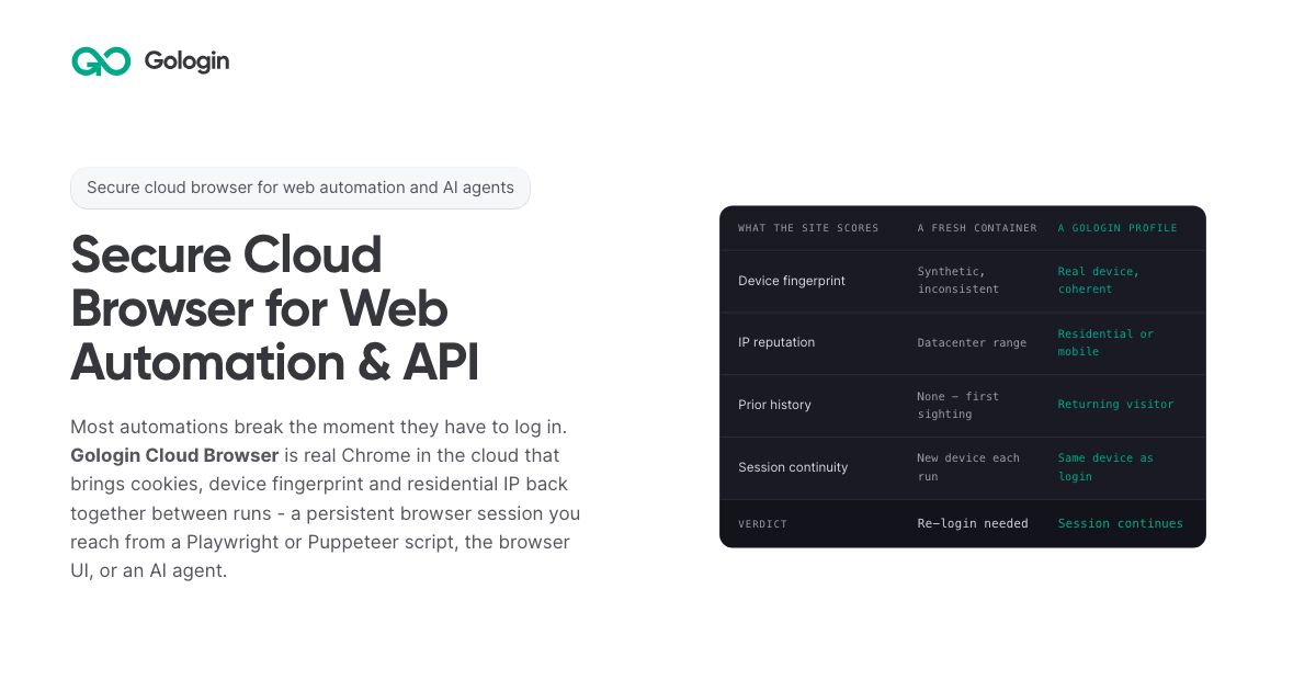
Gologin Cloud Browser delivers real Chromium browsers running in the cloud for AI agents, scrapers and web automation. Instead of launching a fresh browser on every run, developers connect to a persistent browser session that keeps its cookies, device fingerprint and IP address between runs. The browser can be driven from a Playwright or Puppeteer script over a WebSocket connection, from the browser UI by hand, or by an AI agent. It is aimed at developers and teams building scrapers, agents, internal tools and recurring workflows that need to stay signed in to real websites. The product is part of the wider Gologin stack, alongside Web Unlocker, Gologin Browser, Cloud Android, Gologin Proxies and the MCP server. The product addresses a specific failure mode: most automations break the moment they have to log in. According to the site, getting behind a login once is easy, but still being there next month is the hard part. Cookies do not keep a session alive on their own, because sites tie a session to the cookie, the device and the network it came from. A browser container that did not exist three seconds ago has no history, so every run starts as a first visit. Restoring only the cookies means the session arrives on a device the site has never seen, and the site responds by asking for a new login, a code or a check. The page's comparison illustrates this: a fresh container shows a synthetic and inconsistent device fingerprint, a datacenter IP range, no prior history, a new device on each run, and a verdict of re-login needed. Gologin Cloud Browser solves that by reconstructing three things together. The first is the session state: cookies, local storage and everything else the site saved in the browser. The second is the same device: the canvas, WebGL, audio and hardware profile that was present at login. The third is the same network: the residential or mobile IP the account signed in from. Combined, these three make the browser look like a returning user rather than a first-time visitor. The page frames the principle simply: cookies don't keep you logged in, identity does. A Gologin profile brings back all three components, and the FAQ notes that a session stays logged in as long as the site's own login lasts, because what ends a login is the site expiring it, not the platform. Connecting an existing script takes one line. Developers sign up with Google, copy an API key from the dashboard, and create a profile either with one click in the dashboard or with one API call; the profile keeps the device, the IP and the login. Then they install the library (npm install playwright-core, npm install puppeteer-core, or pip install playwright) and replace the script's launch() call with a connect line pointing at wss://cloudbrowser.gologin.com/connect?token=...&profile=.... The page shows complete, working Playwright, Puppeteer and Python Playwright examples that scrape quotes.toscrape.com, using chromium.connectOverCDP or puppeteer.connect with a browser WebSocket endpoint. According to the site, every line below the connect call stays exactly as it was, so selectors, assertions, waits and CI configuration are unchanged and the browser simply runs in the cloud. The browser comes with built-in stealth and anti-bot protection, and it runs on residential and mobile IPs from Gologin Proxies, which can be added to a profile in one API call, or on the user's own proxy. Profiles are isolated from one another: each has its own cookies, its own fingerprint and its own IP, and nothing is shared between them, so a problem in one profile does not reach the others. On the security side, the site states that pages load on Gologin's servers rather than the user's machine, so the target site never reaches the user's device or home IP. The cloud infrastructure is described as fully serverless and able to scale to thousands of browsers, and the company behind it cites seven years of expertise, SOC 2 Type II compliance and a 99.9% SLA. Every session includes a Live View link. Users can open it to watch the script work in real time, or take over by hand to complete a two-factor authentication step or fill in a tricky form, then hand the session back to the script. This matters for the failure case too: if a run fails halfway through, the profile keeps what the run built, meaning the cookies, the device and the IP, so starting the next run in the same profile picks up signed in rather than from the login page, and Live View can show where it stopped. The comparison table also states that no limit applies to session length on the first paid plan, versus 6 hours on Browserbase, 4 hours on Browser Use and 15 minutes on Steel as listed on the page. For AI agents, a Gologin MCP server gives Claude direct control of profiles, proxies and cloud sessions. Users install it with a single command (claude mcp add gologin -e API_TOKEN=... -- npx gologin-mcp) and then describe the job in natural language. The page's example prompt asks for three profiles on US residential IPs and a script that logs into each seller account and pulls last month's invoices; the server creates the three profiles with one US residential IP each, writes invoices.py against the Cloud Browser API, and saves the profiles so the next run starts already logged in. The site describes this as describing the job and letting the tool set up the accounts and write the automation, and it links to a dedicated Browser for AI agents page and a dedicated MCP server page. Pricing is built around browser hours rather than requests. The free tier requires no card and provides 3 runs of up to 15 minutes each on 1 parallel session. Professional costs $4.50 per month for individual developers with 50 browser hours, 1 parallel session, unlimited runs and $0.09 per extra hour. Business costs $8 per month with 100 browser hours, 2 parallel sessions and $0.08 per extra hour. Enterprise costs $14 per month with 200 browser hours, 3 parallel sessions and $0.07 per extra hour. Custom plans start from 4 parallel sessions and include a dedicated account manager, a premium SLA and tailored onboarding. Additional parallel sessions cost $2 per month each on any plan, and proxy traffic beyond the allowance is $1/GB. The site emphasizes that there are no per-request fees, so a retry does not cost twice, and compares its $1/GB residential traffic with published rates of $5/GB for Browser Use, $6/GB for Steel, $8/GB for Anchor and $10/GB for Browserbase. The page maps six use cases. Playwright and Puppeteer users connect over CDP with one line and keep the same selectors, tests and CI while the browser runs in the cloud. Dynamic web scraping handles feeds, load-more buttons and JavaScript-built pages, loading them the way a person's browser would. Web automation that stays logged in targets portals and dashboards that are signed into once and then run on a schedule. AI agents get their own fingerprint, cookies and IP per profile so they can do real work. The Cloud Browser UI covers live sessions where a person watches automation and steps in for 2FA. A scraping browser gives Puppeteer or Playwright real Chromium with its own device fingerprint and a residential IP. The site distinguishes this from Web Unlocker, which is recommended for public pages without a session and bills only on success. The product is positioned for developers, growing teams and organizations running critical operations, as reflected in the Professional, Business, Enterprise and Custom plan tiers. It fits into a broader Gologin ecosystem of one account, one proxy network and one ecosystem: Cloud Browser for sessions that stay logged in, Web Unlocker for sending a URL and getting the rendered page, Gologin Browser for isolated desktop profiles driven by hand, Cloud Android for platforms that only trust a phone, Gologin Proxies for residential, mobile, datacenter and ISP IPs, and MCP and AI Skills for describing a job to Claude and getting a working tool. Support resources include API documentation, a getting started guide and dedicated pages for Playwright and Puppeteer, dynamic scraping, web automation, AI agents, the Cloud Browser UI and the scraping browser. The core promise is simple and repeated throughout the page: log in once, stay logged in. By keeping session state, device fingerprint and residential or mobile IP together across runs, Gologin Cloud Browser lets scrapers, agents, internal tools and daily workflows behave like returning users instead of new visitors, while a one-line connection keeps existing Playwright and Puppeteer code intact. Free to start with no card and residential IPs included, it gives developers a serverless, stealth-capable browser fleet that can scale from a single test run to thousands of browsers.

Radar is an open-source Kubernetes UI and MCP server that lets the AI agent a team already uses investigate broken workloads. From Radar, a user clicks Investigate on an issue, and Radar runs Claude Code, Codex, Cursor or OpenCode read-only on the user's machine; it then lays out the findings, the evidence and a fix the user can approve. The same investigation can be started from an MCP client, and Radar Cloud runs the same setup when an alert fires. Its main purpose is to give an existing agent the cluster context it needs to find the root cause of a Kubernetes failure. The result is a root cause view that combines an agent's reasoning with cluster data the user can inspect. The product addresses a specific gap: an agent knows Kubernetes, but it does not know your cluster. A generic chat can return an answer one line at a time without showing the changes, topology, logs and ownership relationships behind it. Radar is built to supply that context before and during an investigation, so the agent starts from a cluster model that is already joined, time-indexed and checked for failures. This matters because an investigation is only as good as the cluster context the agent reads, and Radar aims to make that context available without asking a user to paste prompts or assemble evidence manually. Radar's Issues list ranks what is broken across the cluster, and an Investigate button sits on every issue. There is no prompt to write and no context to paste. Past runs stay under Investigations, each with its own link, and the UI investigations are read-only because write tools are not loaded. After an investigation, the answer arrives with its evidence: the log lines, events, metric charts and resources the agent relied on, drawn by Radar from what it recorded. One click opens the real object, and Radar states how sure the finding is as Established, Likely or Still open. A follow-up question continues the same investigation from where it stopped, and an approved fix is checked to see whether it worked. This arrangement keeps the history of an investigation attached to the issue it concerns and makes the result easy to share or revisit. The open-source path lets an agent work over MCP. Claude Code, Codex, Cursor, GitHub Copilot, OpenCode or any MCP client can ask Radar from a terminal or IDE, and Radar's MCP server returns resources with their relationships and recent changes. The second path runs an agent CLI from Radar itself: clicking Investigate on anything broken runs Claude Code, Codex, Cursor or OpenCode read-only on the machine and lays out the findings, evidence and a fix to approve. Radar detects which supported agents are on the PATH. The third path is Radar Cloud, which brings its own agent: it runs automatically when an alert fires or on demand, sends the root cause with the alert, evidence included, to Slack or a webhook, and requires nothing to be installed on anyone's laptop. The speed comes from the cluster model the agent starts with. Radar's Issues engine ranks failures before anyone asks, and in the benchmark it was the agent's first call on all 50 faults. Spec changes and events sit on a timeline, so the question of what changed before something broke is one call. Resources come back joined: owners, topology and error-filtered logs are correlated and secret-redacted in one response, so the agent begins with connections already made. Radar keeps, for every cluster, the resources joined into a graph, every change on a timeline and detectors that connect a symptom to its likely cause. The topology graph lays out every resource and connection using ELK.js and updates via SSE, and the same app includes Helm and GitOps context for checking an answer. Because those pieces are already assembled, the agent does not spend its early calls reconstructing ownership or collecting logs; it can move into diagnosis. Radar also adds guardrails around investigations. In Radar's UI and Radar Cloud, investigations are read-only: write tools are not loaded. Over MCP, the agent's write access is the user's choice within their RBAC. An approved fix runs alone in its own session, and changes to resources managed by Argo CD, Flux or Helm ask for explicit acknowledgment because the next sync or Helm upgrade would revert them. This separation keeps an investigation from turning into an uncontrolled change to the cluster, and it gives the user a clear point to review before anything is applied. With Radar OSS, investigations run on the user's machine and use the user's own model account; what the agent reads goes to the user's model provider, not to Radar. In Radar Cloud, each investigation runs as a sandboxed job with read-only access, and an owner accepts that once for the organization. The product is backed by benchmarks on live faults. In a benchmark of 50 live Kubernetes faults across six AI SRE tools, Claude Code on Radar's tools was the most accurate of the six, clearly ahead of HolmesGPT, OpenSRE, kagent and AWS DevOps Agent and slightly ahead of kubectl-ai. It answered in an average of 79 seconds at $0.27 a fault, the fastest and cheapest of the six, and Radar was 1.6–3.6× faster and 30–85% cheaper than the AI SRE tools tested. On faults that announce themselves, all six products scored between 24 and 27 of 28; on the 14 faults where every pod reports Ready, Radar scored 12. These results support the claim that an existing agent with Radar's context can outperform dedicated AI SRE tools. The benchmark page provides downloadable results, and Radar links to separate benchmarks for Kubernetes MCP servers and MCP versus kubectl. Concrete workflows follow from these capabilities. A user can investigate a Pod in CrashLoopBackOff and see that a ConfigMap lost DB_URL a minute before the crash loop. For a Deployment whose pods cannot be scheduled, the agent can check resources and changes, establish that the pods target a Karpenter node pool that no longer exists, and show the Deployment as the cause with next steps. When an alert fires, Radar Cloud investigates it and posts the finding to Slack or a webhook. Developers can also run investigations from Claude Code, Codex, Cursor or another MCP client in the terminal or IDE, then review the timeline, topology, logs, Helm history and GitOps state to verify the agent's story. Evidence cards are tagged and linked to the objects they describe, so the user can move from a claim to the underlying resource. Radar is distributed as an open-source, single binary under Apache 2.0 with no account for local use, and it can be run on a laptop or in a cluster. Installation options include Homebrew, a desktop app, in-cluster use, Krew, Scoop, .rpm and direct download. The quick install command shown is curl -fsSL https://get.radarhq.io | sh && kubectl radar. Radar Cloud is available free for three clusters, and its pricing page is linked for further plans. The product connects to agents including Claude Code, Codex, Cursor, GitHub Copilot, OpenCode and Google Antigravity over MCP; from Radar's UI it supports Claude Code, Codex, Cursor and OpenCode, while Radar Cloud brings its own agent. The same binary also includes Issues and root cause, Applications view, GitOps for Argo and Flux, and a live topology graph. Radar's primary value is that it turns an existing AI agent into a Kubernetes investigator by giving it a prepared cluster model, evidence and read-only safety instead of asking teams to buy a separate AI SRE. It supports investigation from an MCP client, from Radar's UI with a local agent CLI, or automatically through Radar Cloud, and it keeps the cluster context around the answer so users can check the root cause themselves.
Notch Metrics is a native macOS app that puts your revenue, MRR and subscriber numbers into the MacBook notch. Instead of opening a billing dashboard or a spreadsheet, you look up at the camera housing and the figure is already there: the notch expands over whatever you are doing, shows the widgets you have arranged, and folds back when you leave. The product is built for people who run or build a software business and want the handful of numbers they check most often to sit permanently at the top of their screen: builders, founders and marketing teams who watch revenue, subscriptions and traffic through the day. Its stated purpose is simple: every number you check, in the notch. The problem it addresses is the distance between a question and an answer. Payment providers and analytics platforms each ship their own dashboard, so the numbers a founder checks most often sit behind separate logins and separate pages, and reaching them means leaving whatever you are doing. Notch Metrics takes the opposite approach and moves the figure to the one place on a MacBook that is always in view and never in the way. The site frames the payoff directly: you see who just paid without opening a dashboard, and you look up rather than navigating away. Because the notch is a physical part of the display that cannot be hidden behind another window, the number stays visible while you work in Finder, an editor, or anything else. The headline capability is every number at once. Revenue, subscriber counts and today's takings sit side by side in the expanded notch, and the app states that nine widgets can be open at a glance while the island still reads in a second. Each widget carries its own comparison: MRR shown with a +4.2% delta against last month, seven-day revenue with +11% against last week, active subscriptions with a week-over-week count. A glance therefore tells you not just the figure but the direction it is heading. Notch Metrics also shows lists, not only numbers: a recent-payments feed sits beside the headline figures, listing entries such as a Pro yearly plan or a Pro monthly plan, so the underlying events are visible alongside the totals. Widgets are arranged inside the notch itself. There are four tile sizes, from a single square up to the full width, and you drag to arrange them and resize them in place in the notch. The notch opens on hover: rest the pointer on the camera housing and it expands over whatever you are doing, and when you leave it folds back to the shape it had. Because the interaction is hover-driven, checking a number costs a fraction of a second. The app is described as quiet by default: a small native app written in Swift, with no dock icon, no window and no menu bar clutter while you work, and light on memory and on battery. Notch Metrics lists sixteen sources live. On the payments side that includes Stripe, Polar, Paddle, Dodo Payments, Lemon Squeezy, Shopify and RevenueCat; on the analytics and product side, Plausible, Google Analytics, Google Search Console, PostHog, Mixpanel and Amplitude; and alongside them GitHub, YouTube, OpenAI and Claude. Each source reports what makes sense for it: Stripe reports MRR and subscribers, Polar reports today's takings, Dodo Payments reports seven-day revenue and orders, RevenueCat reports trials and active subscriptions, GitHub reports stars and open issues. Payments, analytics and code therefore sit side by side on the same strip of glass. Connectors marked as on the way arrive without an app update, and you connect a source once on the web and every Mac you own picks it up. Provider keys are handled with unusual care for a Mac utility. A key is encrypted the moment you paste it, with a key of its own, and it stays on the server where no app on your Mac can read it. Your account, the integration and the provider are bound into the encryption, so a row copied anywhere else decrypts to nothing, and removing an integration deletes its encrypted key with it, leaving no second copy to clean up. Every plan also includes custom metrics authored by your own coding agent over MCP, which is the approach behind the product's Product Hunt tagline about using Claude Code to build analytics widgets for your notch. Under the hood the model is deliberately thin on the client. Notch Metrics' servers fetch and normalise each metric on a schedule and hand your Mac a number; the Mac receives a figure rather than a credential. That is why a subscription is per account rather than per machine: sign in on another Mac and your connections and layout are already there, with your widget arrangement synced between them. It is also why new connectors can appear without an app update, because the fetching work happens server-side. The macOS app itself is a small native Swift binary for Apple silicon, version 0.4.2, requiring macOS 14 or later, with signed and notarised updates for as long as you subscribe. The benefit the product claims is attention. The numbers you check most often are already on screen, so the check costs a glance instead of a context switch, and nothing has to be opened, closed or rearranged afterwards. Because the notch is quiet by default with no dock icon, no window and no menu bar clutter, the app adds visibility without adding desktop clutter, which is what makes it practical to leave running all day. Side-by-side placement means a founder can read revenue next to GitHub activity or traffic without reconciling two browser tabs, and the deltas attached to each widget turn a raw figure into a trend you can act on. Signing in on a second Mac restores the same connections and layout, so the view follows you between machines. The site names its audiences directly as builders, founders and marketing. A founder can keep MRR, subscriber count and a recent-payments feed in the notch and see the direction of the business each time they look up. An indie developer selling through several providers can place Stripe, Polar, Paddle, Dodo Payments and Lemon Squeezy widgets next to each other instead of visiting five dashboards. A builder can watch GitHub stars and open issues beside revenue. A marketer can keep Plausible, Google Analytics, PostHog or Google Search Console in the same strip as the money numbers. Teams that want a figure nobody ships can author a custom metric with their own coding agent over MCP. Notch Metrics is a paid macOS app with no free tier; the trial exists because each metric is fetched and normalised by the company's servers on a schedule, which costs money per account. The seven-day trial requires no card, and when it ends widgets stop updating but nothing is deleted. Monthly is $9 per month, cancel whenever; yearly is listed at $108 reduced to $49 per year, which works out at $4.08 a month billed once. Every plan includes every connector with no per-integration charge, as many widgets as fit in the notch and in list view, custom metrics over MCP, every Mac you sign in to with layout synced, and signed notarised updates while subscribed. Prices are in USD, tax may apply, and checkout and subscriptions run through Dodo Payments. It requires Apple silicon and macOS 14 or later. Notch Metrics makes a narrow promise and keeps it: put the numbers you check constantly in the one place you always look. By combining sixteen live sources, comparison deltas, payment lists, resizable widgets and hover-to-open behaviour in a quiet native Swift app with server-side encrypted keys, it turns a glance into a status check rather than a dashboard visit.

Genie 4 is Google DeepMind's most realistic and interactive world model yet, described by the team as a new generation of world simulation. Rather than producing a finished video clip, it builds a world that you can walk through with your keyboard and steer with text while it runs. Text and image prompts generate photorealistic environments, and natural language lets you change those environments live: describe landscapes and events, move the camera, add new characters, or change the weather, then see what happens next. It is positioned for creators, game developers, and AI researchers who want to explore what interactive generated worlds can do, and it is currently offered as a research preview with an open waitlist. Genie 4 addresses a gap that becomes obvious once you compare it with ordinary video generation. A video generator hands you a finished clip: you write a prompt, you wait, and you receive a fixed piece of footage that plays the same way every time. Genie 4 instead builds a world you walk through and steer as it runs, which turns generation into something you can explore and revise rather than something you simply watch. Keeping such a world believable while it is being changed is the hard part. Appearance and behavior have to stay anchored in reality, and the simulation has to hold together from one moment to the next as prompts arrive. Genie 4 is presented as a response to both of those challenges, combining realism with the coherence and continuity a live, interactive world demands. The headline capability is shaping worlds in real time with natural language. You create and change worlds live by describing them: landscapes and events, camera moves, new characters, or a change in the weather. Each instruction is applied while the world is running, so the result is visible immediately as the scene continues to unfold around you. Because the interaction is conversational rather than a one-shot prompt field, you can iterate in the moment: set something in motion, watch how it plays out, then adjust it again. The page pairs this live control with keyboard-driven navigation, so you can move through the generated world yourself instead of only watching a rendered clip. For anyone used to waiting on a batch render, the shift is significant: direction happens continuously, while the simulation is alive and responding. Genie 4 also generates realistic interactive environments rather than static backdrops. In the worlds it produces, objects collide, water flows, and trees sway in the wind. Generated characters do not merely appear; they move and behave naturally within the scene. Those behaviors are what make a world feel inhabitable rather than painted. When you add a character or set an event in motion, the environment responds in ways that read as physical: things bump into each other, liquid moves as liquid, foliage reacts to air. This is the difference between a world you can look at and a world you can test, poke, and move through. It is also what makes the output useful for anyone trying to understand how a scene will behave, not just how it will look in a single frame. Beyond the visuals, Genie 4 generates native audio and live dialogue, so the worlds it builds carry sound as well as imagery, and characters can speak within the simulation as it runs. The model incorporates and builds on capabilities from the Gemini family. Gemini Omni anchors simulations in real-world appearance and behavior, which is how the worlds stay grounded in believable materials and motion. Other Gemini models provide the complex reasoning needed to help maintain a simulation's coherence and continuity over time. That division of labor matters for an interactive world: realism and consistency are separate problems, and both have to be solved simultaneously while a user is actively changing the scene. Bringing native audio and live dialogue into the same system extends that coherence past the visual layer and into how a world sounds and how its characters communicate. Taken together, the workflow Genie 4 describes is simple on the surface and technically demanding underneath. You start from a text prompt or an image prompt, and the model generates a photorealistic world. You then walk through that world with your keyboard while issuing natural-language instructions that reshape it live. Behind the scenes, Gemini models work to keep the simulation grounded and continuous. The page shows this loop in action across a wide range of prompts, and it also links to supporting material through sections on capabilities, future applications, limitations, and responsibility, along with a blog post announcing the model. The emphasis throughout is on interaction as the core of the experience: the world is not delivered to you, it runs with you. The benefits follow directly from that design. Creators get a way to explore an idea spatially, walking through a concept instead of describing it and waiting for a clip. Game developers can see environments in motion, with collisions, flowing water, swaying foliage, and characters behaving naturally, which is closer to how a playable space actually feels. AI researchers get a research preview of a world model they can interrogate interactively, changing conditions on the fly and observing what the simulation does next. Because the model handles realism through Gemini Omni and continuity through other Gemini models, users can focus on direction and observation rather than on manually reconciling a scene that keeps drifting. The result is a faster loop between an idea and a world you can stand inside. The prompts shown on the page illustrate the range of scenarios the model is demonstrated with. A crowned crane walks across snow beneath a clear dusk gradient sky in a natural, documentary style. A fully three-dimensional stained-glass landscape is generated as an explorable crystal world with translucent colored glass, dark lead outlines, and volumetric depth. A first-person, documentary-style skier speeds down an alpine course with motion blur, snow spray, and a subtle game-inspired interface layer. A top-down aerial view frames a still wooden rowboat on a dark pond ringed with lily pads and pink water lilies. Live-action-style footage follows an extravagantly dressed man backstage at an eccentric musical theatre. Other examples include a sunlit meadow with a stream of pink satin fabric winding through it, a watermelon on a stone plinth in slow motion, a first-person hot air balloon view over Antarctica, and underwater wildlife photography of pink axolotls in a clear freshwater river. Across these examples, the same pattern holds: rich environments, natural motion, and the ability to keep exploring. Genie 4 is built for creators, game developers, and AI researchers. Its technical foundation is the Gemini family, including Gemini Omni for grounding simulations in real-world appearance and behavior and other Gemini models for the reasoning that maintains coherence and continuity. Access is currently framed as a research preview, and the page invites visitors to join a waitlist. The site's navigation also flags dedicated sections on future applications, limitations, and responsibility, signaling that the model is being introduced with an explicit account of what it can and cannot yet do. No pricing or plan details are stated in the provided content, and the model is presented primarily as an interactive research release rather than a packaged commercial product. The takeaway is that Genie 4 reframes what a generative world model is for. Instead of handing you a finished clip, it hands you a living world you can walk through, steer with text, and change as it runs, complete with physics, natural character behavior, native audio, and live dialogue, all held together by Gemini. For creators, game developers, and researchers, that means exploration replaces waiting, and a prompt becomes something you can step into and reshape in real time.

Savor is an Intention Layer™ — a calm app for thoughts and reminders, available free on iPhone and Android. It is built for the things that come up while life is already happening: a school flyer handed over on the way out the door, a bill with a due date, a restaurant someone mentioned, a text you meant to answer, or an idea you want to write down before it slips. Users capture something by speaking it, typing it, or snapping a photo, and Savor shapes it into a clear Savor Card describing what it is, when it matters, and what to do next. Cards live in three lanes — Now, Soon and Later — so what matters surfaces when it matters, and a timed notification or a daily reminder brings it back at the right moment. Most productivity tools are organised around output: streaks to maintain, dashboards to check, overdue counters, badges and scores. Savor's own comparison sets "most apps" — with their 27-day streaks, "5 tasks overdue" warnings and weekly productivity percentages — against its own approach: no streaks, no shame, no endless dashboards, no pressure. The problem it names is weight: some of the things people carry are big and some are small, but carrying all of them can be overwhelming. Rather than asking people to convert every passing thought into a task before they are ready, Savor gives each item a quiet place to land — clear enough to find again, gentle enough to leave alone until it matters — plus assistance moving it forward toward follow-through. Capture is deliberately low-friction. People can speak an item, type it, or scan a bill, letter or flyer with the camera. Photo capture is aimed specifically at paperwork: Savor reads the photo and creates a card from it, and the user can correct anything it missed. On iPhone, capture also works through Siri — saying "Add buy milk to Savor" creates the card without opening the app, and the card is there the next time Savor is opened. After capture, Savor understands and shapes the input into a Savor Card: the clear, plain-language version of what was captured, covering what it is, when it matters and what to do next. Any card can be edited, moved between lanes, or let go. Cards live in three lanes. By default Now holds today or overdue items, Soon holds the next two days, and Later holds everything after that — so "call the dentist tomorrow" lands in Soon while "buy milk" lands in Now. A card can be dragged to another lane or moved from the card itself, and what each lane means can be changed in Settings. Reminders are fully controlled by the user: Savor sends one notification at the time set on any timed card, plus a daily reminder to check Savor at 9:00 AM until it is changed or turned off. On a card with a date but no time, turning on Reminder brings it that day at the time shown beside it, or another time can be picked there. Settings holds the master switch, the daily reminder and quiet hours. Savor also supports moving an intention forward with other people. To delegate, the user opens a card and chooses "Hand this card to someone", or "Hand this piece to someone" on a subcard. The other person needs Savor and chooses Take it or Not now; once they take it, only they can change it and they receive its reminders, while the original owner sees a read-only copy with Take it back and can talk in the card's chat. Cards can be handed back and forth, and either person can resolve them. Take Action (Beta) helps explore options, build a plan or list, and draft words to use, with the user reviewing and adjusting the output. From a card, an item can also be added to the calendar so a date lives in both places. Savor's distinctive approach is the Intention Layer itself. Where a task manager tracks what needs to be done, an Intention Layer holds what a person means to do until it is ready to become a task. An intention can arrive as a partial thought — a question, a possibility, something the user is not ready to decide — and it keeps its thread as the user adds to it or changes direction. The loop is capture, shape, resurface: capture it now, shape it clearly, resurface it later, at which point the user can act, defer, delegate, finish or let it go. There is no public profile, feed, follower count, ranking or streak, and cards are private unless deliberately shared. The stated aim is to be used just enough — capture what matters, trust that it is held, and return to life. The intended outcome is less mental clutter and more space to live. Instead of holding dozens of small obligations in working memory, users hand them to a calm place and trust they are held until they become useful. Because lanes and reminders decide when something returns, people do not need to keep checking a system; because there are no streaks, badges or "don't break it now" messages, there is nothing to fall behind on. Delegation converts a private worry into a shared commitment with clear ownership, and the in-card chat keeps the context with the handoff rather than in a separate message thread. Adding a card to the calendar keeps a date visible in both places. Concrete scenarios described in the content: a school form or flyer that arrives during the workday — keep the original accessible, capture the next step, choose a reminder, and agree who owns the follow-up by handing the card on. A statement or bill can be photographed so the amount and due date are read and captured, with a reminder set for when it matters. A recommendation like a ramen place someone mentioned can be typed or spoken and parked in Later until it becomes relevant. Siri capture covers the moment of walking out the door. Take Action can help work through an unclear intention, build a list, or draft the words for a message, and handing a single step to someone turns a larger intention into shared progress. Savor is for people 13 and older, and teenagers get the same calm place to capture what is on their mind, with age-aware guardrails enforced around it. On a fresh install the app uses an Apple or Google Play age range where the store says a check is required; it never asks for a birth date or its own age question, and a store-reported under-13 range is blocked. When the store supplies a 13–17 range, model-written Take Action answers stay hidden until an output-safety check clears them, and answers that are flagged — or where the check cannot run — are withheld. Savor is free on iOS and Android while monetization is paused: no paid plan or upgrade is required, and product-limit counters do not block use or trigger an upgrade during the pause, though fair-use and service safeguards still apply. The privacy statements in the content are specific. Private cards, reminders, voice and photos are not sold or shared for advertising and are not used to train general-purpose AI models; voice and scans are turned into text only when the user chooses to capture, and product analytics contain no capture content. Take Action involves Anthropic's Claude Sonnet 5.5 for parts of the conversation and OpenAI's GPT-5.6 Luna for public-information research, with OpenAI's separate moderation service checking Take Action input for every account and, for a known teen account, checking the finished answer before it is shown. Limited advertising measurement is described separately in the full privacy policy at savorapp.ai/privacy. Savor's value proposition is stated plainly on its own site: less mental clutter, more space to live. It is not a traditional, list-first task manager. It is an Intention Layer that captures by voice, photo or text, shapes each item into a clear card, holds it in Now, Soon or Later, resurfaces it with reminders, and lets a card be handed to someone you trust — all without streaks, dashboards or pressure.
Nuvio is AI-native finance software for founders and small business owners, described on its homepage as your invoicing, expenses, books and taxes taken care of. It pairs an AI-driven workspace with accounting services: the software automates invoicing, receipt and invoice scanning, expense categorisation and bank reconciliation, while an accountant who already knows Nuvio looks after bookkeeping, year-end accounting and tax filings included in the plan. The product is positioned as one platform for finance and accounting rather than a tool you have to coordinate with a separate accountant. Nuvio states it is trusted by 1,200+ founders and small business owners and reports 60% less financial admin time on average. Users can start for free with no card needed for 14 days. The product is built around a specific problem: you started a business, not a second job managing its finances. Nuvio illustrates a founder's day broken up by finance admin interruptions, such as finding a receipt, exporting transactions or waiting for an answer, and notes that each task looks small but together they keep pulling the owner away from the business. A second coordination problem is described too: normally you have to find financial software, then find an accountant, then persuade them to work together. Nuvio aims to remove both kinds of friction by connecting the daily work, the answers and the accounting support in one place, so there is less for the owner to coordinate personally. Nuvio handles the recurring document work. You create and send invoices and track what is outstanding, and Nuvio follows up on overdue payments automatically. The site walks through an example invoice to Kestrel Labs: sent on Oct 3, past due with an alert on Oct 17, a follow-up sent by Nuvio on Oct 20, a second follow-up on Oct 27, and payment received on Oct 29. That means the owner does not have to keep every unpaid invoice in their head. On the expense side, Nuvio scans invoices and receipts and extracts the details, filling in fields such as supplier, invoice date, total amount, tax and tag, which the interface labels as AI-filled. Users review the records instead of typing them in from scratch, and expenses are categorised automatically. AI-powered reconciliation matches bank transactions with invoices and expenses, helping keep records reconciled without checking every line by hand. Nuvio shows this as a matching view in which bank transactions, including a Stripe payout, invoices from Kestrel Labs and Harbor & Pine, and an AWS expense, are paired against the corresponding invoices and expenses until all four transactions are reconciled. From there the workspace gives a running picture of the money: paid this month, outstanding, and the forecast low point, shown in the site example as $38,420 paid, $21,450 outstanding and a January forecast low of $31,200. The stated goal is that you can see what is paid, what is outstanding and where your cash is heading without assembling the picture yourself. Nuvio includes an AI finance assistant that answers questions in the user's own words rather than requiring report-building. The homepage suggests prompts such as which invoices are still unpaid, how expenses changed this month, and a request to show the cash flow forecast. In the example answer, the assistant lists four unpaid invoices totalling $21,450 with one overdue, breaks expenses down by category such as contractors, software and travel while comparing them month over month, and projects net flow and cash balance for the next four months. The same assistant can work with the user's own AI agents, so supported financial questions and tasks can be carried out from tools the user already uses; the page names ChatGPT, Claude, Grok Bot and Hermes. Accounting is included rather than sourced separately. Nuvio matches each customer with an accountant who already works in the platform, and the accountant takes care of bookkeeping, year-end accounting and tax filings as specified in the plan. Records reach the accountant's workflow directly, including invoices, categorised receipts, matched bank transactions and expenses, with no exports and no email threads. Setup follows three steps outlined on the site: connect bank accounts and bring in invoices, expenses and transactions in one sitting, with the example showing business checking, savings and company card accounts connected and 1,284 transactions imported; meet the matched accountant and confirm the accounting services included for your business; then get back to the business while Nuvio and the accountant handle the work. A weekly update summarises what was handled, such as receipts scanned, transactions reconciled, follow-ups sent and books kept up to date, and flags only what needs your decision, such as approving a tax return. The outcomes Nuvio emphasises are time and visibility. The site claims 60% less financial admin time on average and describes founders who stopped guessing and started seeing: analyses that used to take hours now take seconds, cash flow, income and expenses are viewable on a single page, financial data is visualised for readability, and users can filter and review income and expenses to take proactive action. Customers quoted include business owners, a general manager, a physiotherapist and an entrepreneur, and the page reports a 5.0 out of 5 rating from six customer reviews. The division of labour is stated plainly in three lines: the AI handles the daily busywork, the accountant handles the books and filings, and the owner stays in control. Typical use cases described on the site include sending an invoice and letting Nuvio chase it with escalating follow-ups until payment arrives; scanning or importing a supplier receipt so the supplier, date, total, tax and category are captured as an expense; letting the AI match a Stripe payout against several invoices and an AWS charge so the bank feed stays reconciled; asking in plain language which invoices are unpaid and how expenses changed month over month; checking a cash flow forecast before making a decision; and approving a prepared tax return or closing the books with the matched accountant. The product also suits owners who prefer to work from an AI agent rather than a dashboard. Nuvio is aimed at founders, owners and small business teams; the site cites 1,200+ founders and small business owners and quotes owners, general managers and practitioners at small companies. Its stated connections include bank accounts and cards for transaction import, plus AI agents such as ChatGPT, Claude, Grok Bot and Hermes. Pricing is subscription-based with accounting bundled in: users start for free with no card needed for 14 days, and the plan specifies the year-end services and tax filings included for the customer's country and business type, with that scope confirmed before subscribing. A 15-minute demo is also offered. In short, Nuvio positions itself as one place where daily financial admin is automated, financial questions get answered immediately, and the accounting and tax work is already covered by an accountant who knows the platform, so a founder can spend less time on the books and more on the business.
The Arcade Controller Pro is a compact all-button arcade controller from 8BitDo, described by the company as built for serious fighters with full control for every match. It is an all-button fight controller with no stick, designed for competitive fighting games, and it combines on-device settings, deep customization, and long-session comfort. The unit pairs a compact button layout with a 1.47-inch built-in display, five programmable buttons, hot-swappable mechanical switches, RGB lighting, and a magnetic wrist rest. It works with Switch, Switch 2 and Windows, over 2.4G wireless, Bluetooth, or a wired USB-C connection, and it is available to pre-order on Amazon in the US and on the 8BitDo eShop worldwide. 8BitDo positions it as hardware for players who want every input within natural reach and full control over how the controller behaves during a match. The Arcade Controller Pro is explicitly built for competitive fighting games. 8BitDo states that it is the presenting sponsor of Street Fighter League Americas and Street Fighter League EMEAA 2026, and the company says it proudly supports the community that brings every match to life. The design responds to the realities of that environment: matches are decided by fast inputs and sudden movements, play sessions can run long, and cabling has to survive high-pressure play. Compared to the original 8BitDo Arcade Controller, the Pro features smaller buttons and tighter spacing, creating a more compact layout that keeps every input within natural reach and that the company describes as comfortable and easy to control through long play sessions. A metal locking mechanism keeps the USB-C cable firmly in place so it stays secure during fast inputs, sudden movements and high-pressure matches. The result is a controller shaped around the demands of competitive play rather than around a traditional joystick. The button system is the core of the product. Five programmable buttons, labeled P1 through P5, can be fast-mapped directly on the controller, and 8BitDo notes that the added P5 button expands control options while leaving more room for natural left-hand movement. Each of those buttons can be replaced with a flat lock cap to prevent accidental presses, and five lock caps are included and stored inside the magnetic wrist rest. Dynamic button labels instantly switch between Switch and PC button layouts, with illuminated labels that change to match. Improved round button caps can be installed from any orientation, which makes them quick to fit and easy to replace, and they are held firmly beneath the tempered glass faceplate. A dedicated capture button lets players take screenshots instantly on Switch. Settings and monitoring happen on the device itself. The 1.47-inch display works with built-in Ultimate Software so players can view inputs, check battery status, and adjust essential settings directly on the controller, described as clear, immediate, and always within reach. The display covers input monitoring, SOCD settings, button mapping and RGB lighting, so players can see every input in real time and change how the controller responds without leaving the hardware. An independent control panel keeps essential controls separated from the action buttons; with its turn-and-click dial, players can switch connection modes, adjust volume and display settings, or activate Tournament Lock. SOCD cleaning is also listed among the controller's special features, and SOCD modes can be switched as part of the customization options. The hardware is designed to be opened and reworked. The controller ships with hot-swappable 8BitDo Core Green low-profile linear mechanical switches, co-developed with Kailh for fast actuation, quiet operation and a smooth feel, and the hot-swappable PCBA means switches can be changed without soldering. Three spare switches and a switch puller are stored inside the controller. A quick-release tempered glass faceplate lifts when the release button on the back is pressed, giving access to the internal components with the additional switches. The magnetic wrist rest supports a more natural hand position on a desk or on a lap, attaches securely when needed, and removes easily for a more compact setup, while also housing the lock caps. Dual USB-C ports let players connect the cable from the top or the side for charging and wired play, choosing the route that fits their setup, reduces cable clutter and gives more space around their hands. Overall, the Arcade Controller Pro works as a self-contained control surface. On-device settings through the display and the independent control panel handle everyday adjustments, while 8BitDo Ultimate Software V2 goes deeper on a computer, letting players customize button mapping, create macros that assign a long sequence and action to a single button, switch between different modes of SOCD, and adjust lighting modes and RGB colors. Connectivity covers 2.4G wireless for Windows, Bluetooth for Switch, and wired play for Windows and Switch, and 8BitDo describes the wireless performance as low-latency for responsive, consistent play without the cable. The practical benefits follow from those choices. A tighter button layout keeps inputs within natural reach during long sessions, and the magnetic wrist rest supports a more natural hand position whether the controller sits on a desk or on a lap. Fast-mapping on the controller means button changes are made in the moment, while replaceable lock caps guard against accidental presses on buttons a player does not want to trigger. The cable lock system protects against disconnects during fast inputs and sudden movements, and dual USB-C ports let players route cabling away from their hands. Spare switches and a switch puller stored inside the controller mean replacements are on hand, and a 3000mAh rechargeable battery provides 15 hours of usage via Bluetooth or 2.4G wireless with RGB off, with a 4-hour charging time. Concrete usage scenarios match the way the controller is presented. It is aimed at competitive fighting game matches, where every input needs to be within reach and cabling has to stay locked in place. Long practice sessions are addressed by the compact layout, the wrist rest and the ability to lock unused buttons. Players who move between Switch and PC can rely on dynamic button labels that change to match the active layout, and a dedicated capture button handles screenshots on Switch. On a desk, the wrist rest and the choice of top or side USB-C routing keep the setup tidy; on a lap, the wrist rest can be removed for a more compact arrangement. Tournament play is covered by Tournament Lock on the independent control panel. Supported platforms are Switch (3.0.0 and above), Switch 2 (20.1.1 and above) and Windows 10 (1903) and above. Connectivity options are 2.4G wireless for Windows, Bluetooth for Switch, and wired for Windows and Switch. The controller measures 301 x 201 x 16 mm and weighs 1090g, and it uses a 3000mAh rechargeable Li-ion battery rated at 15 hours of usage via Bluetooth or 2.4G wireless with RGB off and 4 hours of charging time. In the box are the Arcade Controller Pro, a 2.4G adapter, the magnetic wrist rest, three additional switches, a switch puller, five lock caps for the programmable buttons, a cable and a manual. It is available in a new White Edition, described as a clean white finish ideal for a sleek and minimalist desk, and pre-orders are offered on Amazon in the US and on the 8BitDo eShop worldwide. Taken together, the Arcade Controller Pro is an all-button arcade controller built around competitive fighting games, combining a compact layout, on-device display and settings, programmable buttons with lock caps, hot-swappable switches, a quick-release tempered glass faceplate, a magnetic wrist rest and dual USB-C ports with a cable lock, so players can swap, configure and tailor their arcade experience.
N8N Chat UI is a no-code builder for designing and customizing AI chat widgets that connect to n8n workflows and can be embedded into any website. It is built for n8n users, agencies, SaaS teams, and businesses that want a chat experience matching their brand without writing HTML, CSS, or JavaScript. The site describes a simple flow: design a mobile-friendly chat experience with a live preview, connect it to any n8n workflow, and embed it anywhere with a simple copy-paste. The product positions itself as an upgrade to the default n8n chat widget, adding deep customization, streaming, voice, file uploads, flexible layouts, and a JavaScript API for advanced integrations. The product exists because, in the words of the site, n8n's chat widget "definitely gets the job done — but just barely." Three specific complaints are called out. First, the generic interface: the default chat UI looks very basic. Second, limited customization options: customization is described as extremely limited, making it difficult to match your brand. Third, technical expertise required: further modifications require knowledge of HTML, CSS, and JavaScript. That combination leaves teams with a chat experience that works technically but does not represent their brand and cannot be changed without engineering help. N8N Chat UI addresses each point directly by putting appearance, layout, and input options into a visual builder that requires no coding or CSS knowledge, while still exposing options like a JavaScript API for users who want to go further. The core of the product is easy customization with instant setup. A widget configuration area lets you design widgets with your own branding and see changes live as you make them, then add the result to any website with a simple copy-paste. No technical skills are needed. The chat bubble itself is adjustable: you can modify its size, position, colors, and custom icon, choose a border radius style (circle, rounded, or none), set a custom icon URL, custom icon size, custom icon border radius, color of internal icons, bubble size in pixels, right position, bottom position, and toggle options such as a draggable bubble and auto open bot window. The site also lists a bubble, tooltip, window, footer, and advanced set of customization areas in the builder, and states the widget is mobile-friendly by default and works with no coding or CSS knowledge required. Display is flexible. You choose how your widget appears — as a floating bubble or embedded directly in your page content — using either an in-page or a popup widget type. The site emphasizes that this fits perfectly with your site's layout, so the widget can be a persistent floating launcher or a component placed within the page body. The three-step flow begins with selecting a type (for example, popup), then customizing, connecting, and embedding. Responsive and modern design is a stated feature: the widget is described as looking and functioning great on any device — desktop, tablet, or phone — with a clean, modern, and always user-friendly design. Beyond appearance, the widget adds richer interaction options. File upload support lets users send files directly through the chat, with you controlling which types of files are allowed and setting limits on size and quantity. Voice chat lets users record and send audio messages directly from the chat widget, enabling a voice-driven chat experience. Real-time chat streaming can be added with zero configuration: enable it in n8n and your widgets automatically support streaming, so responses arrive progressively instead of appearing all at once. Functionally, the product sits between your n8n workflow and your website. You build the interface in the N8N Chat UI builder, connect it to any n8n workflow, and embed the generated widget into any website. A JavaScript API is available for advanced integrations beyond the copy-paste path. The site also introduces a newer capability: customization with natural language. By connecting Claude or any other AI tool to the product's MCP server, you can customize your widget using natural language instead of clicking through settings, with documentation linked for connecting to Claude Desktop. That gives two routes to the same outcome — a visual no-code builder and an AI-assisted configuration path. The stated benefits are practical. You get a widget that matches your brand perfectly without coding or CSS knowledge, mobile-friendly behavior by default, and changes visible immediately through live preview before you embed. Because setup is copy-paste, publishing a new look does not depend on a developer. The customer section summarizes consistent feedback as easy to use and customize, looks professional, saves time, and works everywhere — reflecting the combination of on-brand design, fast setup, and cross-device behavior. Typical scenarios follow from those capabilities. A business can place a branded assistant on its website that answers through its existing n8n workflow. A team that wants a persistent entry point can use a floating, draggable bubble that optionally opens the bot window automatically, while a team that wants the chat inside the page can embed it in page content. Support flows that need attachments can accept files through the chat with controlled types, sizes, and counts. Voice-first experiences can let visitors record audio messages instead of typing. Teams building chat for clients or products can wire up a JavaScript API for deeper integration, and users who prefer describing changes can adjust the widget through an MCP-connected AI tool like Claude. The target audience named on the site is n8n users, agencies, SaaS teams, and businesses, and the site reports that 2,803 users have already built their widgets. Pricing is presented as a freemium-style entry with credits: you can start designing your widget now with 100 free credits, and a promotional banner advertises a lifetime license at $59 (from $149) plus 2,500 free credits. The product is delivered as a web-based builder, and it interoperates with n8n workflows, Claude and other AI tools through the MCP server, and any website that can host an embed. Overall, N8N Chat UI is a focused layer on top of n8n: it keeps your existing workflow logic while replacing the plain default chat interface with a customizable, mobile-ready widget. Its value proposition is straightforward — design a beautiful, on-brand AI chat widget without code, connect it to n8n, and embed it anywhere, with voice, file uploads, streaming, and an API available when you need more.
WhoIsCooking is a Mac app that shows the temperature of your chip and tells you which AI agent is heating your Mac. It lives in your notch, or in the menu bar if you prefer, and displays the hottest chip sensor reading next to overall CPU and GPU load. Under that headline it lists the agents and apps that are currently working, each with a CPU percentage and a note about what that agent is doing, such as Claude Code running ffmpeg and python, Codex CLI running a cargo build, Cursor acting as editor and agent, or Chrome with fourteen tabs open. It is made for people who run AI coding agents and other heavy developer work on an Apple Silicon MacBook and want to know at a glance what is cooking the machine. The problem it addresses is a familiar one for anyone using agentic coding tools: Claude Code, Codex and Cursor start builds, tests and renders that turn a MacBook into a stove. When several agents run at once, the machine gets hot and starts throttling, and it becomes hard to tell which of the many running processes is actually responsible. The usual system view shows dozens of cryptic processes rather than the agent sessions a developer actually thinks in, so people either wait for the heat to pass, kill work they still need, or simply accept a slow and noisy machine. WhoIsCooking closes that gap by naming the agent behind the heat and offering a way to cool the Mac without stopping the work. The primary readout is a temperature. WhoIsCooking shows the hottest chip sensor, for example 92°C, together with CPU and GPU percentages and a status line indicating that the machine is hot and throttling. This answers the first question most people have when a MacBook gets warm or a fan spins up: how hot is it really, and is it being pushed hard? Because the figure comes from the chip sensors rather than an estimate, it reflects the machine's actual thermal state. From that same view, a single button invites you to cool down your Mac. Instead of listing processes, WhoIsCooking groups work by agent. An agent session and everything it started, including builds, tests, dev servers and renders, appears as a single line rather than eighty cryptic processes. Each row carries the CPU percentage the agent is consuming, a short description of what it is running, and a cool-down control. The app recognises Claude Code, Codex CLI, Gemini CLI, Cursor, Aider, Copilot CLI, Ollama and LM Studio, and it also covers Xcode builds, ffmpeg, Docker and your browser. That means the list maps onto how a developer actually works: one line per agent rather than a wall of unrelated subprocesses. Cooling is the core action. One click moves busy work onto the Mac's efficiency cores. The job keeps running, a little slower, and the Mac drops about fourteen degrees; the site illustrates the same render at 64°C before and 50°C after. Because the work is moved between cores rather than suspended, the agent continues to make progress. A Full speed control puts the power back instantly whenever you want the power back, and quitting the app always restores full speed. WhoIsCooking is explicit that cooling is not killing. Nothing gets frozen or closed unless you ask for it. Your terminal and your apps stay usable the whole time, so a long build or a render can continue while you keep working in the same session. If you do want something gone, quitting a process is an explicit choice rather than a side effect of cooling. This separates it from approaches that pause or terminate workloads in order to reduce temperature. The app also watches for work that runs away. You get a nudge when an agent burns CPU for five minutes straight, or when it leaves dev servers running after its session ends. Those are the two cases where a machine keeps running hot long after the developer has walked away or moved on to something else, and the nudge points at the specific agent responsible so it can be dealt with. Underneath, WhoIsCooking reads the chip sensors every twenty seconds and only looks at processes while it is open or while the Mac is hot. Idle, it uses about 0% CPU and 14 MB of memory, so monitoring the temperature does not itself become another source of heat. It sits in the notch or the menu bar, appears on hover, and needs no account or cloud service: the reading and the control are local to your Mac. It runs on Apple Silicon Macs, M1 to M5, on macOS 14 or later. The temperature sensors it reads exist only on Apple Silicon, so on Intel Macs you can see CPU use but not temperature. The outcome is a cooler, quieter Mac without losing work. According to the site, cooling takes a machine from 64°C to 50°C on the same render, roughly fourteen degrees, while the job continues. Instead of guessing which process to kill, you can see the offending agent, cool it, and keep the session running. The runaway nudges catch the leftovers that would otherwise keep the machine warm, and Full speed returns the power in one click when you need it. All of this is visible from the notch, so checking costs a hover rather than a switch to another app. Concrete scenarios follow directly from the heat list the app displays. A developer running Claude Code that is executing ffmpeg and python at 184% can see that this single agent is the heat, cool it, and let the render finish on the efficiency cores. Someone running a Codex CLI cargo build at 91% can keep the build going while the Mac drops in temperature. A Cursor session acting as editor and agent at 62%, or a browser with fourteen tabs at 23%, shows up as its own row so the source of load is obvious. Local model users running Ollama or LM Studio, and anyone building with Xcode or running Docker containers, are also recognised in the same list. WhoIsCooking costs $5 as a one-time purchase with no subscription, and it requires an Apple Silicon Mac on macOS 14 or later. It is signed with an Apple Developer ID and notarized by Apple, so macOS opens it without warnings. The takeaway is simple: WhoIsCooking answers which AI agent is cooking your Mac, then cools it down without stopping its work, for a one-time $5 price on Apple Silicon hardware.
Strawberry is a desktop browser with built-in AI companions: AI teammates that work alongside you inside the accounts you are already signed into. Rather than opening a separate chatbot, you browse as usual while a companion researches, drafts, transcribes and clicks through repetitive work on your behalf. You can hire one of Strawberry's official companions or create your own, teach it your preferences and workflows, and share it with your whole team. The product is aimed at fast-growing companies and at people in sales, recruiting, marketing, consulting, executive and founder roles who want hours of browser work compressed into minutes. Most AI tools stall at the edge of real work. Strawberry's site points to three common frustrations: assistants that struggle to work in your tabs, tools that are limited to app connectors, and workflows where everyone works in isolation. A chatbot can answer a question about something you paste into it, but it cannot see the page you are on or take the next step in the tool you are already using. Because Strawberry is a browser, it has access to far more context than a chatbot. It understands what you are looking at and working on, which is what allows it to give better answers and, more importantly, to take actions on your behalf. The FAQ states it plainly: any work that can be done in a browser can be done with Strawberry. The core unit of Strawberry is the Companion. In Strawberry you can hire or create AI Companions; companions learn your preferences and workflows and can start working for you 24/7. Official companions ship with a defined job to be done. Sales Sally gets 100 qualified leads with outreach written in your voice and ready to send. Talent Theo returns 10 strong candidates, each researched and scored against what your team needs. Executive Ellis delivers a brief every morning, replies drafted in your voice and follow-ups that do not slip. Marketing Martin finds what worked for you, then produces posts in your voice for every channel. Consulting Cora turns every client call into a proposal and starts every kickoff with the research already done. If none of those fit, you can create a teammate with its own look, built around your process and schedule. Research is where the browser foundation pays off most visibly. Because a companion can use the web the way you do, Strawberry notes that there are 1.8 billion websites and that it can use them all, so companions can research hundreds of leads in parallel, source profiles on LinkedIn and pull results into the tools you already use. The site shows a companion filling a Google Sheet with a company shortlist and a fit rating while the user watches. Workflows illustrated on the site span Gmail, Slack, Google Calendar, Linear, HubSpot, Notion, LinkedIn and Google Sheets: a companion can add a lead to HubSpot, create a task in Linear, save meeting notes in Notion or queue a follow-up. The same capability covers sourcing candidates, updating CRMs and pulling data into sheets. Strawberry also covers the work that surrounds a meeting. Bring Strawberry with you into meetings and it takes notes, summarizes the transcript and extracts action items and follow-up tasks. It works with all video conferencing tools and does not require adding a meeting bot to the call. Separately, companions can create branded slide decks, posters, infographics and dashboards based on any source on the web, including sources behind login walls. Two further features make the companionship persistent rather than one-off. Work on Autopilot lets you set up recurring tasks, so if something can be done in a browser it can be automated. Superhuman Memory means Strawberry memorizes details, habits, people and projects so that every chat has full context, and useful knowledge and preferences carry into the next task so work builds on what came before. Strawberry describes its foundation as five layers coming together in one place. The Browser is where your everyday browser becomes the place to work with AI, use your tools and access your team's shared workspace. Tools connect the apps your work runs on so companions can help across them. Context brings project files, notes and reference material together so companions work from the right information. Memory carries knowledge and preferences into the next task. Team lets teammates and AI companions share work so everyone can contribute and build on what is already done. Getting started is designed to be quick: install the desktop app for free, bring your bookmarks, passwords and Chrome extensions over from your old browser, and meet your companion, exploring personalized use cases together. The outcome Strawberry sells is time. The Product Hunt listing frames it as an AI browser that saves your team more than 100 hours a week, doing hours of work in minutes. Users quoted on the site report easily 10+ hours saved, 270+ leads sourced with no manual work, and profiles that were 90% spot on. Beyond raw speed, the pitch is about momentum: research, outreach and data pulls are described as the work that used to kill momentum, and companions run in the background while you do other things. Because a companion can be shared with the whole team, the benefit compounds across people rather than staying with one power user. Concrete scenarios named on the site include sourcing very niche roles, where a recruiter at Zapier described using Strawberry for sourcing and called the Ashby connection the cherry on top. They include finding potential customers on LinkedIn and adding them to a Google Sheet, transcribing meetings and turning notes into tasks in Linear or records in HubSpot, producing channel-ready marketing posts in your voice, converting client calls into proposals for consulting engagements, and running routine browser work on a recurring schedule. The FAQ summarizes the range: it can research companies, source leads on LinkedIn, update CRMs, transcribe meetings, create slide decks, pull data into sheets, draft emails and run routine browser work. Strawberry is positioned for teams, with hundreds of teams already using it, including Lovable, Tandem Health and ElevenLabs, as well as for individuals in sales, marketing, recruiting, consulting and founder roles. It runs as a desktop app for macOS and Windows and lets you choose among the best search engines in the world, with Google Search as the default. Pricing is freemium. The free plan includes 500 credits per month, the Intern plan includes 6,000 credits at $20/month, Part-time includes 25,000 credits at $85/month and Full-time includes 75,000 credits at $250/month, with top-ups at $10 per 1,000 credits. Regular browsing does not use any credits; credits are used when chatting with companions or when companions are taking actions. On security, you choose per app and per action what companions may do without asking. Passwords, history and cookies are stored locally and encrypted on your device, and passwords are never exposed to Strawberry or LLM providers. Strawberry states that it meets SOC 2 requirements and GDPR, and that your data is not sold to advertisers, data brokers or anyone else. In short, Strawberry treats the browser as the place where AI can finally do real work: companions that live in your tabs, learn your context, act inside the accounts you are already signed into, and can be hired, created and shared across a team. The value proposition is straightforward: hours of research, outreach, note-taking and admin compressed into minutes, with you in the driver's seat on what runs automatically.

Clips by Plastic is a lyric and lip-sync video maker for Mac, built for music artists who want to promote a finished song with vertical video ads. You drop in a song and Clips finds its tempo and every part — verses, pre-chorus, chorus and bridge — then cuts each part and its catchiest snippets into its own vertical video, on the beat, with the lyrics synced word by word. From there you choose a layout, add a hook line on top, pick one of 54 effects, and export every part on every backdrop at once. The files come out named by song, part and backdrop, ready to upload to Ads Manager. Clips is aimed at artists promoting their own releases, and at labels and studios making videos for a roster or for clients. The problem Clips was built around is stated plainly on its own site: making fifteen videos takes all evening, so you cut two and pray. Rather than guessing which section of a track is the part that actually sells it, Clips lets an artist produce a video for every part of the song and then test them. The site describes the workflow as test first, then spend: run every part for a week with a few dollars a day each, let strangers pick the winner, and put your budget behind the part that wins. In the site's own worked example, the intro beat the chorus on cost per result, which is exactly the kind of finding a guess would have missed. The app was built by Kai Williams, a music artist with 30K monthly listeners on Spotify, who says he built Clips while promoting his album because cutting the same song fifteen ways was eating the time he wanted for music. The first step is dropping in a finished song. Clips finds the tempo — shown in the interface as BPM, for example 124 BPM on a three-minute-fifty-two-second track — and detects every part of the arrangement, listed as Verse 1, Pre, Chorus, Verse 2, Chorus and Bridge in the site's example. Each detected part then becomes one clip, cut on the beat; the product's own illustration shows a Chorus of 16 beats, cut on the beat. You then pick the parts you want to turn into videos, so a single song can yield a whole set of separate vertical clips instead of one long edit. There is no timeline to work on, which is the point of the design: the arrangement and cutting work that would normally consume an evening is done for you once the song is imported. The next step is the lyrics. Clips syncs the words to the music and can present them either word by word or line by line, both on the beat, and the interface exposes a simple Word / Line switch for that choice. You can also add a hook line on top — a short phrase that sits above the lyric treatment throughout the clip, shown in the site's mockups as a repeating line over the synced lyrics. Combined with a layout choice, this is what gives each clip its shape: a vertical frame, a lyric treatment that moves with the music rather than against it, and a hook that carries the catchiest fragment of the song. Because the sync is handled automatically, the artist does not have to hand-time individual words against a waveform. Clips ships 54 effects to give each batch a look that matches the release rather than a template. The site names a set of them — Paper, Glow, Vertigo, Riso, Xerox, Tape, Bitmap, Lines, Heatwave, Drift and Negative — and describes the concept as the same chorus rendered 54 different ways. A Strength control, set by dragging, determines how strong the effect is applied, with values like 3 shown in the interface. Effects are applied on the beat, tied to the detected BPM, so visual changes land with the music. On top of that, backdrops can come from your own footage or photos: Clips animates stills, and the site notes that one phone clip is enough for a batch, or you can download free high-quality vertical videos from Pexels that match the mood of the song. The fourth step is export, and it is where the batch approach shows. Clips exports every part of the song on every backdrop at once — the site's headline claim is 15 ads at once — with a progress indicator counting up from 0 of 15 videos cut. Output is vertical video at 1080 × 1920, or square at 1080 × 1080. Each file is named by song, part and backdrop so that the batch is identifiable and ready for Ads Manager without renaming by hand. The site frames the whole journey as ads in minutes, from a finished song to a full batch, with no timeline involved at any stage. The overall approach is a fixed four-step pipeline rather than a general-purpose editor: drop your song, pick the parts, add your hook, export. Everything runs locally — Clips works offline and your unreleased song never leaves your Mac, which the site answers directly when asked whether an unreleased song is uploaded anywhere. There is no cloud round-trip and no subscription machinery: the site promises no subscription, no credits and no caps. That combination of an offline Mac app and a batch pipeline is what separates Clips from a video editor, where the same job is done by hand, and from cloud-based ad makers, as set out in the product's comparison table. The stated outcome for users is speed and evidence. Instead of spending an evening cutting a couple of videos and hoping, an artist gets a full set of on-beat, lyric-synced vertical ads in one export and can then let performance data decide where the money goes. The site's example week shows cost per result for each part — intro, verse 1, pre, chorus, verse 2, bridge — with the intro winning at $0.21 and the chorus landing at $0.63, and the conclusion that you should put your budget behind the winner. Because every part and every backdrop is exported in one pass, testing more variants costs almost nothing in extra time, which is the core benefit the product is selling. Concrete use cases named on the site include launching a release by uploading the whole batch to Ads Manager on day one and letting it run through day six, then keeping the winner on day seven. Artists without footage are covered: photos work, Clips animates stills, and a single phone clip is enough for a batch. Artists between releases can use the free version, which does not expire, to try the app on an old song. Labels and studios can produce videos for the artists they manage, sign or work for under the Label / Studio license, which covers client and commercial work. Pricing is straightforward. The free version costs $0, includes every feature and unlimited exports, adds a small Clips tag on exports, and has no time limit. The Artist license is $99 paid once, removes the Clips tag, covers up to 3 of your own Macs and includes free updates. The Label / Studio license is $299 once, covers up to 10 Macs for your team, allows client and commercial work, and adds priority email support. A bundle with the DOT app is $125 once and unlocks both apps for up to 3 of your own Macs with free updates. A 30-day refund is offered with no questions, and the license key comes with the receipt. Requirements are macOS 13 or later on Apple silicon or Intel, with lyric sync best on macOS 26; Clips is Mac only today. In short, Clips turns one finished song into a batch of on-beat, lyric-synced vertical videos in minutes, so an artist can test every part of the release and spend behind the one that actually sells it — offline, paid once, with no subscription.

Llama is a small app for Mac and Windows that runs the latest open models directly on your computer, built by the llama.cpp team and Hugging Face. On a Mac it lives in the menu bar; on Windows 11 it sits in the system tray. From there you can open a chat in your browser, browse and install models, and let your other applications talk to a local server. It is free, open source, works offline, and the download is only about 1 MB. The product is aimed at anyone who wants to chat with AI and use AI inside their own apps without depending on a cloud service — from people who simply want a private assistant on their machine to developers who need an API their tools can call. The problem Llama addresses is that running AI locally used to mean reading forum threads about settings, and local AI has a reputation for eating disk space and memory. At the same time, cloud assistants require accounts, API keys, and usage bills, and they send your work off your machine. Llama's stated approach is to give you both halves of what OpenAI offers — a chat surface to talk to and an API to build on — except everything runs on your own computer, with models you choose. The app is positioned as something you can set up in one click rather than configure, while still exposing the full set of llama.cpp settings for people who know what they are doing. The first capability is chat. Clicking "Open chat" in the menu opens a chat with any installed model in your browser — described as like ChatGPT, but on your computer — with nothing to set up. The product shows a simple example of dropping in a lease-agreement.pdf and asking it to summarize the document and flag anything unusual. Because the model runs locally, the conversation happens on your own machine rather than on a remote service, which is the basis of the privacy claim that Llama is yours to keep and works offline. The second capability is a local API. Your apps connect to the server running at localhost:9931, and it speaks the OpenAI API, so coding agents, editors, chat apps, and scripts just work. Llama documents that the endpoints are OpenAI- and Anthropic-compatible, with support for streaming, tool calling, structured output, and vision. If you already use llama.cpp, your models show up automatically. There is also a llama command line, with commands such as llama cli and llama serve, and the API can be reached from your other devices over Tailscale. Changing the base URL is all that is required for code that already works with OpenAI — no API keys and no usage bills. The third area is model management. Models are downloaded once and used everywhere, and Llama recommends models that fit your specific Mac or PC, installing them with one click while picking the settings for you. The menu lists installed models with their sizes, offers a set of recommendations, and links to the full catalog on the web. Guidance is given by memory: Gemma 4 for a Mac with 16 GB of memory or more for everyday questions, writing, and images; GPT-OSS for 24 GB or more for step-by-step reasoning from OpenAI; and Qwen 3.8 for 32 GB or more, which is described as strong at code, reasoning, and long documents. Each model is stored once in the Hugging Face cache, shared with llama.cpp and other tools. Under the hood, Llama checks your computer and sets up each model to run well on it, based on how llama.cpp actually works — you only pick which model to talk to. The automatic choices shown include quantization (the highest precision that fits in memory), context size (only sizes that fit in memory), image input (on for models that understand images), speculative decoding (on for models that support it), and batch size (larger on machines with 32 GB or more). Every llama.cpp setting is still present in one plain-text file for users who want control. Resource use is deliberately minimal: the app is a native Mac app with a 1 MB download and a 4 MB installed footprint, nothing is loaded when idle, models load when something asks for one, and they unload after five minutes idle. The benefits follow directly from those design choices. Because the server is local, there are no API keys and no usage bills, and the app works offline. Because each model is stored once in a shared Hugging Face cache, disk usage is kept low; the product illustrates this with a comparison of 57 GB on disk for three separate apps each carrying their own engine and model versus 19 GB with Llama, where a chat app, a coding agent, and your own app all share one engine and one model copy. For developers shipping apps, there is nothing to bundle: the app talks to Llama over the API and a one-click link installs the model it needs, so there is no engine to ship and no gigabytes in the download, and users keep one copy of each model for all their apps. Concrete use cases described in the content include chatting with a document such as a PDF lease agreement to summarize it and flag unusual clauses; connecting coding agents to the local OpenAI-compatible endpoint so they work without keys or bills; pointing editors and chat apps at localhost:9931/v1 because they are OpenAI-compatible; calling the API from your own code with any OpenAI SDK; using the llama command line for CLI and server workflows; reaching the server from other devices over Tailscale; and distributing an app that installs its required model with a one-click link instead of shipping an engine. Llama is distributed as a download for Mac and for Windows 11, with a command-line version for Linux installed via a curl script. It is also available through package managers such as Brew (brew install --cask llama-app) and Winget, and it can be built from source by following the llama.cpp build instructions. The product is free and open source, hosted on GitHub, and the site notes that it is yours to keep. Model recommendations are framed around available memory on the machine rather than around paid tiers. The takeaway is straightforward: Llama packages a llama.cpp-powered local AI server into a tiny menu bar or system tray app, so one install gives you a private chat interface and an OpenAI-compatible API that all your apps can share. Free, open source, offline-capable, and configured automatically, it is aimed at making local AI something you simply run rather than something you have to assemble.

AgentGrid.io describes itself as a shared drive for collective intelligence: a shared workspace where humans and AI agents work on the same live artifacts. Those artifacts are explicitly named on the site — docs, reports, slides, apps, and designs — and they are held together by shared context, controlled access, and full version history. The product is built for people who already work with agents such as Claude, GPT, Codex, Hermes, OpenClaw, Cursor, or Grok Bot and who need the output of that work to live somewhere everyone can reach. Instead of exporting a result and passing it around, the artifact itself becomes the meeting place where every participant, human or agent, reads the same draft and builds on what came before. The promise on the homepage is direct: bring everyone to the same page, where everyone works on the same live artifacts. The site frames the problem in a before-and-after contrast. In the old way, every handoff meant another copy: humans and agents worked from different versions, and nobody could say which one was actually current. Context got scattered across tools, and the familiar symptom is spelled out on the page as emailing v26_final_FINAL.docx back and forth between people and bots. AgentGrid.io positions its new way as one file that is everyone's source of truth: agents and people work on the same artifact, in the same place, with one history, one owner per change, and no version to chase down. That distinction matters because collaboration between humans and agents breaks down not when the work is hard but when the artifact forks — when a person and an agent each hold a slightly different copy and the shared context that made the work coherent disappears. AgentGrid.io is explicitly agent-agnostic. The site says it is built for Claude, GPT, Codex, Hermes, OpenClaw, Cursor, and Grok Bot, and repeats the invitation that all agents are welcome; the Product Hunt listing also names Muse AI and Instinct. The point is that you do not have to switch tools to participate — you work with your agent anywhere, in Claude, ChatGPT, OpenClaw, Hermes, or any other agent, and you start where you already are. AgentGrid.io then acts as the shared surface where that work lands. The site also states that agents authenticate as agents, which is a deliberate design choice: agent activity is treated as a first-class identity in the workspace rather than being masked behind a human account. Access control is described at an unusually fine grain. The site contrasts granular permissions with team-level access: read, write, modify, and publish can be set per agent and per folder, not just per team. Permissions are described as scoped and revocable, so an agent's reach can be narrowed or withdrawn. A boundary model on the page lays out three ideas: READ, where local context can stay local; APPROVE, where every approval has an owner; and RESTORE, where every revision has a history. Under the heading "Open to ideas. Closed to chaos," the site summarizes the same model as warm collaboration with clear boundaries, and it states plainly that every revision has a history, every approval has an owner, and your work remains yours. Versioning is treated as a universal property of the workspace rather than a feature of one file type. Under the heading "Everything is code," AgentGrid.io states that documents, decks, and designs all version and diff the same way your agents already work. Because every artifact carries one history and one owner per change, a team can see what changed and who or what changed it instead of guessing which copy is current. This is also what lets the workspace avoid the copy-on-handoff pattern: the artifact is not re-exported for each participant, it is edited in place, and the trace of each contribution stays attached to the work rather than living in a chat thread somewhere else. The site describes the workflow in three steps. First, work with your agent anywhere — Claude, ChatGPT, OpenClaw, Hermes, or any other agent — and start where you already are. Second, when the artifact is ready, whether it is a doc, a deck, or an app, ask your agent to share it on AgentGrid.io; the site says the agent "will know how." Third, bring in your team and agents: everyone opens the latest version with the same context, with no copying files and no starting over. Onboarding mirrors this simplicity — the homepage offers a "Start with AgentGrid.io" button, a "Connect your agent" link, and a drop zone where you can drop a file or folder to start. The site articulates a working principle: the artifact is the meeting place, and the conversation lives inside the work. Three supporting ideas are listed. Stay in context: every human and agent sees the current words, sources, and decisions. Keep voices clear: identity travels with each suggestion, approval, and action. Safe to invite: you choose who can read, suggest, edit, publish, or share. Together these describe a model in which discussion does not drift away from the file it concerns, attribution is preserved per contribution, and participation is governed by explicit choices rather than assumptions. The benefits AgentGrid.io states follow directly from that model. Everyone opens the latest version with the same context, so there is no version to chase down and no ambiguity about which copy is current. There is no copying files and no starting over when a new person or agent joins. Each approval has an owner and each revision has a history, so responsibility and change are traceable. And the site closes its boundary section with a simple assurance: your work remains yours. For a team already using agents, the outcome is fewer handoffs, less duplicated context, and a single place where the current state of the work can be found. The artifacts named on the site map onto concrete scenarios. A person working in Claude, ChatGPT, OpenClaw, or Hermes produces a doc, a deck, or an app, then asks the agent to share it to AgentGrid.io so teammates open the latest version with the same context. An illustration on the page shows people and AI agents collaborating on a shared marketing website artifact, with roles attached to participants — owner, editor, agent, and viewer — which indicates a team distributing different levels of access across humans and bots. Reports and designs appear in the same list of supported artifacts, and the permission model supports workflows where someone reviews and approves while another edits or publishes. AgentGrid.io describes its audience in terms of the agents people already use rather than job titles. It is aimed at people and teams who work with Claude, GPT, Codex, Hermes, OpenClaw, Cursor, or Grok Bot and who need a shared place for the artifacts that come out of that work. The Product Hunt listing files it under Artificial Intelligence, Maker Tools, and Vibe coding. The site presents the product as a web workspace reached through a start link at app.agentgrid.io and a connect link for agents. No pricing plans or paid tiers are described in the provided content, and no specific third-party integrations beyond the named agents are listed. AgentGrid.io's core proposition is simple and consistent across the site: a shared drive for collective intelligence where humans and agents work on the same live artifacts. By making the artifact the meeting place, keeping context attached to the work, giving every agent a real identity with scoped and revocable permissions, and versioning every change, it replaces scattered copies with one source of truth. For teams already working with agents, that means less copying, fewer stale versions, and a workspace built for collaboration between different kinds of intelligence rather than bolted onto it.

pawl is a tiny focus companion that lives in the Mac menu bar. Rather than opening another app window and configuring a session, you start a focus timer by pulling on a cat paw. The paw sits in your menu bar and shows how much time is left at a glance, and you can change your focus time, break time, and focus interval by pulling on it. pawl is built for macOS 14 or newer, and the current direct Mac build is only around 7 MB. It is made for anyone who wants a timer that is always nearby without another window getting in the way, and its stated goal is to make starting smaller, turning "i should get to work" into a running timer. The idea behind pawl is stated plainly on its site: sometimes the smallest thing standing between you and starting is one little paw. Starting a focus session is often the hardest part. Conventional timers ask you to open a window, pick a duration, and press start, which adds friction to a moment that already requires willpower. pawl reduces that down to a single gesture. It also addresses the other end of a session: a break can sneak up on you if nothing tells you that focus time is almost done, so pawl provides a quiet heads-up shortly before your focus time ends. And because it lives in the menu bar rather than in its own window, checking how much time is left does not mean switching away from what you are working on. The core interaction is pulling. One little gesture turns an intention into a running timer, and the same gesture is used to configure the session: you can change your focus time, break time, and focus interval by just pulling on the paw. That means you are not locked into a single fixed setup. pawl can work like a pomodoro timer, but the site is explicit that you are not stuck with one specific configuration, so you can adjust the three values to fit the way you like to work. Alongside pulling, there is also a start button available on the clock layout, so a session can be started by clicking as well as by dragging. pawl is designed to live in your Mac menu bar, so your timer is always nearby without another app window getting in the way, and the remaining time is visible at a glance. If you would rather keep it more prominent, you can detach it by clicking the pin icon and keep it pinned as a mini timer. The product also gives you a quiet, configurable heads-up shortly before your focus time ends and playtime is close, so the transition into a break does not arrive unannounced. A reviewer specifically called out that heads-up as a thoughtful accessibility detail that most focus timers do not consider. pawl is built around making your focus companion yours. It comes with eight lovable paws to start: tuxedo, orange tabby, calico, gray tabby, brown tabby, tortoiseshell, siamese, and black & white. You are not permanently stuck with the paw you picked first, so you can switch between the available paws whenever you like. Themes let you set the mood for your focus time and switch whenever you feel like a change of scenery; the site shows the timer in a dark theme as one example. More paws and other variants are planned for the future, including dogs, which the team notes is one of its most asked-about pets. Using pawl follows a short loop. You pull the paw, or click start on the clock layout, to begin a focus session, and then the paw shows the remaining time in the menu bar so you can check it at a glance. Shortly before focus time ends, pawl gives you a quiet heads-up that break time is close. When the focus session finishes, you take your break, and the interval you configured governs how the cycle repeats. Because focus time, break time, and interval are all adjustable through pulling, the same mechanism that starts a session also shapes it, which keeps configuration inside the gesture instead of inside a separate settings screen. The outcomes the product promises are modest and practical: a lower barrier to starting, a timer that stays out of the way, and a break that does not arrive as a surprise. Reviewers describe the effect in their own words. One software engineer called it a "10/10 productivity booster" that is "very cute" and "very feline," while another user wrote that it is so cute they forgot they were working. A student said managing time has never been more fun and engaging and compared it to having your own pet living in your laptop. A reviewer with ADHD said it makes focusing so much more fun and easy to use, and a deaf reviewer highlighted the pre-break heads-up as an accessibility feature most focus timers overlook. One user even reported using it mostly outside of the timer, dragging the paw when missing their cat. Concrete scenarios follow directly from those details. For pomodoro-style work, you set focus time, break time, and interval by pulling, then cycle through sessions and breaks without leaving the menu bar. For study blocks, the same loop applies, and students can claim a 50% discount with a verified student email. For people who find starting difficult, the single pull gesture plus a cute companion removes the setup step. For anyone working in another app, the menu bar placement means the remaining time is always a glance away, and the pin icon detaches it into a mini timer when you want it more visible. And for anyone who would rather not be ambushed by the end of a session, the configurable heads-up warns you before focus time runs out. pawl is currently a Mac-only app that requires macOS 14 or newer; the site states that Windows, iPhone, and iPad are not supported right now, though future support is on the roadmap. It costs $9.99 USD once, with no subscription, and is available through a direct checkout and the Mac App Store. Students save 50%, bringing the price to $4.99 USD when verified with a student email. Owners download the latest build from the download page, follow a releases page for version updates and fixes, and can watch a roadmap for what is being worked on or considered. Bugs and questions go to [email protected], and a waitlist is available for launch updates. The takeaway is that pawl turns a focus timer into a small, playful companion rather than another window to manage: pull a paw, watch the time at a glance, get a gentle warning before the break, and keep it forever for a one-time price.

Canva Craft is Canva's first state-of-the-art image generation model, developed and trained from scratch by Canva Research, Canva's in-house AI lab. Built specifically for design, it turns prompts into images that work as designs rather than as flat pictures, producing compositions with deliberate hierarchy, alignment, spacing, crisp edges and text that lands where it should. Craft is available to all Canva users globally through Dream Lab inside Canva, and to developers and product teams through Canva's Public API. It is intended for everyone from first-time creators to professional designers, as well as marketers and product teams who need visuals they can edit, refine and reuse. Most image generation models are trained primarily on photographs and generate pixels directly from a prompt. That approach can produce attractive pictures, but it offers little control over how an image is structured, where objects sit, how text reads, or whether the result can be pulled apart and edited afterwards. Canva Craft was designed around a different assumption: that a great deal of visual output is not photography but design work such as posters, social posts, presentations, infographics and menus, where layout, hierarchy and typography matter as much as the imagery itself. The context is significant in scale, with more than a quarter of a billion people using Canva to create over 400 designs every second, and Canva states that delivering frontier-level performance at that scale required breakthroughs in both compute efficiency and inference speed. Craft's core answer to this is a two-stage architecture that separates compositional planning from image rendering. In the first stage, an image planning model interprets the prompt and writes a detailed plan of the composition: which elements appear, their spatial relationships, relative scale, visual hierarchy, and any text that needs to appear in the image. In the second stage, a dedicated image rendering model translates that plan into a high-fidelity image at up to 2K resolution across more than 30 aspect ratios. Because the model reasons about the structure of an image before generating it, it can produce complex layouts with greater accuracy, including legible text, precise object placement and consistent visual relationships. Craft gives users direct control over what ends up in the frame. Canva describes shaping images your way by treating the whole image as an intentional composition of layered elements, and perfecting every detail, with the example of asking for a purple sky, long shadows and a lone tree and getting all three with the emphasis where you wanted it. Output size is flexible too: users can choose from more than 30 aspect ratios or enter their own, to create everything from social posts or stories to posters or banners. Prompts can be written in any language, and Craft can create text in 55 languages, which makes it practical for multilingual campaigns and localized assets. That same structure enables granular editing. Because composition is explicitly modelled, Craft allows targeted changes to individual elements without unnecessarily altering everything else. Craft outputs are particularly well suited to Canva's Magic Layers, which can transform generated images into fully editable design elements. JSON boundary boxing makes it easier than ever to convert images into editable layers with Magic Layers, with more accurate and faster results. Canva also states that this architecture provides the technical foundation for more advanced editing and reference-image capabilities coming in future releases. Craft's training places a much greater emphasis on design than on photographs. Its training data includes millions of human-made templates from Canva's content library, spanning professionally designed posters, social posts, presentations, infographics, menus and typography-rich layouts. Unlike flat images, these templates teach the model exactly how layout, hierarchy and typography fit together, giving it a deeper understanding of the principles behind effective design rather than simply what finished images look like. Following pre-training, Craft was optimised through supervised fine-tuning and reinforcement learning, incorporating feedback from Canva's professional designers to improve instruction following, typography accuracy and overall visual quality. For internal evaluations, Canva's professional designers worked alongside dozens of researchers to assess more than 25,000 pairs of images in head-to-head comparisons with leading models, and when automated evaluations and human judgments differed, Canva sided with the designer. Performance work underpins the model's availability at scale. Through advanced model distillation, Canva reduced the number of inference steps required by Craft to a fraction of the original model, and it developed a custom inference engine optimised for the planning stage, making Craft an order of magnitude faster than its first internal version. These advances underpin Craft-fast and Craft-ultrafast, two upcoming variants designed to deliver high-quality image generation at a fraction of the cost of leading frontier models. On DesignArena, the largest crowdsourced assessor of AI design, Craft debuted as the fourth most advanced image generation model, ranking first globally for People & Portraits out of 87 models and for Landscapes & Nature out of 85 models, second for Abstract & Patterns and fourth for Products. Access is broad. Canva Craft is available starting today to all Canva users globally; to begin, users open Dream Lab in the bottom left panel. Craft is also available via the Public API and the Canva MCP Server, representing Canva's push to develop AI models that extend the reach of its technology beyond its core product. Developers and product teams can build Craft into their own tools, such as marketing platforms, e-commerce sites, ad builders and print services, and Canva notes the API is also the quickest way to test Craft on your own prompts and compare it with other models. Canva MCP, coming soon, connects Craft to AI assistants and automated workflows so agents can create images ready to use in a design, meaning an assistant can make a launch graphic, a product shot or a social post as one step in a bigger task. Safety is built into every stage of how Canva develops and deploys AI. Models undergo continuous testing and rigorous safety evaluations to identify and mitigate potential risks, and alongside visual quality Canva evaluates brand safety, cultural context and the potential for harmful content before release. Like all AI products on Canva, Craft is backed by Canva Shield, Canva's comprehensive approach to AI safety, which includes robust input and output moderation, privacy and safety controls, and reporting tools that allow people to flag potentially harmful or misleading content. The model is built to support a wide range of creative work. For social content and marketing assets it produces posters, social posts, flyers, presentation visuals and ads with layouts, hierarchy and text that are ready to use. For lifestyle and editorial photography it generates realistic scenes featuring people, places, food, travel and everyday moments. For illustration and digital art it covers flat, vector, painterly and hand-drawn styles. For people and characters it handles portraits, groups and fashion, including complex scenes that stay coherent. For nature and environment imagery it produces landscapes, cityscapes, interiors and architecture, and for creative and conceptual work it builds imaginative compositions that bring real and stylised elements together. The outcomes Canva describes are precision and control. Users get photorealistic images that bring together the fine detail, depth and soft transitions of real-world imagery with the thoughtful composition of design: deliberate hierarchy, alignment, spacing, crisp edges and text that lands where it should. Because generated images can become editable layers, the output feeds directly into a design workflow instead of ending as a static file, and because composition is planned first, users can make targeted adjustments rather than regenerating everything. The result is more flexibility for first-time creators and professional designers alike to bring their imagination to life. Craft's target users span marketers, creators and designers who need images that work as designs, along with developers and product teams building marketing platforms, e-commerce sites, ad builders and print services through the Public API. This first version is described as just the start: faster Craft models are already on the way, and Canva plans to keep raising the bar on quality, detail and control to improve things like fine print and technical drawings. In summary, Canva Craft's primary value proposition is that it generates design-ready images rather than mere pictures. By planning composition and typography before rendering, training on millions of human-made Canva templates, and producing 2K output in more than 30 aspect ratios with text in 55 languages, it delivers the precision, consistency and editability that design work demands, available inside Canva through Dream Lab and to developers through the Public API.