Page MenuHomePhabricator

[DESIGN] Design mobile view of Typeahead Search
Closed, ResolvedPublic

Description

Our Typeahead Search component is not optimized for mobile phones. Minerva uses an OOUI search experience. We want to define what TAhS looks like at mobile breakpoints so that we can use one component in both Vector22 and Minerva. This is a requirement before we implement empty state search recommendations in Minerva. The design needs to be accessible, optimized for small screens, and compatible with RTL languages.

WIP Designs
Zero state

image.png (1×768 px, 303 KB)

Focus

image.png (1×640 px, 143 KB)

Type ahead

image.png (1×640 px, 150 KB)

Dismiss keyboard

image.png (1×640 px, 154 KB)

Overflow

image.png (1×640 px, 153 KB)

RTL

image.png (1×640 px, 143 KB)

RTL Typeahead

image.png (1×640 px, 155 KB)

Event Timeline

Challenges
If we directly adapt our current component, several issues arise:

  • Two icons inside the search bar and a cancel button outside the search bar leave very little room for the actual text inside the search bar.

image.png (1×640 px, 147 KB)

  • Using a text button for the cancel affordance gets even trickier in languages where the word for "Cancel" is much longer than in English.
  • The width of the results window is tied to the width of the search input which make type ahead results and empty state recommendations wrap a lot. On a small device, there would only be room for one result above the keyboard.

image.png (1×640 px, 144 KB)

  • Using an icon-only button for the cancel affordance creates a lot of ambiguity with the clear affordance. A user is presented with two "x" icons right beside one another.

image.png (1×640 px, 145 KB)

Solution
If we make some tweaks to the TAhS component at mobile resolutions we can fix the issues above.

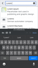
Focus state

image.png (1×640 px, 143 KB)

  • Focus state drops the magnifying glass icon
  • Instead of a cancel, we use a back affordance with a chevron. This eliminates both the long "Cancel" text button issue and the ambiguity with the clear icon inside the field.
  • The results pane is anchored to the bottom of the header instead of the field itself. It also uses the full width of the viewport.

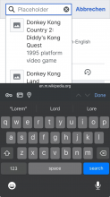
Active state

image.png (1×640 px, 150 KB)

  • When a user begins typing, the clear affordance appears. The type ahead results appear in the results pane.

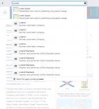
Results pane

image.png (1×640 px, 154 KB)

I think we can use the same logic in both desktop and mobile for deciding how many typeahead or empty state results to display.

Long queries

image.png (1×640 px, 153 KB)

If the query string is longer than the viewport width, it will continue on one line.

RTL

image.png (1×1 px, 342 KB)

  • Using a back affordance instead of a cancel affordance also removes the ambiguity effect of the double X icons for RTL languages.
CCiufo-WMF subscribed.

Assuming the Epic task was mistakenly pulled from the parent task.

@JScherer-WMF what about tablet devices? Currently they show the same as mobile but look pretty terrible. Do we want that to work more like Vector 2022? Tablets account for a notable portion of mobile traffic.

@JScherer-WMF what about tablet devices? Currently they show the same as mobile but look pretty terrible. Do we want that to work more like Vector 2022? Tablets account for a notable portion of mobile traffic.

Here is the way the Minerva Search would break down to a tablet viewport size.

  • The max width of the Menu items and the search bar is 640px.
  • The overlay behind it should be the semi-transparent codex overlay that we use for dialogues.
  • It should be centred on the viewport and the back chevron should stay in the same left alignment as on the mobile viewport sizes.
  • Tapping outside the menu should dismiss it.

image.png (1×1 px, 491 KB)

Is it possible to avoid using the codex semi transparent overlay? I'd expect this to increase the scope of this work a bit more, as the tablet design is adapted from the original Minerva design, which has a regular overlay and we werent planning on using codex for it. I.e. this is what it looks like now.

Screenshot 2025-05-02 at 1.06.57 PM.png (1×1 px, 296 KB)

Also, i believe this would make the search overlay the only overlay that gets semi transparency on tablet.

Jdrewniak subscribed.

meeting notes: assigning to @bwang to sign-off and create follow-up tablet design implementation ticket.