


They finally sold it in 1983, and it was sold again in 2006 -- for US$1.5 million.

They finally sold it in 1983, and it was sold again in 2006 -- for US$1.5 million.
They finally sold it in 1983, and it was sold again in 2006 -- for US$1.5 million.


They were genuinely “green architecture” before that term became a byword for bullshit instead of the common sense and joy it was intended to be. (Frank Lloyd Wright reckoned that the job of architecture is “to make human life more natural, and nature more humane” – a job description that needs neither fashion nor compulsion to succeed, but which these days is made more difficult by both.)
Built for a college couple in 1939 for $12,000, the Rosenbaum House was one of the first Usonians and, at just 143sqm., one of the simplest – but like all of Wright’s small houses it had the soul of a larger house packed in there.
Usonian scholar John Sergeant calls the Rosenbaum house “the purest example of the Usonian.”
“It incorporates detailing improvements and combines all the standard elements in a mature and spatially varied interior. [It’s use of “nested space,” for example is superb.] Its exterior has an almost overpowering horizontality. The street facade forms a cypress wall from which springs the carport, a 20-ft cantilever itlizing concealed steelwork.
“Ten years after construction, the Rosenbaums had Wright extend the house. It thus becomes the first Usonian to be radically altered, something which owners of Wright houses were loathe to do, but which he himself saw as potentially inherent in an organic building.
“This addition [like the Hanna House addition] backed a second ‘L’ onto the first, containing a Japanese garden. With four sons in the family, extra sleeping accommodations were required. A quiet guest room terminated one arm, and the other contained a family, kitchen, bunk-playroom and utility room with second carport.”
PS: If you’re looking to learn more about these beauties, the two best books to hunt down are:


“When in doubt plant a shrub” – or (these days) whack in a bloody wind turbine – or do some complicated bloody calculation – that’s about all so much of the dubious modern mantra amounts to to make the latest unattractive box conform to the latest “green” fashion.
Oh, and a lengthy sermon on the often imaginary benefits of all the extra expense.

The bloggers at the Architecture + Morality site have a lengthy meditation on the problem which, if you’re at all interested, is worth your time to contemplate. As they say,
A fair question. And why is the compulsion behind “designing green” killing what is – or should be – mostly just basic environmental common sense?Much of what is considered responsible design is already green and has been so for the last 3,000 years. Siting the building to maximize natural daylighting and breezes while reliably
sheltering occupants from the elements was fundamental since not doing so would make life indoors extremely unbearable and a threat to health. Stale air, excessive heat, mold, water-borne diseases, and smoke inhalation from cooking fires were the consequences of from a failure to design according to traditional 'green' principles.
If designing green is nothing new, how come is it seen as the next big thing?

![1938fp01[4]](https://blogger.googleusercontent.com/img/b/R29vZ2xl/AVvXsEi-Dnt52OeKNqz40wG8J7kjhBWdinM3IpDNzVLN-VP5fGs4rVvVFLaJZ-MUrFDON5EA7A9LpMwwSctzzy53VQv7LuugWpQTtnoXyWu9L9eGBRyqzHjfatcrIqZK2cFbRMJClLqF/s1600-h/1938fp01%5B4%5D%5B9%5D.gif "1938fp01[4]")
Visit the Schwartz House’s website for more, much more information about this little restored Usonian beauty -- a design based on the 1938 “dream house” Wright produced for Life magazine, from which these floor plans come.
Wright himself said that the Schwartz House was "a house designed for utility and fecund living....in which there is no predominating feature, but in which the entire is so coordinated as to achieve a thing of beauty."
Check out this neat photo of current owners Michael Ditmer & Lisa Proeche with Wright apprentice Edgar Tafel, who supervised construction of the house around 1939, and an interview here with Michael and Lisa.


“Rush Creek,” says the New York Times in this story (that gets just a few details wrong, which is not bad for The NY Times), “is the country's most enduring and successful -- and undiscovered -- middle-class community built according to Wright's principles.” Hat tip Prairie Mod, who say
The article recounts the origin of the community and how it's survived through the years, changing the lives of the people who have sought out this architectural secret. It's the sort of lifestyle and community that is founded on the same principles that are at the heart of living PrairieMod. Check out the article and also cruise this link to see some Flickr photos of some of the houses in this remarkable Wright-inspired community.


 My favourite Wright houses as a 'group' are the Usonians -- small, for the most part, but perfectly formed, and conceealing a wealth of ingenuity.
Wright designed the first house for journalist Herbert Jacobs and his wife in 1936 -- it was the first of Wright's 'Usonian' houses, costing $5500 including architect's fee.
The Jacobs family loved their first house so much that when they moved in 1942 in order to get away from the town that was sprawling out to meet them (Wright's advice when first the bought -- which they didn't take -- was to buy out as far as they could afford, then go out just a litle bit further) they commissioned another Wright house, and once again he produced a 'first.'
This time it was what he called a double-storey 'solar hemicycle' for the northern American prairies; tucked down behind an earth berm to protect it from freezing northerlies, and opening up to the south on both ground floor and mezzanine to sun and gardens and a pool half-inside and half-outside.
The Jacobs family built the house themselves, and by their own account lived a charmed life there.
Designed in 1958 when Wright was ninety and described has having “more architecture per square foot than any other building Wright ever designed,” this tiny (88sqm) one-man cottage is a jewel.
The Seth Peterson Cottage in Mirror Lake, Wisconsin, is one of eight Wright locations you can rent, along with:
Every respected instrument or architectural opinion and cultivated taste, from Domus to House & Garden, told the urban dwellers of America that this was living. This was the good taste of today; this was modern, and soon the International style became known simply as modern architecture. Every Sunday, in its design section The New York Times Magazine ran a picture of the same sort of apartment. I began to think of it as THAT apartment. A glass and steel box in which "the walls were always pure white and free of mouldings, casings, baseboards and the rest... Somewhere near there was always a palm or a dracena fragrance or some other huge tropical plant, because [the apartment] and all the furniture was so lean and clean and bare and spare that without some prodigous piece of frondose Victoriana from the nursery the place looked absolutely empty. The photographer always managed to place the plant in the foreground so that the stark scene beyond was something one peered at through an arabesque of equatorial greenery. (And that apartment is still with us every Sunday.)They went away for a while, but I have to tell you that apartment and the lounge that goes with it are back and flourishing in contemporary NZ architecture! And instead of the palms, rubber plants and prodigious pieces of frondose Victoriana used to transform the photographed starkness, these soulless contraptions rely on the stunning New Zealand landscape to breathe into them the life the architect failed to.
another look at the New Zealand landscape through the eyes of NZ architects, photographers and writers. [Twenty-two] buildings have been juxtaposed alongside images of nature and are accompanied by ideas about the notion of site ... [and] collected together as examples of how each unique environment has inspired the architect to produce a different solution as to how a house can interact with the landscape as well as accommodate contemporary modes of living.Inspire, by the way, means "to imbue or animate (with); to infue or instil (as emotion in or into)..."
 Instead, what appears to be the same house in all essentials is dropped into twenty different settings -- settings you would kill to design for -- and author Amanda Hyde de Krester (PhD) accompanies pictures of these places with telling phrases such as "the architect has designed a vantage point from which landscape is viewed as art," and "the site is an expectant reality, always awaiting the event of construction, through which its otherwise hidden attributes will appear," and" the architecture interacts with the landscape not in a deferential way, but by framing and contrasting it," and "the house has been designed to present the landscape to its occupants perfectly."
 Closer inspection reveals that for the most part the landscape has been "presented to its occupants" by the simple expedient of framing up a box and then wrapping it in glass, and that while sometimes the house wears a different hat or a different shirt, once all all the candy floss and artifice is stripped away, at the very heart of these places is almost always that lounge.
  A picture window with a flat ceiling, downlights and a view. A gorgeous view. But of integration of architecture and view (let alone inspiration or animation) there is none, if any.
 All the photos shown here bar one are from the award-winning houses in that book. And I assure you, they really are all different houses, not just the same one at different times of the day ...
 Of the twenty-two houses inside, then, nearly twenty of them are substantially the same house -- glass boxes whose "dialogue" with the unique landscape in which they've been dropped consists of a bare "pardon me" as they push their way in and sit silent -- a series of glass boxes all too open to the heat and glare of the afternoon sun, with -- at their heart -- as their culmination -- a flat-ceilinged box with glass walls, expensive furniture and nowhere to put your drink. That lounge!
  At the very place in which you expect to find the very heart and soul of the house, that place in which the occupants can engage daily with each other and that unique landscape that's all around them, you find instead an antiseptic airless and soulless box where the sun is an enemy and "the view" has been treated as just so much wallpaper, and the occupants as so many props for a one-off magazine shoot.
 I swear you can almost hear these places echo -- and most likely with the saddest sound of all: the sounds of what might have been...
 Far from "different solutions" that have been "inspired" by the unique landscapes in which they're located, instead of buildings that grace instead of disgrace their locations, that connect the people within to the beauty without by means more artful than just window walls and a sliding door (and some curtains to keep out the inevitably overpowering afternoon sun), you would think by comparing them that the twenty architects were all reading the same magazines, and that those magazines were telling them how to suck the very life out of a site. And you might well be right.
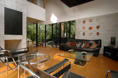 Contrast this sterility with the approach of NZ architects like John Scott and Harry Turbott and Claude Megson -- or with the designer of the rugged beauty I spotted manfully riding the wild hills out at Bethell's Beach on Sunday -- who were able to almost artlessly drop a house in a setting and immediately bring the landscape outside alive, and even reflect it in the spaces inside (above and below).
 Or contrast it with architects such as Frank Lloyd Wright with his Prairie houses and his Usonian houses and his Californian 'textile block' houses; his houses for deserts and waterfalls and clifftops; for the rolling hills of Wisconsin (above and below), the lakes of Tahoe and the earthquake-prone landscapes of Japan ... which are of the site instead of on it, their addition making the landscape sing and the occupants with them.
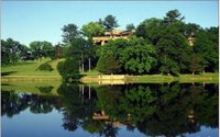
 Or contrast it to the Japanese idea and techniques of Shakkei, of 'borrowing scenery' to bring the view inside and 'capture it alive,' instead of sitting there in your glass box with your blinds drawn or glass tinted and the view floating outside like a butterfly pinned to a cushion.
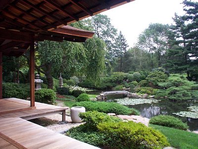 Or contrast it to what an honest New Zealand house anchored in the New Zealand landscape might be like: a truly New Zealand house using honest materials and honestly responding to the New Zealand experience and the New Zealand landscape, instead of simply recycling glass and steel knock-offs of something that didn't really work fifty years ago.

![1938fp02[4]](https://blogger.googleusercontent.com/img/b/R29vZ2xl/AVvXsEjCPJQ8oSIlKmPs6nr-6erwAoTd6eNoJeZ7cLYs6-xlVNd6J4UlN_UjUKoz0IHufWTMRP4ORMFI25O4QdBZVnk1zvmZOTWkk-AkRl3YzrWcdU8uAYcVl4WRyYjoGHouar04mpGI/s1600-h/1938fp02%5B4%5D%5B4%5D.gif "1938fp02[4]")

