Visual design tweaks #3642
Visual design tweaks #3642
Conversation
- Use "Source * Pro" fonts
- No longer ship fonts with Streamlit, but use fallback instead.
- Update header sizes and weights
- Update text color
- Update table and dataframe designs
- Make tooltip follow bg color
…means no DOM element drawn.
| )} | ||
| </StyledWidgetLabel> | ||
| ) : null} | ||
| <WidgetLabel visible={!!label}> |
There was a problem hiding this comment.
I removed help from here. No other widget did this, really, and it can only impact our own usage of Radio anyway since label is never falsy when coming from the Python side.
Plus we don't actually use Radio ourselves, and if we ever do we shouldn't have the combination of no label + help, as that would be visually strange.
 kmcgrady
left a comment
kmcgrady
left a comment
kmcgrady
left a comment
There was a problem hiding this comment.
Found two bugs that exist today in my pass, and have a few questions/thoughts.

I see an issue with the dataframe ellipsis.
| href="https://fonts.googleapis.com/css2?family=Source+Serif+Pro:ital,wght@0,400;0,700;1,400;1,700&display=swap" | ||
| rel="stylesheet" | ||
| /> | ||
|
|
There was a problem hiding this comment.
This essentially prevents people from working with streamlit locally without an internet connection right? Should we be merging this into the codebase as font files?
| // 1rem == 16px | ||
| // (Can't set actual pixels here because it breaks reboot) | ||
| $font-size-base: 1rem; | ||
| $font-size-base: 17px; |
There was a problem hiding this comment.
Concerned about the comment removed that says can't set actual pixels here because it breaks reboot?
I say this because we often want the number to be highly divisible. It makes the REM to px computation more predictable.
| "& .table-top-right": { | ||
| overflowX: "hidden", | ||
| backgroundColor: theme.colors.secondaryBg, | ||
| overflow: "hidden !important", |
There was a problem hiding this comment.
Hmmmm. I don't think we are using !important properly here. What's accidentally overriding it?
| borderBottom: `1px solid ${theme.colors.fadedText10}`, | ||
| borderRight: `1px solid ${theme.colors.fadedText10}`, | ||
| fontSize: theme.fontSizes.md, | ||
| fontFamily: theme.fonts.sansSerif, |
There was a problem hiding this comment.
Should this be theme.genericFonts.bodyFont to be themeable?
| textAlign: "right", | ||
| padding: theme.spacing.sm, | ||
| fontSize: theme.fontSizes.md, | ||
| fontFamily: theme.fonts.sansSerif, |
There was a problem hiding this comment.
Same here. theme.genericFonts.bodyFont ?
| paddingBottom: 0, | ||
| paddingTop: 0, | ||
| marginBottom: 0, | ||
| marginTop: 0, | ||
| lineHeight: 1.25, | ||
| marginTop: "0 !important", |
There was a problem hiding this comment.
Curious where you see the !important needed here? Is this not being respected here?
| @@ -105,6 +109,36 @@ export const StyledHr = styled.hr(({ theme }) => ({ | |||
|
|
|||
| export const StyledCheckbox = styled.input(({ theme }) => ({ | |||
| marginRight: theme.spacing.xs, | |||
| appearance: "none", | |||
There was a problem hiding this comment.
Not a big deal, but are we essentially looking to align these to the checkbox widget? It's close but we might be able to make that better.
| @@ -44,7 +44,11 @@ export function ArrowTable(props: TableProps): ReactElement { | |||
| <StyledTableContainer data-testid="stTable"> | |||
| {cssStyles && <style>{cssStyles}</style>} | |||
| <StyledTable id={cssId}> | |||
| {caption && <caption>{caption}</caption>} | |||
| {caption && ( | |||
| <caption> | |||
There was a problem hiding this comment.
Any reason we don't just use a styled component for StyledCaption. I think this would be a misuse of the small tag for accessibility reasons.
In HTML5 it is acceptable to use the tag to denote things like disclaimers, caveats, legal restrictions, or copyrights
| @@ -197,7 +197,7 @@ class Multiselect extends React.PureComponent<Props, State> { | |||
|
|
|||
| return ( | |||
| <div className="row-widget stMultiSelect" style={style}> | |||
| <StyledWidgetLabel> | |||
| <WidgetLabel visible={!!element.label}> | |||
There was a problem hiding this comment.
I remember we had issues with vertical alignment for elements that had a label and those that don't. This should be addressed.
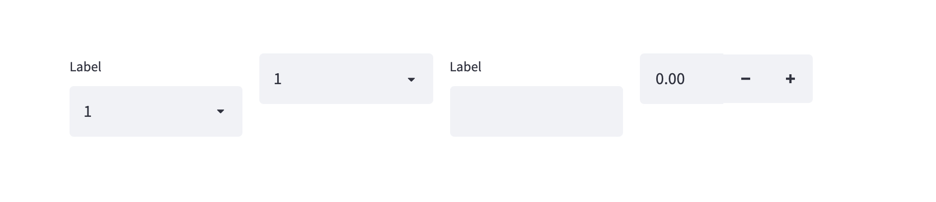
Current release:

| md: "1rem", | ||
| lg: "1.25rem", | ||
| xl: "1.5rem", | ||
| twoXL: "1.75rem", | ||
| threeXL: "2.25rem", | ||
| fourXL: "3.125rem", | ||
|
|
||
| smNoUnits: 14, // 0.823rem with $font-size-base=17px |
There was a problem hiding this comment.
Really it's 13.991, right? I'm a little nervous at all this complex number of pixels. They present off rounding values that could make weird appearances.
| width: theme.fontSizes.md, | ||
| height: theme.fontSizes.md, |
There was a problem hiding this comment.
Should this be theme.spacing.md?
| return ( | ||
| <div className="stTimeInput" style={style}> | ||
| <StyledWidgetLabel> | ||
| <WidgetLabel visible={!!element.label}> |
There was a problem hiding this comment.
Hm, I think it's a rare use case, but it is possible for a widget coming from Python to have a falsy label since the empty string is falsy in JS.
It also seems like there's at least a bit of contention around what the right behavior here is. Some users don't want the extra padding (#3603), but it was originally intentionally added to ensure that widget alignment is consistent even for widgets with no label (#3071).
|
I see that this MR switches the fonts from Is there any chance Streamlit can choose a font family that has a condensed font? The |
|
Closing this and breaking into multiple PRs, as requested offline. |
4 participants
Except for some updates to how tables/dataframes look, everything else could even go unnoticed by distracted viewers.
If you're on Notion, you can find a wheel file here
Changes