Skip to content

Add Scylla Sphinx Theme 1.0#201

Merged
lauranovich merged 138 commits intoscylladb:masterfrom
dgarcia360:branch-1.0
Sep 26, 2021
Merged

Add Scylla Sphinx Theme 1.0#201
lauranovich merged 138 commits intoscylladb:masterfrom
dgarcia360:branch-1.0

Conversation

@dgarcia360
Copy link
Copy Markdown
Collaborator

@dgarcia360 dgarcia360 commented Jul 29, 2021

Context

This PR adds the new design to the project scylladb/sphinx-scylladb-theme. It moves the contents from the branch branch-1.0 to master.

How to test this PR

  1. Clone this PR. See Checking out pull requests locally.
  2. Run make preview to review the theme locally.
  3. Accept the changes, or add comments.

Showstoppers

  • The TOC on the left - when I click through several topics, what I want to see is: the topic I am on is blue &The parent of that topic (if relevant) is bold. Waiting for design & confirmation.
  • Tables - need many changes. I want to see a better design here. Waiting for design & confirmation.
  • The build takes too much time in scylla-docs.
  • Change admonition icons.
  • Headings - There is an issue w/ headings in that H3 is bigger than H2. I need to see a nice progressive hierarchy. At the lowest heading the text should be the same size as body text.

* Moved custom code to theme

* Removed markdown support

* fix order imports

* Reset order imports
* Added content navigation

* Updated css
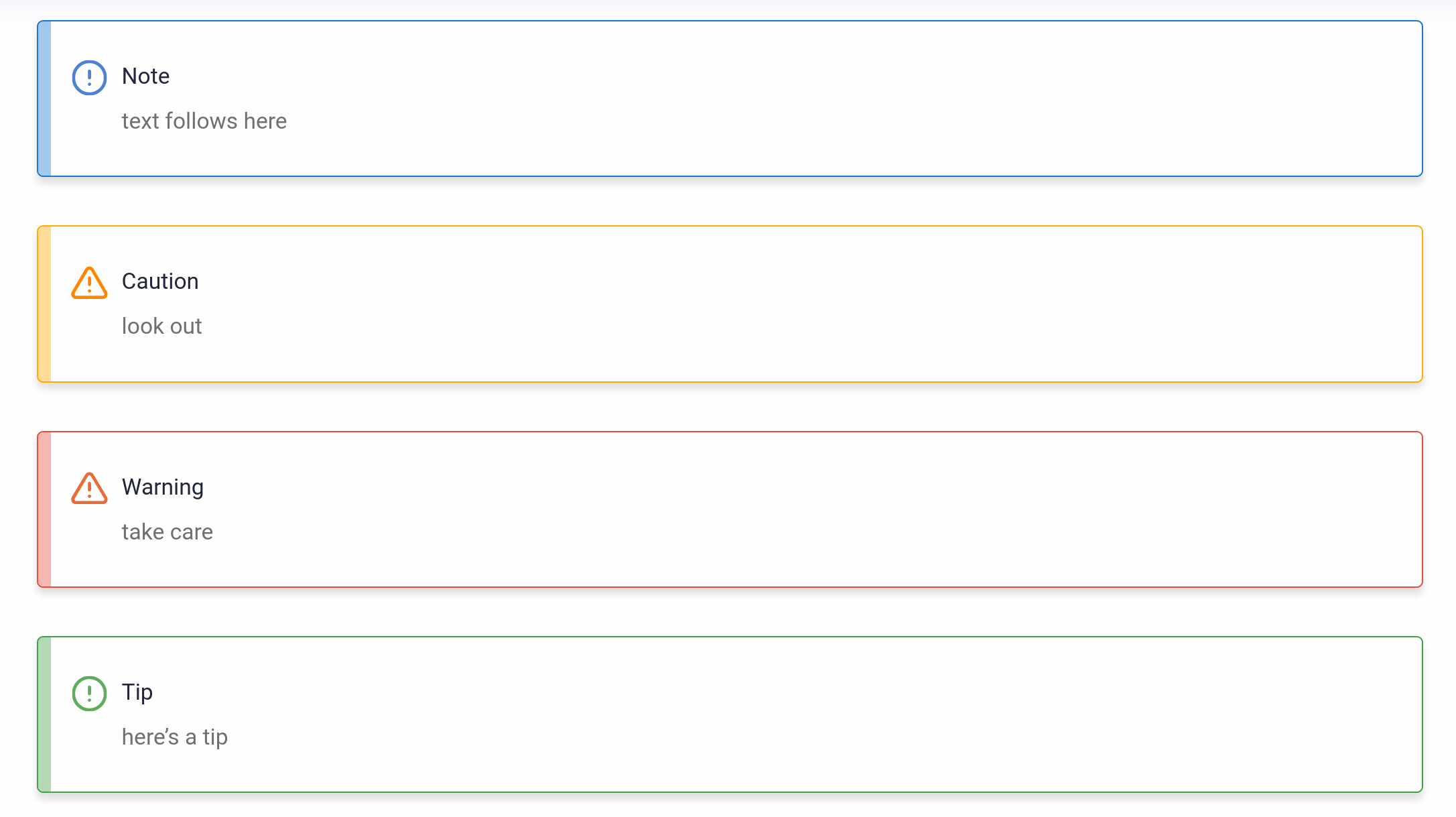
* Added icons

* Added admonition icons
* Style ul

* Added tests
@dgarcia360
Copy link
Copy Markdown
Collaborator Author

dgarcia360 commented Aug 11, 2021

@lauranovich Please forward this feedback to Guy to reflect it on Figma before implementing any change:

  1. Hero box/Topic box with mascot pictures - can we change the transparency setting to be less transparent?

  2. Tables - need many changes. I want to see a better design here.

    • Header row needs to be shaded, bold and larger text than the table text
    • Lines should be consistent. There should be a line framing the table. I know we said it should be like MongoDB, but I don't like their tables so much.
    • There should be a very thin line for each row. The line should be in very light grey.
  3. Admonitions

  4. In cases where we have inline code code we need to make it more distinguishable. In https://docs.mongodb.com/drivers/php/#connect-to-a-mongodb-server-on-your-local-machine case they change the font, make it larger, have a thin line around the text which is also shaded. This is too much but the idea of a different font and the thin line is something we should consider.

  5. Overall text size - what is our font size? It looks very small in most cases and should be increased. In cases where text is light having it small makes it harder to see.
    Also, we need to bring back the "report an error on the page" complaints from the field about moving the cheese ...

I'm opening an issue to review the next topics for the next release:

  1. The TOC on the left - when I click through several topics, what I want to see is:
    *The topic I am on is blue
    *The parent of that topic (if relevant) is bold
  1. Headings

    • There is an issue w/ headings in that H3 is bigger than H2. I need to see a nice progressive hierarchy. At the lowest heading the text should be the same size as body text.
  2. On this page TOC - please make sure that the default depth is 2 at least. - we should see how a 3 looks as well.

@tzach
Copy link
Copy Markdown
Collaborator

tzach commented Aug 19, 2021

The TOC on the left - when I click through several topics, what I want to see is:
The topic I am on is blue
The parent of that topic (if relevant) is bold

Need to be fixed. Added a Figma comment to Guy
showstopper

Hero box/Topic box with mascot pictures - can we change the transparency setting to be less transparent?

Added a comment. Not a showstopper

Tables - need many changes. I want to see a better design here.

showstopper

Header row needs to be shaded, bold and larger text than the table text
Lines should be consistent. There should be a line framing the table. I know we said it should be like MongoDB, but I don't like their tables so much.
There should be a very thin line for each row. The line should be in very light grey.

Admonitions
Change the Warning icon to a triangle, not a circle so it is like the caution
Change the Note icon to be a circle with an i inside it and make the tip the same but in green.
Consider adding a colored top header with the admonition title in it like https://docs.mongodb.com/drivers/php/#connect-to-a-mongodb-server-on-your-local-machine

Figma design up to date. Need to implement
showstopper

Headings
There is an issue w/ headings in that H3 is bigger than H2. I need to see a nice progressive hierarchy. At the lowest heading the text should be the same size as body text.

Design is good. Need to fix
showstopper

On this page TOC - please make sure that the default depth is 2 at least. - we should see how a 3 looks as well.
In cases where we have inline code code we need to make it more distinguishable. In https://docs.mongodb.com/drivers/php/#connect-to-a-mongodb-server-on-your-local-machine case they change the font, make it larger, have a thin line around the text which is also shaded. This is too much but the idea of a different font and the thin line is something we should consider.

Overall text size - what is our font size? It looks very small in most cases and should be increased. In cases where text is light having it small makes it harder to see

Non issue

@dgarcia360 dgarcia360 mentioned this pull request Aug 19, 2021
@dgarcia360
Copy link
Copy Markdown
Collaborator Author

The TOC on the left - when I click through several topics, what I want to see is:
The topic I am on is blue
The parent of that topic (if relevant) is bold

Suggested a proposal here: #204 (comment)

Please let me know if do you agree with the proposal, or if you prefer to wait until Guy provides a new design.

Headings
There is an issue w/ headings in that H3 is bigger than H2. I need to see a nice progressive hierarchy. At the lowest heading the text should be the same size as body text.

Design is good. Need to fix

Fixed with the latest commits. To preview the changes:

  1. Pull the latest commits from this PR.
  2. Run make preview.
  3. Open http://127.0.0.1:5500/examples/headings/

image

Admonitions
Change the Warning icon to a triangle, not a circle so it is like the caution
Change the Note icon to be a circle with an i inside it and make the tip the same but in green.

Figma design up to date. Need to implement

Fixed with the latest commits. To preview the changes:

  1. Pull the latest commits from this PR.
  2. Run make preview.
  3. Open http://127.0.0.1:5500/examples/admonitions/

image

Tables - need many changes. I want to see a better design here.

showstopper

@tzach @lauranovich Please ask Guy to update Figma with the desired table design. Thanks!

@lauranovich
Copy link
Copy Markdown
Contributor

@dgarcia360 - I have a build error
WARNING: error while formatting arguments for sphinx_scylladb_theme.extensions.substitutions.substitution_code_role: type object 'list' has no attribute '_special'

@dgarcia360
Copy link
Copy Markdown
Collaborator Author

@lauranovich I couldn't reproduce the issue, could you please try again after pulling the latest changes?

I've updated both staging sites with:

  • Left navigation bar only should highlight the current page.
  • New design for tables.
  • Homepage topic boxes should have a border on hover.
  • Homepage mascots should have less transparency.

@lauranovich @tzach Could you please review the changes and let me know if you find any other showstopper?

sphinx-scylla-theme: https://sphinx-scylla-redesign.netlify.app/
scylla-docs: https://scylla-docs-redesign.netlify.app/

@dgarcia360
Copy link
Copy Markdown
Collaborator Author

Known issue: When the page does not have a top banner, the sidebar it's not height: 100%:

image

I'm fixing this with the next commit.

@lauranovich
Copy link
Copy Markdown
Contributor

I have a build error
WARNING: error while formatting arguments for sphinx_scylladb_theme.extensions.substitutions.substitution_code_role: type object 'list' has no attribute '_special'

@lauranovich
Copy link
Copy Markdown
Contributor

Screenshot from 2021-09-12 10-15-33

I see this issue in the local build (make preview) It is not on the staging site.

@dgarcia360
Copy link
Copy Markdown
Collaborator Author

I've updated the staging site for this repo (sphinx-scylladb-theme) with the latest sidebar: https://sphinx-scylla-redesign.netlify.app/

If you like how it looks, I'll throw an new release to update the scylla-docs staging site.

I have a build error
WARNING: error while formatting arguments for sphinx_scylladb_theme.extensions.substitutions.substitution_code_role: type object 'list' has no attribute '_special'

I couldn't reproduce this yet in my local environment. @tzach opened an issue to track it here. #209 It only affects to this repo, and it's not blocking the build to finish, so it should not be a showstopper to release the theme. I propose to keep the issue open, and I'll solve this as soon as I manage to reproduce it.

image

This issue seems to do with the browser's cache, since it's not happening in the staging site. Please try to clean the browser cache, and you should see the logo as expected.

@lauranovich
Copy link
Copy Markdown
Contributor

@dgarcia360
Please update the docs staging site.

@lauranovich
Copy link
Copy Markdown
Contributor

@tzach @dgarcia360 - we are going to merge this PR
any issues found can be addressed in the next version. (1.1)

@lauranovich lauranovich merged commit 6b71d7f into scylladb:master Sep 26, 2021
Sign up for free to join this conversation on GitHub. Already have an account? Sign in to comment

Labels

None yet

Projects

None yet

Development

Successfully merging this pull request may close these issues.

3 participants