Emphasize "Continue" button in subscription prompt #135
Description
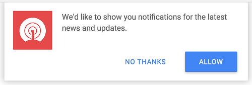
Currently "Cancel" and "Continue" buttons have the same style.
"Continue" button should be emphasized, so undecided users can lean toward this option.
See example of good practice from OneSignal: