Skip to content

Conversation

@SiboVG
Copy link
Member

@SiboVG SiboVG commented Jun 30, 2022

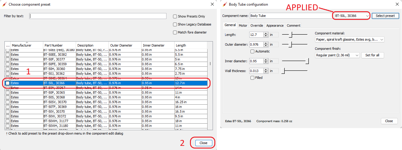
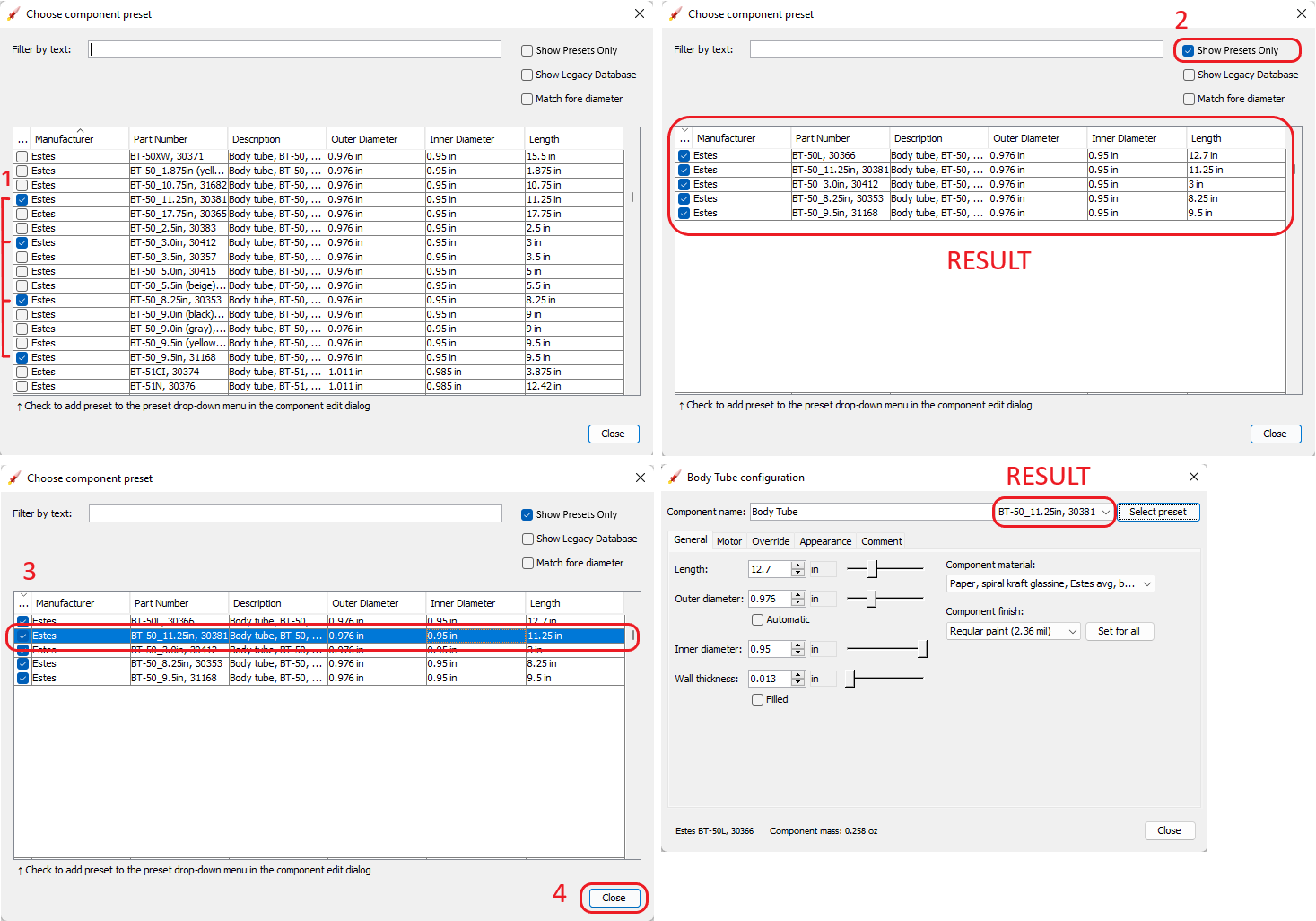
This is my proposal to fix #1481. Two things I hated about the previous selection menu:

  • I'm not a fan of the 'Select preset' option, because it is really a 'No preset' option. I get why it is called that way because it draws the attention to what the function of the combobox is, but it doesn't make sense that when you unfold the combobox that the 'Select preset' option is still there...
  • Very much dislike that selecting a preset from the database is triggered by clicking a certain item in the combobox...

So my proposal is:

  • Change 'Select preset' to 'No preset'
  • Move 'select from database' out of the combobox and add it as a button

Additionally, this PR also increases the maximum number of items in the selection menu from 7 to 25.

I also changed the text underneath the preset dialog from 'Select to add preset to drop-down menu' to 'Check to add preset to the preset drop-down menu in the component edit dialog', as for new users, the first text could still be very confusing.

Demo:

Screen.Recording.2022-06-30.at.17.01.14.mp4

@hcraigmiller
Copy link
Collaborator

hcraigmiller commented Jun 30, 2022

Need confirmation of intended functionality.

Using the A simple model rocket example, open the Parachute configuration window. Left-click Select preset and chose (highlight) the Estes PK-12 parachute by way of a single left-click on the parachute description (not on the check box), then left-click Close. Previously, this would change the current parachute to the Estes PK-12, but that does not happen now.

Instead, you have two choices:

  1. Open the Parachute configuration window. Left-click Select preset and chose, check the box AND then highlight, the Estes PK-12 parachute by way of a single left-click on the parachute description. Then left-click Close to make the PK-12 the current parachute; or
  2. Open the Parachute configuration window. Left-click Select preset and chose (check the box) to add the Estes PK-12 parachute to the preset list. Then left-click Close. Now the user can pick the PK-12 from the preset list.

If this is the desired behavior, this PR functions as described with no anomalous behavior (parachutes or other components).

@neilweinstock
Copy link
Contributor

Hmm, this is not so simple.

Regardless of whether that's the intended behavior, it's no good. Selecting an item from the database must make that the active component.

Basically, this UI has several required functions:

  1. Allow user to select a component from the database (I'm frankly not sure if this should be called a "preset" or not, or whether a preset is something from the preset menu; "select from database" is really more accurate, although more space-consuming)
  2. Allow the user to select from an assortment of pre-designated components (truly "presets")
  3. Display the currently selected component, if any

From Craig's description above, function # 1 is not working well here, unless I'm misunderstanding. And function # 3 really has no place to live here: if the preset menu is truly dedicated to selecting from pre-designated components, then it doesn't make sense to put the current selection in the combobox if it is not a preset.

Adding "Recent selections" section to the top of the preset menu might clean a lot of this up, but I'm not sure if we should go that way. That's a common approach in things like font menus, where there are a lot of choices. But it's still not perfect.

I definitely agree with Sibo's dissatisfaction from the current UI, but I'm not sure this gets us there. I need to think on it more. Let's not rush into this one.

BTW the same UI would apply to the texture selector in the Appearance tab.

@hcraigmiller
Copy link
Collaborator

hcraigmiller commented Jul 1, 2022

After reviewing everything, and looking at current functionality and how to expand that, I think I have a proposal that may speak to all of the concerns; it preserves most of the current functionality (eliminating the disavowed Show all compatible). It has three usages:

  1. Basic selection of component: Using a body tube as the example, in the configuration window, after left-clicking Select preset to open the parts library, Step 1, left-click on the component description (not the check box) to select (highlight) the component, Step 2, left-click Close to make the selected component the current component.

01 01 Body Tube

  1. Add components to preset list (with and without selecting a component): In the configuration window, after left-clicking Select preset to open the parts library, Step 1, left-click on the check boxes to select the components to be added to the preset list, Step 2, left-click the new Show Presets Only button to hide everything except the presets (similar to hiding legacy components); closing at this point adds the components to the preset list without changing the current component. To change the current component, Step 3, left-click on the component description (not the check box) to select (highlight) the component, Step 4, left-click Close to make the selected component the current component.

02 01 Body Tube

  1. Recent List: Where the preset list is now an integral part of the parts library dialog, what was being used to drop-down the presets is now used to display recently used components within the class, with the current component highlighted; the word Recent is displayed when a new component is created, until a component from the Recent list or parts library is selected as a substitute.

03 01 Body Tube

I think this speaks to everyone's concerns with simple and straight-forward functionality, and functionality which for the most part will be familiar to users. Thoughts @SiboVG and @neilweinstock?

@neilweinstock
Copy link
Contributor

My thoughts:

  1. I think the benefit of "presets" is to eliminate the need to go into the database window at all. Therefore I think it would still be good to have the presets in the pull-down menu, in a section below "recent". The "show presets only" checkbox might or might not still be useful in that case, but I would probably demote it to someplace less prominent in the dialog.
  2. In fact, now that I look at it, the "Match fore/aft diameter options" (which I still content should be checked by default) should probably be first in the checkbox list because they'll be the ones most often used. The "Show Legacy Database" will be rarely used. I guess the exact layout of the database window is a separate issue so I won't spend any further time on it here.
  3. I casually tossed out the idea of a "Recents" section, and it sound great, but now that I think about it more I'm not sure how it should work. Obviously a separate recents list should be maintained for each component type. But should it be per rocket? Global for the whole program? I think global doesn't work because different rockets are likely to have radically different component usage (e.g. an LPR and HPR will have exactly zero parts in common most of the time). Per rocket... well I suppose that might work, but I don't know if it would be useful. Would it be useful? I'm not really sure. I think for design scratch rockets, where I flip back and forth between different options a lot, it might be useful. But it feels kind of niche for me.
  4. In the Database window, there should be something other than the "close" button when you've selected a component. Something like "use this component" or "cancel". Or maybe "apply changes" and "cancel". "Close" is an unhelpful button name for a dialog. We have a similar problem with the configuration window, where there's no "cancel" button...
  5. When no database component/preset is selected, the pulldown should show "custom".
  6. The part numbers in the new database seem to be somewhat longer than the old one. We need to make sure we leave enough room to display the whole thing. Certainly, the Component Name field doesn't need to be so long, so we should be able to steal some room from it.

So where does that leave us? I'm not sure. Sibo and Craig's proposals are not far apart, and my comments above are only slight tweaks. Perhaps we are close.

@hcraigmiller
Copy link
Collaborator

Is this what you are describing @neilweinstock ?

04 02 Body Tube

Insofar as the Component name and part number are concerned, I would not take any more space away from the Component name field. The function is that when a component is selected, the component's description becomes the name of the component and the part number would now become the preset name. In my view, part numbers should be kept short, and simply because someone makes a long one should not affect the length of the drop-down preset field.

Further thoughts @SiboVG and @neilweinstock, others?

@neilweinstock
Copy link
Contributor

Is this what you are describing @neilweinstock ?

Yes, although I'm not sure if "apply"/"cancel" is right under all circumstances. For instance, in the config window, you can switch away from it (but selecting another component) and changes are expected to stick even if you never hit "apply". It's kind of weird in that way.

Possibly, what we need is simply a button to undo the changes that were made since that window was opened. I'm not sure what that should be called.

Insofar as the Component name and part number are concerned, I would not take any more space away from the Component name field. The function is that when a component is selected, the component's description becomes the name of the component and the part number would now become the preset name. In my view, part numbers should be kept short, and simply because someone makes a long one should not affect the length of the drop-down preset field.

Well, we're using a pre-existing database that has some long part numbers in it. To some extent that is out of our control. I haven't tried to see what the longest part number is. Here's a biggie:
image

(In the current implementation, if a long part number is selected, the combobox will expand to show it, which is good:
image)

Also, I personally don't use the component name to hold a part description; rather I use it to describe the function of the component (e.g. "Payload section", "motor mount", etc.) This is much more useful to me when looking at the component tree.

However, the full description of the part from the database is very useful as well, since part numbers are frequently cryptic (the Apogee 14811 is... what again?) It would be good if it were available in the config dialog (in a read-only field), only when a preset part is currently active. Come to think of it, it would be good to have in the preset pull-down as well, because selecting from a list of cryptic part numbers is not super useful. I had this problem with my selection of Estes BT presets using the legacy database: non-descriptive part numbers meant I basically had to memorize them to use the preset menu, and I struggled with it regularly. I'm not sure the best way to implement this, though... putting full part numbers and descriptions in the preset menu would make it very wide and messy. Maybe put the description in tooltips for the menu? I don't know.

I apologize for continuing to add new issues to this but the truth is that this area of the UI currently has all sorts of little problems, not theoretical but actual ones that I encounter all the time. None are fatal, but collectively they make the program slower and harder to use. It is good to consider the whole scope of the problem when trying to fix it.

@hcraigmiller
Copy link
Collaborator

hcraigmiller commented Jul 1, 2022

Yes, although I'm not sure if "apply"/"cancel" is right under all circumstances. For instance, in the config window, you can switch away from it (but selecting another component) and changes are expected to stick even if you never hit "apply". It's kind of weird in that way.

Possibly, what we need is simply a button to undo the changes that were made since that window was opened. I'm not sure what that should be called.

I believe that this labeling structure would resolve your concern. If you left-click Undo then the changes revert and the buttons change back to "Apply" (greyed out) and "Close." Left-clicking the "X" in the right-hand corner is treated as. . . what. . . "Accept", or "Undo" and close (logic says the latter)?

05 01 Body Tube

Does this work for you @neilweinstock, others?

@neilweinstock
Copy link
Contributor

It is generally not a good idea for button labels to change like that (there are occasions when it is appropriate, but I don't think this is one of them.) If we want a separate Undo and Close functions, we should just have an additional button which is only enabled at the appropriate time.

I confess I'm not really sure what the function of the "Apply" button here? It would be a major change to the program (and not a desirable one) to require the user to hit "apply" every time they wanted to commit changes.

@hcraigmiller
Copy link
Collaborator

hcraigmiller commented Jul 2, 2022

Apply implements the changes AND closes the window. The reason undo and close have the same button is because it is essentially the same function as the “X”, to undo changes then close the window without having to relocate the mouse, just two slow left clicks. We could use “cancel” and “update” like GitHub…

@hcraigmiller
Copy link
Collaborator

hcraigmiller commented Jul 2, 2022

Have one last idea… I’ll mock it up tonight or tomorrow. Greater simplicity.

@neilweinstock
Copy link
Contributor

Apply implements the changes AND closes the window.

Normally I would expect "Apply" to implement changes without closing the window, although I'd have to think about whether I've seen it used the other way as well.

The key, though, is that OR has well established that the changes are implemented without clicking any sort of apply button. There is no reason to suddenly start requiring the user to click "apply" to commit changes.

The reason undo and close have the same button is because it is essentially the same function as the “X”, to undo changes then close the window without having to relocate the mouse, just two slow left clicks.

Sorry, you just Don't Do That, no how no way.

I think this particular line of discussion started when I said that "Apply"/"Cancel" is not always what we need. It is not necessary to try to shoehorn this functionality into the config window. I think that all we need is a "revert changes" or maybe just plain old "undo" button, perhaps on the lower left corner of the window (I sure wish I could decide whether to call it a window or a dialog...) And then keep the "Close" button as-is. That covers everything we need, unless I'm forgetting something.

Here's the bottom bar from a dialog in one of my company's apps, as example:
image

Here, "Reset" is the revert changes function. "Apply" commits changes without closing the dialog, "OK" commits and closes, and "Cancel" closes without committing. That's a bit different from our config window because for us, "Apply" is automatic, so we replace all three buttons on the right with "Close", and just add the "Reset" (or whatever we want to call it) on the left. This is an easy, straightforward UI that I think would work fine.

The database window would simply work differently, which is OK, since it inherently has a different sort of function.

@hcraigmiller
Copy link
Collaborator

The mock-up will have some of the same functionality as GitHub…

@neilweinstock
Copy link
Contributor

Have one last idea… I’ll mock it up tonight or tomorrow. Greater simplicity.

Before you do... please explain why we need to do anything more than just add a "revert" button?

@hcraigmiller
Copy link
Collaborator

Huh, your screen grab says “apply”… just teasing.

@hcraigmiller
Copy link
Collaborator

hcraigmiller commented Jul 2, 2022

Let's start with current functionality, with the added "preset" drop-down created by @SiboVG, ignoring labels for the moment.

In analyzing the functionality, a characteristic change on the component configuration pane is given effect immediately (closing the pane is not required). And, for comparison, Undo (Ctrl+Z), to use @neilweinstock's nomenclature, "reverts" all of the user's changes made to the data that existed before the first of those changes were made.

Functionality at issue:

  1. Number 1: Added by @SiboVG, when a "preset" is included in the preset list, this is where it is displayed. A single left-click drops-down the list of preset components.
  2. Number 2: This is the access point to the parts library pane. A single left-click opens the Chose component preset pane.
  3. Number 3: A single left-click exits the component configuration pane AND keeps the data that exists at the time of the click, whether changed or not. [Identical to 4.]
  4. Number 4: A single left-click exits the component configuration pane AND keeps the data that exists at the time of the click, whether changed or not. [Identical to 3.]

Currently, once changed, the past data may only be restored by using the Undo (Ctrl+Z) function.

Body Tube 63

The last question posed by @neilweinstock was:

Before you do... please explain why we need to do anything more than just add a "revert" button?
So, let's add a button.

Body Tube 64

For the sake of consistency, the following should be the beginning point for a functionality discussion:

  1. Number 1: Added by @SiboVG, when a "preset" is included in the preset list, this is where it is displayed. A single left-click drops-down the list of preset components.
  2. Number 2: This is the access point to the parts library pane. A single left-click opens the Chose component preset pane.
  3. Number 3: A single left-click exits the component configuration pane AND keeps the data that exists at the time of the click, whether changed or not. [Identical to 4.]
  4. Number 4: A single left-click closes the component configuration pane AND keeps the data that exists at the time of the click, whether changed or not. [Identical to 3.]
  5. Number 5: A single left-click restores the data that existed prior to any changes AND then what, stay open or close? (@neilweinstock's "revert" button; closure is consistent with how GitHub and most other applications I use function.)

Now, let's talk about labels.

  1. As to the drop-down list of preset components, @neilweinstock said:

When no database component/preset is selected, the pulldown should show "custom".

And, I agree with that nomenclature as well. So, I suggest that Label 1 be "Custom".

  1. I also previously suggested that Label 2 be "Parts Library", and I renew that suggestion.
  2. Number 3 needs no label.
  3. Consistent with the terminology used by GitHub ("Update") and most other applications that I am aware of, the nomenclature for this function should be "Update" or, I believe more descriptive for the functionality described below, "Update/Close".
  4. Consistent with the terminology used by GitHub and most other applications that I am aware of, the nomenclature for this function should be "Cancel", meaning that the user is abandoning any and all changes made. Functionally, there is a question here, when clicked, should the component configuration pane remain open so that different changes can be made, or simply close. Most of the applications that I am familiar with just close, including GitHub [Rocksim 10 has a pop-up that asks if you want to save changes]. But, I suggest that the functionality of "X" be changed as described below and that the component configuration pane remain open. Put another way, "X" would restore the data that existed prior to any changes AND exit the component configuration pane, while Number 5 would restore the data that existed prior to any changes AND keep the component configuration pane open, adding a modicum of additional flexibility.

Taken together, this is my suggestion for changes to the component configuration pane:

  1. Number 1: Added by @SiboVG, when a "preset" is included in the preset list, this is where it is displayed. A single left-click drops-down the list of preset components. [No change in @SiboVG functionality, label only.]
  2. Number 2: This is the access point to the parts library pane. A single left-click opens the Choose component preset pane. [No change in @SiboVG functionality, label only.]
  3. Number 3: A single left-click restores the data that existed prior to any changes AND exits the component configuration pane. If changes have been made, a confirmation pop-up might be nice... "Save changes" or "Exit". [Change in @SiboVG functionality]
  4. Number 4: A single left-click closes the component configuration pane AND keeps the data that exists at the time of the click, whether changed or not. [No change in @SiboVG functionality, except maybe graying out "Update" (and not "Close") until a user change is actually made.]
  5. Number 5: A single left-click restores the data that existed prior to any changes AND keeps the component configuration pane open; gray out "Cancel" until a user change is actually made.

Body Tube 66

As to the parts library/preset pane, I still believe that the functionality described above is best, see:

2. Add components to preset list (with and without selecting a component)

@SiboVG SiboVG marked this pull request as draft July 4, 2022 10:24
@SiboVG
Copy link
Member Author

SiboVG commented Jul 4, 2022

  • Number 1: Added by @SiboVG, when a "preset" is included in the preset list, this is where it is displayed. A single left-click drops-down the list of preset components. [No change in @SiboVG functionality, label only.]
  • Number 2: This is the access point to the parts library pane. A single left-click opens the Choose component preset pane. [No change in @SiboVG functionality, label only.]
  • Number 3: A single left-click restores the data that existed prior to any changes AND exits the component configuration pane. If changes have been made, a confirmation pop-up might be nice... "Save changes" or "Exit". [Change in @SiboVG functionality]
  • Number 4: A single left-click closes the component configuration pane AND keeps the data that exists at the time of the click, whether changed or not. [No change in @SiboVG functionality, except maybe graying out "Update" (and not "Close") until a user change is actually made.]
  • Number 5: A single left-click restores the data that existed prior to any changes AND keeps the component configuration pane open; gray out "Cancel" until a user change is actually made.

I agree with changes 1-2. However, your propositions for 3, 4 and 5 is a duplicate of #960. I also prefer an 'Ok' / 'Cancel' button over the 'Update/Close' / 'Cancel' button.

So since numbers 3-5 are already documented in #960 and since that functionality will require a bit of extra programming, I will not implement them in this PR.

@SiboVG SiboVG marked this pull request as ready for review July 4, 2022 21:14
@SiboVG
Copy link
Member Author

SiboVG commented Jul 4, 2022

Last commit updates the labels.

@hcraigmiller
Copy link
Collaborator

No functional anomalies found.

The following configuration panes truncate the "Custom" label:

  • Nose cone
  • Body tube
  • Rail button
  • Launch lug
  • Centering ring
  • Streamer

Config_Pane

However, not all truncations are consistent, some, like the body tube, come and go.

Build 784
[Windows 11 Pro; Version 21H2; OS Build 22000.739; Windows Feature Experience Pack 1000.22000.739.0]
[Java "11.0.15" 2022-04-19 LTS; Java(TM) SE Runtime Environment 18.9 (build 11.0.15+8-LTS-149)]

@hcraigmiller
Copy link
Collaborator

hcraigmiller commented Jul 7, 2022

I would also change the label "Close" to "OK" now, rather than waiting for Issue #960 to be completed.

@neilweinstock
Copy link
Contributor

I vote to keep it at "Close", which precisely describes what the button does. "OK" isn't bad necessarily, but it's not clearly better and therefore there is no need to change it.

It is important to remember that, when comparing this dialog to things like Github or whatever, that ours if fundamentally different because changes take place and "stick" immediately. So labels that are different from what you would find elsewhere are often appropriate because they function differently. Our close button does not do the same thing as the typical "OK" button. It just closes the dialog.

As for the other proposed changes... will wait to argue that with issue #960, post-release.

@SiboVG
Copy link
Member Author

SiboVG commented Jul 11, 2022

Last commit fixes the dropdown menu text being cut off (already tested by @hcraigmiller).

@hcraigmiller
Copy link
Collaborator

Functions as described, no anomalies found.

Build 792
[Windows 11 Pro; Version 21H2; OS Build 22000.739; Windows Feature Experience Pack 1000.22000.739.0]
[Java "11.0.15" 2022-04-19 LTS; Java(TM) SE Runtime Environment 18.9 (build 11.0.15+8-LTS-149)]

@SiboVG SiboVG marked this pull request as draft July 12, 2022 00:16
@SiboVG
Copy link
Member Author

SiboVG commented Jul 12, 2022

Aha, now I know why I filed #1518, because I did my testing for that issue on an OR instance from this PR. So currently, this PR breaks the functionality of 'selecting a preset without checking it applies that preset either way'. I'll look into it...

@neilweinstock
Copy link
Contributor

I had a suspicion that might be the case.... :)

@SiboVG
Copy link
Member Author

SiboVG commented Jul 12, 2022

Should be fixed now.

@SiboVG SiboVG marked this pull request as ready for review July 12, 2022 00:24
@SiboVG SiboVG merged commit 01d868a into openrocket:unstable Jul 19, 2022
@SiboVG SiboVG deleted the issue-1481 branch September 30, 2022 12:30
Sign up for free to join this conversation on GitHub. Already have an account? Sign in to comment

Labels

None yet

Projects

None yet

Development

Successfully merging this pull request may close these issues.

Improvements to Preset selection menu

3 participants