[docs] Move "TextField" section higher in the "Selects" page#17643
Conversation


|
No bundle size changes comparing 05c533b...7be2f56 |

 croraf
changed the title
croraf
changed the title

|
What do you think of positioning the demo after the customization one? I strongly think that native should be before, promoting the customization before might be interesting too, we tend to keep these customization demos high in the order, they are frequently used and strategical for us. |

| }, | ||
| })); | ||
|
|
||
| export default function ControlledOpenSelect() { |

There was a problem hiding this comment.
Component name doesn't match the file name.
| </Select> | ||
| <FormHelperText>Select implementation</FormHelperText> | ||
| </FormControl> | ||
|
|
There was a problem hiding this comment.
I ran prettier and lint and got no errors. This blank line improves readability, although can be removed.
| id="age-text-field" | ||
| label="Age" | ||
| helperText="TextField implementation" | ||
| SelectProps={ |
There was a problem hiding this comment.
I would propose the removal of all the blank props from the example. A mention of SelectProps in the demo description could help.
There was a problem hiding this comment.
I think they are very nice and useful to have in the demo.
But prettier made it look like a mess. They were one per line as in the original commit and it looked so pretty :). Perhaps we can improve prettier as in codesandbox, where it contracts into single line where possible.
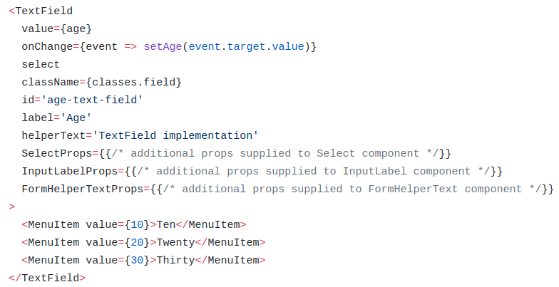

I would keep the TextField stuff in the "Simple Select" chapter. If "Simple Select" is of lower priority than "Native" or "Custom" then move it bottom, but keep TextField in it. To me personally "TextField" api is the nicest, and I will use it the most. Native select element behaves strange in some cases. |
|
I believe we document the select mode in the dedicated text-field documentation page. Maybe we should avoid the duplication and only link a demo from select to text-field? cc @joshwooding |

|
@oliviertassinari I agree - it doesn't seem like we need two demos for the same thing. We should probably keep them in the TextField section and make them more prominent like we are doing with the other demos under #17483 |
|
It is a bit messy that select is part of the I think the confusion comes from the material design specs, because in "Components" they don't have But in develop they do have the |
|
Given the direction that #17483 is taking, I think that we will be able to update this pull request to something like this: diff --git a/docs/src/pages/components/selects/selects.md b/docs/src/pages/components/selects/selects.md
index 59dc2b8ab..f7a636001 100644
--- a/docs/src/pages/components/selects/selects.md
+++ b/docs/src/pages/components/selects/selects.md
@@ -30,6 +30,10 @@ Once it's styled, you can either use it directly as a text field or provide it t
{{"demo": "pages/components/selects/CustomizedSelects.js"}}
+## Text Fields
+
+The `TextField` wrapper component is a complete form control including a label, input and help text. You can find an example with the select mode [in this section](/components/text-fields/#select).
+
## Multiple Select
The `Select` component can handle multiple selections.
@@ -48,7 +52,3 @@ Like with the single selection, you can pull out the new value by accessing `eve
While it's discouraged by the Material Design specification, you can use a select inside a dialog.
{{"demo": "pages/components/selects/DialogSelect.js"}}
-
-## Text Fields
-
-The `TextField` wrapper component is a complete form control including a label, input and help text. You can find an example with the select mode [in this section](/components/text-fields/#textfield).Would it work for you guys? |
|
@croraf I also have mixed feelings about the TextField importing the Select. It could have been better to have a SelectField component that bundles the other field components, à la TextField for the input type text. |
|
@oliviertassinari If you are talking about removing |
|
Yes, it would be a breaking change. If the idea get tractions, it could make sense to explore it in the future, during the preparation of v5. |

7be2f56 to
d2a249e
Compare
oliviertassinari
changed the title
d2a249e to
6693f67
Compare

4 participants


Motivation: Using MUI a lot, but didn't even know TextField can be used for Selects. Always used the set of components (InputLabel, Select, helpercomponent). The small section in the bottom is not noticeable.