Scale box drawing glyphs to fit cells for visual bliss#5743
Conversation
…and descent to center glyphs vertically (as much as possible).
…ate CustomTextLayout to add a new analyzer pass to detect box drawing layouts and store a BoxDrawingEffect in the run. Add capability for Runs to hold a custom drawing effect. Pipe drawing effects all the way down. Make the glyph run drawing engine detect when a custom effect is applied and call a special method to perform the effect. Implement special effect for box drawing run based on the ol' manual glyph run drawing method, adjusting it to draw the outline as well as fill the geometries and also apply both a scale factor as well as the existing translation to the geometries.
…nd performing the analysis after the fallback font has been adjusted to make its advances align with the primary font (by applying a font size scalar).
|
nit: imperative |
|
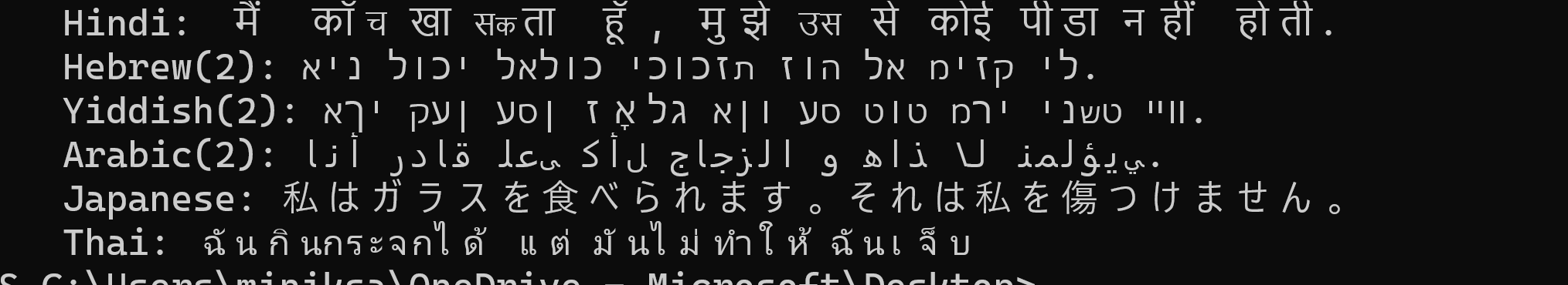
I know this is all supposed to be vertical metrics, and I hate to be such a one-note Charlie here, but can you just run a quick check that RTL is still fine with this? It just touches a lot of the previous trouble spots |
|
Unless RTL glyphs happens to fall in the range [U+2500, U+259F], this won’t impact them. It plugs into the same run-splitting and text analysis machinery that we already had, and which you helped ensure works with RTL. |
|
(Thanks for keeping us honest!) |
…Update spell checker. Fix spelling mistake. Add comments and rearrange code in a bunch of places.
 zadjii-msft
left a comment
zadjii-msft
left a comment
There was a problem hiding this comment.
This seems entirely reasonable to me, and you've certainly got a lot of test cases for this (even if they are all manual)
…ithm. Ensure that null is acceptable effect. Don't make an effect if there's nothing to be done. Fix leak after QI-ing for the BoxDrawingEffect.
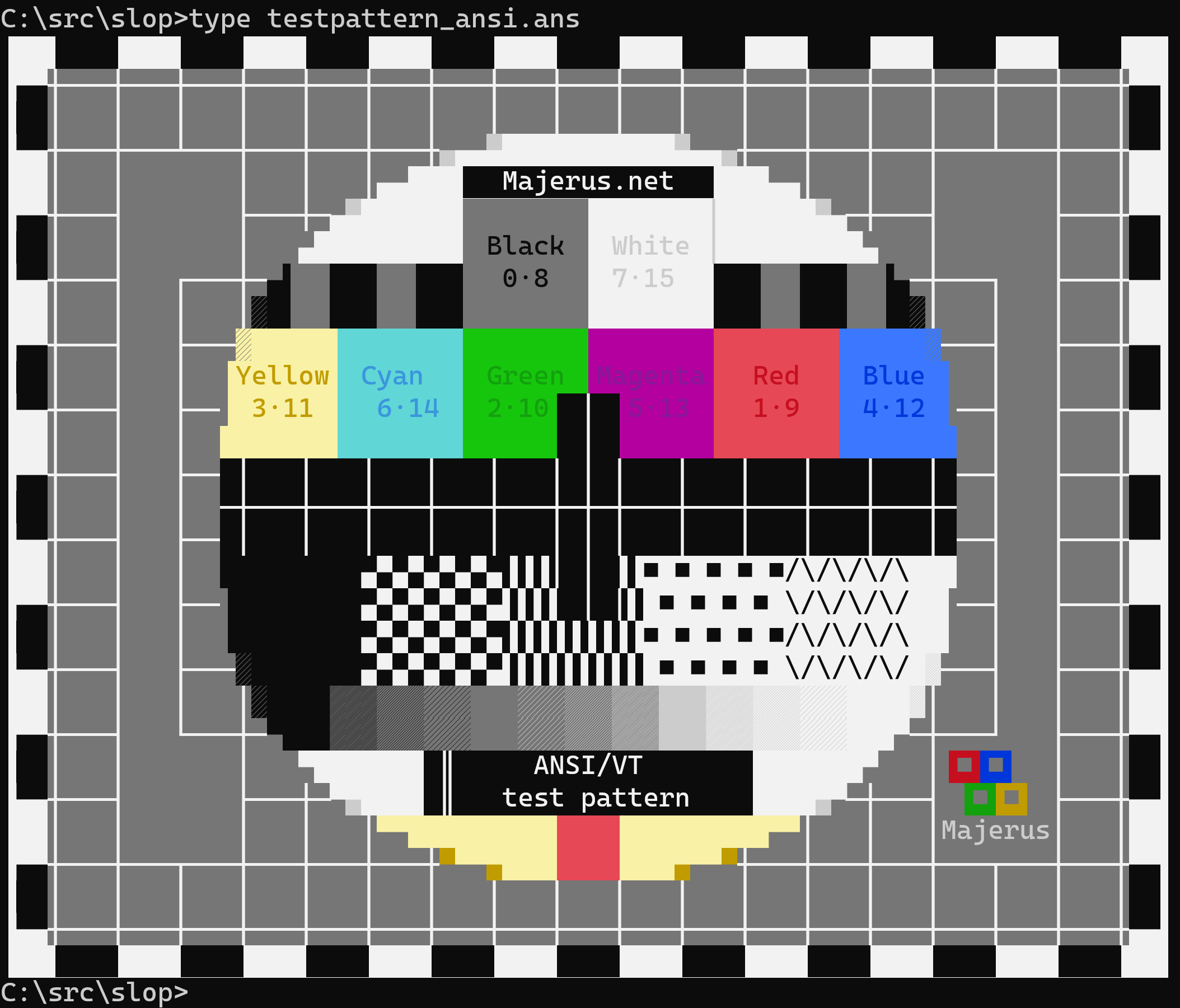
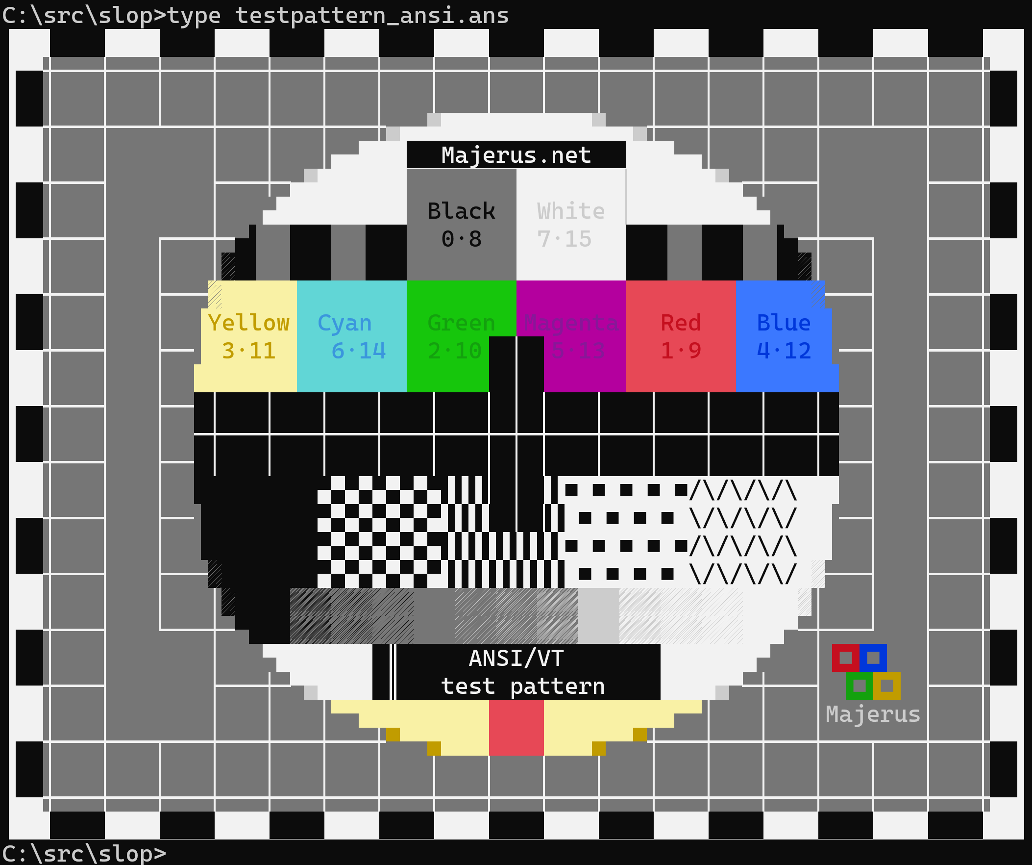
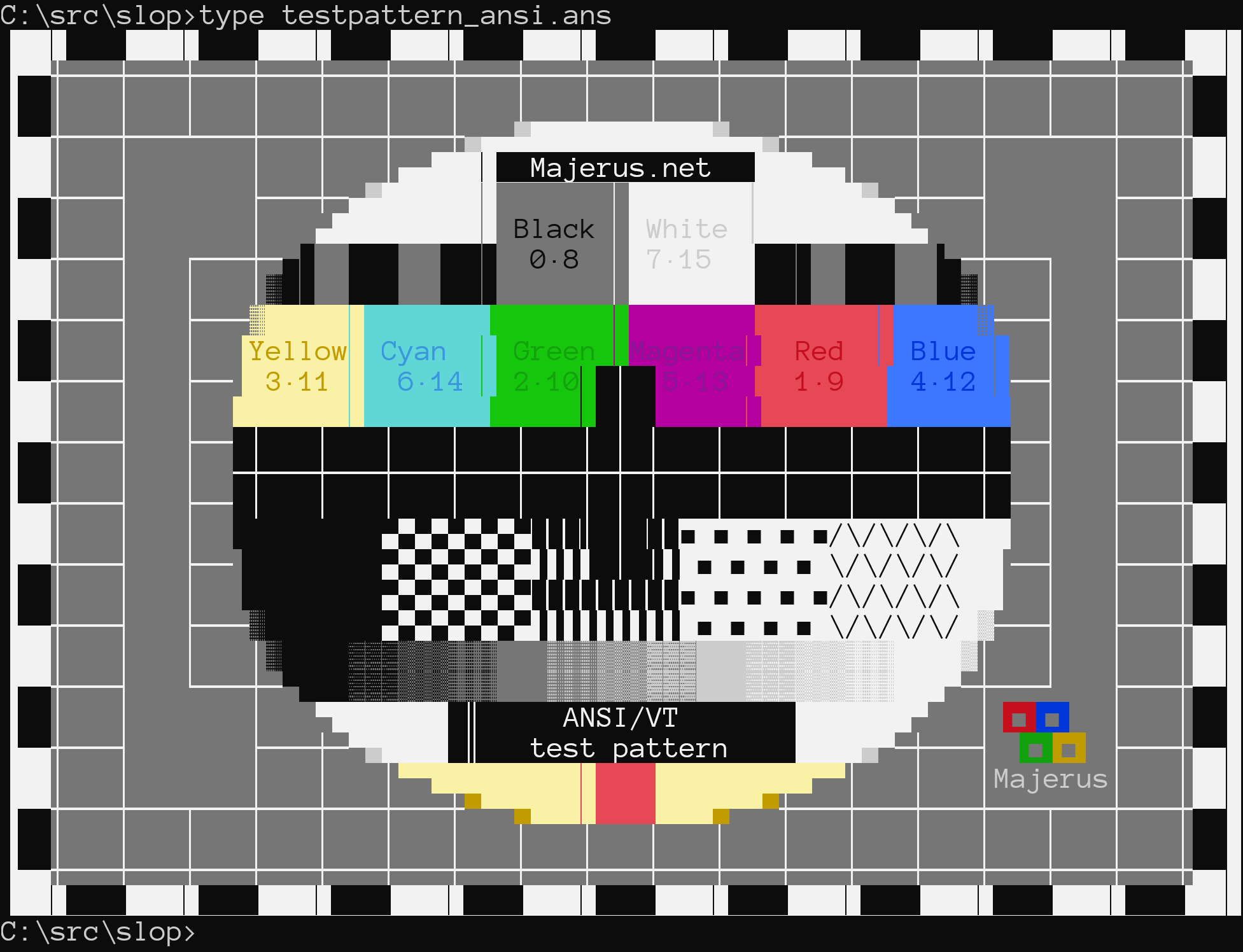
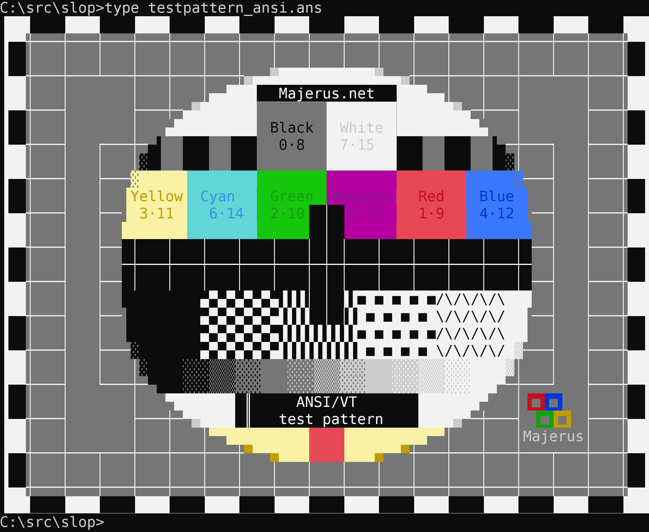
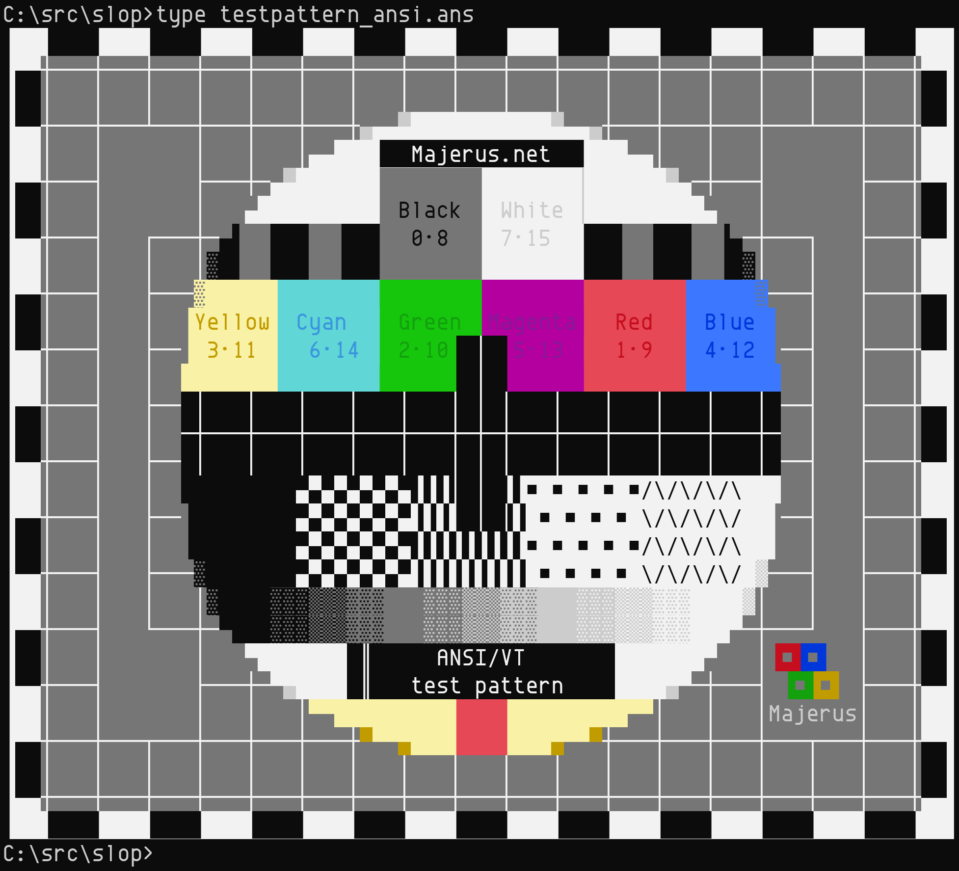
Screenshots
Anonymous Pro still isn't perfect because of fallback fitting since it's missing block drawing glyphs, but it's way better than it was. Good enough for now. |


…Use a move to save an addref/release on returning the Effect.
|
Hey @DHowett-MSFT: |
|
idl didn't wanna build in CI. Fascinating! |
…ully not generate useless proxy.
@schorrm, Lookin' good to me (from that old |
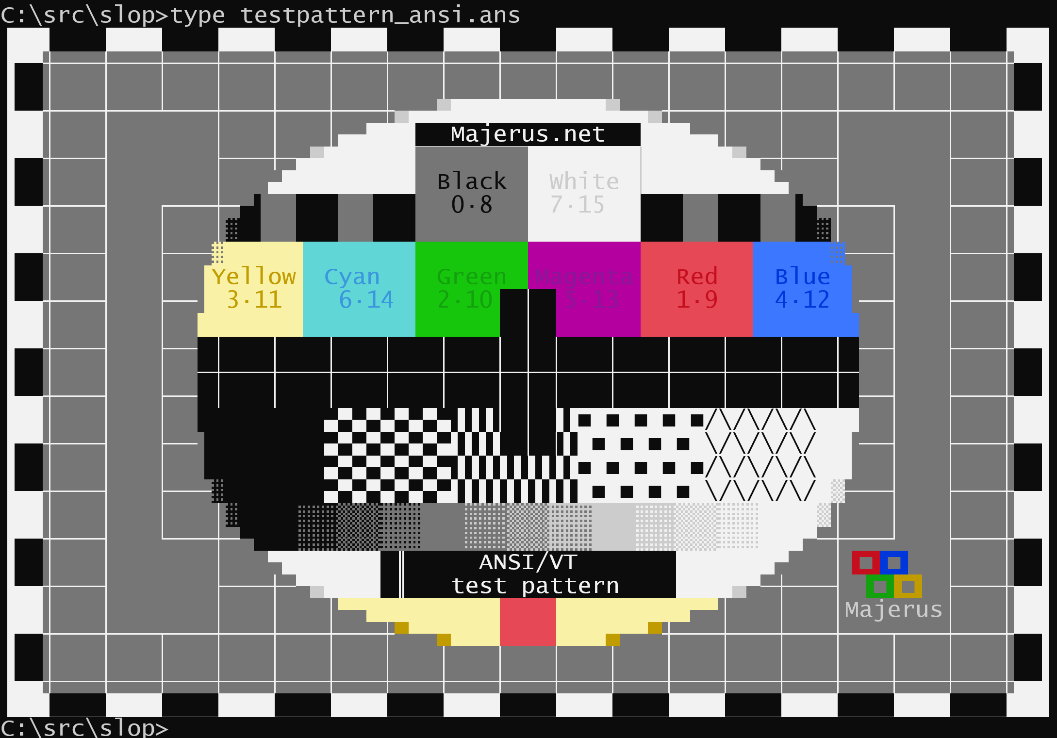
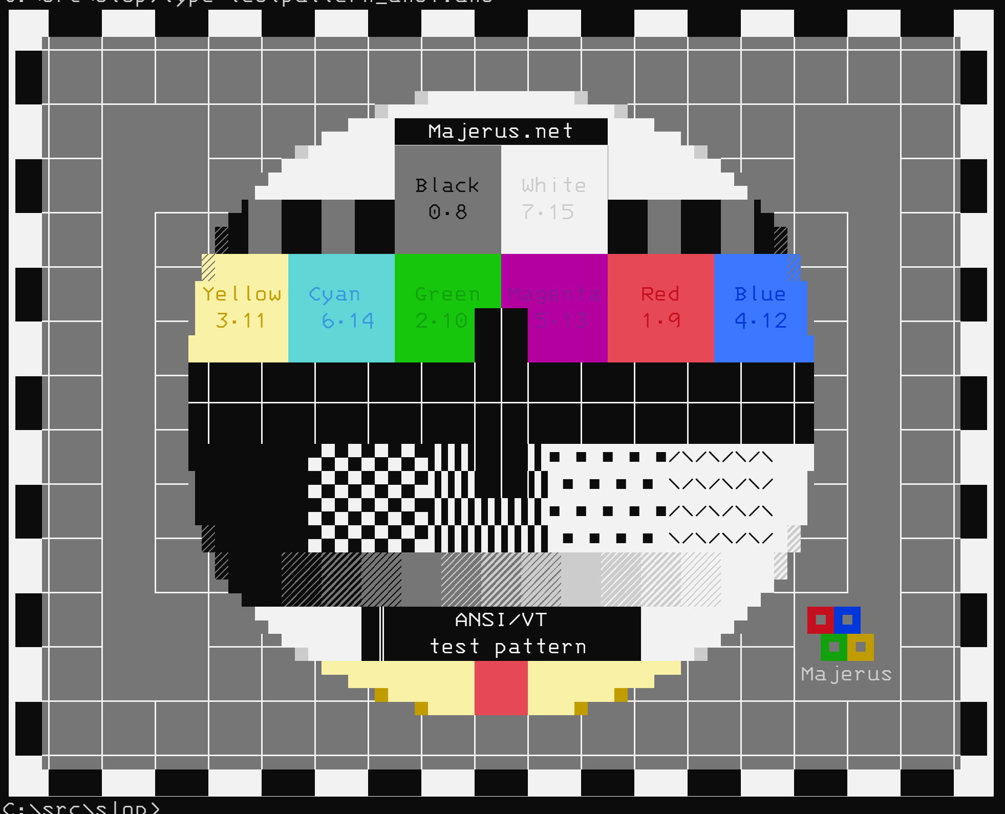
Screenshots (with don't scale to below 1.0f)
|


|
OK, so, there's actually still one more thing:
But I'm going to pull that into a new issue that may come post 1.0. This is so much better than it was for a majority of cases that I don't want to hold it up any longer. |
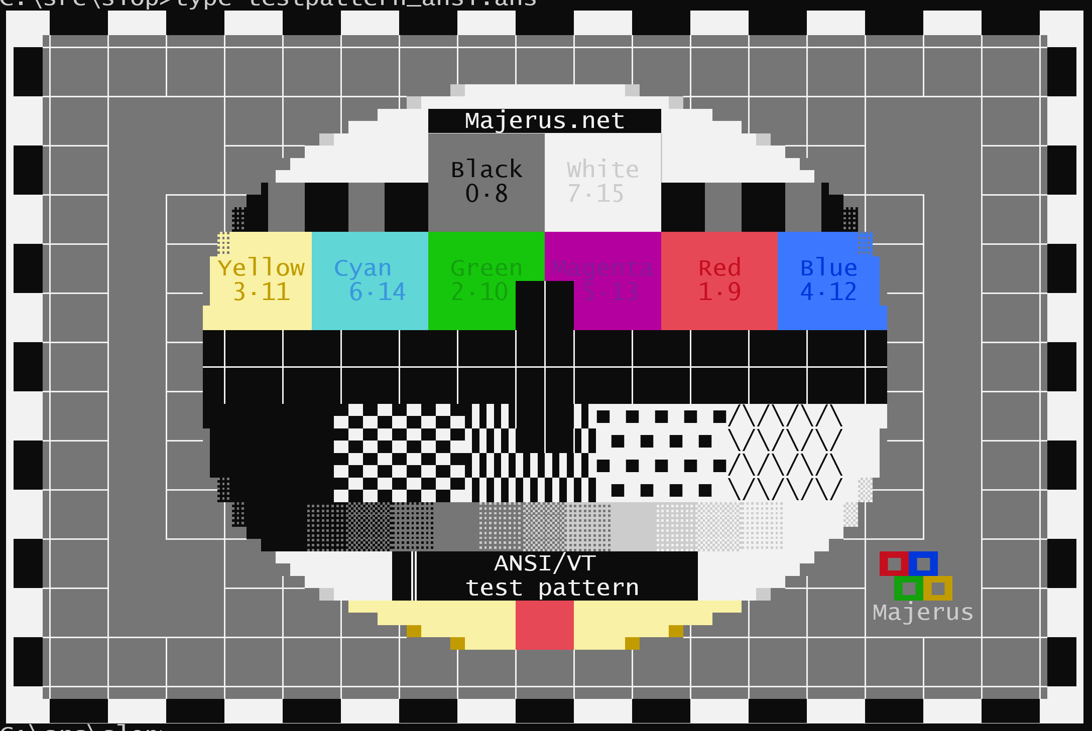
## Summary of the Pull Request
Identifies and scales glyphs in the box and line drawing ranges U+2500-U+259F to fit their cells.

## PR Checklist
* [x] Closes #455
* [x] I work here.
* [x] Manual tests. This is all graphical.
* [x] Metric ton of comments
* [x] Math spreadsheet included in PR.
* [x] Double check RTL glyphs.
* [x] Why is there the extra pixel?
* [x] Scrolling the mouse wheel check is done.
* [x] Not drawing outline?
* [x] Am core contributor. Roar.
* [x] Try suppressing negative scale factors and see if that gets rid of weird shading.

## Detailed Description of the Pull Request / Additional comments

### Background
- We want the Terminal to be fast at drawing. To be fast at drawing, we perform differential drawing, or only drawing what is different from the previous frame. We use DXGI's `Present1` method to help us with this as it helps us compose only the deltas onto the previous frame at drawing time and assists us in scrolling regions from the previous frame without intervention. However, it only works on strictly integer pixel row heights.
- Most of the hit testing and size-calculation logic in both the `conhost` and the Terminal products are based on the size of an individual cell. Historically, a cell was always dictated in a `COORD` structure, or two `SHORT` values... which are integers. As such, when we specify the space for any individual glyph to be displayed inside our terminal drawing region, we want it to fall perfectly inside of an integer box to ensure all these other algorithms work correctly and continue to do so.
- Finally, we want the Terminal to have font fallback and locate glyphs that aren't in the primary selected font from any other font it can find on the system that contains the glyph, per DirectWrite's font fallback mechanisms. These glyphs won't necessarily have the same font or glyph metrics as the base font, but we need them to fit inside the same cell dimensions as if they did because the hit testing and other algorithms aren't aware of which particular font is sourcing each glyph, just the dimensions of the bounding box per cell.

### How does Terminal deal with this?
- When we select a font, we perform some calculations using the design metrics of the font and glyphs to determine how we could fit them inside a cell with integer dimensions. Our process here is that we take the requested font size (which is generally a proxy for height), find the matching glyph width for that height then round it to an integer. We back convert from that now integer width to a height value which is almost certainly now a floating point number. But because we need an integer box value, we add line padding above and below the glyphs to ensure that the height is an integer as well as the width. Finally, we don't add the padding strictly equally. We attempt to align the English baseline of the glyph box directly onto an integer pixel multiple so most characters sit crisply on a line when displayed.
- Note that fonts and their glyphs have a prescribed baseline, line gap, and advance values. We use those as guidelines to get us started, but then to meet our requirements, we pad out from those. This results in fonts that should be properly authored showing gaps. It also results in fonts that are improperly authored looking even worse than they normally would.

### Now how does block and line drawing come in?
- Block and Line drawing glyphs are generally authored so they will look fine when the font and glyph metrics are followed exactly as prescribed by the font. (For some fonts, this still isn't true and we want them to look fine anyway.)
- When we add additional padding or rounding to make glyphs fit inside of a cell, we can be adding more space than was prescribed around these glyphs. This can cause a gap to be visible.
- Additionally, when we move things like baselines to land on a perfect integer pixel, we may be drawing a glyph lower in the bounding box than was prescribed originally.

### And how do we solve it?
- We identify all glyphs in the line and block drawing ranges.
- We find the bounding boxes of both the cell and the glyph.
- We compare the height of the glyph to the height of the cell to see if we need to scale. We prescribe a scale transform if the glyph wouldn't be tall enough to fit the box. (We leave it alone otherwise as some glyphs intentionally overscan the box and scaling them can cause banding effects.)
- We inspect the overhang/underhang above and below the boxes and translate transform them (slide them) so they cover the entire cell area.
- We repeat the previous two steps but in the horizontal direction.

## Validation Steps Performed
- See these commments:
   - #455 (comment)
   - #455 (comment)
   - #455 (comment)

Also see the below one with more screenshots:
   - #5743 (comment)

(cherry picked from commit 70867df)
|
🎉 Handy links: |
## Summary of the Pull Request
Identifies and scales glyphs in the box and line drawing ranges U+2500-U+259F to fit their cells.

## PR Checklist
* [x] Closes microsoft#455
* [x] I work here.
* [x] Manual tests. This is all graphical.
* [x] Metric ton of comments
* [x] Math spreadsheet included in PR.
* [x] Double check RTL glyphs.
* [x] Why is there the extra pixel?
* [x] Scrolling the mouse wheel check is done.
* [x] Not drawing outline?
* [x] Am core contributor. Roar.
* [x] Try suppressing negative scale factors and see if that gets rid of weird shading.

## Detailed Description of the Pull Request / Additional comments

### Background
- We want the Terminal to be fast at drawing. To be fast at drawing, we perform differential drawing, or only drawing what is different from the previous frame. We use DXGI's `Present1` method to help us with this as it helps us compose only the deltas onto the previous frame at drawing time and assists us in scrolling regions from the previous frame without intervention. However, it only works on strictly integer pixel row heights.
- Most of the hit testing and size-calculation logic in both the `conhost` and the Terminal products are based on the size of an individual cell. Historically, a cell was always dictated in a `COORD` structure, or two `SHORT` values... which are integers. As such, when we specify the space for any individual glyph to be displayed inside our terminal drawing region, we want it to fall perfectly inside of an integer box to ensure all these other algorithms work correctly and continue to do so.
- Finally, we want the Terminal to have font fallback and locate glyphs that aren't in the primary selected font from any other font it can find on the system that contains the glyph, per DirectWrite's font fallback mechanisms. These glyphs won't necessarily have the same font or glyph metrics as the base font, but we need them to fit inside the same cell dimensions as if they did because the hit testing and other algorithms aren't aware of which particular font is sourcing each glyph, just the dimensions of the bounding box per cell.

### How does Terminal deal with this?
- When we select a font, we perform some calculations using the design metrics of the font and glyphs to determine how we could fit them inside a cell with integer dimensions. Our process here is that we take the requested font size (which is generally a proxy for height), find the matching glyph width for that height then round it to an integer. We back convert from that now integer width to a height value which is almost certainly now a floating point number. But because we need an integer box value, we add line padding above and below the glyphs to ensure that the height is an integer as well as the width. Finally, we don't add the padding strictly equally. We attempt to align the English baseline of the glyph box directly onto an integer pixel multiple so most characters sit crisply on a line when displayed.
- Note that fonts and their glyphs have a prescribed baseline, line gap, and advance values. We use those as guidelines to get us started, but then to meet our requirements, we pad out from those. This results in fonts that should be properly authored showing gaps. It also results in fonts that are improperly authored looking even worse than they normally would.

### Now how does block and line drawing come in?
- Block and Line drawing glyphs are generally authored so they will look fine when the font and glyph metrics are followed exactly as prescribed by the font. (For some fonts, this still isn't true and we want them to look fine anyway.)
- When we add additional padding or rounding to make glyphs fit inside of a cell, we can be adding more space than was prescribed around these glyphs. This can cause a gap to be visible.
- Additionally, when we move things like baselines to land on a perfect integer pixel, we may be drawing a glyph lower in the bounding box than was prescribed originally.

### And how do we solve it?
- We identify all glyphs in the line and block drawing ranges.
- We find the bounding boxes of both the cell and the glyph.
- We compare the height of the glyph to the height of the cell to see if we need to scale. We prescribe a scale transform if the glyph wouldn't be tall enough to fit the box. (We leave it alone otherwise as some glyphs intentionally overscan the box and scaling them can cause banding effects.)
- We inspect the overhang/underhang above and below the boxes and translate transform them (slide them) so they cover the entire cell area.
- We repeat the previous two steps but in the horizontal direction.

## Validation Steps Performed
- See these commments:
   - microsoft#455 (comment)
   - microsoft#455 (comment)
   - microsoft#455 (comment)

Also see the below one with more screenshots:
   - microsoft#5743 (comment)
microsoft#5743 introduced a dependency from _any consumer of the DX header_ to a header generated from an IDL file.

Fixes microsoft#5819.
## Summary of the Pull Request
Identifies and scales glyphs in the box and line drawing ranges U+2500-U+259F to fit their cells.

## PR Checklist
* [x] Closes #455
* [x] I work here.
* [x] Manual tests. This is all graphical.
* [x] Metric ton of comments
* [x] Math spreadsheet included in PR.
* [x] Double check RTL glyphs.
* [x] Why is there the extra pixel?
* [x] Scrolling the mouse wheel check is done.
* [x] Not drawing outline?
* [x] Am core contributor. Roar.
* [x] Try suppressing negative scale factors and see if that gets rid of weird shading.

## Detailed Description of the Pull Request / Additional comments

### Background
- We want the Terminal to be fast at drawing. To be fast at drawing, we perform differential drawing, or only drawing what is different from the previous frame. We use DXGI's `Present1` method to help us with this as it helps us compose only the deltas onto the previous frame at drawing time and assists us in scrolling regions from the previous frame without intervention. However, it only works on strictly integer pixel row heights.
- Most of the hit testing and size-calculation logic in both the `conhost` and the Terminal products are based on the size of an individual cell. Historically, a cell was always dictated in a `COORD` structure, or two `SHORT` values... which are integers. As such, when we specify the space for any individual glyph to be displayed inside our terminal drawing region, we want it to fall perfectly inside of an integer box to ensure all these other algorithms work correctly and continue to do so.
- Finally, we want the Terminal to have font fallback and locate glyphs that aren't in the primary selected font from any other font it can find on the system that contains the glyph, per DirectWrite's font fallback mechanisms. These glyphs won't necessarily have the same font or glyph metrics as the base font, but we need them to fit inside the same cell dimensions as if they did because the hit testing and other algorithms aren't aware of which particular font is sourcing each glyph, just the dimensions of the bounding box per cell.

### How does Terminal deal with this?
- When we select a font, we perform some calculations using the design metrics of the font and glyphs to determine how we could fit them inside a cell with integer dimensions. Our process here is that we take the requested font size (which is generally a proxy for height), find the matching glyph width for that height then round it to an integer. We back convert from that now integer width to a height value which is almost certainly now a floating point number. But because we need an integer box value, we add line padding above and below the glyphs to ensure that the height is an integer as well as the width. Finally, we don't add the padding strictly equally. We attempt to align the English baseline of the glyph box directly onto an integer pixel multiple so most characters sit crisply on a line when displayed.
- Note that fonts and their glyphs have a prescribed baseline, line gap, and advance values. We use those as guidelines to get us started, but then to meet our requirements, we pad out from those. This results in fonts that should be properly authored showing gaps. It also results in fonts that are improperly authored looking even worse than they normally would.

### Now how does block and line drawing come in?
- Block and Line drawing glyphs are generally authored so they will look fine when the font and glyph metrics are followed exactly as prescribed by the font. (For some fonts, this still isn't true and we want them to look fine anyway.)
- When we add additional padding or rounding to make glyphs fit inside of a cell, we can be adding more space than was prescribed around these glyphs. This can cause a gap to be visible.
- Additionally, when we move things like baselines to land on a perfect integer pixel, we may be drawing a glyph lower in the bounding box than was prescribed originally.

### And how do we solve it?
- We identify all glyphs in the line and block drawing ranges.
- We find the bounding boxes of both the cell and the glyph.
- We compare the height of the glyph to the height of the cell to see if we need to scale. We prescribe a scale transform if the glyph wouldn't be tall enough to fit the box. (We leave it alone otherwise as some glyphs intentionally overscan the box and scaling them can cause banding effects.)
- We inspect the overhang/underhang above and below the boxes and translate transform them (slide them) so they cover the entire cell area.
- We repeat the previous two steps but in the horizontal direction.

## Validation Steps Performed
- See these commments:
   - microsoft/terminal#455 (comment)
   - microsoft/terminal#455 (comment)
   - microsoft/terminal#455 (comment)

Also see the below one with more screenshots:
   - microsoft/terminal#5743 (comment)
Summary of the Pull Request
Identifies and scales glyphs in the box and line drawing ranges U+2500-U+259F to fit their cells.
PR Checklist
Detailed Description of the Pull Request / Additional comments
Background
Present1method to help us with this as it helps us compose only the deltas onto the previous frame at drawing time and assists us in scrolling regions from the previous frame without intervention. However, it only works on strictly integer pixel row heights.conhostand the Terminal products are based on the size of an individual cell. Historically, a cell was always dictated in aCOORDstructure, or twoSHORTvalues... which are integers. As such, when we specify the space for any individual glyph to be displayed inside our terminal drawing region, we want it to fall perfectly inside of an integer box to ensure all these other algorithms work correctly and continue to do so.How does Terminal deal with this?
Now how does block and line drawing come in?
And how do we solve it?
Validation Steps Performed
Also see the below one with more screenshots: