Anti-Aliasing for powerline font icons is poor when using 12 pt or lower #7260
Description
Environment
Windows build number: 19041.388
Windows Terminal version:1.1.2021.0
Actual behavior
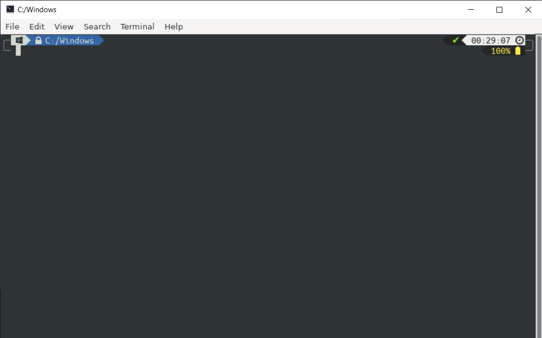
Icons in powerline fonts are blurred in the Windows Terminal using 12 pt or lower, therefore ,they are hardly recognizable
The following sample is the Windows logo icon in Windows Terminal, Gnome Terminal on Ubuntu, and ConEmu:

Windows Terminal, font:3270NF, size:12pt - windows logo not recognizable
Gnome Terminal, font:UbuntuMono NF, size:12pt - windows logo recognizable

ConEmu, font:3270NF, size:12pt - windows logo recognizable
I also tested other non-terminal software:

notepad.exe, font:Anonymous pro NF,size:12pt - windows logo recognizable
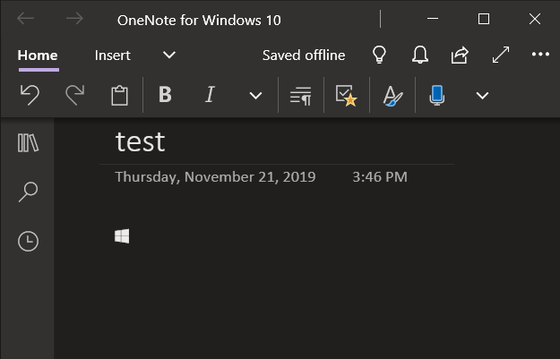
OneNote for W10 (100% resized), font:3270NF,size=12pt - windows logo recognizable